Shadowing Alphas
Hey Everyone! Tronesia here to share some tips on shadows for alphas. The one thing I enjoying adding to my pages is a fun title using alphas. I love making each of the letters look as if they are about to jump off the page. It just seems to make any page a bit more fun and interesting.
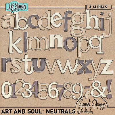
The first step is to pick the right alpha- for your page and that will work well with overlapping shadows. Usually, I will choose one that is thick and prominent. For my page and this tutorial, I have chosen to work with Julie’s awesome set of neutrals. They are the right width and will go well with the look of my page.
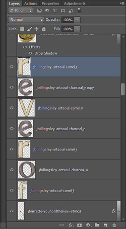
Once the alphas are chosen, I drag each one onto my page in Photoshop and place them in a blank space that will be easy to work in. Make sure that each of the letters overlap each other, as much or as little as you like. You can even rotate some of them to add to the effect. After the letters are placed onto the page, check the layers palette to make sure they are in order as this will also have affect your end result.
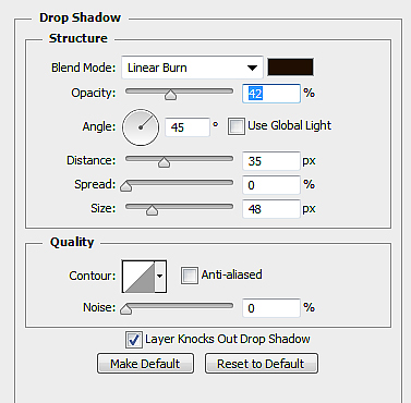
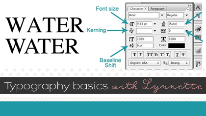
Now the fun part is adding the shadow layer style. Most times I used linear burn for my shadows, but on some pages I tend to mix it up and use the ‘multiply’ blend mode. To start, I initially apply the following settings to my alpha:
- Blend mode: Linear Burn – Color: 2C1901
- Opacity: 42%
- Distance: 35 | Spread: 0 | Size: 48
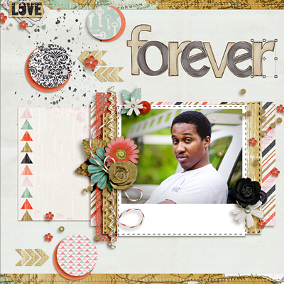
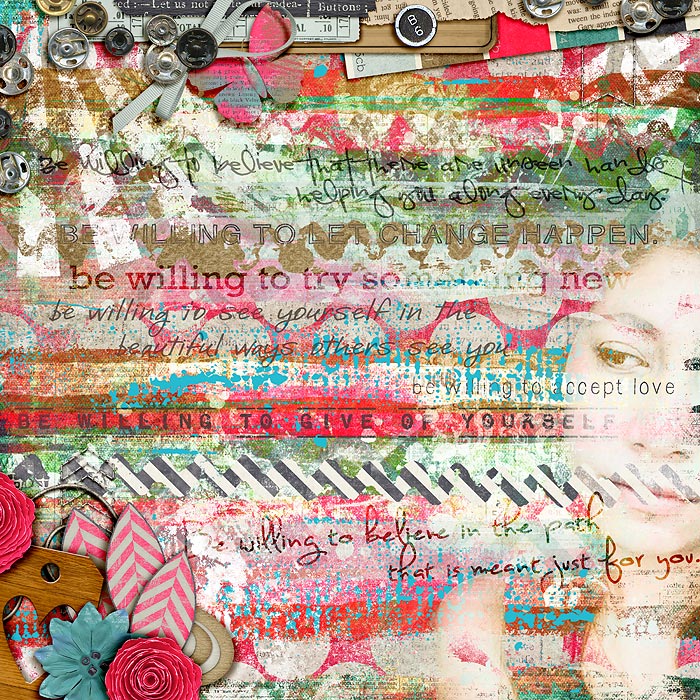
If the shadow is not dark enough, you can increase the opacity and change the distance. After my initial setting, I increased my opacity to 55% and changed my distance to 45 on the darker colored alphas. For the lighter colors’ shadows, I just changed the opacity to 45%. I felt a little more adventurous and decided to add a few elements to the title just to make it stand out a bit more. Here is my finished page with the title:
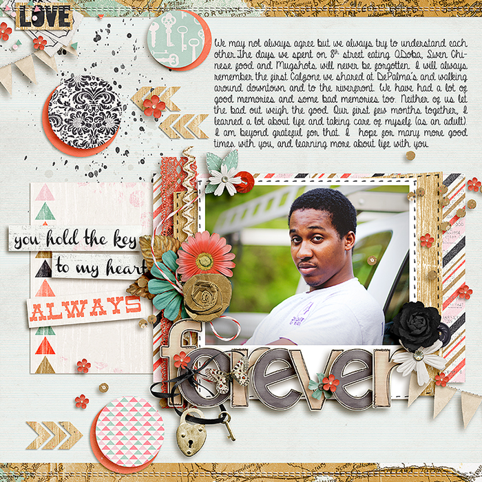
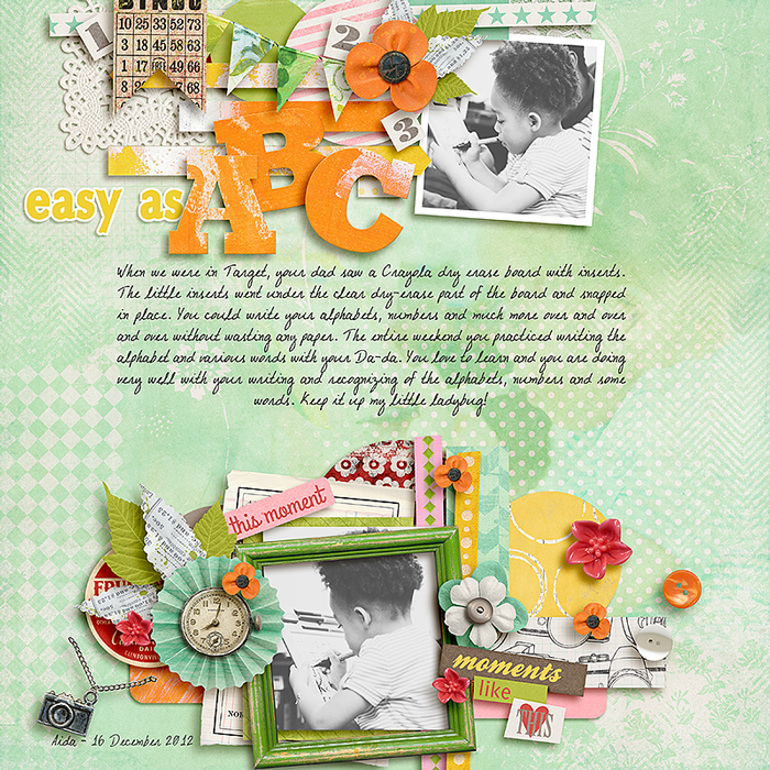
This is one other page that I applied the same shadow settings to make the alphas stand out.
I hope this tutorial will help you a little more in shadowing your alphas and adding a fun effect to your page titles. 
Jacinda Prattley said...
on February 15th, 2013 at 3:12 am
Ooh, I agree, the larger shadow looks great! I need to try this with my layout. My titles look so flat next to yours. Thanks for the tutorial Tronesia!
Su Hall said...
on October 26th, 2013 at 4:20 pm
Such an awesome difference this made! I’ll have to give it a whirl.
I just had to tell you, I call(ed) my girls ‘LadyBug’, too! It could be sort of tongue in cheek, like when they were being ‘bugs’! Otherwise, it was a sweet endearment! Too, I grew up with a family collie dog pet named LadyBug, so, the name was always special to me. Thank you!
Su