Getting the Most Out of Your Typography
In this tutorial, I am going to show you how you can use the Character and Paragraph palettes in Photoshop to fine tune your fonts and journaling. This tutorial is written using Photoshop CS3, but the information should be applicable to all versions of Photoshop CS.
The Character Palette
To start, we’re going to take a closer look at the Character palette. To open your Character Palette, click the Character palette icon ![]() in the tool dock on the right or go to Window>Character to open the palette.
in the tool dock on the right or go to Window>Character to open the palette.
Here is what your Character palette will look like when open. For the sake of this tutorial, I am going to assume you are familiar with how to select a font and adjust the weight (regular, bold, italic) and size of that font. So, I will be focusing on how you can use the leading, tracking, kerning and baseline shift options to fine tune your fonts.

When we read text, we read in phrases. Our reading pattern is disturbed if letters and words are consistently too close together or too far apart. Leading, tracking, and kerning are all ways we can adjust our text to maximize readability.
As scrapbookers, this is important because want to make sure our stories and titles are as easy to read as possible for all those generations of readers who come after us.
Leading
Leading (rhymes with sledding) is the amount of vertical space found between lines of text. Adding extra leading between the lines of text gives the eye room to rest and keeps the reader from being overwhelmed by a large, scary looking block of text.
Here’s an example of how a four-point font would look with two different amounts of leading. On the left, the leading is set to 4 points, while on the right, it is set to 8 points:

In Photoshop, the leading is set to Auto by default and will adjust based on the size of your font. But, if you’d like to manually increase or decrease the space between the lines of text, you can do so by manually setting the leading.
To set the leading:
1) Select the Type tool and select the text you would like to adjust.
2) Open the Character palette in Photoshop.
3) Click on the small arrow to the right of the input box. This will expand a drop down menu that looks like this:

4) Select the amount of leading you would like to apply. The higher the number you choose, the larger the amount of space between the lines of text will be.
Note: You can also set the amount of leading by inputting a number directly into the Leading input box or by holding your curser over the Leading icon in the palette (you will see a hand with arrows appear) and dragging left or right until you have the chosen amount of space.
Kerning and Tracking
When we want to adjust the spacing between letters and groups of letters, we can adjust the kerning and tracking. Kerning refers to adjusting the space between a selective pair of characters where as tracking refers to adjusting the overall spacing of a group of letters or large block of text.
Let’s start off with kerning.
Kerning
Certain letters, when placed next to each other create an awkward space. While this spacing isn’t as noticeable when fonts are small (like in journaling), this awkward space becomes more apparent when fonts are in all caps, like in titles. We can use kerning to increase or reduce that space to make the text more readable and visually appealing.
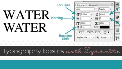
Let’s take a look at an example using the word “water:”

If you look closely, you can see there are awkward gaps between the W and the A and the A and the T when compared to the spacing between the T, E, and R. By kerning these letters in pairs, we can reduce just the space between those letters.
To adjust the kerning:
1) Open the Character palette in Photoshop.
2) Select the Type tool and click in between the letters you want to kern.
3) Choose either Metrics, Optical, or a numerical value in the Kerning field on the drop down menu. You can also type your own values into this field if you want.

Optical Kerning adjusts the spacing between adjacent characters based on their shapes.
Metrics Kerning uses kern pairs. Kerning information for many commonly kerned character pairs, such as LA, P., To, Tr, Ta, Tu, Te, Ty, Wa, WA, We, Wo, Ya, and Yo, is built in to quality fonts. Some high quality fonts may define up to 1000 different kerning pairs, and automatic kerning occurs without having to intervene.
Let’s go back to our “water” example. Our original un-kerned text is on the top row. On the bottom row, Optical Kerning has been applied to the text, between the letters W and A, and between A and T. The text on the bottom row clearly looks more evenly spaced and easy to read.

Tracking
Along the same lines as kerning is tracking. Tracking is the adjustment of the space of groups of letters or entire blocks of text. By adjusting the tracking, we can make text appear more airy or dense which affects the appearance and readability of text. Tracking can be applied to small portions of text or to an entire block at a time.
In this example below, three different amounts of tracking have been applied to the same sentence:
![]()
As you can see, with the tracking set to 0, the spacing looks pretty good, with the tracking set to -100, the letters start running into one another, and with the tracking set to +100, the spacing is nice and airy. How much tracking you need will vary depending on the font and the look you want to get. In some cases, the default tracking of zero will cause letters to be too tight or too loose depending on the font.
To adjust the tracking:
1) Open the Character palette in Photoshop.
2) Select the Type tool and highlight the sentence or paragraph for which you’d like to adjust the tracking.
3) In the tracking input box, you can either choose a preset value or you can type in your own numbers. You can also drag your cursor left and right on top of the tracking icon to increase or decrease the tracking. A positive number will increase the spacing between the letters, while a negative number will decrease the spacing between letters.
![]()
One situation where adjusting the tracking is especially useful for scrapbookers is when dealing with a pre-designed journaling block. Let’s say you have some journaling that only barely doesn’t fit into your journaling block. You can decrease the tracking and shrink the journaling down so that it fits, like this:
![]()
No other changes have been made to the text—only the tracking has been reduced. In general, I try to not decrease or increase the tracking more than + or – 30. But, depending on the font, those numbers may change.
Baseline Shift
Our final tool in our Character Palette arsenal is the Baseline Shift. The baseline is the imaginary line that all text sits upon. By adjusting the baseline of the text, we can move the line of text up or down depending on our needs.
Where this comes in handy for scrapbookers is when dealing with uneven journaling strips, like this:

In the journaling on the left, even though I adjusted the leading of the text, I still had a few lines of journaling that fell off of the journaling strip, specifically in rows 2, 3 & 6. By shifting the baseline down in rows 2 & 3 and up in row 6, I was able to fit all my journaling onto the strips, just like if I had written them by hand.
To set the baseline shift:
1) Select the text you want to adjust with the text tool.
2) In the Character palette, set the Baseline Shift option. Positive values move the character’s baseline above the baseline of the rest of the line; negative values move it below the baseline.

The Paragraph Palette
Now we’re going to shift over to the Paragraph palette and take look at alignment and justification. To open the Paragraph panel, click on the icon ![]() in the docked tool bar or go to Window>Paragraph to open the panel.
in the docked tool bar or go to Window>Paragraph to open the panel.
Once open, the Paragraph palette looks like this:

The top row of icons are for adjusting the alignment and justification of paragraphs, the second row is for indenting those paragraphs and the 3rd row is for adding space before or after a paragraph. Lastly there is a check-box that you can check or uncheck depending on whether you want to hyphenate that paragraph or not.
Let’s look at each of these.
Align
You can align text to one edge of a paragraph: left, right, or centered.
To align text:
1) Select the type layer or paragraphs you want to align.
2) In the Paragraph palette or options bar, click an alignment option.
There are three alignment options for horizontal text:

- Left Align Text Aligns type to the left, leaving the right edge of the paragraph ragged.
- Center Text Aligns type to the center, leaving both edges of the paragraph ragged.
- Right Align Text Aligns type to right, leaving the left edge of the paragraph ragged.
Justify
To justify text, the steps are the same as with aligning, you are just choosing between four justification options:

- Justify Last Left Justifies all lines except the last, which is left aligned.
- Justify Last Centered Justifies all lines except the last, which is center aligned.
- Justify Last Right Justifies all lines except the last, which is right aligned.
- Justify All Justifies all lines including the last, which is force justified.
I hope that gives you some ideas on how you can fine tune your fonts, journaling, and titles using the Character and Paragraph palettes in Photoshop. By combining these tools together, you’ll be a font ninja in no time.


Tutorials by Sweet Shoppe Designs » Playing with Text in an Art Journal Layout said...
on March 28th, 2013 at 10:00 am
[…] Adjusting the size, scale, or tracking of the fonts. Lynnette has a way better explanation of the technicalities of the Character Palette in Photoshop. I personally just like fiddling with the size and tracking mostly. Some script fonts actually look […]
MDE said...
on November 17th, 2014 at 1:10 am
Great technical help. Thank you.
Mitzi said...
on February 24th, 2023 at 3:10 pm
Thank you for this! I often have problems what I now know is tracking! And try as I might, I had no clue how to fix! Now that I have the answer to that problem, I realize more problems and how to fix them!!!!
Kiana Fitzpatrick said...
on June 4th, 2023 at 3:33 am
So glad we could help!