Better Black and Whites
Not all black and whites are created equal. In photo editing programs, there are a lot of different ways to create black and white images and many variations within those methods. You can go deep and dark or light and airy. There is also that ugly grey and muddled look that we all seem to loathe but don’t know how to escape from. Each method has its unique results.
There are also a lot of black and white actions available to download/purchase that make the transition instantly. However, the problem with actions is that no one action will work on every photo. Photos are made up of millions of pixels — light and dark and everything in between. An action may be perfect for one photo, but a photo with different lighting or focus can make that same action look awful. You could also use Lightroom with some black and white presets. However, those have the same problem as actions with the added difficulty of working in a second program.
I have learned a very simple black and white conversion method that I love. It is possible in Photoshop AND Photoshop Elements and looks great because it is done individually to each photo. It may look hard, but with practice it can be done in a less than a minute (20 seconds to be exact; I timed myself).
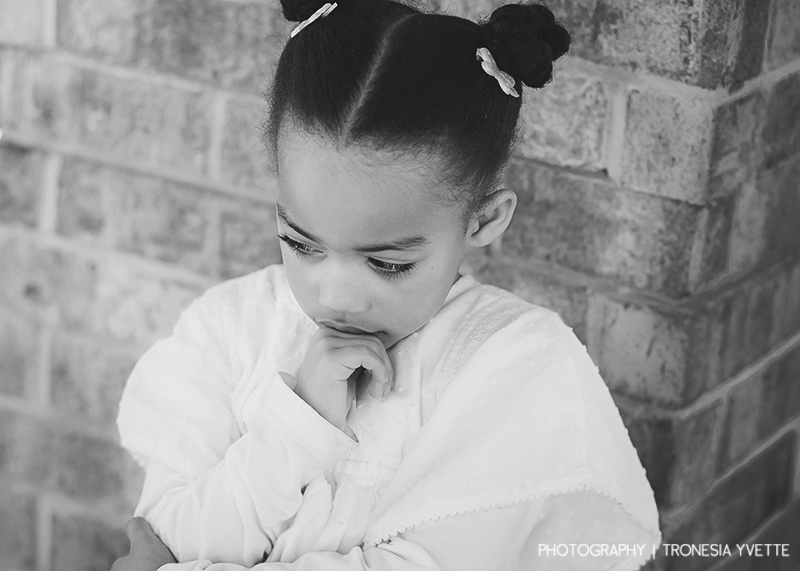
Here is a picture of my sweet six year old, Alaina. This shot is SOOC (straight out of the camera). Just in case you are interested, here is the technical info: Canon 20D, manual mode, ISO 800, f2.8, 1/60

I was working on a scrapbook page and had a specific kit I wanted to use. Her dress (which was her Easter dress last year but she insisted on wearing it for her birthday) didn’t match the kit I wanted to use, and I didn’t like the orange tile behind her head. I decided a black and white photo was in order. Now, I could have just done a remove color or remove saturation in PSE, but then it would have looked like this:

Not bad, but not great. I am not a fan of grey and prefer my black and whites to be actually black and white instead of shades of grey. So, I did an easy gradient map conversion (which is easier than it sounds).

In the layers palette, click on the adjustment layer* icon, the one that looks like a half white/half black circle. Choose levels from the drop down menu. When the levels box pops up, click ok. We will come back to this box later.
*(Simply put, an adjustment layer is a layer that affects the layers below it visibly, but does not actually change the pixels of the other layers. Think of an old overhead projector — if you have a picture of your uncle Albert on a transparent sheet and then draw a funny mustache on him with a permanent marker, you have forever changed the picture. However, if you put a transparent page over the photo and then draw your mustache, on the screen it looks like you drew a mustache on the photo but the photo is actually unharmed and untouched.)
Next, click on the adjustment layer icon again and choose gradient map.

When the gradient editor pops up choose the black to white option (the default choice will be your current foreground color to background color)

Now your layers palette will look like this

Next, click on the levels adjustment layer. For this tutorial, we are not going to get into what exactly the levels dialogue is and what it means. That is for another day. As you can see, when the levels dialogue opens, you can see a “mountain.” This mountain represents the light in your image — the lights, the darks, and the midtones. Ideally, the “mountain” will spread across the whole image and will peak towards the center. Now, you can see in my photo that the photo did a good job of peaking in center (shows that it had decent exposure) but I am a little short on the extreme ends of the tonal ranges. To correct that, I moved the black triangle on the left until it hit the mountain and the white triangle on the right until it hit the mountain.

This was the result

Now, this is much better but I was hoping for a more light and airy feel for this specific photo. In order to do that, I moved the grey triangle, which represents the midtones in the image, and moved it to the left, lightening up the whole image. I watched my image the whole time so I could stop when it looked right.


Okay, it is looking much better. However, lightening up the midtones seemed to wash out my photo a little. Good thing that is easy to fix! Above my levels layer, I added an adjustment layer for brightness and contrast.

With this layer I just added a touch of brightness and a bit more contrast. I just watched my photo until it had the look I was going for.

A quick sharpening of the eyes (another tutorial for another day!) and here is the final result!

See the amazing difference when you do the conversion yourself? And it really only takes seconds when you get the hang of it.

And now my photo is ready for my scrapbook page!

Here are some other photos that benefited from a custom black and white conversion


Don’t let actions and defaults keep you from having gorgeous black and whites. Do the conversions yourself and you will LOVE the difference!
*Please note that this article has been modified from its original version which was originally published for The Daily Digi and has been used with permission.
Isa Norris said...
on January 1st, 2012 at 1:41 pm
thank you for this fab tutorial. I already new different ways to turn photos to b&w, but not this one. It will be very useful.
Isa
Sandra said...
on January 3rd, 2012 at 12:35 am
Thank you, clearly written and great results!
Black and white « Selina Duncan Photography said...
on April 30th, 2012 at 11:20 am
[…] Here”s an example and tutorial I found from Sweet shoppe designs tutorial page that have better examples and a how to: Sweet shoppe design tutorial […]
Lydia said...
on August 22nd, 2012 at 2:57 am
I just tried this out for the first time today, and I really love the results! Thanks so much for this great tutorial, Janet!
Brenda said...
on December 1st, 2013 at 8:06 pm
I was wondering if you could explain it more in detail if using Gimp..I
Janet said...
on December 1st, 2013 at 9:27 pm
Hi Brenda — I am sorry, I am not familiar with Gimp.