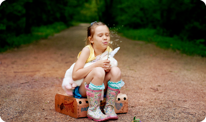
Honey Coated Vintage : Photo Editing
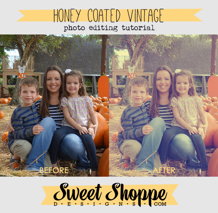
Hi! This is Brook and I’d like to walk you through my method of editing a photo to look a little vintage. It’s one of my favorite edits because it adds such a nice charming feel to almost every photo I try it on. So, let’s get started!
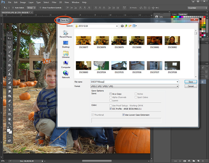
The first step when editing photos is to protect your original photo from getting accidentally saved by clicking “Save As” and saving it as a new file. This way, if you make any mistakes or accidentally click save your original won’t be ruined. I like to keep my edits in the same folder as the originals and I like to keep the file name the same also… I just add ‘copy’ or ‘edit’ to the end of the file name.
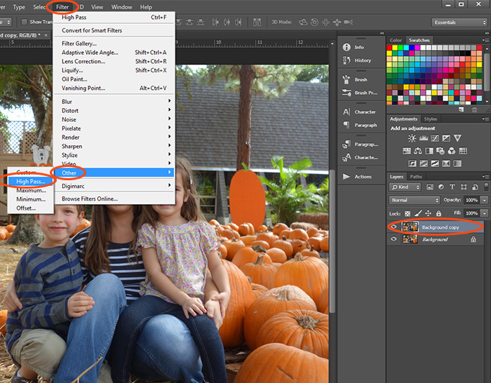
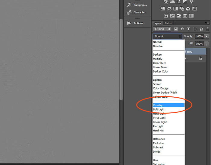
Next, my usual routine is to run a High Pass filter to sharpen up the photo a bit. I almost always do this when editing. It’s my favorite sharpening method. I first duplicate the background layer, then I go to Filter> Other> and click High Pass.
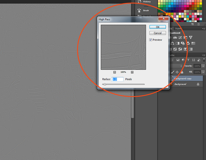
When the window comes up these are the settings I used for this photo. The effect works best when it is used sparingly so keep the settings low, under 2.5 pixels.
After clicking OK, select the gray layer (the background layer we duplicated earlier) and change the blending mode to “Overlay”.
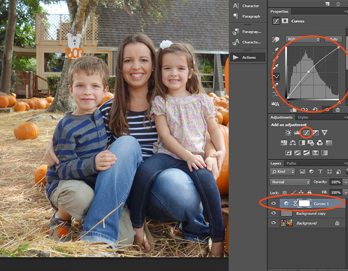
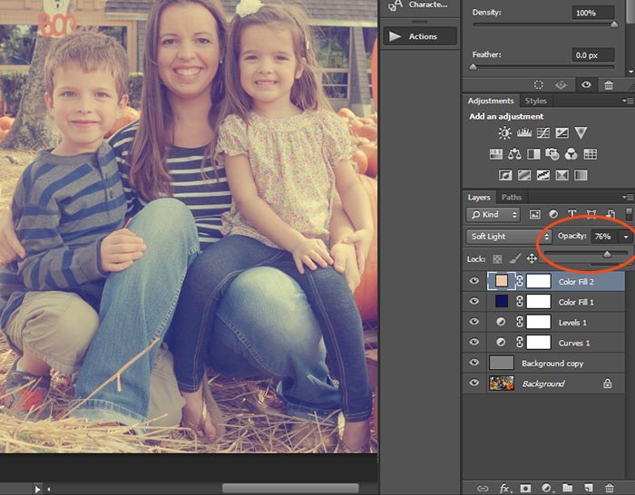
Now that it’s all sharpened I run a couple adjustments on the photo. The first is Curves. On the adjustment palette I have circled the icon for curves. Click the icon and it will create a layer in your layers palette above the High Pass layer (Background Copy). I boost the brightness in the photo as seen by pulling up slightly on the middle of the curves line as shown in the large circle.
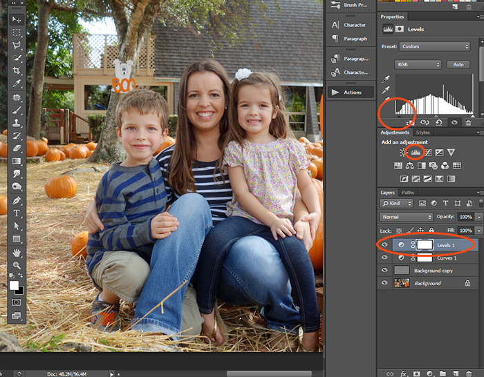
The next adjustment is Levels. The vintage effect will dull the lights and darks in the photo and so it really helps to tweak the levels and boost the black. If you can see the top red circle… I have slightly moved the black arrow right, towards the center of the chart. Although, this depends on your photo. You can adjust these adjustment layers at any time, so if it ends up wrong you can go back later and tweak it again. 
Now it’s time to transform the look of the photo! On the bottom of the layers palette is a circle icon with half white and half black. Click that and select “Solid Color”.
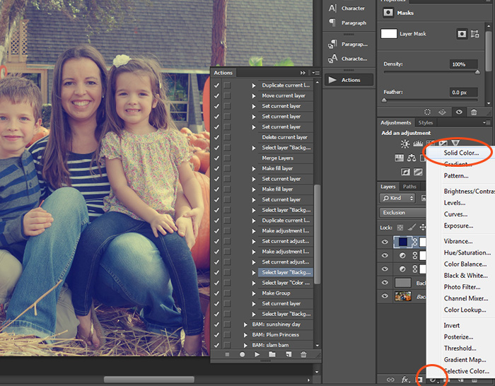
When the Color Picker pops up, you can choose your color. This color will be the darks in our photo. I like this vintage photo edit with a nice tinge of navy blue in the blacks. You can use the exact blue I have used by copying the circled numbers. This also looks nice with a deep forest green or deep purple, it depends on the photo. Play and experiment with it!
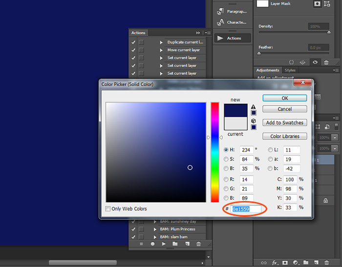
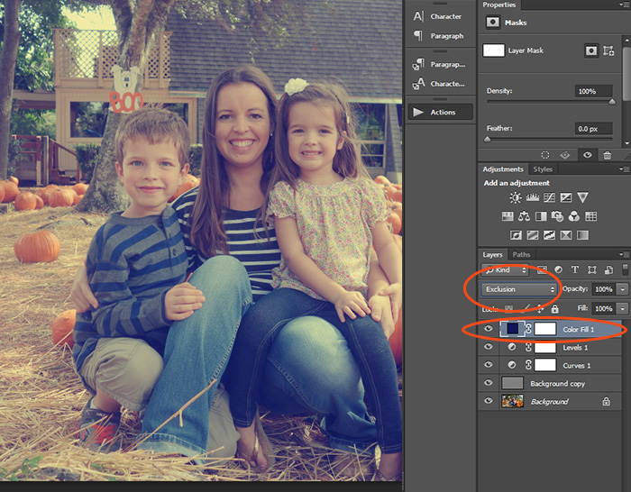
Once you’ve chosen your color, change the blending mode of the color layer to “Exclusion”. And see? It’s already looking awesome.
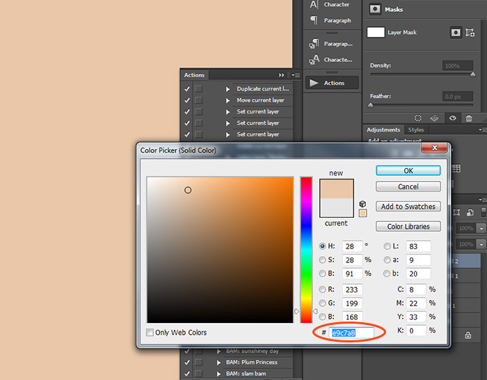
Let’s do another color layer. Do just as we did with the blue layer, except this time punch in these numbers for a nice peachy color. You can also use pale yellow or pale pink if you want to experiment.
Change the blending mode to “Soft Light”.
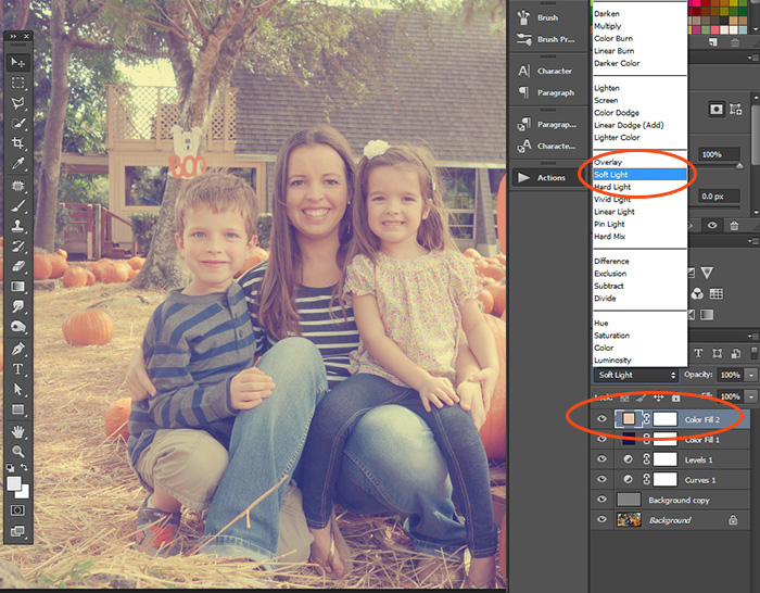
And I just adjust the opacity of the peach layer a bit. It will depend on the photo. You might want to lower the opacity of the blue layer also, or go back and adjust your Levels or Curves adjustment layers, too.
And that’s it!!! I hope you enjoyed this tutorial!
Thanks for following along,
Brook
Missy said...
on January 15th, 2014 at 3:08 pm
Very cute tutorial. Thanks!
Emil Kadlic said...
on January 16th, 2016 at 10:52 am
Absolutely mind blowing! I like the tutorial. It’s short, but very accurate and described every instruction nicely with red circle. Very easy to understand everything. Thanks.