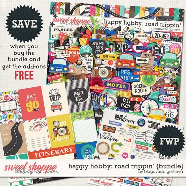
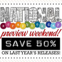
Sweet Shoppe Designs

The Indispensable Memory-Keeping Tool: Custom Fonts

Lex interviews our resident Font Queen Darcy Baldwin who makes a case for using one’s handwriting as a font, and takes us through her font-making process


“I never imagined I’d be doing something like this,” Darcy Baldwin, fontographer, confessed. “But I was given the opportunity to learn how to create fonts from a friend who was retiring her business; she wanted to pass along the knowledge to me to help me create my own business. I jumped at the chance to do something so cool!” Darcy was awesome enough to answer a few more questions we had about fonts and making them. And y’all might find a little something special to look at the end of this post as well :)

What are the common misconceptions about creating fonts?
That somehow [my client's] writing is so bad that I’ll never be able to capture it in a font. I work with a client to make sure the font looks as much like their handwriting as I can possibly make it, even it if means getting another sample or two.

What do you love about making fonts?
I love being able to work with someone to preserve a small piece of themselves. It’s so much fun to see someone excited to receive their font and talk about starting to scrap again so that they can begin telling stories again, because this makes it more personal to them.

What do you think makes a font iconic?
A timeless, classic line that helps you see the text and emotion portrayed without getting caught up in the actual lettering. You don’t want the style of a font to overtake what it’s actually trying to say. That’s not to stay that a font’s style can’t become the trademark –think Disney. Disney just doesn’t seem the same written out in a typewriter text as Disney in its iconic font.

What are your favorite qualities in a font?
Fonts that have character. I love a stylistic g. I love fonts that have emotion built into their style. And as a fontographer, I love a font that technically awesome.

Why do you think people should have fonts made of their handwriting?
Foremost, as a storyteller, having journaling and text in the writing style of yours (or any family member) will be treasured down the road. I think back about how I treasure the hand-written recipe cards of my mother and grandmother, most particularly because THEY wrote them..and it’s a little piece of them I still have. Besides, just how neat is it to be able to type on the computer and see your writing style reflected? That’s just plain cool!!!

ON YOUR FONT-MAKING PROCESS:
After your clients submit their font sample, what happens?
I spend some time in quality cont
rol mode–taking the font through a couple of clean-up processes (Step 1 & 2)to make sure the samples are the best quality I can get them.
While stylish, messy fonts are awesome, I find people really do want their personal fonts to be more. So I work hard to create clean strokes where their pens may not have given one (Step 3), and connectors that really connect in as many combinations as possible (Step 4) and then that it looks correct in use (Step 5) and then some super secret things I do to make fonts a little more realistic. Of course, if a client WANTS something super messy, less composed and grungy looking, that’s the look I go for!

Any tips for creating a kick-@ss font sample?
Relax. Seriously. I think so many clients get so caught up in the creation of a sample letter that they lose what makes the characteristics of how they normally write that letter. Also, use an awesome pen. Using the ball point pen you’ve had sitting in a desk for the last 20 years isn’t going to be the best choice :) And last, be creative! If you want a fun font – make it! It doesn’t have to be in your exact writing, but take the time to make something you’d love to see!

What is the most time-consuming process of creating a font?
Glyph cleanup. The glyph is the individual character in a font. For varying reasons, the stroke on a character isn’t always clean and I do my best to clean up those strokes so that you don’t have big blotches where ink may have absorbed into paper, or where a pen didn’t quite connect fully to paper on a curved stroke, etc.

What is your favorite part of the process?
The reveal :)

Now for the FUN stuff

Hope you enjoyed that little chat we had with Darcy, and we hope you also realize how creating your own font (or a loved one’s font) is also another way of memory-keeping! How cool would it be to tell your future stories with YOUR own handwriting? Well, Darcy is generously offering a custom-print font for one lucky commenter on this post! Here’s how to win:

1. Go LIKE her Facebook page! You want to stay updated on any new fonty goodness, right? Plus you never know when a freebie can pop up. :)
2. Come back to this post and leave a comment answering this question: Why would you want your own custom-made font?

That’s it! Giveaway closes at 11:59PM EST of May 31. Thanks for reading!

Credits: Title made using DJB Snarky Bess and Misty Cato’s Color Lift Photoshop Styles.

Our Favorite Fonts for Silhouette Cutting

Heather shares some of the staff’s favorite fonts for Silhouette cutting machines

Hello scrappers… Heather here to share some of our favorite fonts for cutting with a our Silhouette cutting machines. One of my favorite features of a Silhouette over any other cutting machine is the fact that you can use any font you have installed to cut out titles and such. I’ve used some to make vinyl cuts for wall art around the house and my “no soliciting” sign on my front door. I LOVE how easy it is to just type up your words, and send to cut. So, I’ve asked Mari and Maria to share some of their favorite fonts and I’ve compiled a list of free fonts that we love to cut with our machine.

Print fonts:

1. AW Conqueror, 2. Bebas, 3. Blackout, 4. Boston Traffic, 5. Chunk Five, 6. DJB Play Misty For Me, 7. Droid Serif, 8. Oliver, 9. Stencil Std, 10. Ultra

Maria had some fun using AW Conqueror for her Project Life spread, I’m in LOVE with that ampersand card and how she used the swashes and welded them together to make word art…


One of my favorite things about script fonts is that you can “weld” the letters together to make a whole word instead of having the separate letters to tape down…There are tons of really great script fonts out there, so I tried to pick ones that didn’t have to do a lot of manipulating in order to weld them. Don’t worry, I’ve got a tutorial coming this week that will walk you through welding and cutting script fonts, if you have not idea what I’m talking about, be sure to check it out on Thursday. Here is a list of our favorite free script fonts…

Script fonts:

1. Cookie, 2. Cursive, 3. Deftone, 4. Grand Hotel, 5. Japan, 6. Lobster Two, 7. Pacifico, 8. Marketing Script, 9. Sofia, 10. Unicorn NF

This layout uses Marketing Script, for most of the words I didn’t need to do any adjusting to get them to weld perfectly… there were only a couple letters I needed to squeeze in a bit so they touched and I could weld them together.

There are a couple fun dingbat fonts that are fun for cutting too…

I haven’t personally used any dingbat fonts but in my search for fonts, I found some that I thought might be fun to use and I hope to use in the near future…

There are also some great fonts by Darcy that are perfect for cutting too… I might be a tad bit biased but I think all her fonts would be awesome for cutting, but these are the ones I thought really stood out as good titling cutting fonts…

Fonts in the Shoppe:

Belly Button Innie
Emphatic
Starry Starry
This Font Is Bold
Fizza Wizza Wowza
Fancy Nancy
Dear Mrs Claus
Downstairs at the Abbey
Holly Jolly B’Golly
Uncertain Tense 

Here is a layout using Darcy’s This Font is Bold…

Here is an awesome layout by Mari using both Bebas and Pacifico fonts for her title work, I love how she cut it out of her background paper and then put paper behind it like a stencil:

Sweet Shoppe Saturday 5/18

Hey Hey Sweet Shoppers! Another week has come and gone which means your favorite day of the week is here! Like always, I have a bunch of sweet new goodies to show off to you tonight along with our weekly round-up of what you may have missed around the site too! We have a brand new featured designer in the spotlight which means a new free gift with purchase from now til May 31st, so read on for the scoop on all things Sweet Shoppe Designs…


Don’t forget that point values for challenges have been lowered for the entire month of May, so if you’ve never played along or have taken a break from our monthly portfolio, now is the perfect time to get back to scrapping! Every layout you create earns you points toward Sweet Rewards, and you only need 30 points to earn 40% off this month, so we hope you’ll come join in on the fun!

On that note, I’m off for the week, but I’ll be here in your inbox with lots more sweet new stuff soon. Until then, keep making memories and scrap MORE!

In The Spotlight: Erica Zane

Get See Jane Play, a bright and cheerful kit reminiscent of times gone by from Erica, FREE with your $10 purchase in the shoppe between now and May 31st! You also won’t want to miss checking out some gorgeous inspiration from our talented Babes featuring this whimsical freebie too. This is one special offer you won’t want to miss!

What is your current bestseller?

Underwater Escape has been my most popular kit so far.  It’s been around for a while but I still love it as it reminds me of the beach.

What is the product you’re most proud of creating?

I’d have to say Looking For Answers, my heart has a soft spot for this kit for sure.

What is your favorite layout you’ve seen in the gallery created by a customer?

Oh my word, it was so hard to narrow this down!!  I LOVE seeing what people do with my designs.  I ending up picking this LO by sugirox.  The thumbnail jumped out at me, it looks fabulous & the photos are so super CUTE!

Sugi, I’d love for you to choose a kit you’d like from my store for FREE. Just email Robin at admin@sweetshoppedesigns.com with your pick and she’ll get you hooked up!

What do you have in the works?

I feel like I’m still playing catch up from iNSD & my daughter’s birthday is in a few days so I don’t have a lot in progress, but this LO I made using my EZ Edges shows a peek of something that will be coming soon.

Do you have a favorite hybrid project you’ve seen made with one of your kits? Why do you love it?

First of all, I love seeing any hybrid projects with my designs!  I love to see the creativity when mixing media.  One of my favorites is this mini book by Heather.  I love how it’s all piled up with goodies and the colors are just awesome & vibrant!  I can never seem to pull off this kind of look so I’m totally envious!

Show us some standout recent layouts from your creative team!

I adore this LO by neeceebee, the colors are so perfect with her adorable photos and the placement of everything just rocks.

This LO by AJM just screams fun to me – from the fab photo to the bright colors, it’s just awesome.

This LO by taracotta 7 makes me smile.  I love that blended photo is the corner, it’s the perfect touch.

This LO by scrappurple is another that just makes me smile. I love the fun photos and the clean yet scattered look to the page.

I love the color scheme & layering in this LO by sucali – so gorgeous!

You can connect and interact with Erica in the following ways…

Like her on Facebook!

Check our her awesome Blog!

And don’t forget, when you spend $10 in the shoppe between now and May 31st, you’ll get her adorable featured designer kit, See Jane Play, absolutely FREE!

Kerning, Leading, Glyph, Serif? A Glossary of Font Terms


Glyph, Serif, Leading, Kerning? What does it all mean? Darcy brings some meaning to words we often hear used with fonts.

Font: A Mini-Glossary of Typography Terms  -  Sweet Shoppe Designs

While we’re probably all familiar with the words “font” and “typography”, we may not be so familiar with the words that make up the skeleton of how fonts are created and used, even though we hear the words thrown around often, so let’s put some meaning behind those words.


A Mini-Glossary of Typography Terms

Ascender: The part of the glyph that extends above the common top line of the font  (think d, b, etc.)

Baseline: The visual line a font sits on…the blue line on your notebook paper, the chalk line from that cool tool teachers used to help you write straight on the board..

Descender: The part of the glyph that extends below the baseline (think g, y, etc.)

Font: A collection of letters, numbers, characters in a program to create text.

Font Family: The collection of fonts that are built similarly, but that have different characteristics – Century is a famous font family.

Glyph: An individual character within a font, though a single character may have a few different glyphs.

Itallic: The slanted look of a font. This is usually manipulated by the software program to take a straight font and slant it and used for effect and for proper grammar usage in titles, etc.

Kerning: The spacing between any two characters of a font. In some editing programs, fonts can be adjusted to give you a look like this   l  o  o  k    l  i  k  e    t  h  i  s . Proper kerning of a font doesn’t create a character combination like T here.

Leading: The vertical spacing between lines. While conventional wisdom says leading = 2x point size, actual leading may need to be adjusted for the space you have to work in. Most editing programs automatically give you the corrected space needed, however, because of the way fonts are made between different foundries, you may need to adjust according to your needs on your page.

Font: A Mini-Glossary of Typography Terms (Leading) ~ Sweet Shoppe Designs

Ligature: A special glyph created for letters that have special spacing considerations when they are combined. This is different than kerning as the combined pair is its own special character.

Open Type Font: Font system developed by Microsoft and can work across platforms and contain many more glyphs than found in a standard true-type font. This doesn’t mean that .ttf fonts aren’t useful, but this is a newly developed format that gives more flexibility and usability for the modern digital age. This can include post-type fonts and true-type fonts.

Point Size: The measurement of the body of a font – characterized by the size of its ‘x’ character. This is why you have fonts that look different at the same point size. Their “x” character determines the size of their ‘body’ .

Rasterize: The point where the vector of a font is changed to a pixellated image to use in printing and publishing.

Serif: the tiny little bit of add-on to a character that gives it character.

Opp: Sans-Serif: a character that does not have the extra little bits on it

Difference between Serif and Sans-Serif  ~  Sweet Shoppe Designs "Font: A Mini-Glossary of Typography Terms"


True Type Font:  (.ttf) This is a font format developed by Apple licensed to Microsoft. It’s the basic font used by Windows systems, but can also be used by MACs.

Typeface: The way in which a font looks. The font is the software, the typeface is how it looks (though most of us tend to use font with both contexts).


Fun Fact: Upper Case and Lower Case are named from ancient printing organization! When manually setting type for use on early printing machines, a characters stored in the “Upper Case” were the tall characters not used as often as the smaller characters stored in the “Lower Case”.  Now you know!

For even more information, try this tutorial by Lynnette Penacho: Making the Most of Your Typogrpahy


Shaped Text and Text Paths

Lydia highlights some amazing Sweet Shoppe products for creating shaped text and text on a path

I love the look of shaped text on a layout. It’s one of those details that can give a layout that extra special touch. It’s not too difficult to create text on a path or shaped text in Photoshop. But, we’re lucky here at SSD, because our designers have done of the work for us and made it that much easier. Here’s a look at some of the fabulous products in the Shoppe that include shaped text or text on a path.

Cindy has these fabulous journaling templates that include text boxes that follow the beautiful curves of the layouts: Half  Pack 24 and Half Pack 29.


Janet has this super cute birthday album that includes shaped text around the number for each year. And, if you’re doing Project Life, Misty has these 3×4″ journaling cards with shaped text. Best of all, there’s a 4×6″ version too.


Misty has such a knack for using text in interesting ways in her products. These newspaper and magazine templates are perfect examples, and her It Happened Here Clipping Masks are another great way to add some extra flair to your text.

If you’re looking for more traditional text shapes, Penny has you covered. Take a look at Text Pathapalooza 1Text Pathapalooza 2, and Text Pathapalooza 3.


Libby has an entire line of shaped text templates, and I have to say that I adore them all. Check out Text MeText Me 2Text Me 3, and Text Me 4.


Are you feeling inspired to try some shaped text on your next layout? I hope so! Many of these products can be found in the Text Paths section of the Shoppe, so head on over and grab a few! Until next time, happy scrapping!

Sweet Shoppe Saturday 5/11

Hey Hey Sweet Shoppers! It’s been a wild and crazy week for us behind the scenes here at SSD. We found an amazing photographer who will be joining our team of designers later this month to bring you a wide array of photoshop actions and tools. We agonized over choosing our newest Babes (read on to meet them) and most of our team (and all of you too, I’m sure) have been generally been recovering from the craziness that was iNSD weekend! Thank you soo much for making our community’s special day a huge success. We had tons of fun with each of you during our contests and games and we hope all of you enjoyed it too!

Believe it or not, even after the release of more than 90 new products last weekend, our team of designers has managed to create more yummy stuff for you to indulge in this week. So without further delay, check out this week’s sweet new stuff, including our latest news, tutorials and more…

We were seriously blown away by the talent of the scrappers who applied to join our team of Babes and we think the world of you guys! If you didn’t make the team this time around, one of the best ways to win over the hearts of our designers is to work hard as a member of their personal creative team, and boy, do I have the perfect opportunity for you guys to do just that!

Zoe Pearn is one of our most long standing designers here at SSD and she creates absolutely stunning products which are so much fun to work with. She’s looking to fill all kinds of roles on her new creative team so check out the details below and get those applications in…

On that note, I am off for the week, but I’ll see you here in your inbox with lots more sweet new stuff, a brand new featured designer and some other sweet goodies next weekend! Until then, keep making memories and scrap MORE!

The Sweetest Fonts

Darla shows us the top 10 best selling fonts here at Sweet Shoppe Designs

Hello everyone. If you are like a font junkie like I am, you are always on the hunt for the “just right” font for your layouts, and instantly, our designer, Darcy Baldwin comes to mind, And I had to ask – what are the top 10 best selling fonts at SSD? So here is her list in no particular order:

1. Dear Mr. and Mrs. Claus font – This is the perfect script journaling font that would be perfect on those pages you want an easy to read font or title on a page. See Heather’s example here:

2. Gimme Space – Ok I won’t lie – Gimme Space is one of my all time favorites and is so perfect when you want a clean simple font for your page. Here I used it on my page for the title:

3. Ellefont – is a really cute font that I think would be so very perfect on a teen or girl page like Keely’s example here:

4. Brittany Print – is another great print type font that has a clean look about it for large journaling areas like in Jacinda’s example:

5. A Fresh Start – is a font that is perfect for journaling that has that “warm and cozy” feel about it when you see it sort of like in Lydia’s layout here:

6. Miss Molly Brown – is a nice print type font that reminds you of when you first start learning to write your letters in school. Take a look at the beautiful layout by Tara:

7. Baby Bump – this font makes me smile I think because of the name of it but what a perfect font for all your kid-type pages. See the example by Lizzy that illustrates this perfectly:

8. All the Cool Chicks – this font is just well – cool and so fun to use on your pages – look at this cute page by Traci:

9. Scruffy Angel – this is a font that looks like it was drawn with a fine ink pen and adds that extra special touch like on this example:

10. Coffee Shoppe Expresso – this is a font that has such a perfect rounded touch to it that honestly has a futuristic kind of feel about it. I like how it is used on this page:

These are only a few of the large selection you will find in Darcy’s shoppe – so if you still want to see more – feel free to browse through the pages of fonts starting here. And if you don’t find something you like, you can always ask Darcy to make your own handwriting font to add to your font stash! Have fun shopping!!

Typography Resources

Nikki shares some fabulous typography resources from around the web.

What did we ever do without the amazing World Wide Web? These days countless resources for just about any thing or any topic that we may need are right at our fingertips. I remarked to my husband just the other day about how incredible it was that most of us walk around with the internet literally in our pockets. Today I’m going to share some fabulous Typography Resources I’ve come across using that amazing World Wide Web.

TYPEinspire

This site describes itself as “a showcase of typography and text effects.” It’s a great visual site for inspiration and also has links to other typography resources.

Typetester

This is a cool site for testing different fonts side by side. You can type in your own sample text and then choose up to 3 fonts to get a side by side comparison of how they look.

ilovetypography.com

This is another great website for visual inspiration. It also has great articles on different aspects of typography. If you’re a font nut, this website is for you!

wordle

Wordle is a fun site that most of us are familiar with. But if you’re not, you should really check it out. Basically, it’s a word cloud generator. You can enter in the url of your blog, etc. (as I did at the top of this post with the Sweet Shoppe Blog) or enter in any words you want. It’s very easy to customize and a fun way to use type on your scrapbook layouts.

Ransom Note Generator

This site is just what it says it is. You enter in whatever text you want, and it generates an image of those words using various “cut out” letters . . . kind of like you see in ransom notes.

Tagxedo

This is another cool word cloud site. Their site states:

Tagxedo turns words — famous speeches, news articles, slogans and themes, even your love letters — into a visually stunning word cloud, words individually sized appropriately to highlight the frequencies of occurrence within the body of text.”

Pretty cool huh? And you can also add them to t-shirts, mouse pads, coffee cups, etc. and have the option to buy.

Of course these are just a handful of the typography resources out there. There are countless sites where you can download free fonts, get visual inspiration, or anything else font/typography related.