Kerning, Leading, Glyph, Serif? A Glossary of Font Terms
Glyph, Serif, Leading, Kerning? What does it all mean? Darcy brings some meaning to words we often hear used with fonts.
While we’re probably all familiar with the words “font” and “typography”, we may not be so familiar with the words that make up the skeleton of how fonts are created and used, even though we hear the words thrown around often, so let’s put some meaning behind those words.
A Mini-Glossary of Typography Terms
Ascender: The part of the glyph that extends above the common top line of the font (think d, b, etc.)
Baseline: The visual line a font sits on…the blue line on your notebook paper, the chalk line from that cool tool teachers used to help you write straight on the board..
Descender: The part of the glyph that extends below the baseline (think g, y, etc.)
Font: A collection of letters, numbers, characters in a program to create text.
Font Family: The collection of fonts that are built similarly, but that have different characteristics – Century is a famous font family.
Glyph: An individual character within a font, though a single character may have a few different glyphs.
Itallic: The slanted look of a font. This is usually manipulated by the software program to take a straight font and slant it and used for effect and for proper grammar usage in titles, etc.
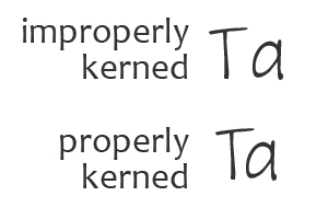
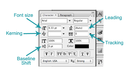
Kerning: The spacing between any two characters of a font. In some editing programs, fonts can be adjusted to give you a look like this l o o k l i k e t h i s . Proper kerning of a font doesn’t create a character combination like T here.
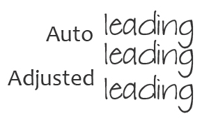
Leading: The vertical spacing between lines. While conventional wisdom says leading = 2x point size, actual leading may need to be adjusted for the space you have to work in. Most editing programs automatically give you the corrected space needed, however, because of the way fonts are made between different foundries, you may need to adjust according to your needs on your page.
Ligature: A special glyph created for letters that have special spacing considerations when they are combined. This is different than kerning as the combined pair is its own special character.
Open Type Font: Font system developed by Microsoft and can work across platforms and contain many more glyphs than found in a standard true-type font. This doesn’t mean that .ttf fonts aren’t useful, but this is a newly developed format that gives more flexibility and usability for the modern digital age. This can include post-type fonts and true-type fonts.
Point Size: The measurement of the body of a font – characterized by the size of its ‘x’ character. This is why you have fonts that look different at the same point size. Their “x” character determines the size of their ‘body’ .
Rasterize: The point where the vector of a font is changed to a pixellated image to use in printing and publishing.
Serif: the tiny little bit of add-on to a character that gives it character.
Opp: Sans-Serif: a character that does not have the extra little bits on it
True Type Font: (.ttf) This is a font format developed by Apple licensed to Microsoft. It’s the basic font used by Windows systems, but can also be used by MACs.
Typeface: The way in which a font looks. The font is the software, the typeface is how it looks (though most of us tend to use font with both contexts).
Fun Fact: Upper Case and Lower Case are named from ancient printing organization! When manually setting type for use on early printing machines, a characters stored in the “Upper Case” were the tall characters not used as often as the smaller characters stored in the “Lower Case”. Now you know!
For even more information, try this tutorial by Lynnette Penacho: Making the Most of Your Typogrpahy
