Standout Sunday: Passport to Family 11/28
Sweet Sunday salutations, my scrapbooking friends! I hope you’re taking some time to recover from this weekend’s Turkey Coma, Shopping Shock, Traveling Exhaustion, Family Frenzy … whichever ones may apply to you and yours.
Are you tired of thinking about the holidays yet? Well, why not shift gears for a bit – after all, with just three days remaining in the month of November, it’s time to check in on the progress of your Passport!
I refer, of course, to the November Passport to Family. For those who may be new to the Sweet Shoppe, the Passport is our monthly challenge-and-reward system. You’ll find it posted in the Passport to Sweet Stuff forum on the first day of the month with 18 scrappy challenges to choose from. Based on the number of challenges you complete, you can earn up to a 40% discount in the Shoppe; those who finish all 18 are entered in our monthly drawing for a $50 Sweet Shoppe gift certificate.
There are three more days to finish November’s Passport to Family and qualify for those sweet, sweet rewards. How many squares do you have left to go? If you need a little inspiration, today’s your lucky day, because I get to share some standout layouts from your fellow Sweet Shoppe scrapbookers! I found them all in the Passport Gallery or linked to their Passport to Family post. So let’s take a look, and I’ll tell you why I think each one is a standout.
#1: One Little Word: Tribe

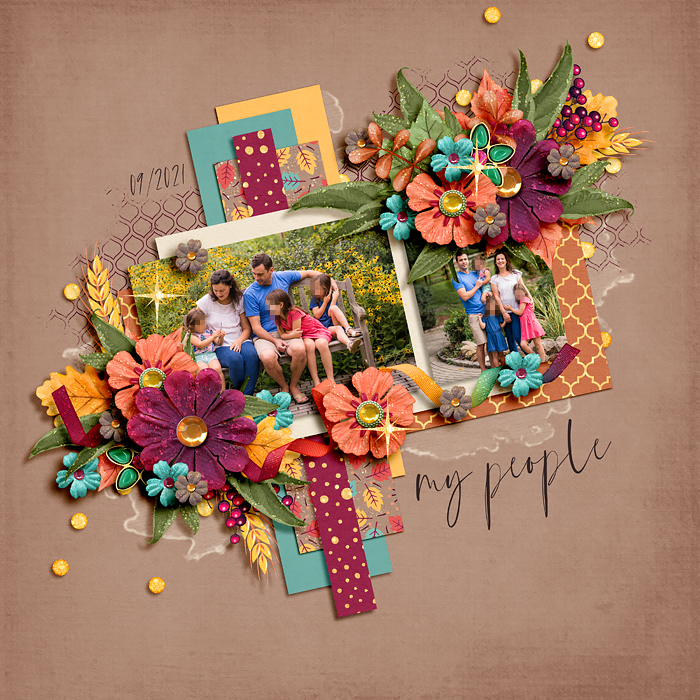
It was the combination of vibrant jewel tones and a slightly tilted layout that made this layout jump out of the gallery at me. I love the three little sparkle lens flares she added – one on the photo, one on a flower, and one on a jeweled button – it’s like a little sprinkling of fairy dust on top. Simply magical!
#2: Product: Gratitude

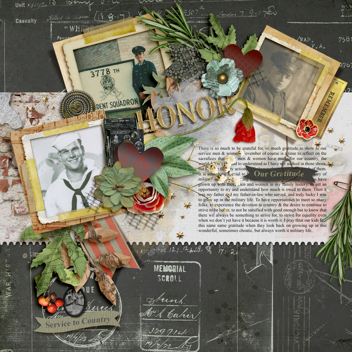
As the daughter of a US Army Veteran with 30 years of service, nothing tugs at my heart quite like a military-themed layout. For this gratitude-themed challenge, clucaswvu04 writes about the service members in her own family and how grateful she is to have grown up in the military life. By concluding with her hopes for her own children, she’s looked both backwards and forwards in time, all in a single layout. This is just beautifully done!
#3: Featured: Jennifer + Blagovesta

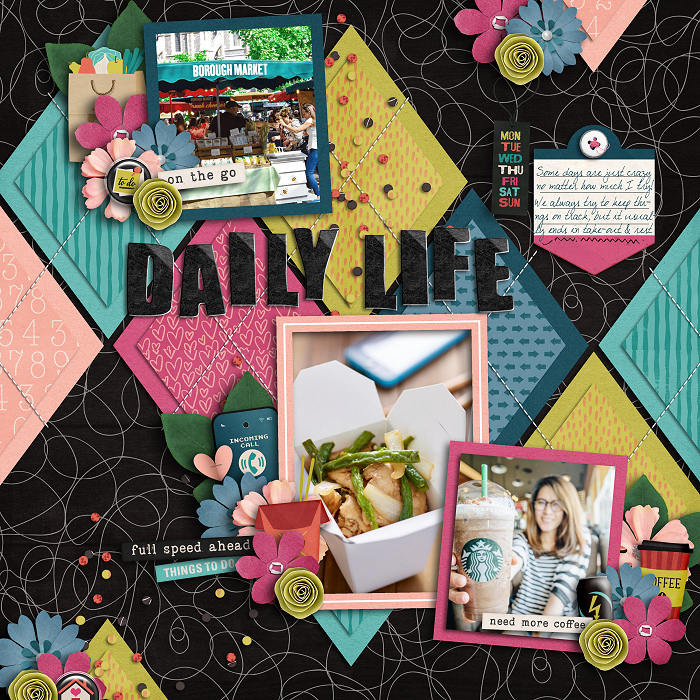
This layout is made with Blagovesta’s featured designer kit “A Busy Day” and takes its subject directly from the kit’s theme. I like the mixture of patterned papers here, the sweet little clusters sprinkled throughout the page, and the stitching used to hold everything down. But what I love most are those photographs! They’re beautifully shot, perfectly framed, and are the exact match for her journaling: “We always try to keep things on track, but it usually ends in take-out & rest.” What a story iScrap has told in just two sentences and three photos!
#4: Inspired By: Family

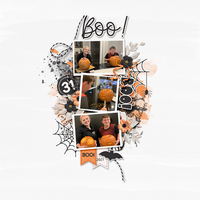
Just look at that white space! I love the look of this layout, with a vertical composition of her three photos, backed by layers of paint and some hand-drawn elements, a few elements tucked behind in clusters, and a simple title, oh-so-perfectly shadowed. By keeping her color scheme limited to black, white, and orange – a perfect match for her photos, by the way – amyjcaz has created a vibrant, attention-grabbing layout that still has plenty of room for the eye to rest. Gorgeous!
#5: Dealers Choice: Color Families

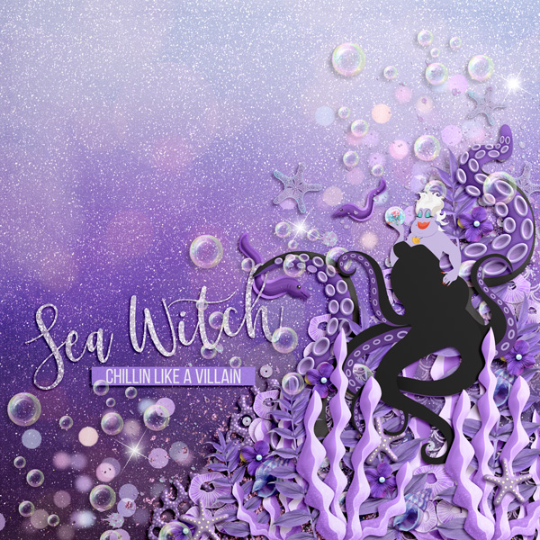
Speaking of colors, Cinna knocked it out of the park with this layout in the Color Families challenge. Would you look at all that rich purple? The layering in the giant cluster of coral and shells is just fantastic – excellent shadowing, by the way – and the placement of Ursula versus the title and the cascade of bubbles to create a diagonal composition … I just can’t stop looking at this piece of art. WOW!
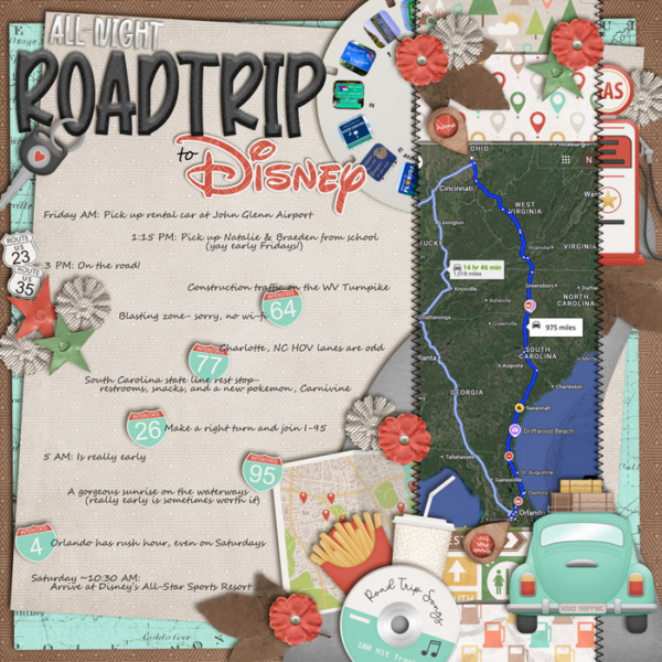
#7: Photography: Family Gatherings

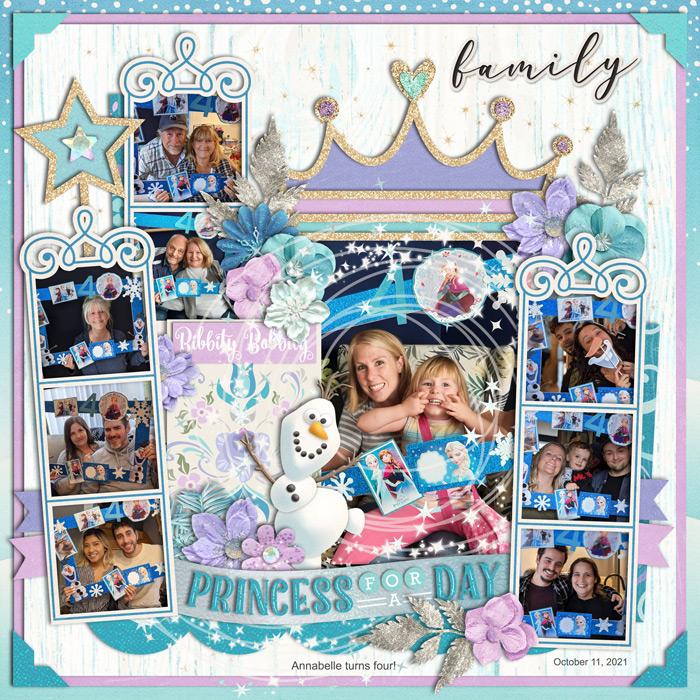
Sometimes, you wind up with the perfect combination of photos and kit and it’s complete and utter scrapbooking magic. That’s precisely what Lidia G has created with this sweet layout! The colors and elements are pastel, princessey perfection, and my favorite part? It’s the circular swirl of snow and stars she placed around the focal point photograph! Sometimes I struggle with how to use those swirly elements … this is brilliant! I’ll definitely remember it for the next time I’m working with a kit that includes a similar element.
#8: So Sketchy

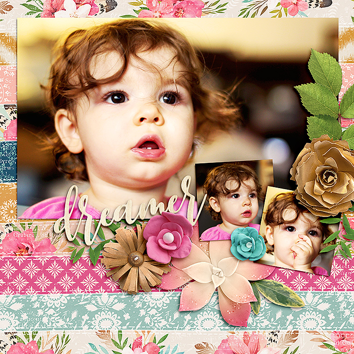
THAT PHOTOGRAPH – oh my word! Her big brown eyes, those sweet curls, and that full lower lip with the tiniest glimpse of baby teeth … it’s a beautiful shot and the ideal image to use for a layout with a great big stinkin’ picture. It really could stand on a piece of black cardstock all on its own, but nowens added just the right dash of paper, flowers, foliage, and a single piece of word art. Just enough to dress it up, but not so much as to detract from that stunning photograph.
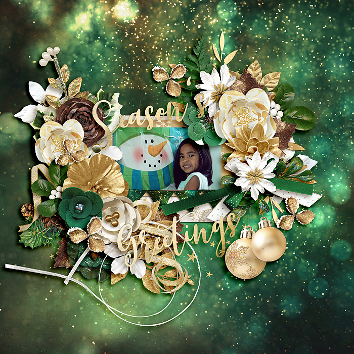
#9: Seasonal: Buttons

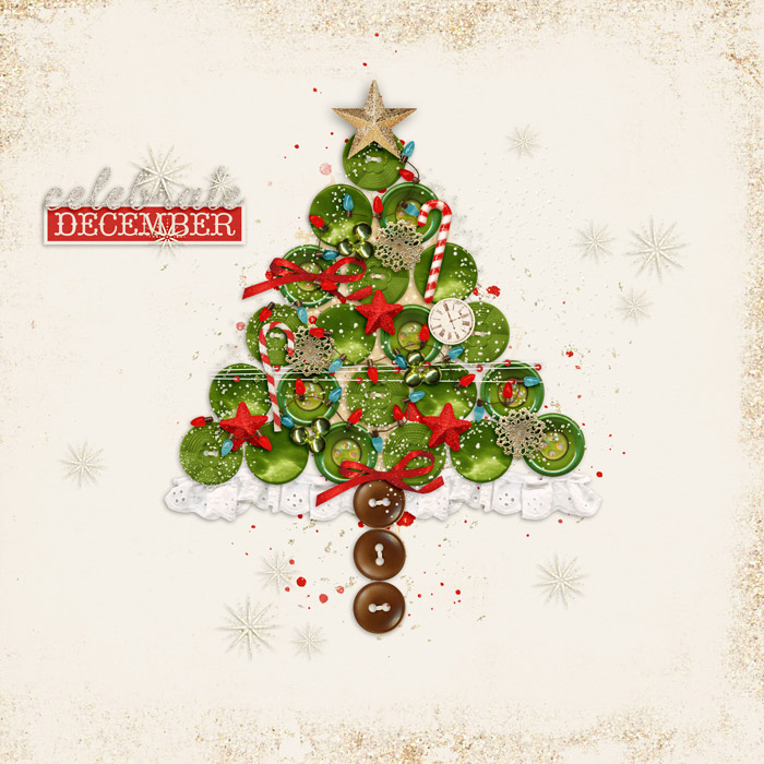
If this isn’t the title page for a December Daily-style album, it should be! How stunning is this tree made of buttons?!? It has a skirt made of lace. Like an actual tree skirt. And a tiny strand of lights. And there’s bows and ornaments and the star on the top … and everything is shadowed so beautifully I feel like I could reach out and pick up any single element. It’s another work of art, and if it doesn’t grace the cover of an album, it should at least be printed and framed and set out as holiday decor. (Apparently I feel very strongly about this tonight – LOL!) Truly, Romajo, you did an amazing job on this.
#10: Typography: Bestowens Family Font

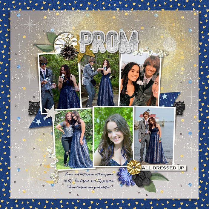
Two things stood out to me about this layout in particular: first, the contrast in color between the background and frame really catches the eye; and second, the mixture of photographs – both close-ups and full-length shots, individual, couple, and group – create significant visual interest and keep the eye moving around the photo cluster. Those two things together add up to a lovely layout buzzing with energy, perfect for chronicling prom!
#11. Wild Card: Scrap Anything You’d Like

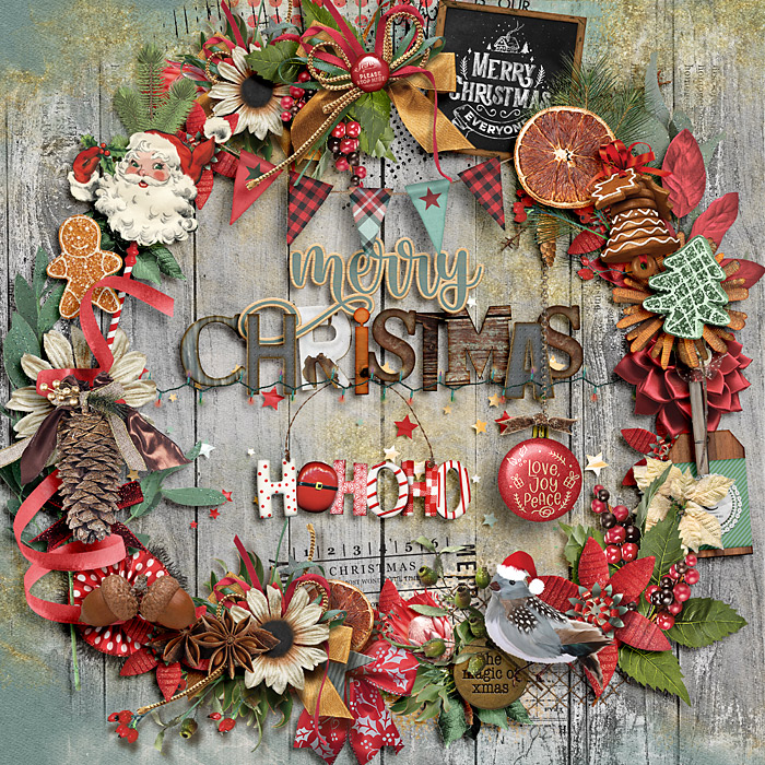
I love texture. Seriously, I’m a texture junkie when it comes to layouts, and this stunning piece by Cinderella has it in spades. There’s so much to look at here, I feel like I’m perusing one of those beautifully illustrated “seek-and-find” books my grandsons love so much. From the sleek ribbon to the satiny flowers, the rough wood to the spiky pine boughs, the bumpy metallic cord and the pinecone and the dried orange and the berries – this is a gorgeous wreath with so many different elements, so many different textures, and is that ornament hanging from a metal chain? Wow! Another candidate for the cover of a holiday album, for sure.
#12. Composition: Big Bold Titlework

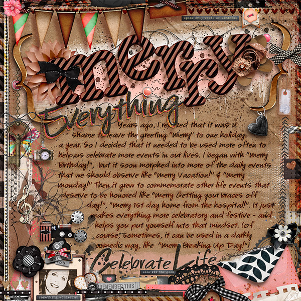
I like big titles and I cannot lie! What a beautiful job justpattyanne did on this layout with those giant chipboard letters, set off the background by backing them with two shades of contrasting paint as well as a paper flower, and accented with the cutest bow “tied” around the leg of the letter M. By rocking the letters back and forth, they appear to bounce on the page, echoing the meaning of the word “merry” themselves. It’s simply masterful!
#13. Journal: Family Traditions

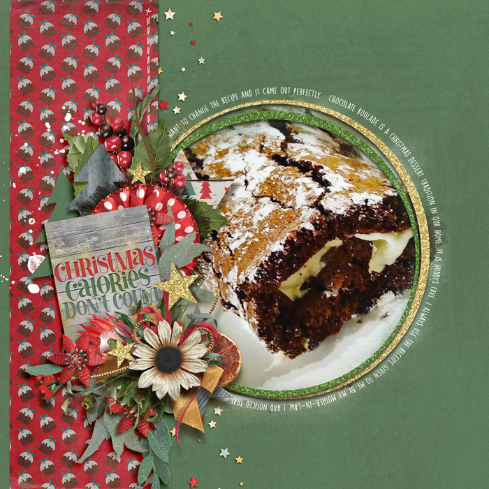
Sassy journaling card? Check. Big photograph of mouthwatering dessert? Check. Just the right amount of journaling about what makes Chocolate Roulade a family tradition? Check! I really like the approach ClaireG took with this layout. I don’t know that I would have thought to go the direction of a specific recipe, but it makes so much sense – after all, how many of our traditions center around the preparation or consumption of food? I’m already brainstorming a list of foods I could cover like this in my holiday album this year.
#14. Currently: Grateful for…

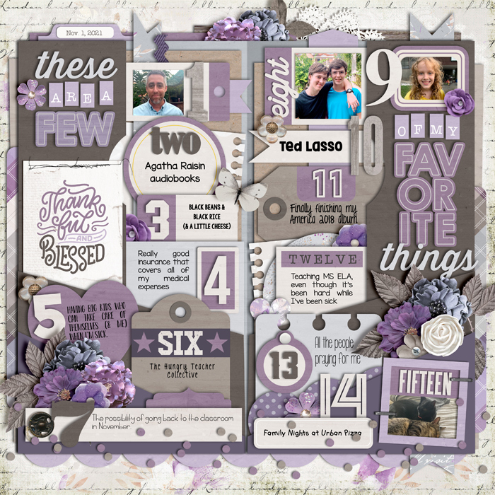
I don’t know if it’s completely meta if I say that “favorites” layouts are favorites of mine, but it’s the truth. It’s a way of capturing a quick snapshot of who we are at this moment in time – what we’re doing, what we love, what we’re into, what’s important to us – and it’s an easy way of getting ourselves to show up more in our family albums. This layout by joelsgirl first caught my eye because of its lovely and cohesive color scheme. But as I looked closer, it was her creative approach to the template that made me say, “now why didn’t I think of that?!?” I absolutely LOVE the way she replaced blocks 1, 8, 9, and 15 with small photos rather than words. Love, love, LOVE it!
#15. List: Your Family Members

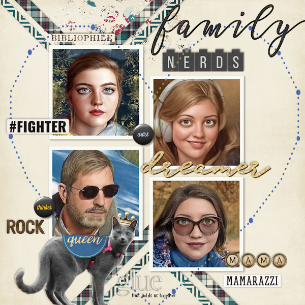
This layout by zinzilah absolutely mesmerized me, and it took me the longest time to figure out what it was about it that just kept my eyes coming back over and over again. At first glance, it’s a simple photographic list of her family members. But look deeper… she defines her family as nerds. Each photograph has been run through a filter – maybe something like the Voila app? – and they look like they could be old-school game avatars. Combine that with the one-word descriptors she listed next to each photo – fighter, dreamer, thinker, etc. – and I keep feeling like it’s the intro to an RPG and I should be picking my character. I want to know everybody’s back story. This is one seriously compelling layout – all with just four photos and a few simple words.
#16. Pop Culture: Saturday Crafternoons

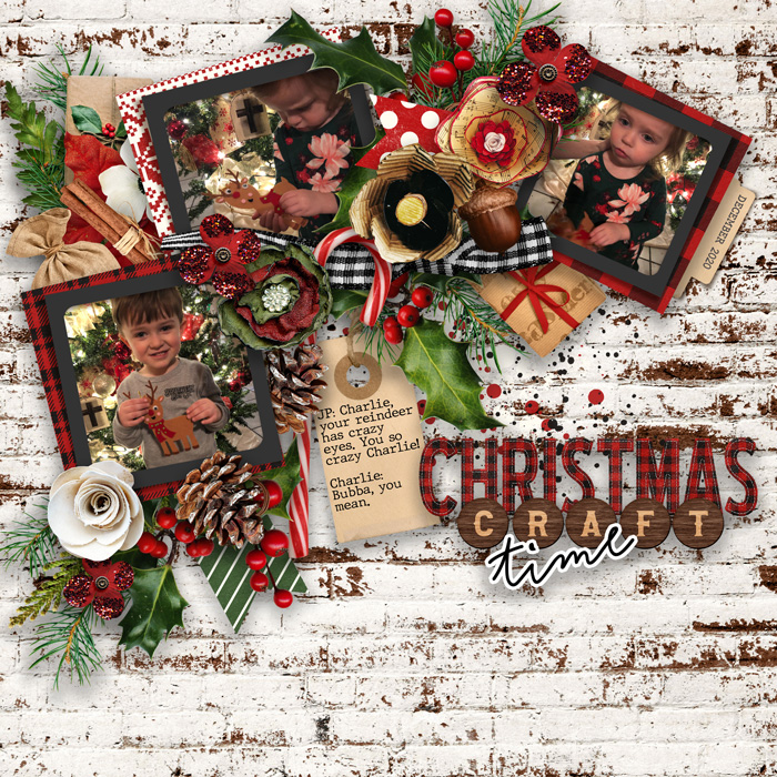
Capturing photographs of creating crafts with the little ones is utter sweetness. Adding their dialogue to the layout? Now that makes it a standout! This short exchange between JP and Charlie illustrates so much more about them and their personalities than could be captured in a still photograph. This is so precious!
#17. Details: Blended Backgrounds

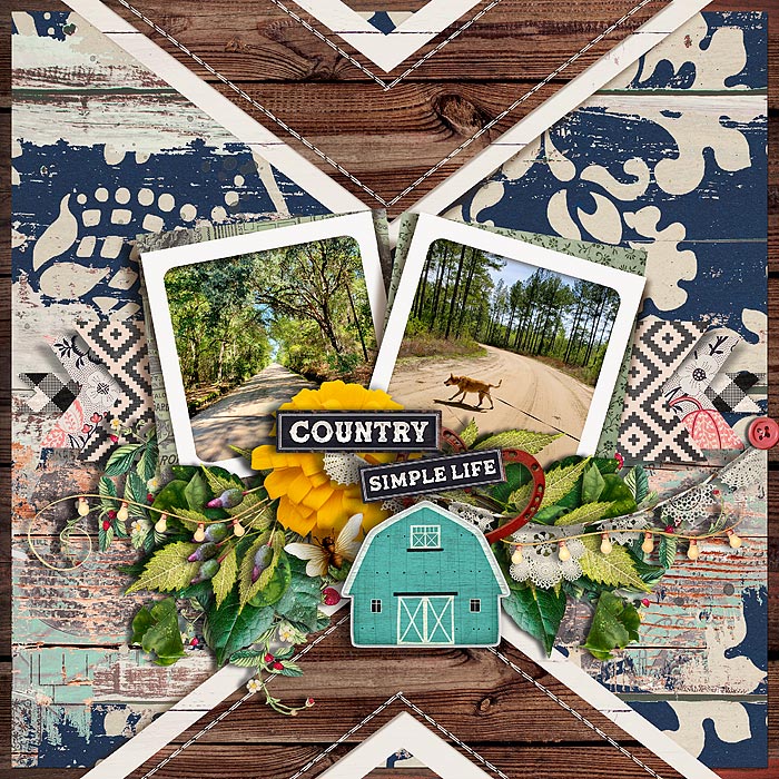
This challenge involved blending two or more background papers together to create something new. Tanyiadeskins did so masterfully, making it look like the blue patterned paint has worn off to show the wood’s previous coat of paint in teal and orange, and beneath that, the wood grain itself. It’s perfectly on-theme with the country-style, distressed and weathered kit, and looks like something that could have happened naturally over time. I am seriously impressed!
#18. Scraplift : Hosted on the Blog

I never fail to be amazed at how different scraplifted layouts can look! immaculeah opted for a fairly straightforward lift of Neverland Scraps’ layout (option #1 in our November Scraplift Challenge) but by choosing a kit with such a wildly different color scheme, it doesn’t look like a straight copy. And may I just say how much I adore that green background paper? I love that she didn’t shy away from such a deep and vibrant color. By framing her photograph with the large clusters in white and gold, she kept it from being swallowed up by that vivid background paper. I just love it!
All right, just like that turkey, stick a fork in me – I’m done! That’s all for this Passport edition of Standout Sunday. Remember, you’ve got three days left to finish up your challenge layouts for the November Passport to Family and earn your rewards to use in December. You can do it!
Claire Grantham said...
on November 28th, 2021 at 4:54 pm
Thank you for featuring my layout! In such talented company too. Cx
Kellie said...
on November 28th, 2021 at 6:01 pm
Thanks for including my layout among such a fabulous bunch of layouts!
Leablahblah said...
on November 28th, 2021 at 9:48 pm
Angie, you are the best described and storyteller. I love reading your description for each layout. They are all glorious! And thank you for picking one of mine. I’m truly blessed.
Sheryl M Gibson said...
on November 28th, 2021 at 9:49 pm
Thank you for choosing my layout! I am thrilled to be included!
immaculeah said...
on November 29th, 2021 at 6:21 pm
Such inspiring layouts and what an honor that mine is included. Thank you and love your comments, too!
Patty Anne said...
on December 1st, 2021 at 4:54 am
I love all of these inspiring beautiful pieces of art and I so enjoy reading your descriptions. I usually glean some deeper insight to the finer points. I’m totally honored to be included among these artists. Thank you!!!
just_jo said...
on December 1st, 2021 at 9:35 pm
Thank you for including one of mine. I’m so honored. It was a fun layout to do too.