Standout Sunday – 8/14
Happy National Creamsicle Day, my sweet scrapbooking friends! Yup, National Creamsicle Day … it’s a thing. I figure any reason is a good reason to indulge in some icy-sweet goodness when the outdoor temperature is in the triple-digits … so why not grab yourself a creamsicle, popsicle, scoop of ice cream, root beer float, iced coffee, slushee, shave ice, or whatever cold confection rocks your socks off, and settle in for some creative inspiration? Because it’s Standout Sunday, when I get to highlight some of the outstanding work from our community of scrappers. I’ve got six lovely layouts to share with you today, including one from a scrapbooker who is being featured on our blog for the very first time … so let’s get started!

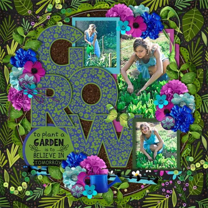
Grow by scrappinnewbie
If I could give out a “Best Use of a Template Award” it would go to scrappinnewbie a.k.a. Melinda! The way she used this template by Cindy Schneider is sheer genius – and it’s all about what papers and elements she chose. First off, the soil or dirt paper for the center background to emulate a garden plot (so clever!) while using the patterned paper with leaves for the wider background creates the feel that she’s cleared a space for her garden – or photos – amidst the rest of the wild growth of the land. It’s subtle and may only register in the subconscious, but it’s exceptionally well-executed! Melinda kept the colors in her title to blue and green, very simple and natural, and broke away from that color palette only in her element clusters and photo mats. There, she took her accent colors from the photos themselves – specifically the turquoise dress – and two complementary colors, royal blue and fuschia. In the end, it creates a cohesive-feeling layout and it’s a masterful use of a digital template.

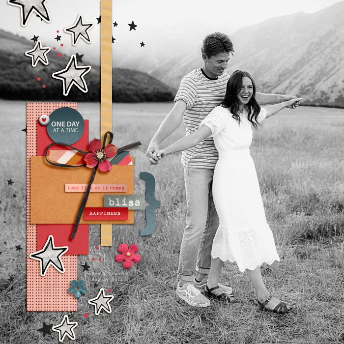
one day at a time by keepscrappin
Sometimes, when you have a photograph that is sheer perfection, it needs to stretch out across the entire 12×12 canvas. But as scrapbookers, we can’t just leave it at that, can we? This layout by keepscrappin a.k.a. Kayla is the perfect example of what to do to add embellishment to a full-page photograph. She positioned the focal point of her photo – the lovely couple – on the right half of the canvas, leaving most of the left half as grass and background landscape. Since it was essentially photographic “whitespace” she could easily cover it up with embellishments, which is precisely what she did. I like that she chose a simple vertical arrangement of paper blocks, word strips, stars, and a few other bits and bobs to add color, texture, and interest.

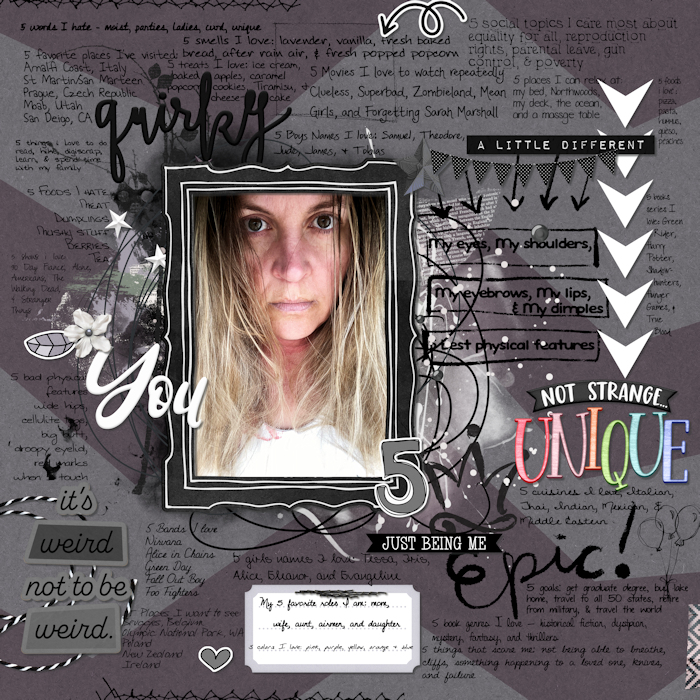
you by lovely1m
This layout is one that was created for my Summer Scrap-A-Thon “August 9th – More Than A Selfie + A List Challenge” and I absolutely LOVE what Mari did with her self portrait! It’s a very raw, very vulnerable image, which is perfect for the scads of lists she chose to surround it with. She went with not just one list, but many lists – everything from her best physical features to what she considers her “bad” physical features, things she loves to do and words she hates, movies she loves to watch repeatedly and things that scare her. The entire layout provides a look into her likes, dislikes, loves, and fears … and if that isn’t vulnerable, I don’t know what is. Brilliantly done!

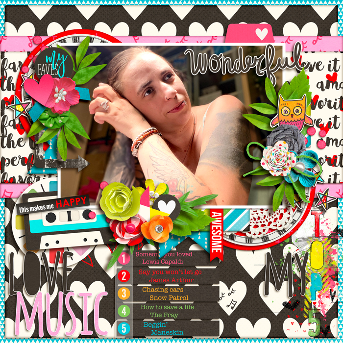
Love music by angels
I’m not sure if this layout is part of the “August 9th – More Than A Selfie + A List Challenge” as it wasn’t posted there, but it looks like it meets all the criteria. It contains a list of at least 5 items – in this case, songs she loves – and a beautifully lit photograph I’m guessing is a self-portrait. Oooooh, that side light and the pose Aud chose – it creates a gorgeous mix of light and shadow and shows off her stunning tattoos! Combine that photo with all the bright colors of her layout and I just adore the results!

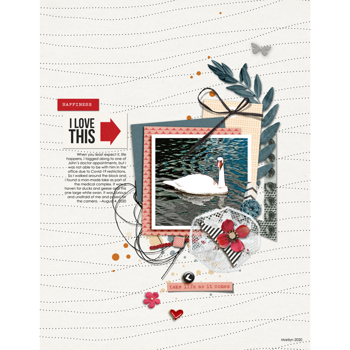
Unscripted by mcurtt
This is the first time we’ve featured mcurtt a.k.a. Marilyn in one of our Spotlight Sunday posts, and I’m so excited to show off her work here! This layout tells the story of a happy accidental meeting with a photogenic swan right in the middle of a medical complex. First off, that background paper – the way it subtly evokes the idea of gentle ripples across the surface of water with the movement of those dots – it’s a brilliant selection for this layout. Next, her clean-and-simple layout design centered around the singular photograph allows it to take center stage. Just a few layers of paper, some ephemera for texture, perfectly positioned paint drops (and I love the curved leaf frond!), quite literally tied off with a bow. And her title and journaling are set to the left with the perfect typesetting that is characteristic of the clean-and-simple page layout style. Taken together, it creates a visually pleasing page with texture and interest along with ample whitespace for the eye to rest. Thank you for sharing your work with us, Marilyn – I can’t wait to see what you create next!

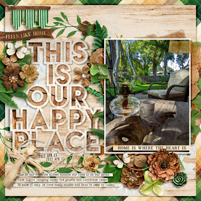
This is Our Happy Place by gonewiththewind
The final entry in today’s Spotlight Sunday post comes from veteran layout designer gonewiththewind, a.k.a. Cheryl. Isn’t this absolutely gorgeous? Talk about the marriage of the perfect kit for her photograph … you’d almost think it was designed specifically for this image! The majority of her background is wood in the same tone as the tabletop in her photo (brilliant choice!) and the way she’s layered the leaves behind the photo, it’s almost as if the foliage has escaped the bounds of the image and grown out onto the page. I guess the word I’m looking for here is cohesive. There’s a truly cohesive feel to this layout, almost as if it’s a challenge to remember where the photo ends and the layout itself begins. I love the big happy title and the journaling on those word strips as well as those small ribbon pennants in the upper left corner. Exceptional layout, Cheryl – and what a gorgeous outdoor hideaway you’ve created for your family!
I hope this week gives you lots of opportunity for scrapbooking. After all, you have just 2 1/2 weeks until our Summer Scrap-A-Thon ends! Keep your eyes on the prize, Sweet Shoppe Scrappers – I know you can do it! Scrap away, share your makes in the Gallery so we can leave love on your pages (and you can get credit in the Scrap-A-Thon!) and I’ll see you back here on Tuesday with our next round of Oldies But Goodies Made New Again. TTFN!
angels said...
on August 15th, 2022 at 12:12 pm
Thank you for sharing my layout!!
I was not very comfortable with the idea of making a self-portrait, but finally I quite like this photo
Angie Key said...
on August 15th, 2022 at 5:22 pm
It’s an absolutely gorgeous photo, Aud – you should be proud of the result! That light just seems to caress the side of your face, shoulder, and arm, and it provides the perfect illumination for that almost dreamy look on your face. It’s a beautiful portrait, and I’m so very glad you shared it with us!
Marilyn said...
on August 16th, 2022 at 1:55 pm
Thank you, Angie! So thrilled that I’ve been featured.
Cheryl Ashcraft said...
on August 16th, 2022 at 2:07 pm
What a delight to be featured! It’s rewarding to have another scrapper look in depth and make such lovely comments. Thank you so much!
Melinda said...
on August 18th, 2022 at 8:47 pm
You made my day! Thank you for featuring my page and your lovely comments. I so appreciate the positive uplifting words.