One Template, Fourteen Ways with Sweet Doll – January 29
It’s time, my sweet scrappy friends, for another round of “One Template, Many Ways” – where we highlight the work of one of our talented designers while challenging the Sugar Babes to make the most of a single layered scrapbooking template.
This month, we’re featuring the work of the oh-so-talented Raquel of Sweet Doll Designs. While Raquel’s scrapbooking kits have a beautifully shabby-chic aesthetic, her layered templates often feature bold shapes, dimensional shadowing with “lifted” corners, and prominent title work. This is certainly true of her newest release, A Bright Start {templates}. These templates are all sized for 12″ x 12″ and are available in PSD, TIFF, and PNG formats for use with your favorite digital scrapbooking programs.
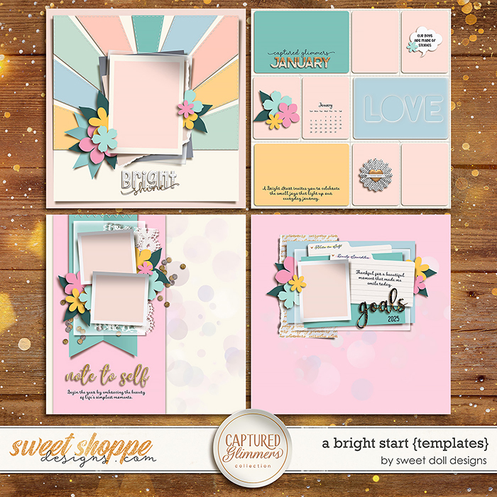
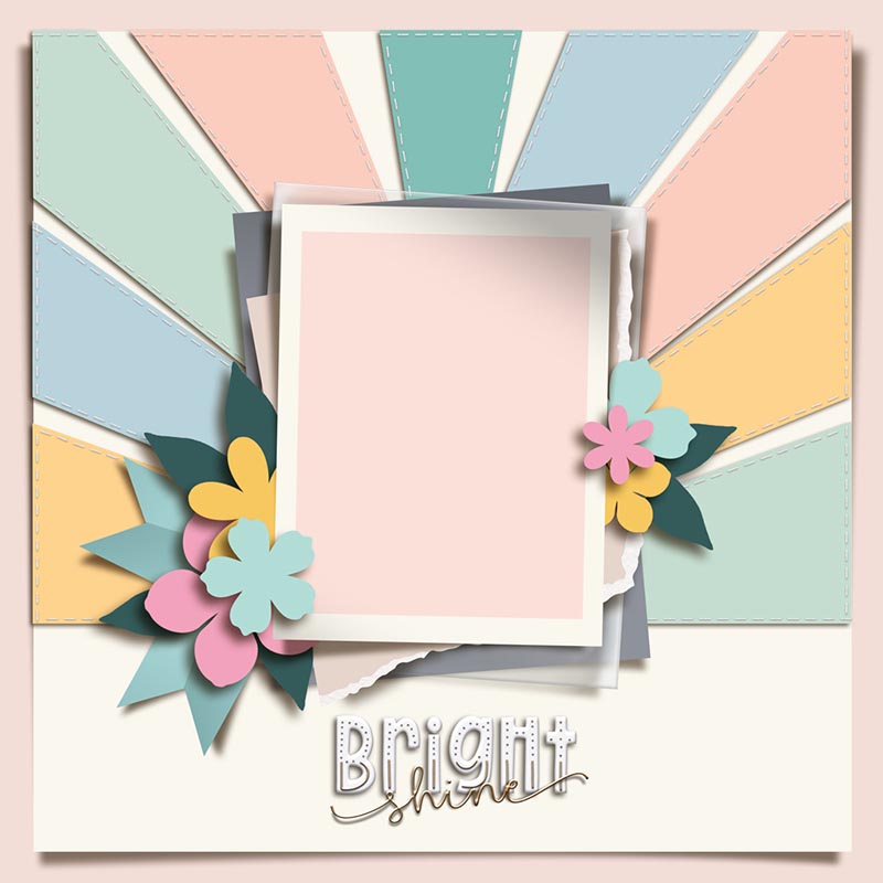
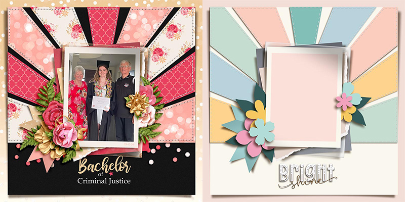
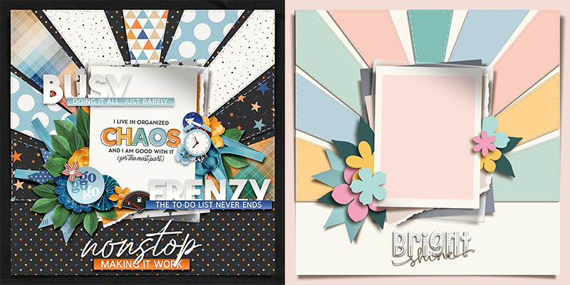
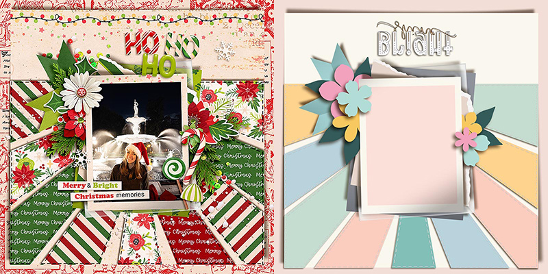
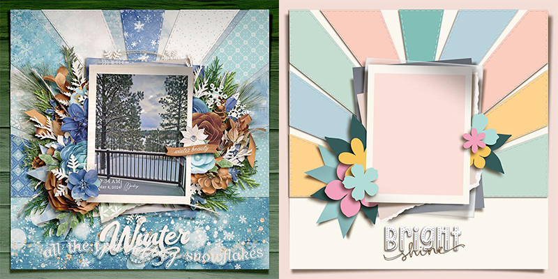
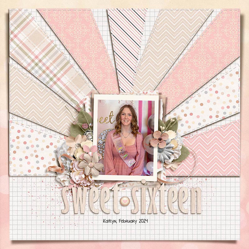
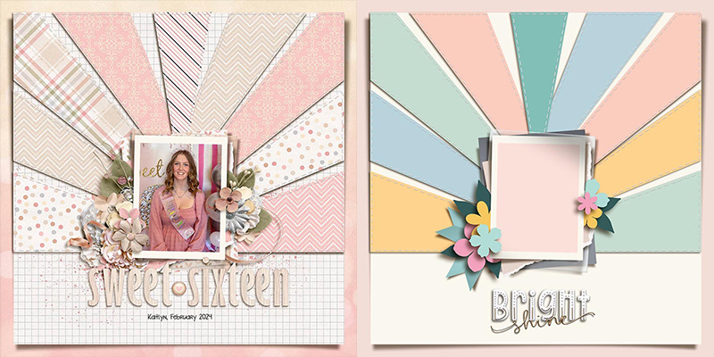
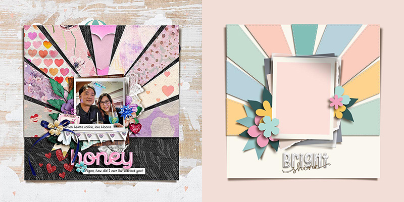
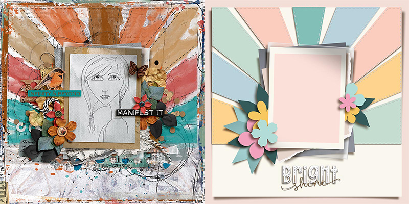
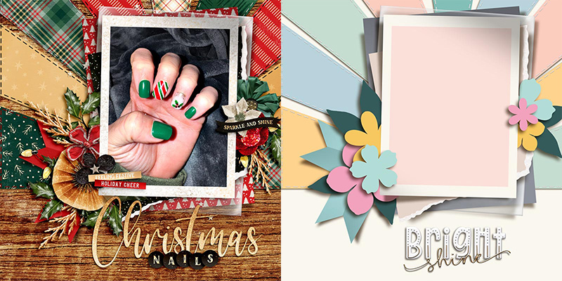
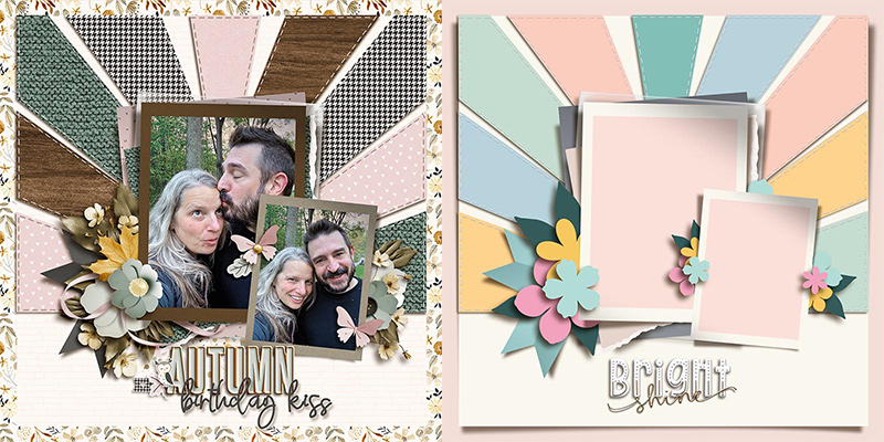
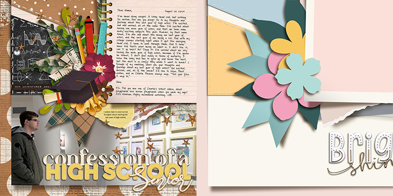
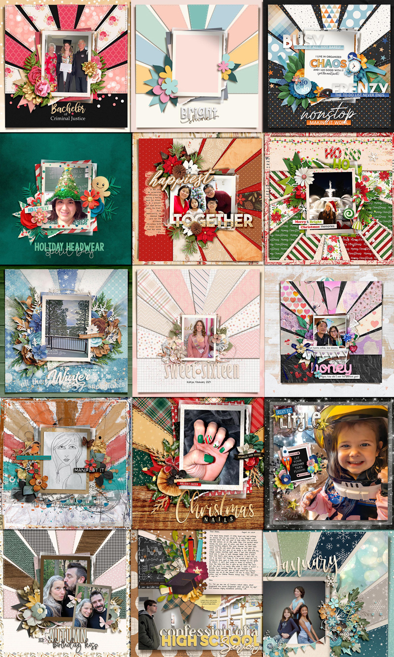
We worked with the template in the upper left corner. It includes room for one “bright-and-shiny” portrait-oriented photograph, designed to look like it’s part of a stack of paper layers and other elements. A series of paper shapes designed to look like rays of light are stitched to the background paper, which is lifting off the canvas in the corners. And there’s room for a large title at the bottom center of the page.
We gave this template to our creative team of Sugar Babes and challenged them to use it as the starting point to create as many unique layouts as they could come up with. Of course, every layout created with a template will look different when used with different digital scrapbooking kits and supplies, but there are additional techniques you can use that will result in even more uniquely lovely layouts. The Babes worked their magic and came up with fourteen different variations on this one template. Read on to learn more!


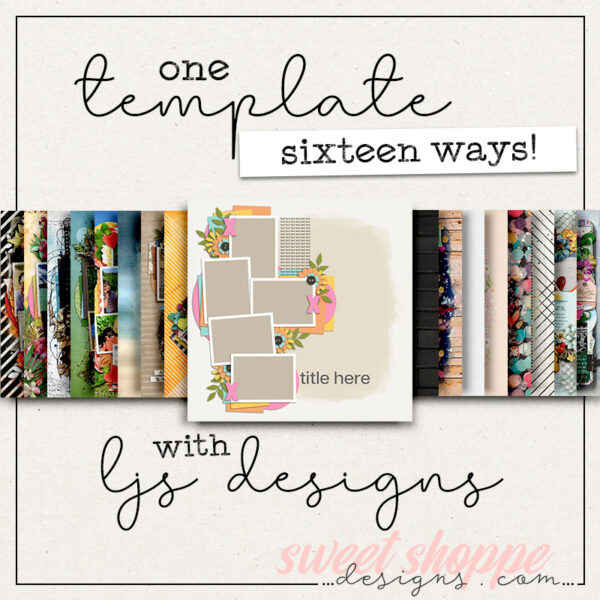
Jacinda starts us off with a straight-forward interpretation of this template precisely as-is. She clipped a photograph to the center mask as well as patterned papers to the various layer shapes. Then she replaced the floral and foliage layers with flowers and leaves from her selected kit and finished it off by replacing the title with a custom one built from two fonts. Beautiful!

Jaye also gives us a straight-forward interpretation of the template, but does so by creating a photoless layout. She clipped a pre-designed pocket card to the center mask rather than a photograph and built up additional layers of word art around it. Jaye also enhanced the element clusters to the right and left of the paper stack by adding ribbons and other elements from her selected kit. Perfection!

Mary changed the template by removing the background paper layer and its accompanying rays and stitches. Instead, she used a solid background paper and built up her photo stack and clusters to create a visually simpler layout. It’s a variation on the original template that’s still balanced and beautiful.

What can you do when the photo you want to scrapbook is landscape, but the template is designed for portrait? Why, spin it, of course! Sherly shows us how with this layout. She rotated the template 90-degrees clockwise; this gave her the right orientation for her photograph. Then she used the space on the left of the canvas – where the template placed the title – to include several sentences worth of journaling, and she built her title up using word art at the top and bottom of her photograph. Nicely done!
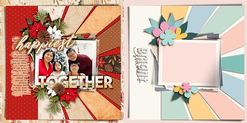

Cassie shows us another way to use this template by flipping it 180 degrees vertically. The photo mask is still in a portrait orientation, but now the rays go down instead of up. I love that she used a nighttime photograph of a fountain – those paper shapes continue the “down and out” motion of the water in the picture and it creates a really fun effect!

If you’re all about the element and floral clusters, you’ll love Amie’s interpretation of this template! She used the template as-is but then built up additional layers of flowers, leaves, snowflakes, ribbons, and other elements to create a truly “cluster-riffic” layout. Remember, if you believe “more is more”, you can always add more elements to a template’s design!

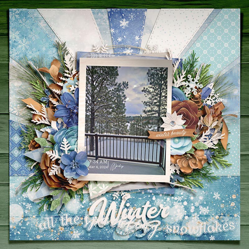
Trina is the first of the Babes to play with the size of the template. She left all those background layers as designed, but took the photo stack with its element clusters and shrunk them down to 70% of their original size. It allows those beautiful patterned papers to really take center stage. So if you prefer the look of a page with a smaller photograph than the template is designed for, you’ll definitely want to remember this trick!

Speaking of shrinking parts of the template, Eve shows us another way you can play around with size. She took not only the photo and element layers but also the background paper shapes and shrunk them all to 85% of their original size. This gave her a wider margin of whitespace around the template and created a little more visual “breathing room”. What a gorgeous result!

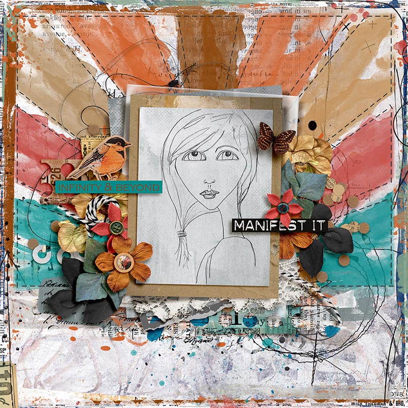
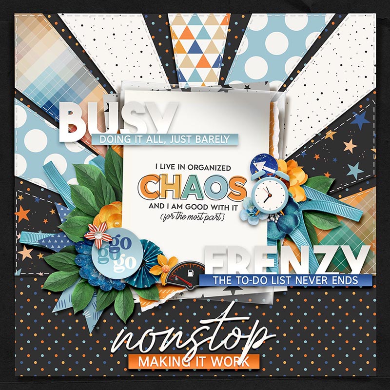
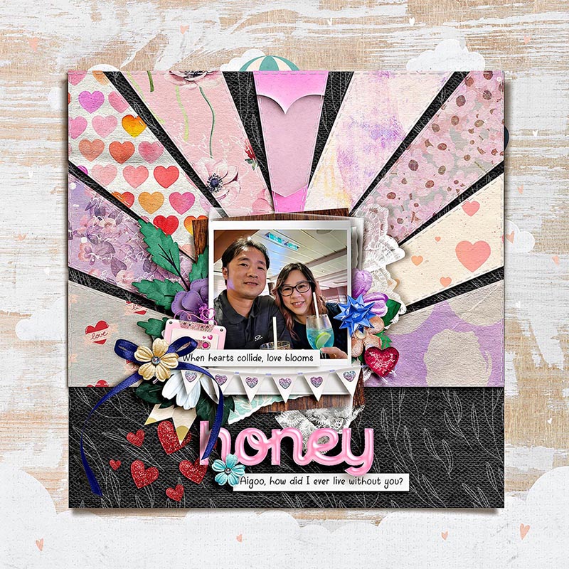
Judie creates some of my favorite artsy, multimedia-heavy layouts, and it’s always a treat to see how she’ll interpret a layered template. I love how she kept the paper shapes in the background, but rather than clipping patterned papers to them, she removed their drop shadows and clipped paint to them instead. Then by adjusting her blending modes, she was able to make it look like the rays were painted directly on her background paper. Isn’t it gorgeous?!?

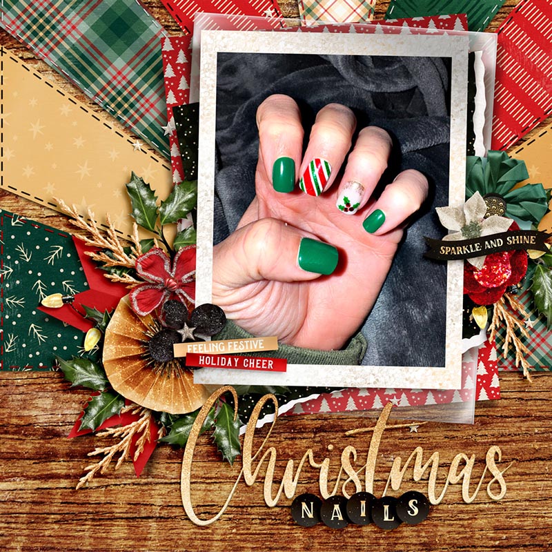
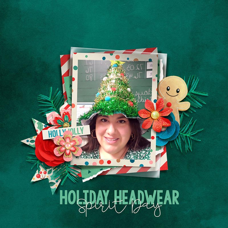
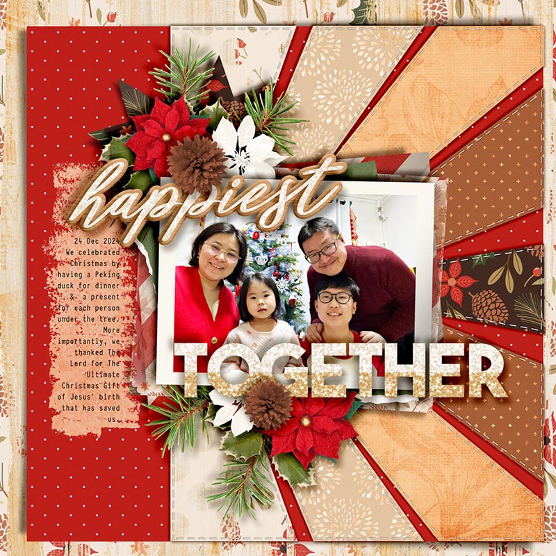
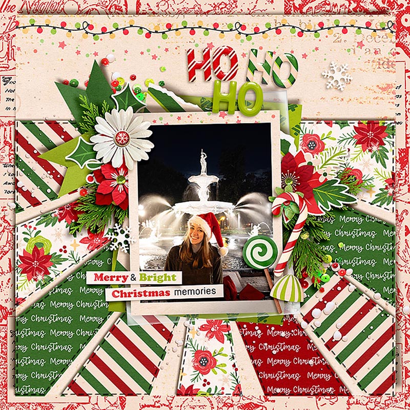
Carrie is the first of our Babes to “go big” with this template. She increased the size of the layers to 130% their original size and then shifted it around so the photo stack was anchored in the upper right corner of her page. This is a fun way to extend the use of a template and show off the details in a photograph, as Carrie did with her gorgeous Christmas nails. Nicely done!

Want to include more photographs than the template is designed for? No problem! Ally shows us how with her layout featuring these two sweet photographs. Ally selected all the layers for the photo stack and cluster elements and duplicated them. Then, she shrunk it to 70% of its original size, tilted it slightly, and placed it in the lower right corner of the original photo stack. It’s a great way to include multiple takes from a photo shoot.

Rebecca went really, really BIG with her layout by increasing the template layers to 180% of their original size. She focused on design in the the lower left corner of the original template, using the paper shape at the bottom for her large landscape photograph and the original’s photo stack for a big journaling block instead. What a clever way to stretch the original template and use it to tell a longer story!

Tammy took a similar approach to Rebecca but rather than focusing on the lower left corner of the template, she zoomed in on the upper right quadrant. She increased the size of the template’s layers to 155% of their original size and then slid them around to place the photo off the page but anchored in the lower left corner. She was able to showcase some gorgeous patterned paper as well as a large element cluster while still including a big photograph. Beautifully done, Tammy!

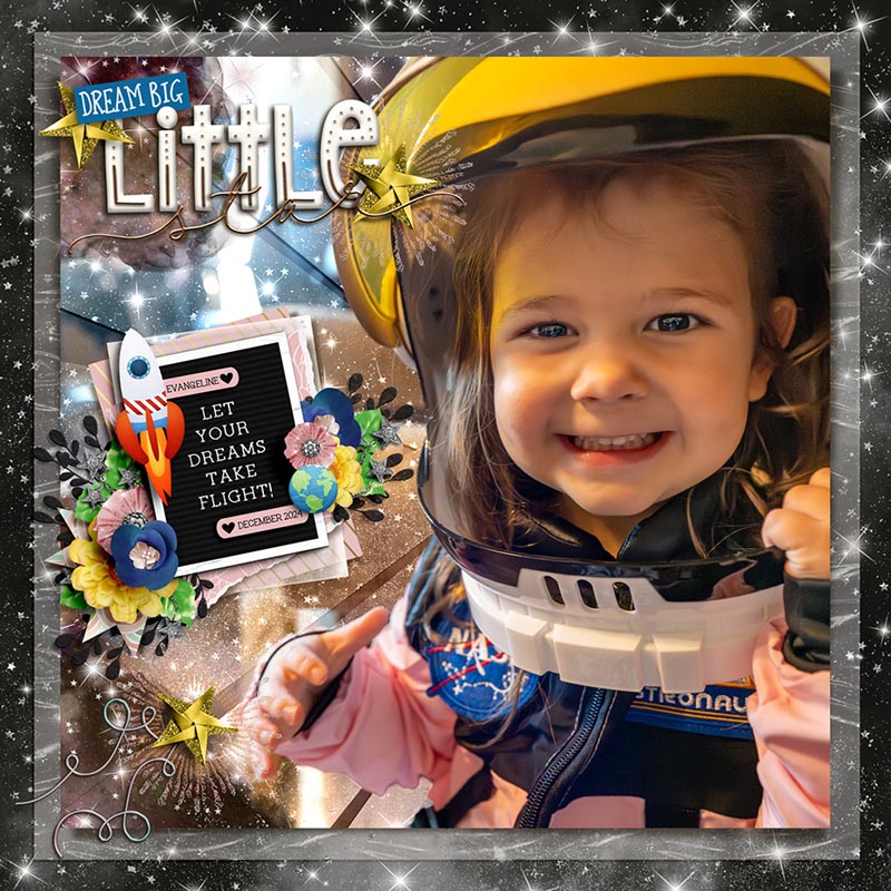
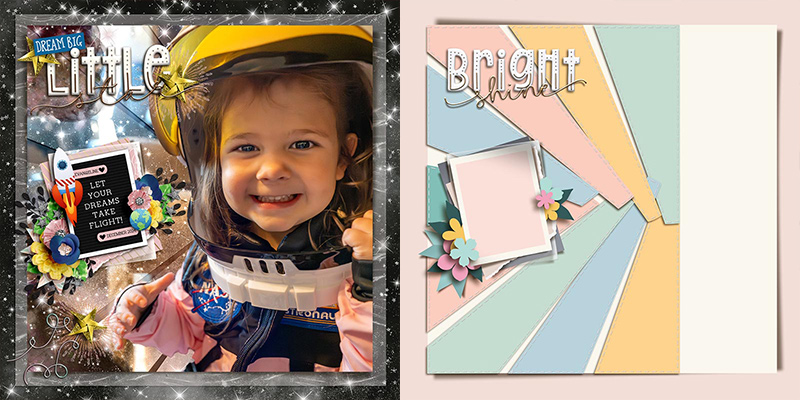
I, of course, couldn’t resist getting my hands on the template as well… but I might have gone a little crazy with playing around with it! I wanted to create a layout using this photograph of my granddaughter in her new astronaut dress-up costume we bought her for Christmas. It’s such a great photo, I knew I wanted it to take up most of the 12×12 page… but I also loved the design of the original template, especially those paper rays in the background. So here’s what I did…
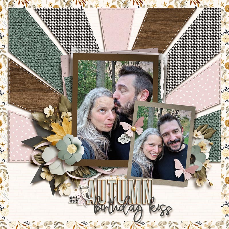
I broke the template up into three groups of layers: one for the background paper with the rays and stitches, one for the photo stack with its element clusters, and one for the title. I rotated the background 90-degrees counter clockwise, moved the title to the upper left corner, and shrunk the photo stack & clusters. I clipped papers to the ray shapes and changed their layer styles to make them look like vellum; then I masked them so they only appeared “behind” my granddaughter. Then with the help of a couple different kits, I built up the photo stack using a journaling card and word strips and finished it off with a fun title. Whew!
So there you have it: one template … fourteen uniquely gorgeous digital scrapbook layouts!
It’s our hope that today’s post gives you some inspiration for your next layout and gets you thinking about all the ways you can get the most out of your layered scrapbook templates. Whether you use it with a photo or go photoless, simplify it or add lots of clusters, flip it, spin it, shrink it or expand it, scrap it as-is or break it apart into pieces and create an entirely new masterpiece, the possibilities with layered scrapbook templates are absolutely endless. So grab yourself a template – maybe even this latest one from Sweet Doll – and record some new memories today!
Lori said...
on February 9th, 2025 at 3:06 pm
This post is so inspiring! I hadn’t used this template yet and honestly hadn’t thought of rotating it to the side (or some of the other ways that the Babes used it). I just completed a LO using Sherly’s as my inspiration. Thank you!