One Template, Fourteen Ways with Pink Reptile Designs
As novelist and artist Julie Israel wrote, “Creative people do not see things merely for what they are; they see them for what they can be.” And that is the perfect description for our “One Template, Many Ways” series here at the Sweet Shoppe Designs blog!
In this monthly feature, we challenge our creative team – known as the Sugar Babes – to work with one digital scrapbook template. The goal is to see how many different layout variations they can create in order to showcase the true versatility of layered scrapbook templates. And along the way, you’ll enjoy lots of eye candy and, hopefully, get a few ideas for your next scrapbook layout.
This month, we’re featuring the mostly-minimalist yet artsy templates from Mirjam of Pink Reptile Designs. As Trina wrote last August, “Mirjam’s kits have a distinct style, filled with painty goodness and lots of themed elements … her templates [include] great white space and her alphas are legendary…”
We’re working with an older set of Pink Reptile Designs templates you might already have in your stash: A Beautiful Mess Templates. It includes four coordinated templates, each featuring space for one to four photographs, backed by layers of texture in the form of paint and splatters. You’ll also find small element clusters, stamps, word strips, room for titles and journaling, and ample white space.
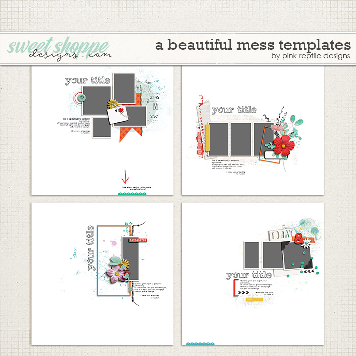
These templates are all sized for 12″ x 12″ and are available in PSD, TIFF, and PNG formats for use with your favorite digital scrapbooking programs.
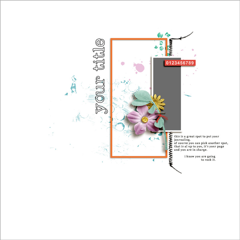
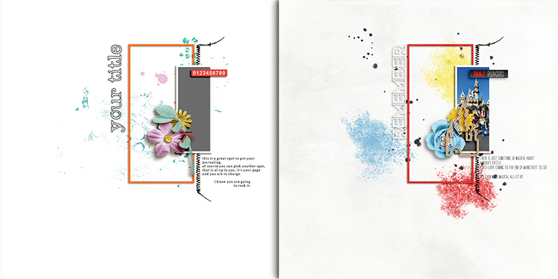
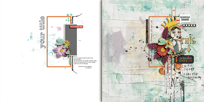
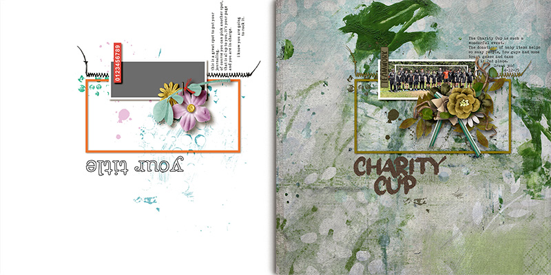
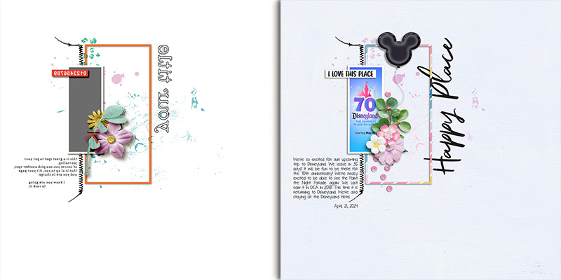
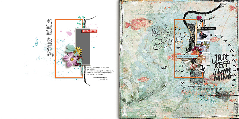
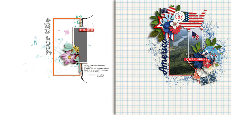
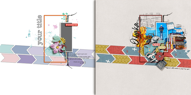
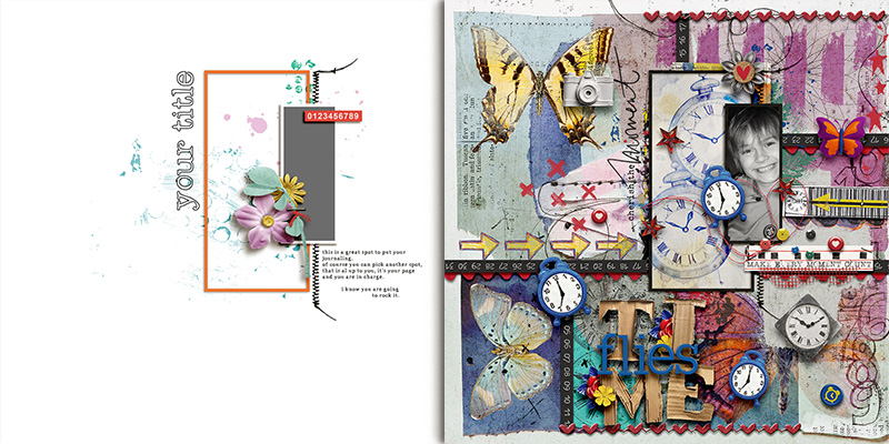
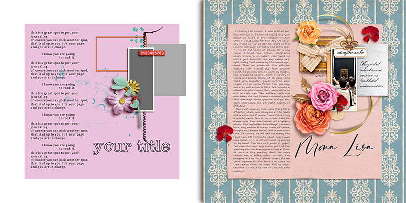
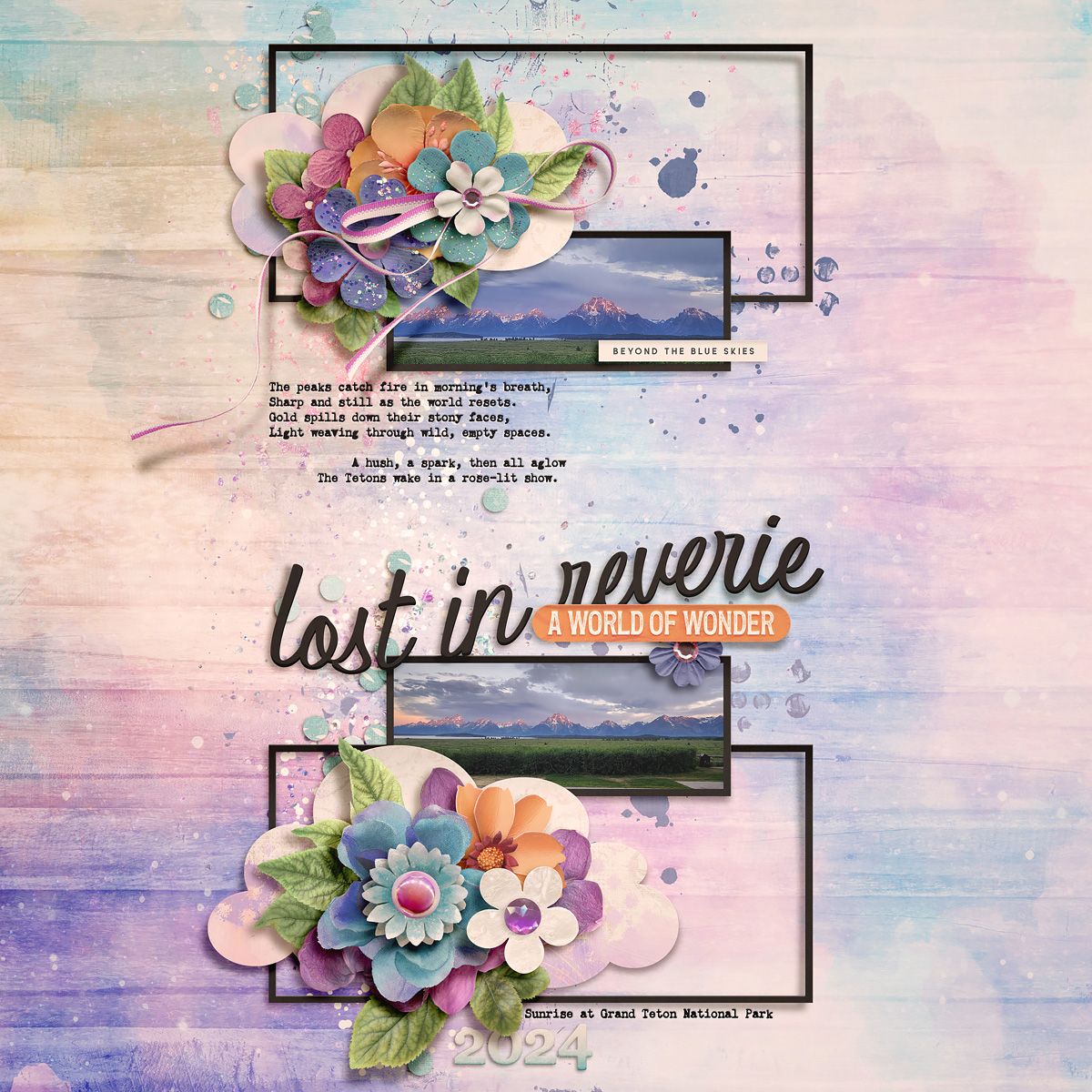
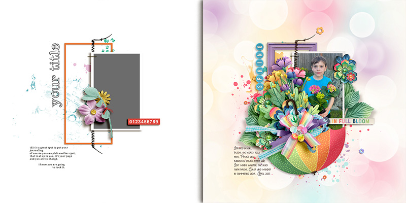
For this month’s challenge, we’re working with the template in the lower left-hand corner. It has one long (or tall) portrait-oriented photo block anchored by both a frame and a line of stitching. A small cluster of floral and foliage elements is attached to the layout with a digital staple, the title is rotated 90 degrees counter-clockwise so it runs from bottom-to-top rather than left-to-right, and the journaling is left-justified and placed below the photo, to the right of the stitching.
We gave this template to our creative team of Sugar Babes and challenged them to use it as the starting point to create as many unique layouts as they could come up with. And in the true spirit of the quote at the beginning of this post, they did not see the template merely for what it is … they saw it for what it could be. They came up with fourteen different layout variations based on this one template. Keep reading to be inspired!

Carrie starts us off with a layout that uses the template exactly as-is. She clipped papers to the background and frame layers, clipped her photograph to the photo mask, and replaced the various element layers with flowers, a wooden die-cut, and a word strip from her selected kit. She also used a piece of word art in place of the title and added journaling with a font in the designated spot. I love her bright-and-clean layout!

Jaye decided to double up on the number of photos on her layout by using the empty frame as a second photo spot. Then she replaced the background with a striped paper and layered in several pieces of paint, stamps, and doodles. She added word strips, flowers, leaves, and string to embellish her layout. A little journaling in the designated area, and her layout’s ready to rock. So fun!
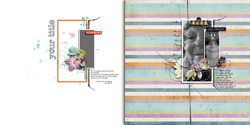

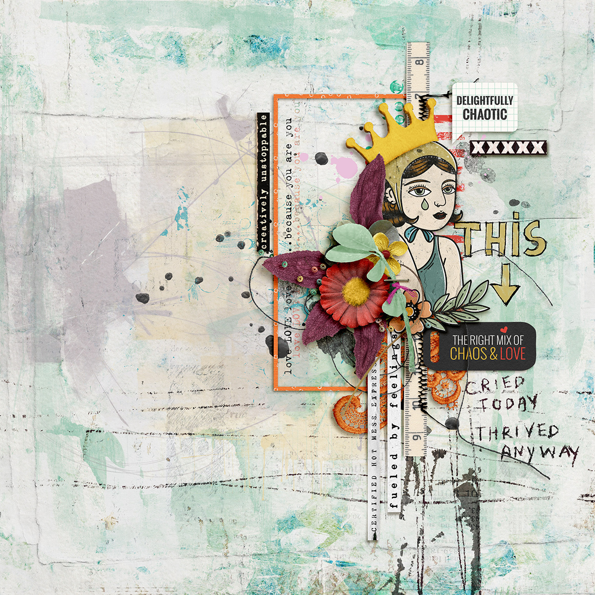
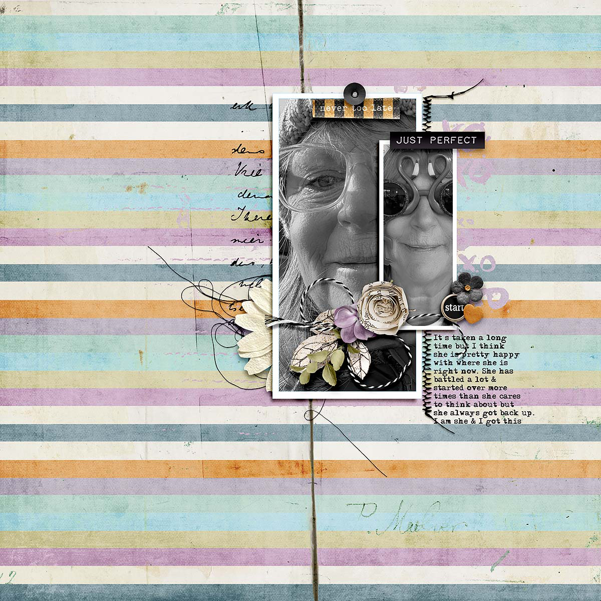
Judie demonstrates how easy it is to turn this template into a photoless layout. She used the hand-drawn figure from her chosen digiscrap kit in place of the vertical photo mask … no photograph needed! Then she added layers of paint and stamps to the background as well as pieces of word art to tell a story of thriving in spite of the chaos. I especially like the vertical word strips and tape measure she added behind the figure and element clusters. Beautifully done!

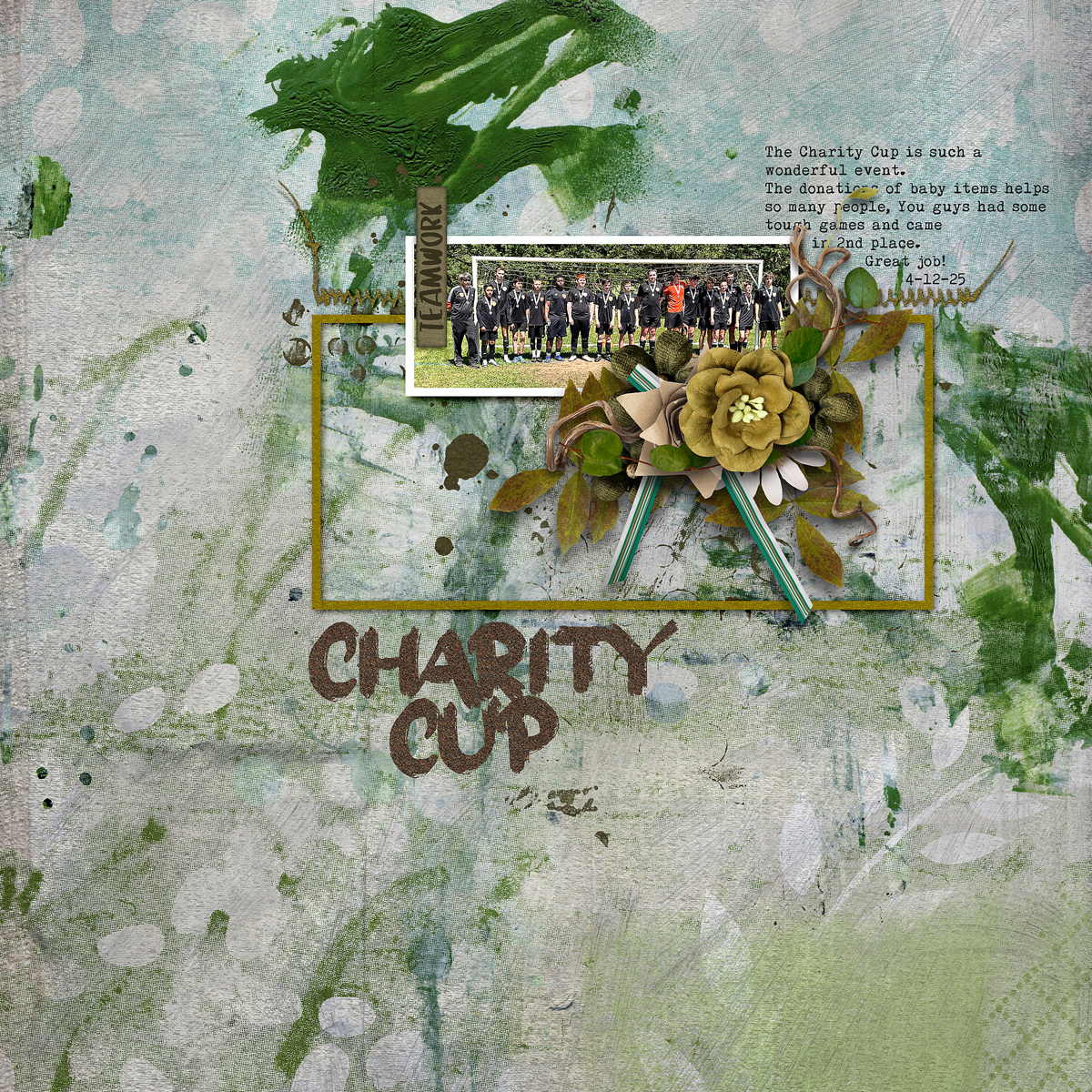
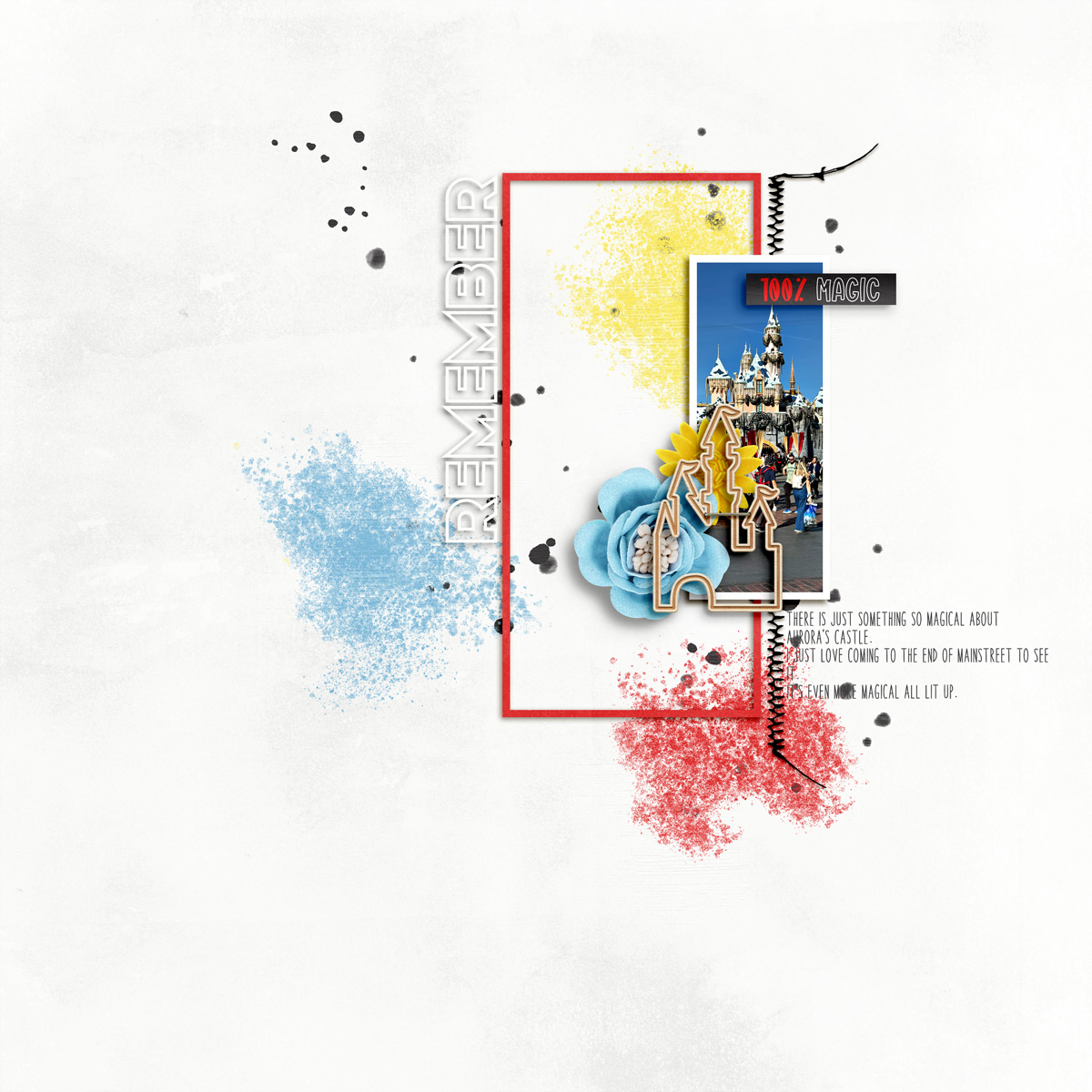
Charlene’s spin on the template is a literal one: she rotated the template 90-degrees counter-clockwise. The result is a layout fit for a landscape panoramic photograph – in this case, the team’s group shot. Because of the rotation, her title now runs left-to-right instead of bottom-to-top and nicely balances out the big floral cluster. And I just love all the texture she added with those layers of paint!

Mary gives us another spin on the template – or should I say flip? – as she flipped the template horizontally. This still leaves her with a portrait-oriented photo block, but now it’s on the left side of the layout instead of the right. This is a great technique to use when you want to create a cohesive look to a book or album by re-using a single set of templates, yet still create variety from page-to-page.

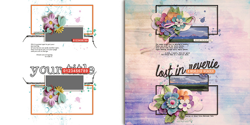
Eve demonstrates another way to extend this template as she replaced the single tall photo block with a vertical photo strip. She now has space for three small photographs instead of one tall one. Remember, a photo block on a layout is really just a suggestion. When you keep the background mat the same size and shape, you can easily split up the photo mask without altering the overall balance of your template. Easy peasy!

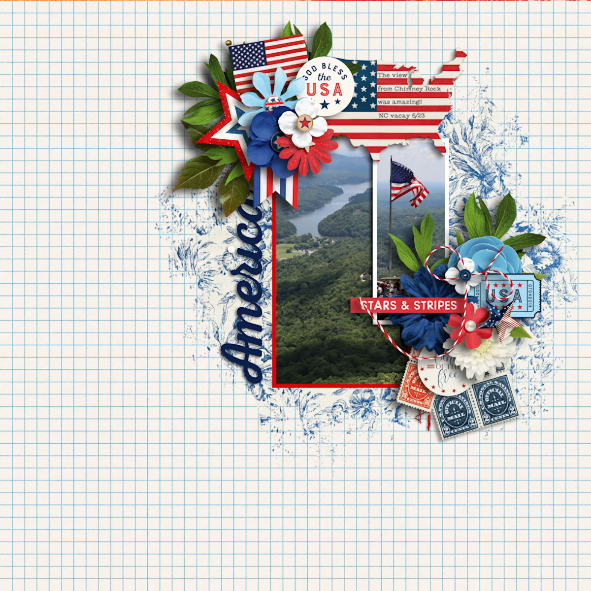
Jill amped up the beauty in her tribute to America with lots of additional decorative elements and clusters. She used the template as a starting point – with a second photo in the large, empty frame – but then built up two large floral & element clusters at the top and on the right. If “minimalist” isn’t your personal style, don’t immediately discount a template like this one. Instead, use it as a framework for your layout and add as many embellishments as you like!

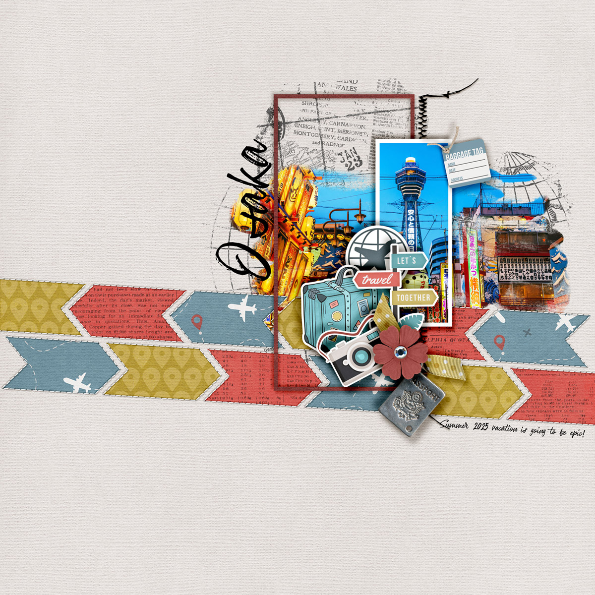
Sherly is this month’s template mix-master; she combined the template from Pink Reptile Designs with a second template from Bold Backgrounds 4 by Cindy Schneider. And Sherly got super creative in how she used it by (a) rotating the background slightly clockwise and (b) only using two rows rather than the page full as originally designed. The end result draws the eye across the layout and creates a sense of motion that fits beautifully with her theme of travel. I also enjoy how it allows her to showcase more of the paper from her selected kit, yet still maintain a fairly minimalist feel with so much beautiful whitespace. Absolutely brilliant!

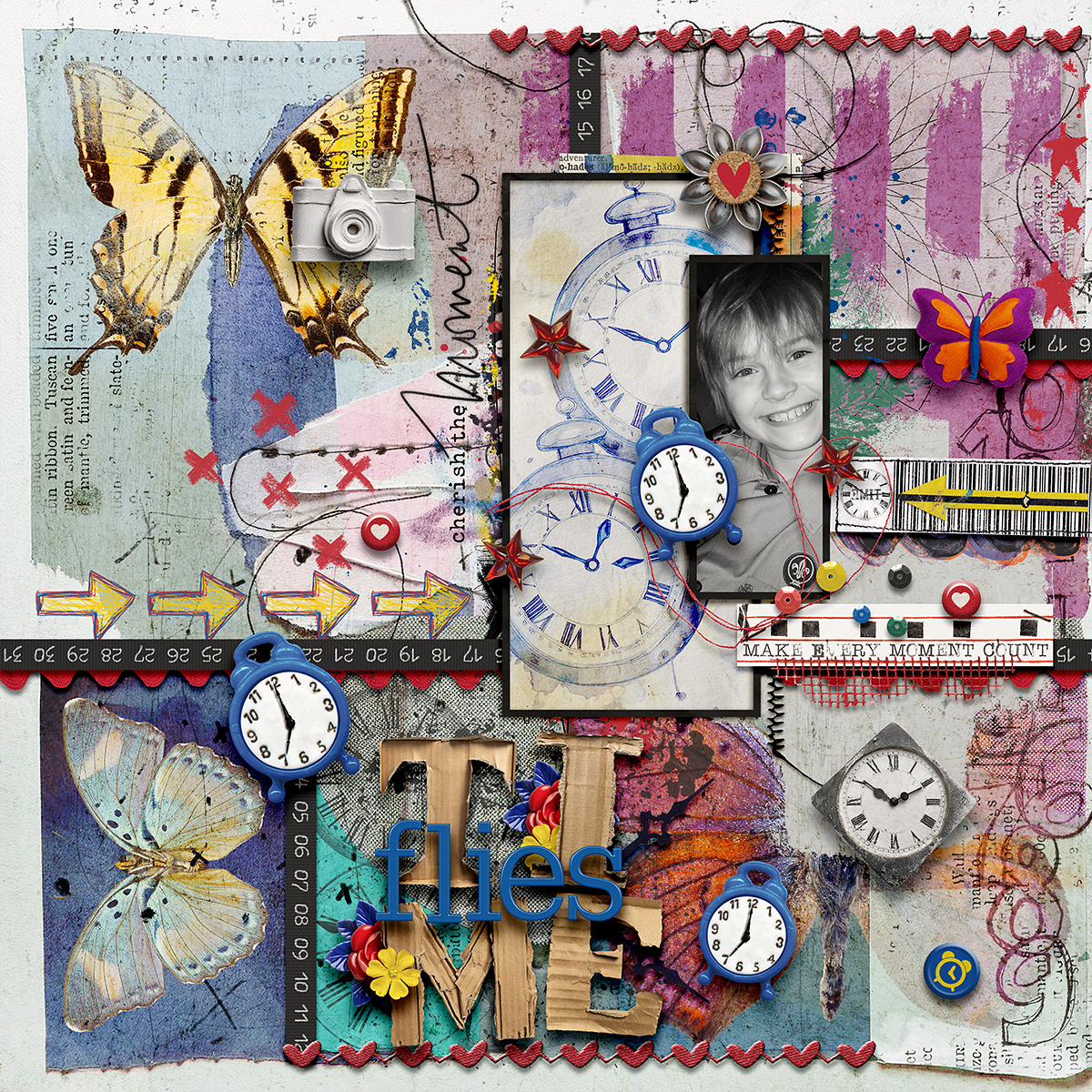
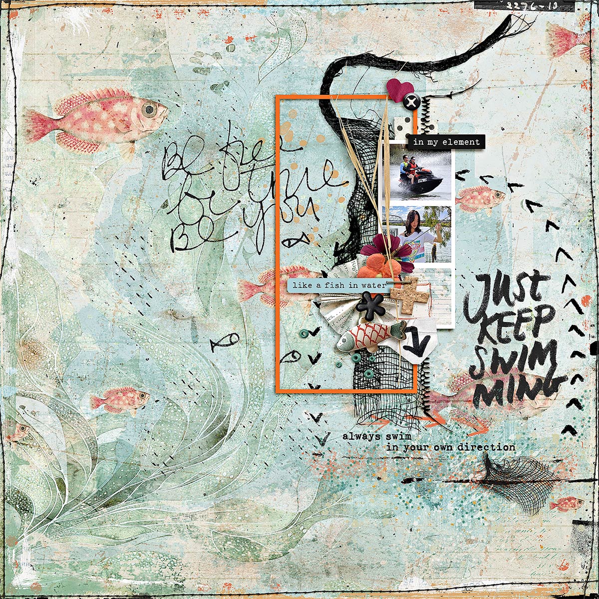
Heather went all-out creating an art journaling collage-style layout based on the template. In place of the plain white background, she built up a collage with different papers and multimedia elements. Then she filled the photo mask with a black-and-white photograph and the empty frame with another sheet of paper, and built up that gorgeous dimensional title. It’s simply stunning!

When you’ve got a lot to say, it can be a challenge to find the right template. Krista shows us how easy it can be by making a few changes to the template to tell a story with lots of journaling. First, she added a large block of solid paper directly atop the background. Notice that she left wide margins of about 1″ around all four sides; not only does her background paper stand out, but it helps the layout not feel overly crowded. The block of solid paper gave her a wide area on the left to create a column of journaling. Krista moved the title to the empty space below the photo & frame, and added a third rectangular element in the form of a journaling card. She finished it off with flowers, foliage, and fibers. Personally, I think it’s the gorgeous drop-shadow behind the solid paper that helps to ground it!

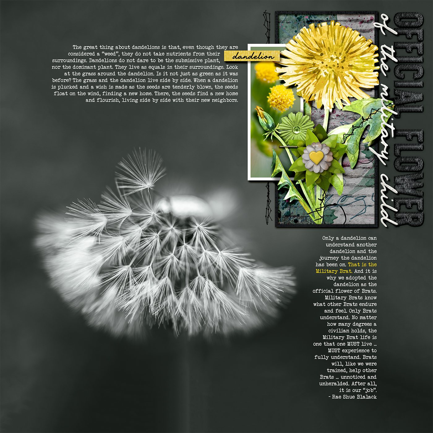
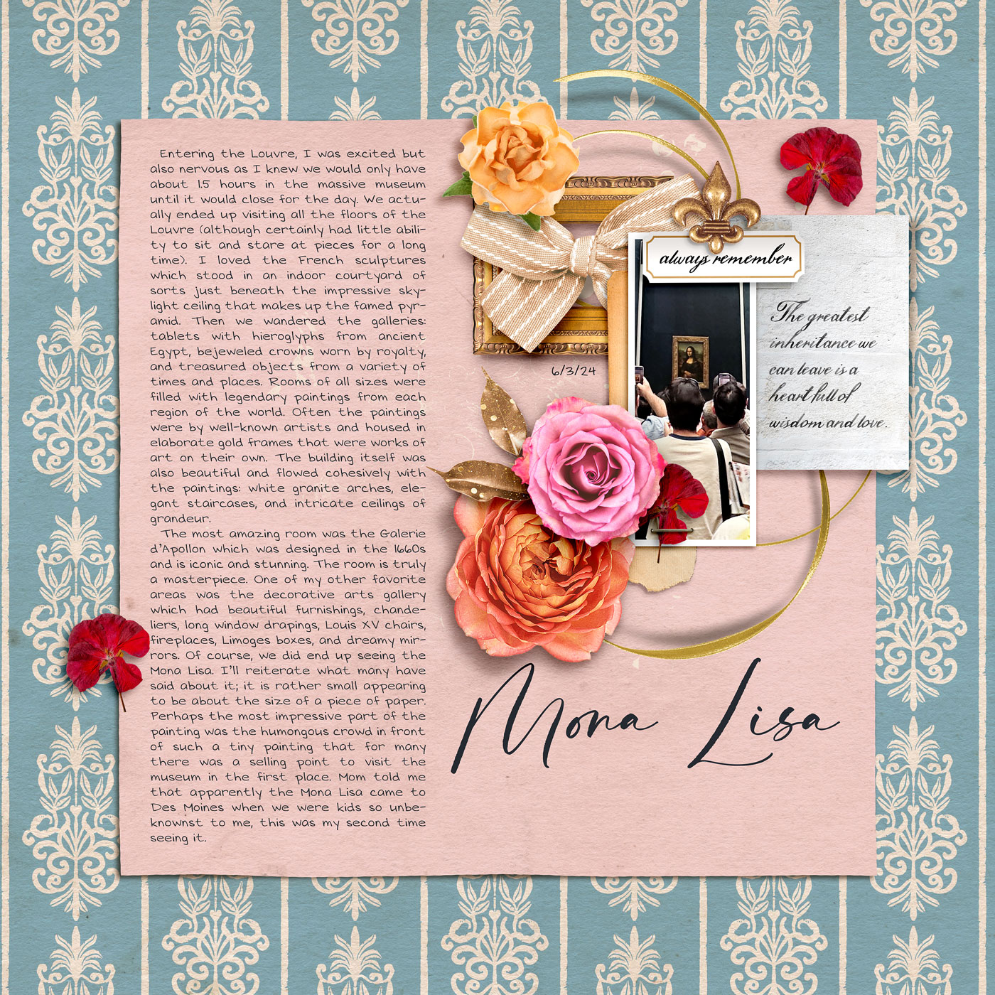
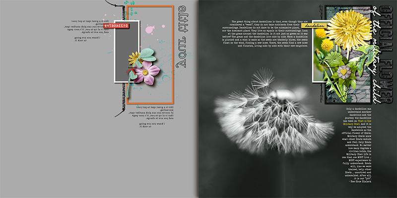
I’ve said it before, and I’ll say it again: I like big photos and I cannot lie! This template is set up nicely to accommodate a full-page photograph, which is exactly how I used it. First, I dropped my photo onto the background layer and moved it around until I was happy with its placement. (Tip: remember to use Photoshop’s Content Aware Fill when you need to extend the background of a photo to fill any empty spots on your canvas!) Then I selected all the layers from the template and flipped them horizontally. I shifted them to the upper right corner and resized them until they fit perfectly in the null space of my photo. I had a lot of fun playing with the empty frame region; I clipped a corrugated paper to the inside of it, added paint layers with a variety of blending modes, and used the hand-painted dandelion from the kit along with layer masks to make it both hide behind and pop out of the framed area. After building my title with a combination of alphabet stickers and a scripty font, I added two text layers with my journaling and my layout was finished.


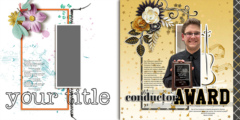
Rebecca created an absolute masterpiece of a layout by first enlarging the template and then shuffling around some of its elements. She resized the template’s layers to 168% of their original size. Then, she left the frame and photo mask in place but moved the title to the bottom, making it bigger in the process, relocated the element cluster to the upper left corner of the frame, and placed her journaling area inside the frame. Rebecca’s choice to use layer masks to digitally “cut out” her son from the photo so that his head extends beyond the top of the photo mask and his shoulder and arm pop out of the left and bottom adds a major WOW factor to her layout! I love the way she layered the violin from the kit behind his photograph to emphasize the fact he’d won the award for his participation playing the violin with the orchestra. What a gorgeous keepsake Rebecca has created here!

Amie shows us how easy it is to double the impact of a template by duplicating part of it. After rotating the template 90 degrees clockwise so her photo mask was in a landscape orientation, she placed the frame cluster at the top center of her canvas. Then, she duplicated those layers and flipped them vertically before placing them at the bottom center of her canvas. Amie then moved the title to the middle and added journaling text and labels. The result is a gorgeous layout featuring two stunning panoramic photographs that’s beautifully balanced.

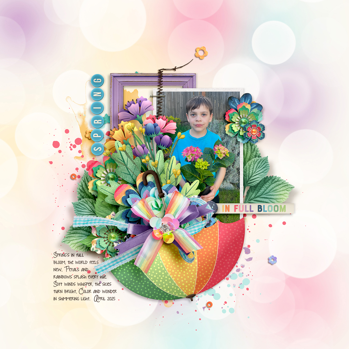
When Sheri submitted her take on the template, she said, “I wanted to play, but I went rogue (as per my typical style, lol) … I really love making a template my own, so I mixed it up while still keeping some spirit of the original design.” How did Sheri create this stunning layout? She first centered the template’s elements on the canvas before enlarging the photo mask. After clipping a photograph to the mask and replacing the template’s frame with a wooden frame from her chosen kit, she rearranged the word strip, journaling area, stitching, and staple. And finally, she built up a gorgeous floral cluster inside an umbrella from the kit and finished it off with several bows. All I can say is, “Holy WOW!”
Boom, done: one template … fourteen delightfully different creative creations!
Whether you’re looking for ways to stretch your stash by using and re-using a template, working to create an album with a cohesive look but variation from page-to-page, or trying to tell a long story or a story without photographs, we hope today’s post has sparked your imagination.
Remember, layered scrapbooking templates are a versatile tool for digital memory keepers. They aren’t “cheating” and using one doesn’t make you “lazy”. Instead, they’re a clever means to jump-start your creativity and give you a starting point for your next layout.
Whether you use the template precisely as designed or start moving things around, spinning it, flipping it, adding more photo blocks or taking elements away, mixing it with another template like a Bold Background, dress it up with lots of element clusters or make it totally artsy with layers and layers of paint and mixed media, endless possibilities await your creativity.
So grab yourself a template – like this minimalist yet versatile set from Pink Reptile Designs – and create your own layout magic today!