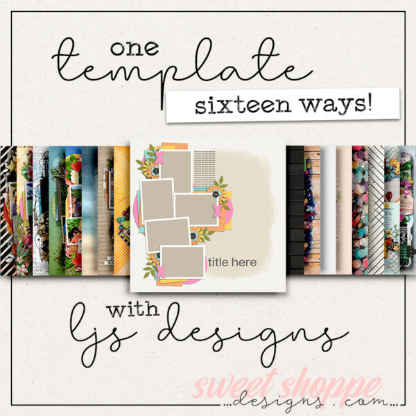
One Template, Thirteen Ways with DSI
As the saying goes, “April can make old things new” – so it’s only fitting that in this month’s installment of One Template Many Ways, we’re taking an older template and showing you lots of ways to make it new!
This time around, we’re featuring a template by Willemijne of Digital Scrapbooking Ingredients. It’s part of her “Focus” series, and is available for download in her Shoppe now:
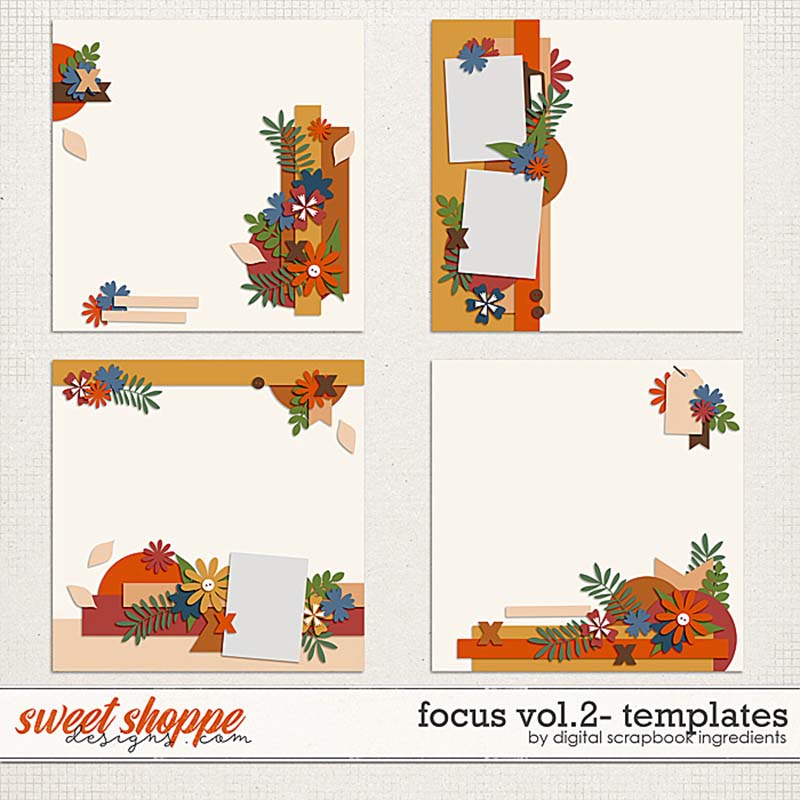
These templates allow you to focus on one big, spectacular photo that runs edge-to-edge on your layout. As such, they’re designed with borders containing element clusters, word art strips, and a few smaller photo spots. But there’s lots of different ways you can use these templates beyond showcasing a large photograph, and our creative team of Sugar Babes is ready to show you how!
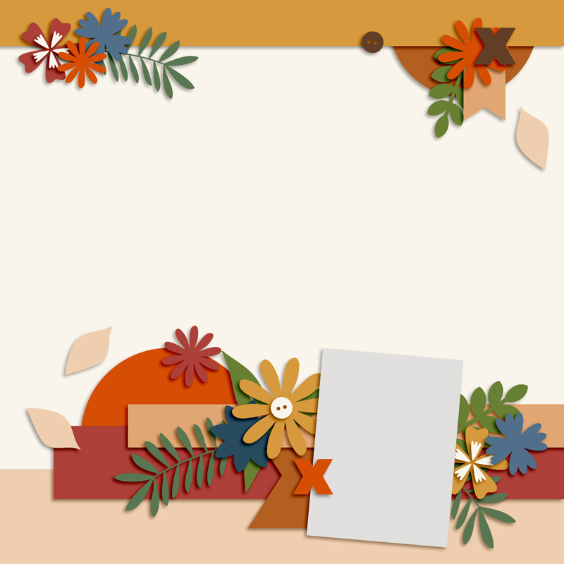
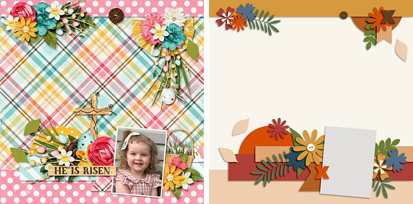
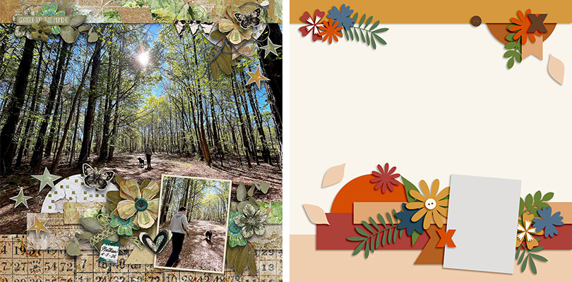
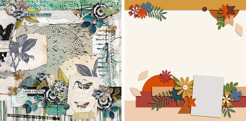
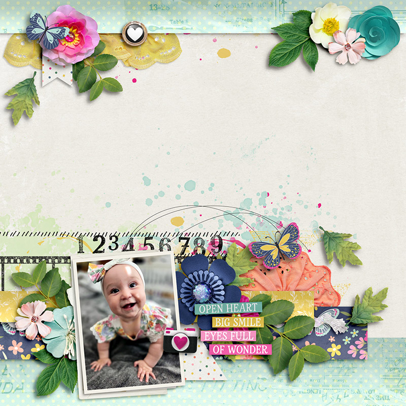
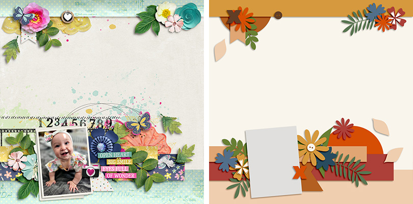
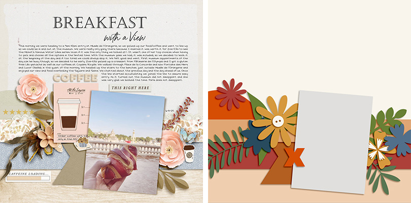
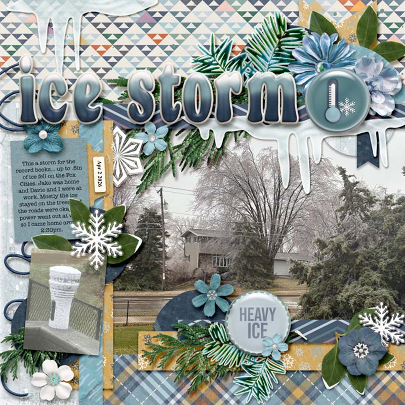
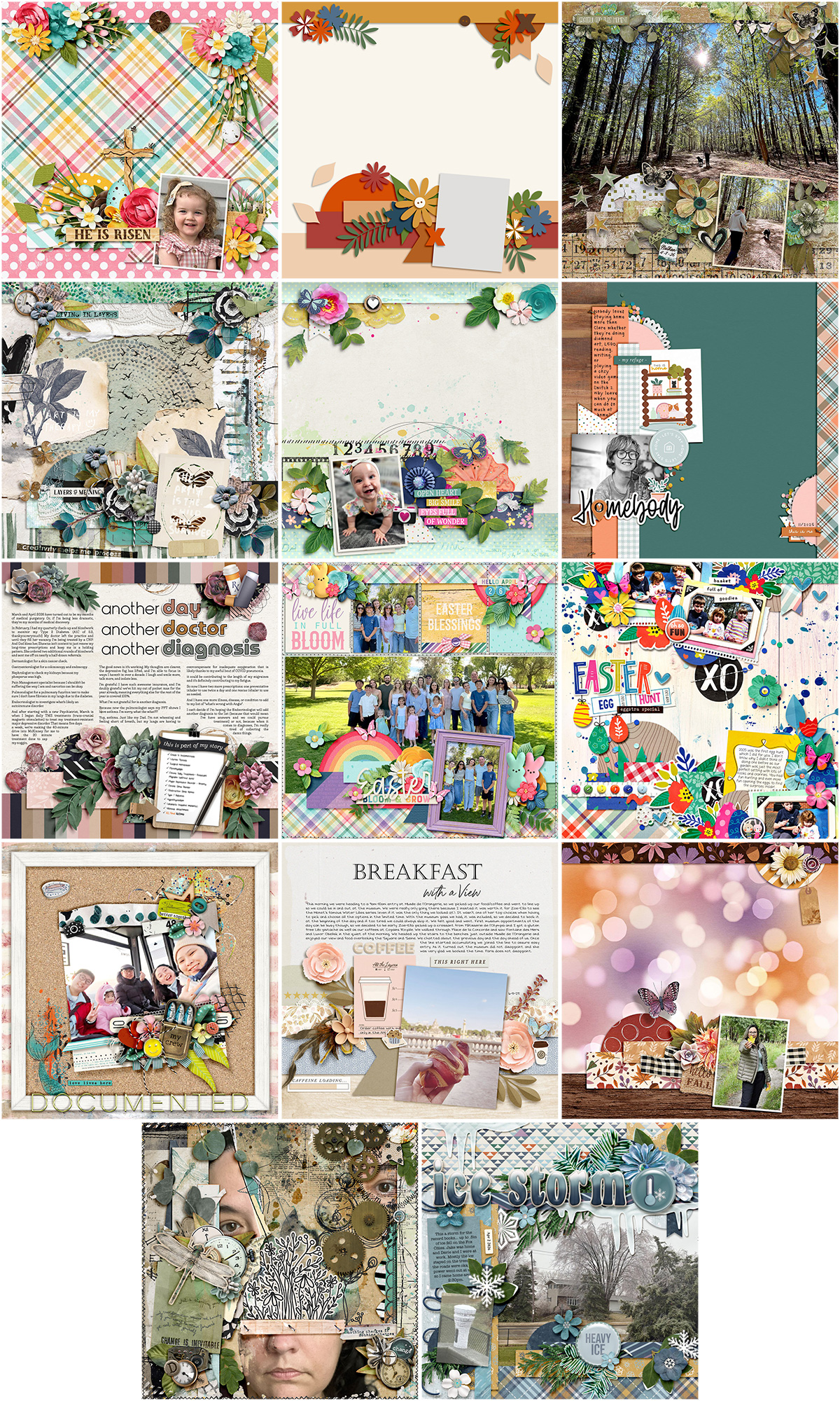
We gave them the template in the lower left corner and asked the Babes to use it in as many different ways as they could. This 12×12 layout template features a border across the top of the page as well as a series of paper strips and clusters at the bottom with a single photo mask:
The Babes came up with thirteen different ways to use this one template. So if you’re ready for some inspiration to help you look beyond a template’s initial design, grab a beverage and settle in for a fun read!

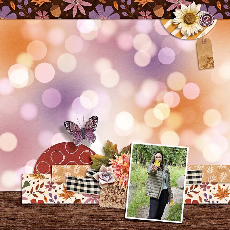
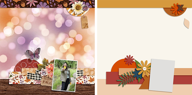
Sugar Babe Evelyn starts us off by scrapbooking the template exactly as-is. She chose to use patterned paper on the background layer and then clipped a single sweet photograph to the rectangular photo mask. This is a fun way to feature a pattern you love, and it also allows that lower element cluster to really stand out.

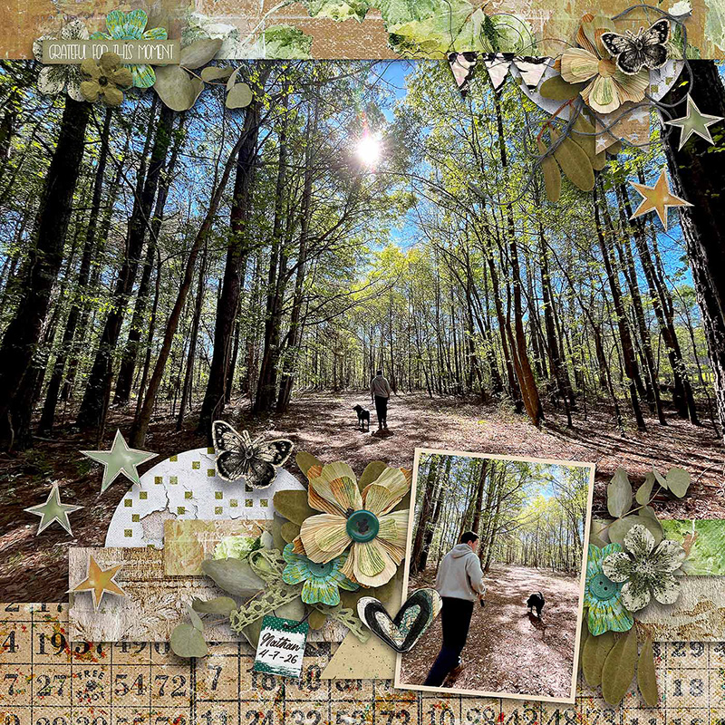
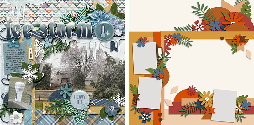
Sugar Babe Charlene also used the template exactly as-is, but instead of patterned paper, she went with great big photograph as her background. What a gorgeous wide-angle shot, and this is the ideal template for featuring a photo that’s large and in charge (of the layout, that is).
“This template,” says Charlene, “is perfect for adding a BIG photo. It has a nice large spot in the background that I chose to put a picture in instead of a paper and it has the smaller photo spot that could be used for a journal card if preferred.”

Sugar Babe Tammy used this template to create an entirely photoless layout. Rather than using the rectangular mask for a photograph, she clipped a journaling card to it instead. It’s a great way to make use of the beautiful cards that coordinate with her chosen kit, Cut and Keep Vol 2 by Studio Basic & Little Butterfly Wings.

Sugar Babe Carrie flipped out over this template – or maybe the template flipped for her? By flipping the template horizontally to create her layout, she moved the photo to the lower left corner. This allows the viewer’s eye to start at the photograph and move across the page through the word art and over to the whimsical elements from her chosen kit.

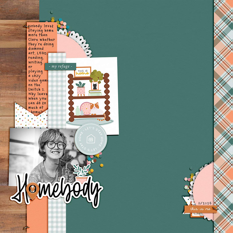
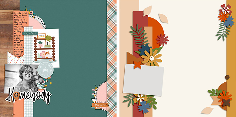
Sugar Babe Leeandra gives us a different spin on the template by rotating it 90 degrees clockwise. The photo mask is now fit for a landscape shot and she used the border strip behind it for a few sentences of journaling.
Leeandra says, “I’ve been holding on to this cute kit” – Homebody by Becca Bonneville, Sara Gleason, & Soco – “while I waited on the perfect photos of the inside of my home. In the meantime, it occurred to me that I could use this to scrap my favorite kind of layout: a ‘personality’ page. My oldest is the homebod-iest homebody to ever home so I’m grateful to have gotten this page done so it can be added to the family album.”

Sometimes, I feel like I’m less of a scrapbooker and more of an essay writer. I always have too much to say on my layouts and not enough space to include all my journaling. But when you use the background for journaling rather than a photograph, this template gives you oh-so-much room! Rather than including one big block of journaling that ran across the full width of the page, I split it into three columns of equal width. This makes it easier to read and is a technique you’ll often find in magazines and other print media.

Sugar Babe Krista L. turned this template into a pocket-style page and I just love the results! By adding the layers from this template atop a pocket template from Traci Reed’s 365Unscripted: Stitched Grids 7 she got the best of both worlds. The pocket style matches the other pages in her family’s albums and gave her specific areas for cards and photos, while the borders and clusters from our featured template adds fun, dimensional interest that literally breaks out of the box. Krista says, “It was fun to creatively get out of my comfort zone and mash up the two templates.”
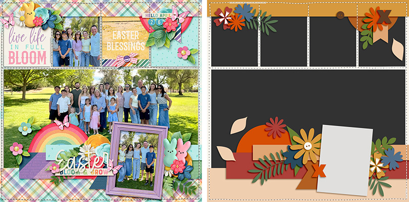

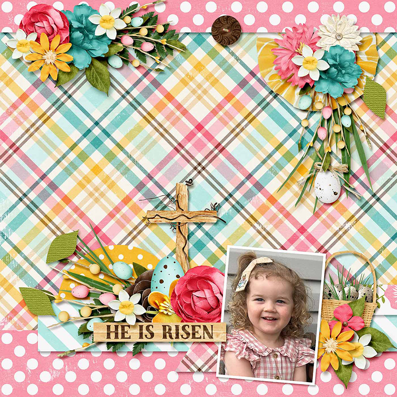
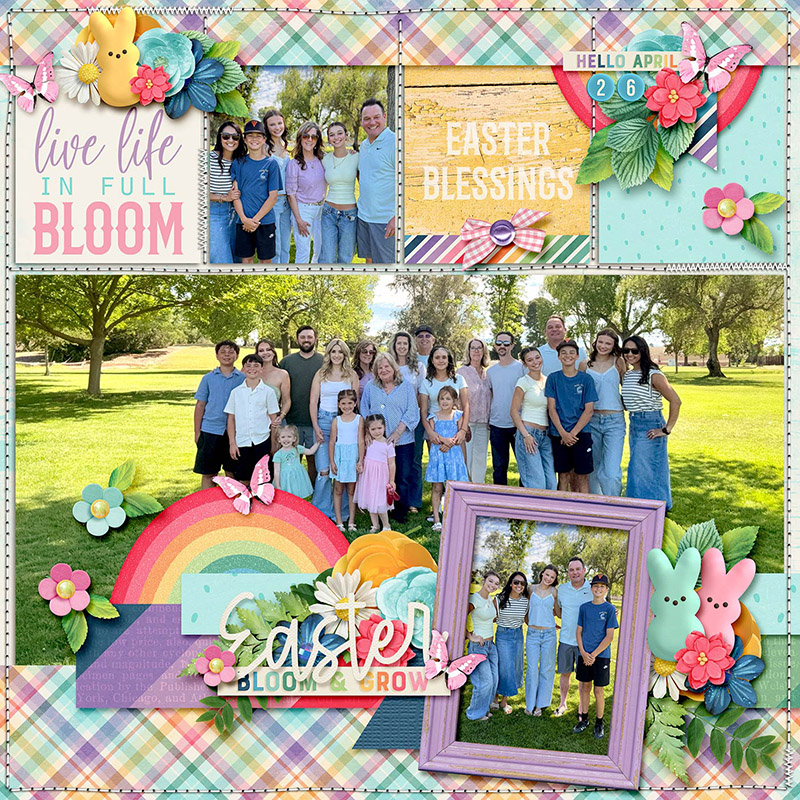
Sugar Babe Suzanne is our first mix-master of the month; she combined DSI’s template with another layered template from Around in Circles Page Drafts by The Nifty Pixel. By spinning and flipping one template and then layering the other atop it, Suzanne wound up with a 3-photo layout filled with fun Easter elements.

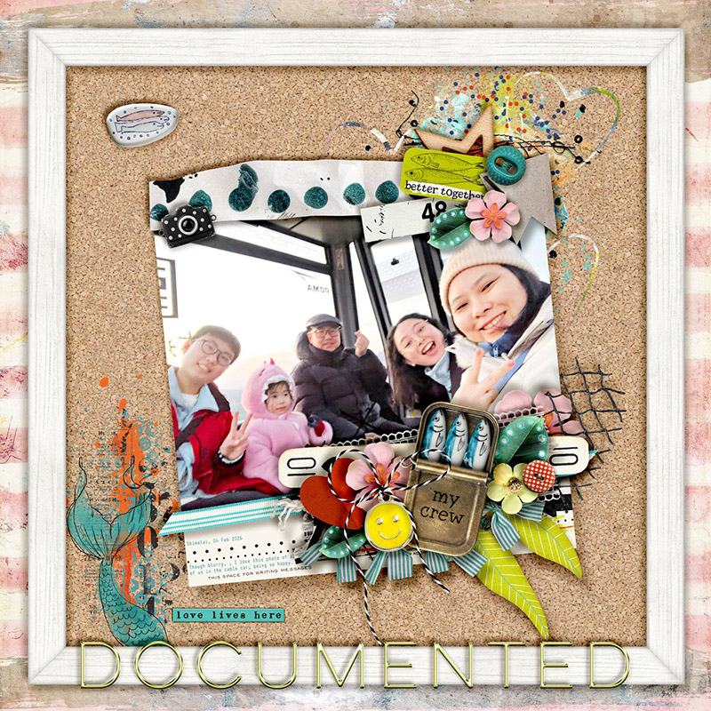
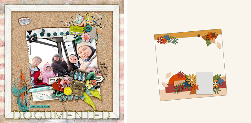
Sugar Babe Sherly is the first this month to play with the size of the template. She selected all the layers in the template and transformed them to a much smaller size in the middle of her canvas. Sherly says, “I thought it would be fun to put the shrunk composition of the template onto a giant framed cork board, making it look as if it is attached on it!”

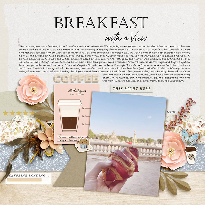
Sugar Babe Krista P. also played with the template’s size, but she went the other direction by making it big. “First I resized to 140%,” says Krista, “and with that scale I still had a band across the top and bottom. I decided that I had so much journaling I should make that more prominent and go with a slightly larger scale, thus having the template only along the bottom. Using the 145% accomplished the balance I was looking for. I loved resizing this template and playing around with scale and position; there are really no limits!”
Sugar Babe Eve simplified the template for a more minimalist layout by removing many of the layers for decorative elements. “Minimalist is not really my usual style,” said Eve, “but there are lots of pretty papers in this bundle so I just used minimal elements and let the papers shine.”

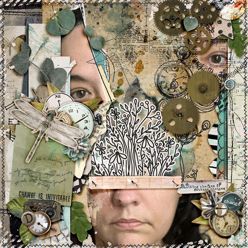
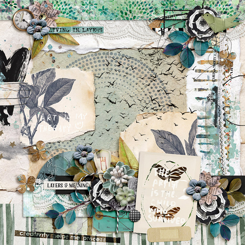
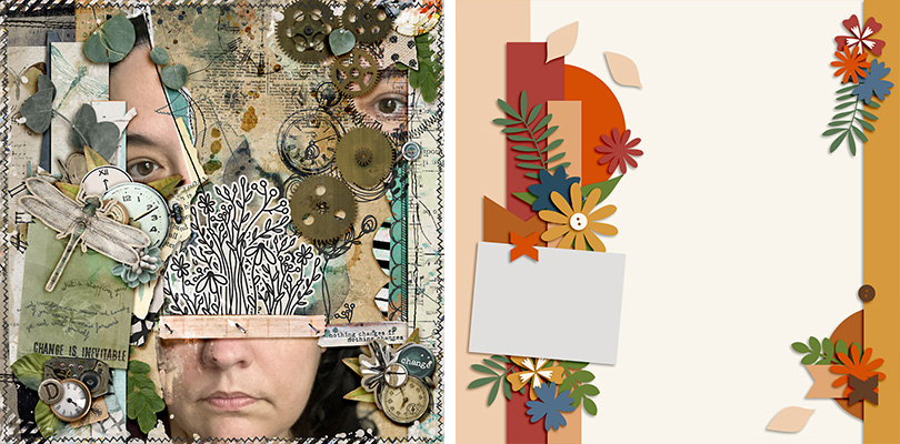
Sugar Babe Karli demonstrates how this template can even be used for the basis of an art journaling creation. “I don’t usually scrap with a template when I’m creating art journaling pieces so this was a fun challenge for me,” said Karli. “I started off with the template as-is, but I couldn’t quite get the look I was going for, so I flipped everything 90 degrees clockwise and then flipped just the right side vertically and bam! Everything just clicked. And as you can see, the layout kind of took on a life of its own after that!”

Our final layout of the month comes from Sugar Babe Rebecca, and she combined not just two but three templates to create this beauty – and they all come from this same pack by DSI! “I used three of the templates in the set,” said Rebecca. “Our feature template, I scaled down 75% and it’s the bottom right corner. Template 2 is scaled down 75% and put on the left side of the page. Finally I used the full size cluster blend from template 4 for the top of the page. I took a risk and decided to try to blend three of the templates into one to create a whole different look. It was a fun challenge and something I will try to do again!”
One layered template, thirteen different ways to give it new life!
It’s almost time for National Scrapbooking Day weekend and all the sales, games, and prizes you’ve come to know and love from us here at the Sweet Shoppe. The fun kicks off next weekend – Friday, May 1st – and though there will be heaps of new releases, it’s also your chance to pick up anything in the Shoppe while we’re running our site-wide sale. So start building your wishlist, and while you’re at it, be sure to add DSI’s Focus Vol.2 Templates so you can try out some of these techniques on your next layout!