One Kit, Endless Possibilities with Kristin Cronin-Barrow
Welcome to the May installment of “One Kit, Endless Possibilities” – where we show you lots of different ways you can use and re-use a single digital scrapbooking kit.
This month, we’re taking a closer look at a kit & collection from Kristin Cronin-Barrow that’s part of her Life in Color series. In this series of monochromatic kits and collections, Kristin focuses on a single color (plus a few neutral shades) and centers it around a theme that closely ties in with that color. For example, red for love, black for grief, and yellow for positive energy.
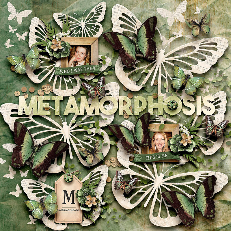
This month, we’re working with Life in Color: Metamorphosis.
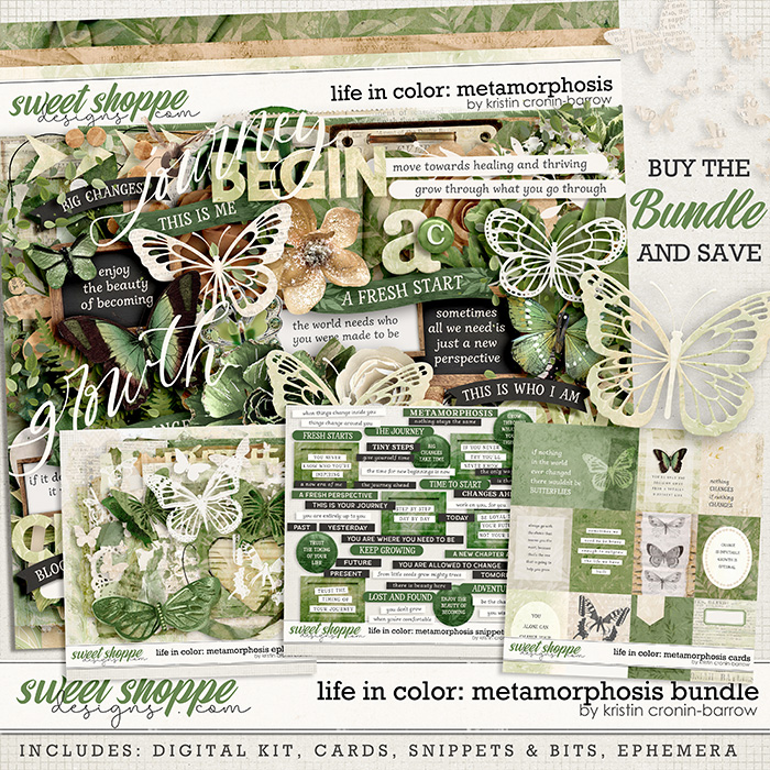
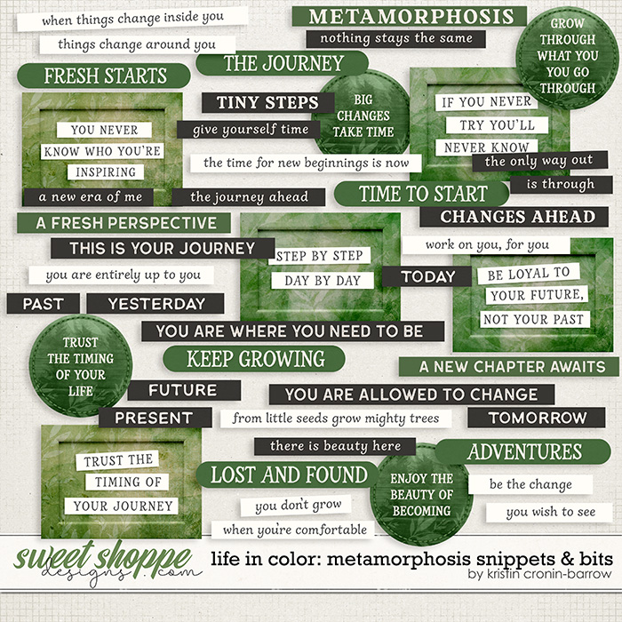
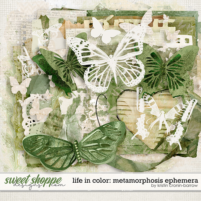
This bundle features a monochromatic color palette centered around the color green. With shades ranging from sage to grass to hunter, the green is accented with neutrals of black, white, and kraft.
Like its title suggests, the elements and word art focus on the theme of metamorphosis: change, growth, small steps, your journey, and the idea of “becoming”. There’s lots of butterflies as well as textured media, foliage, and florals.
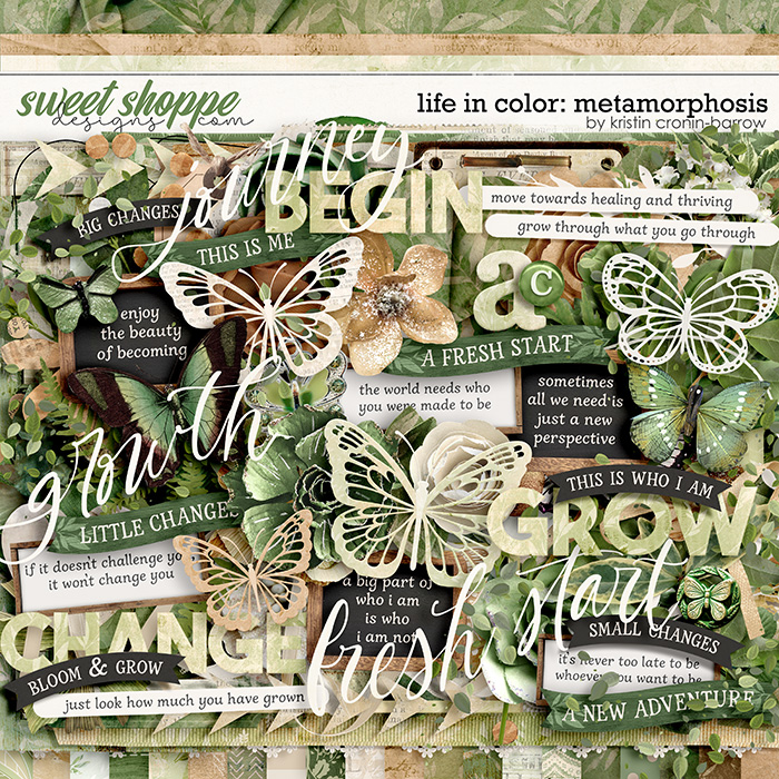
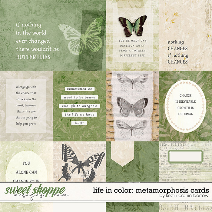
The digital kit can be purchased separately, or you can save money when you buy the bundled collection. The bundle includes a set of journal cards, an extensive pack of word art, and an ephemera pack filled with mixed media.
We challenged our creative team of SugarBabes to come up with as many different ways of using this kit as they could imagine. They delivered seventeen unique creations, and you’ll be amazed just how versatile this monochromatic collection really is. Let’s take a closer look!

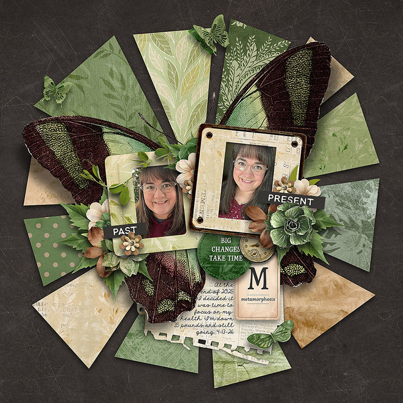
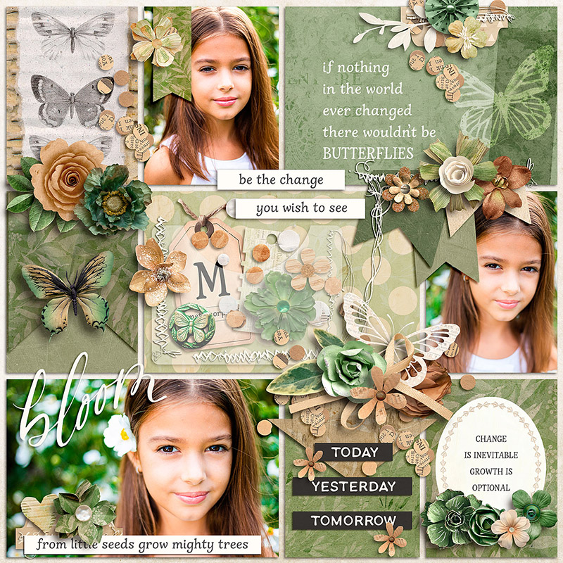
SugarBabe Charlene used this kit to create a layout centered around the theme of metamorphosis through weight-loss and a personal health journey.
“I’ve been focused on my health this year and losing weight,” says Charlene, “and this bundle is perfect for a layout about my progress. There are so many word strips and embellishments with phrases to express aspects of the journey and all of the butterflies are wonderful. I’m very partial to green, as well.”
My favorite thing about this layout is the way Charlene used one of the butterflies as an additional layer behind her photos and on top of the paper pieces!

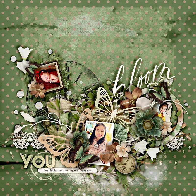
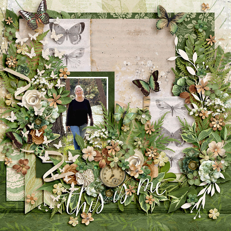
SugarBabe Sherly also worked with the theme of the kit but took it in a different direction, focusing on the metamorphosis of a child as they grow.
“Kristin’s kits always make me want to put every element on my page,” says Sherly. “For this one, I love all the different greeneries she put in it. While having so many greens in there, I let the photos pop in their original colours.”
Look at all the layers Sherly used to build up that amazing element cluster! From the paint to the ribbons to the paper to the flowers and foliage to the dimensional ellies on top, it’s a master class in how to build a cluster that’s truly a showpiece.

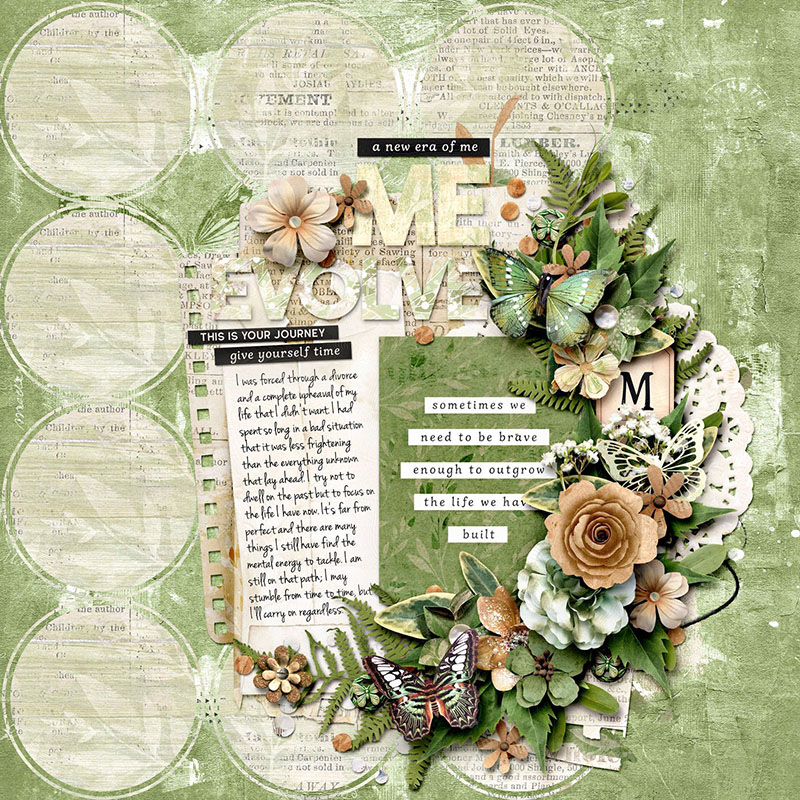
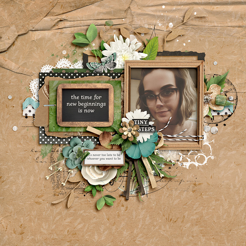
SugarBabe Suzanne used this same kit to guide her page with yet another of its themes: the metamorphosis and journey of mental health.
“This kit is quietly encouraging with it’s gentle but positive messaging and soothing and reflective greens,” says Suzanne. “I found the word art helped me to document what has been a really tough few years for me. It reminded me that I have been strong through adversity and that I can continue to grow and flourish despite those difficulties.”
I’m a fan of how Suzanne used those paper layers to provide plenty of space for her journaling, and the way she anchored it all around the journaling card with that perfect quotation. Plus, the addition of the little word strips that support her page’s theme are fantastic.

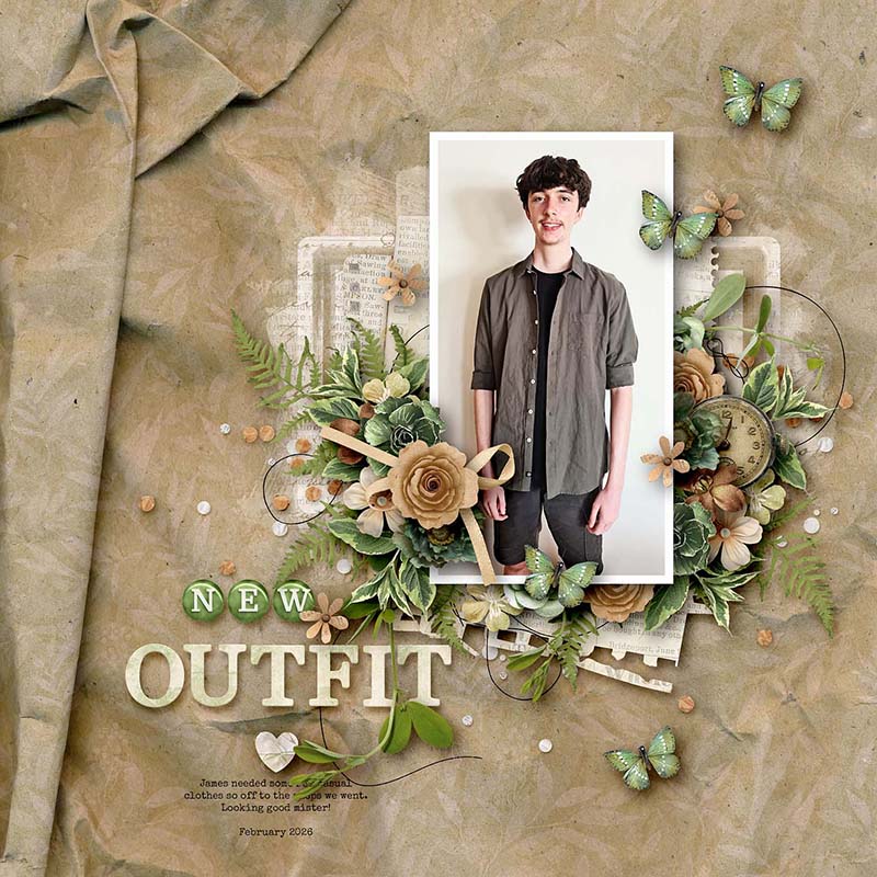
SugarBabe Kim B worked with this kit in an unthemed way, matching the colors to those of her photograph.
“I love the colour scheme in this kit,” says Kim, “and it perfectly matches photos of my son wearing some new clothes I bought him, so it felt like the right kit to use to scrap them. I especially love the crumpled background paper, which helps frame my photo and the elements. Kristin always fills her kits with so many beautiful flowers and greenery which look good with any subject!”
I was blown away when I saw the paper Kim chose for the background of this page – given that she was capturing the new clothes she bought her son, the fact that the background looks like fabric that’s been draped and folded … it does such a good job of subliminally reinforcing her theme.

SugarBabe Krista L shows us how to let this monochromatic kit shine by using it with black and white photography.
“What isn’t there to like about KCB’s gorgeous bundle?!” asks Krista. “I could use this kit several more times and still not use all the elements and papers included. I loved all the butterfly elements!”
Krista’s photography is stunningly gorgeous (as is her daughter) and I adore the way the black and white looks against all that pretty green.

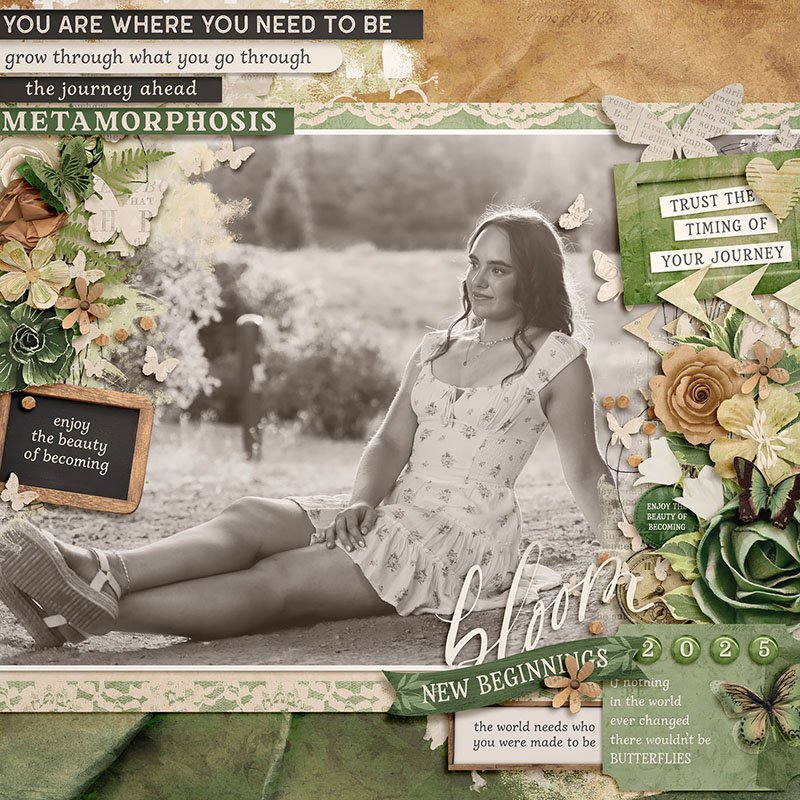
SugarBabe Amie gives us another example of how to make any photo work with a monochromatic kit – by converting your images to sepia-toned photography.
“I love all of Kristin’s monochromatic collections,” says Amie, “but this one in particular is so complementary to almost any photos- especially sepia photos! The metamorphosis theme was perfect to capture my daughter’s senior photos as she’s about to spread her wings & head off to college!”
What a stunning photo of Amie’s daughter! I love how soft it looks with the sepia toning, and all the little word bits she included are simply perfect. When a monochromatic kit includes kraft as one of its neutrals, the warm tones of a sepia photo treatment work incredibly well with it.

SugarBabe Tammy demonstrates how to use this kit to create an embellishment and cluster-filled page.
“What’s not to love about Kristin’s amazing kits?!” asks Tammy. “Kristin always gives so many options for creating clusters. It’s hard to pick which to use. This kit spoke to me with its butterflies and words about growth and change. It was perfect for the season I am currently in.”
I love the way Tammy concentrated on using all that gorgeous foliage and then layering the flowers and all those butterflies atop it. Her shadowing on the butterflies gives it such an incredible sense of dimension, like they’re floating just above the page.

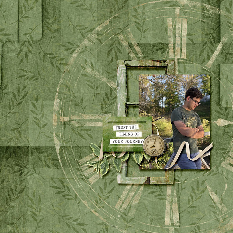
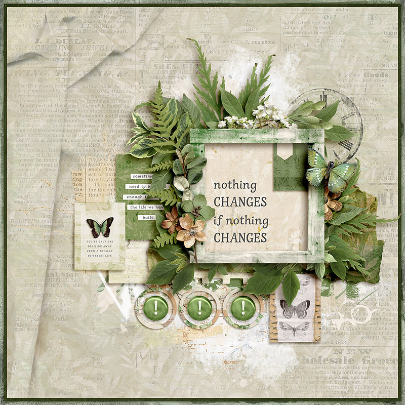
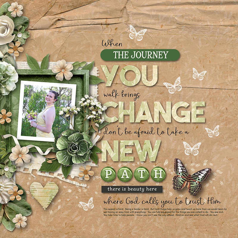
SugarBabe Rebecca gives us a gorgeous example of how to use this same kit to create a layout that’s both clean and simple and masculine.
“Kristin’s kits are always full of stunning papers and elements,” says Rebecca, “and by limiting myself to just 6 elements, it was a challenge! By creating a minimalist page, I was able to really focus on the photo and also show a masculine layout without flowers.”
Using that clock stamp, large and in charge, as a frame for her photo? And pairing it with that word art? Absolutely brilliant! Rebecca says she struggles with minimalist pages, but as far as I’m concerned, she totally rocked it.

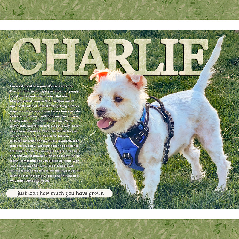
I had to get in on the fun; I opted to use this kit to create a magazine-style layout.
With a kit like this one that’s filled to the brim with so many lovely embellishments, I tend to want to use them all on my layout. But the kit works equally well to create a simple modern editorial-style page.
I snapped this shot of my pup at the dog park and knew I wanted to add my journaling atop the negative space created by the grass. I used one sheet of lightly-patterned paper in the same shade of green to create a simple border, dug into the alphabet sticker options to build my title, and added one word art strip to anchor the bottom of the page. Quick, easy, and done.

SugarBabe Mary A leaned on the collection’s pre-designed journaling cards to create a gorgeous pocket-style layout.
“I adore all of Kristin’s kits,” says Mary, “and this one is fantastic as well. She has a variety of elements to use from journal cards, to word bits, foliage, and flowers. I never have to worry about not having enough things to work with.”
Mary began with a template – Story Starters No. 1 Layered Templates by Amber of Alchemy Wild Studio – and filled it with her gorgeous photos and journaling cards. Then she used the kit’s elements to build clusters that expand outside the pockets and create flow for the eye across the page. What a stunning layout!

SugarBabe Judie also worked with the collection’s pocket cards, but used them instead to create a non-pocket photoless layout.
“What’s not to love about this gorgeous collection – the journaling cards alone are worth it!” says Judie. “I don’t always reach for cards, but this set completely won me over. I used five of them on my page: one as a standout title in the frame, two in place of traditional journaling, and two as eye-catching design elements.”
Judie’s layout is a stunning example of not only the versatility of journaling cards, but also how meaningful a photoless layout can be.

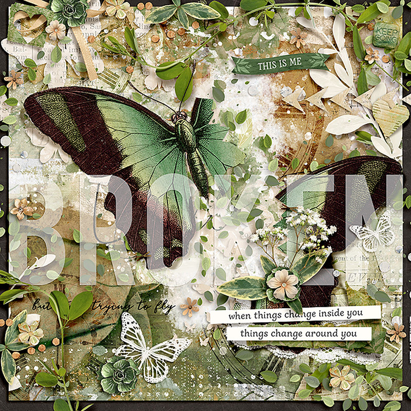
SugarBabe Cassie also used the kit to create a photoless layout, taking it in the direction of an art journaling page.
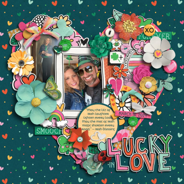
“Sometimes life feels too heavy and emotions are so overwhelming that a person doesn’t have the energy to talk about it,” says Cassie, “but scrapping helps make something painfully ugly into something artistically beautiful. I loved using this kit from Kristin for my art journal page because it did just that for me. The color green always speaks of life, growth and potential to me and her many pieces of word art are uplifting and encouraging. Plus, who doesn’t love butterflies?!”
Cassie’s page grabbed me by the throat and punched me in the gut at the same time. I can definitely identify with the feeling of “broken but trying to fly”. The way she used that big butterfly, separating the one wing to reinforce the concept of being broken, is both clever and creative.

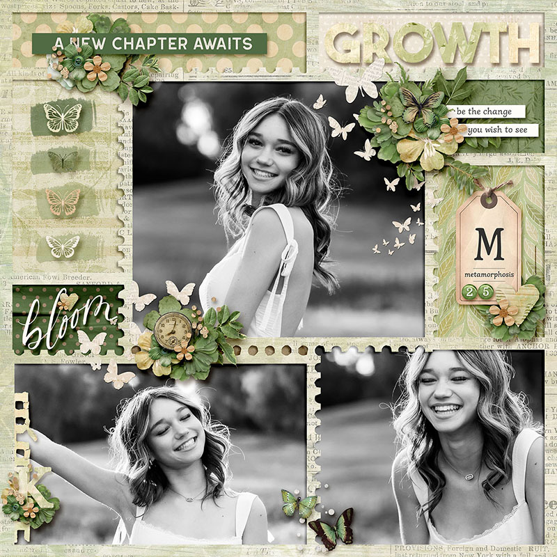
SugarBabe Heather focused on the repetition of a single element to create her page, and the results are lovely.
“Kristin’s kits are always so beautiful with so many floral and greenery options,” says Heather. “I especially loved all the beautiful butterflies in this kit so I made them the focus of my page.”
Heather provides us with a fantastic example of how to repeat one element on your page without it feeling … well, repetitive. Note that she changed the butterfly’s size and angle so it feels organic. And I love the way she layered the photorealistic butterflies atop the die-cut version.

SugarBabe Kim E. shows us the gorgeous alphabet sets included in this collection with her title-focused layout.
“This collection makes creating titles easy,” says Kim, “with two different sets of word titles included and lots and lots of word bits to choose from. Those are the things that caught my eye in the collection… that and Kristin’s always amazing flowers! Sometimes a large title can be a part of the journaling of the page, and that’s what happened as I scrapped this one.”
I love the way Kim built her title out of not only word art but also word strips, alphabet stickers, and text layers with a scripty font. It’s a perfect mix!

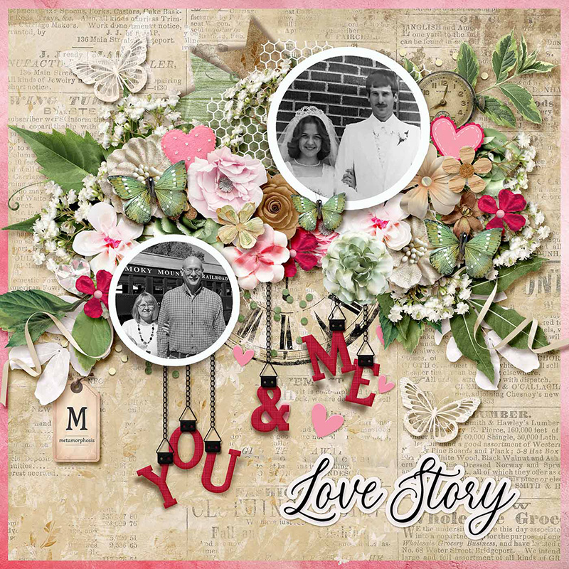
SugarBabe Evelyn shows us what lovely results this collection yields when you mix it with another monochromatic kit.
“I love how the different collections in this series work together so beautifully!” says Evelyn. “I used the theme of metamorphosis to refer to the changes we have undergone in our almost 47 years of marriage. We have both grown and changed individually and as a couple. I also used the theme of love to refer to the love we have for each other and how it has grown.”
I love the mix of the pinks with the greens on this layout! I wouldn’t have thought Lovey Dovey would be a good monochromatic kit to mix with Metamorphosis, but my word, Evelyn proved me wrong. It takes a truly artistic eye to mix red and green and keep it from feeling Christmas-like, and she nailed it.

SugarBabe Carrie demonstrates how to extend this collection even further by mixing it with another kit by the same designer.
“Combining two of Kristin’s kits together is very simple to do,” says Carrie. “The way that her style and color palettes mesh makes combining them flawless.”
Carrie worked with Kristin’s collection As Days Go By: Now and Then, matching its kraft and black neutral base with the same neutrals in Life in Color: Metamorphosis. I love the mix of the greens from Metamorphosis with the aqua ones from As Days Go By. This is a perfect example of how, stylistically, mixing two kits by the same designer works so very well.

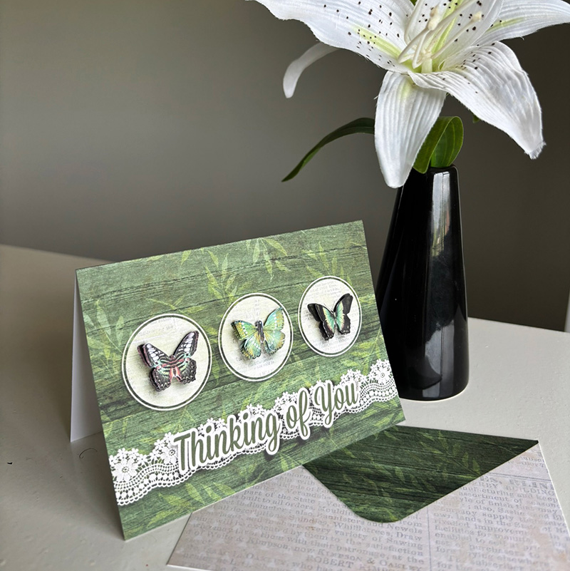
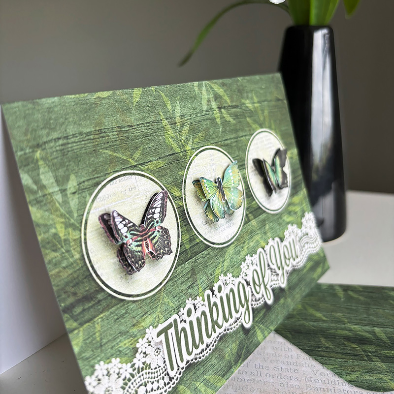
SugarBabe Jacinda reminds us that a digital kit needn’t be limited to just your scrapbooks by creating this stunning hybrid project: a greeting card.
“I couldn’t resist doing a card with dimensional butterflies,” says Jacinda. “The circle element gave me the design format straight away so it was super quick to put together.”
What a beautiful card! I love the mix of the flat background (that doesn’t look flat thanks to her drop-shadows) with the butterflies that have been adhered using a dimensional adhesive. And did you catch the fact she made a matching envelope? How cool is that?!?
One kit, seventeen different ways to use it.
There’s absolutely nothing wrong with buying a digital scrapbooking kit and using it to create one single layout. But if you’re keen on getting the biggest bang for your buck, take a closer look and consider the many different ways you can re-purpose that kit. Use it for its stated theme, for an adjacent theme, or completely un-themed. You can focus on matching a kit’s colors to your photos or make your photos match the kit by converting them to black-and-white or sepia-tones. Create one page that’s clean-and-simple and another that’s filled with element clusters; focus on art journaling, create a pocket- or grid-style layout or use those pocket cards on a page in place of photos. You can repeat a favorite element over and over, play with alphabets and word art to create a stand-out title, or mix the kit with another to extend your options even further.
Whether you do one of these, some of them, or all of the above, we hope you’ll share your finished layouts with us in the Gallery, because you inspire us as much as we hope we’ve inspired you!