One Template, Sixteen Ways with LJS Designs
“You can’t use up creativity,” said Maya Angelou. “The more you use, the more you have.”
And that applies to layered scrapbook templates; the more creative you are, the more pages you can create, all with one single template. Yes, my friends – it’s time for another edition of One Template, Many Ways!
This month, we’re delighted to feature a template by Lorie of LJS Designs. It’s part of her template 4-pack 4 Story: Sign of Summer, and is available in her Shoppe now:
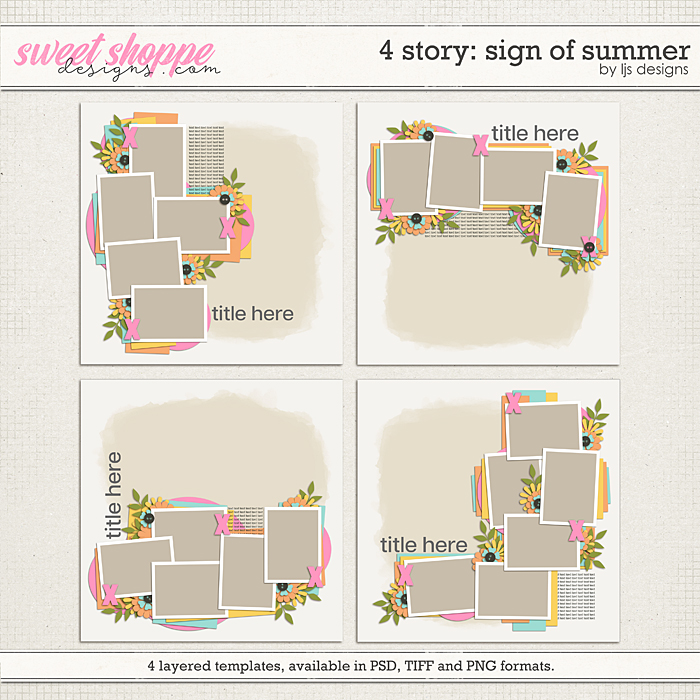
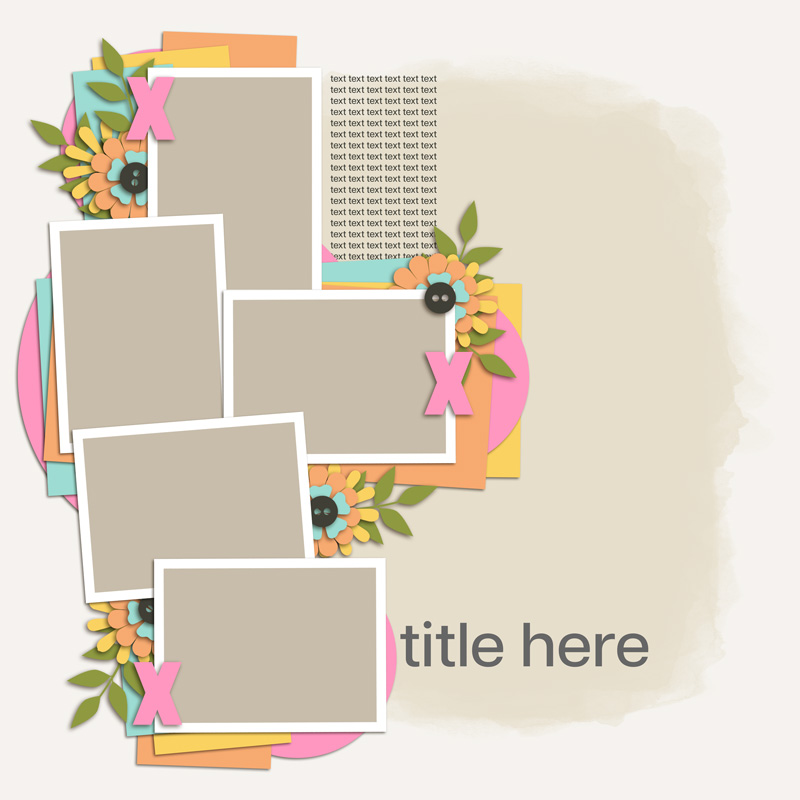
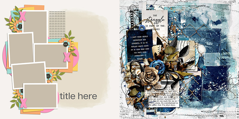
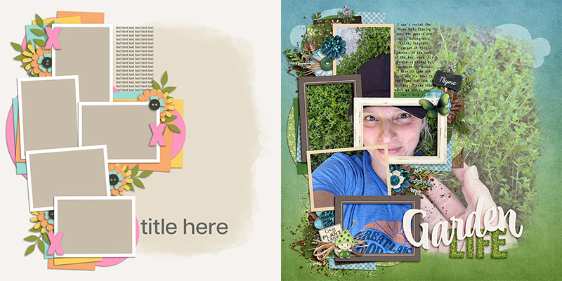
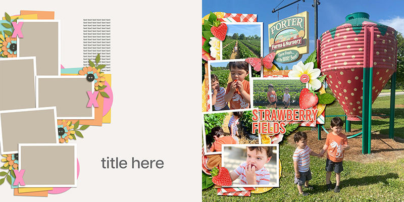
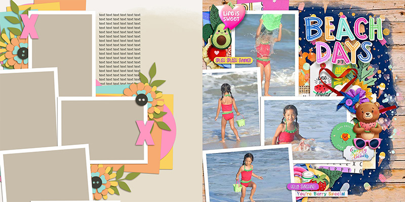
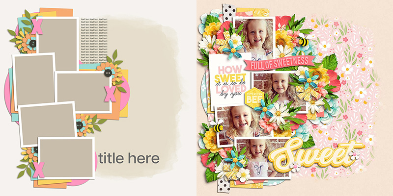
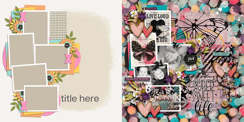
We challenged our creative team of Sugar Babes to work with the template in the upper left corner. This 12″x12″ 300dpi template features five framed photo masks in a mix of portrait and landscape orientations, all layered atop stacks of paper strips and circles. There’s also four small floral clusters tucked around the photos, ample space for a title, and room for journaling. But the big feature all four templates in this pack share is the large, painted mask that fills most of the background of the canvas.
Our goal with the One Template, Many Ways series is to demonstrate the versatility of a single template and give you lots of ideas for how it can be used to create a wide range of scrapbook layouts. The Babes outdid themselves this month! We have sixteen different spins on this template (some of them are even literal spins!), and I can’t wait to walk you through them all and talk about their strategies for getting multiple uses from a single template.
Technique #1: Use it as-is

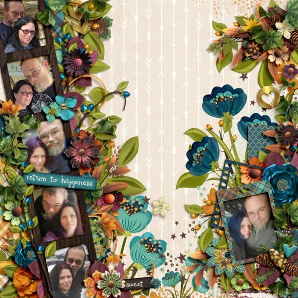
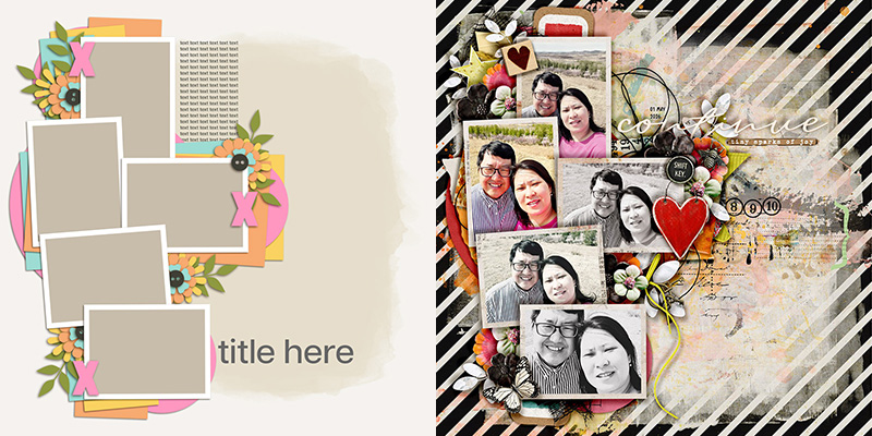
Our first example comes to us from Sherly, who used the template exactly as-is. She filled the five photo masks with photographs, clipped papers to the various shaped layers, and added in dimensional elements where the template placed them.
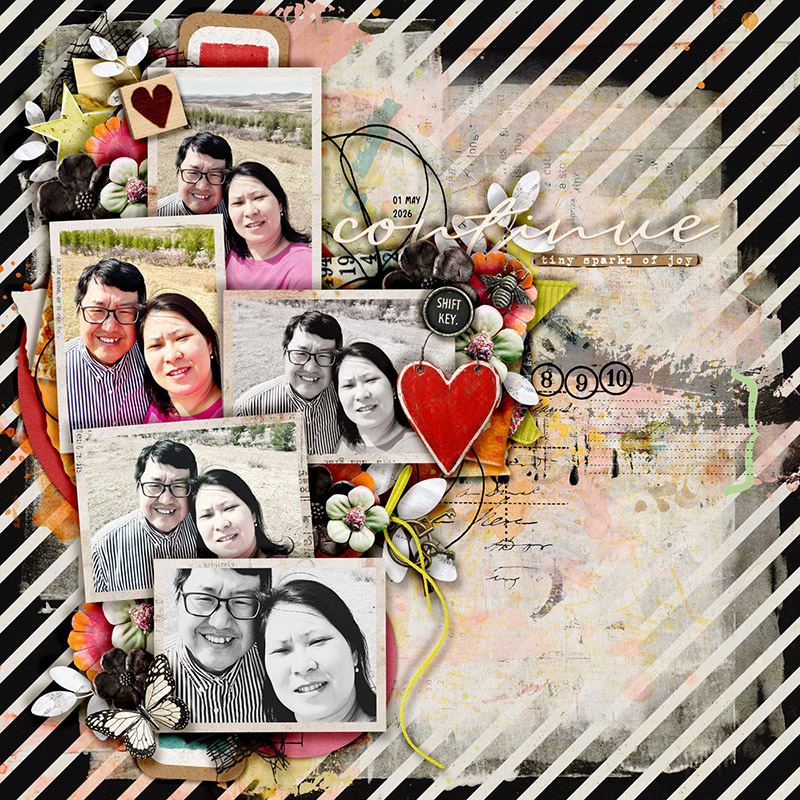
“I love how versatile this template can be!” says Sherly. “It’s a great foundation to create the traditional style scrapbook pages, However, for those that love messy/grungy style, Lorie’s template also works so well to create such a style.”

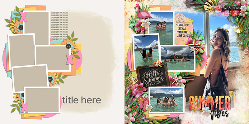
Krista also used the template as-is, but instead of clipping a piece of paper to the background mask like Sherly did, Krista used a gorgeous photograph.
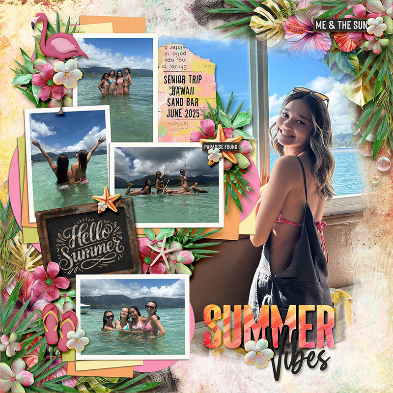
“I love that the template allows for multiple photos,” says Krista, “without making the layout feel crowded or overly busy.”
Technique #2: Change up the photos
The first way to stretch a template beyond its initial design is to change up how you work with the photographs and their associated masks.

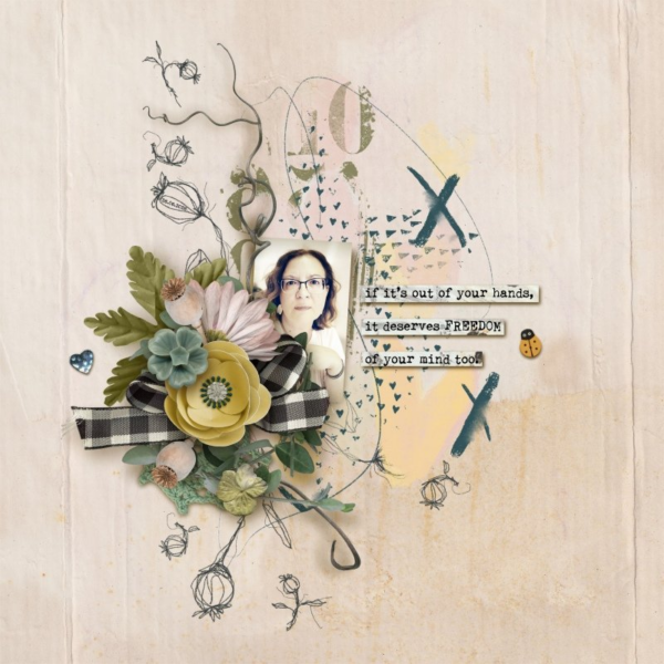
Suzanne used this template to create a completely photoless layout.
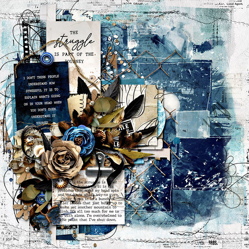
“I love that there is a mask included in the template as my own masking skills aren’t that great,” says Suzanne. “It instantly gives a more artsy base on which to build. I used all of those photo spots to clip a variety of journaling cards and patterned papers, as well as my journaling. I’d say if you were a little hesitant about creating an art journal style page from scratch, this template provides a great base to work from.”

Ally used one of my favorite techniques on her layout: she chose one photograph and clipped it to all of the photo masks so that, together, they reveal one large image.
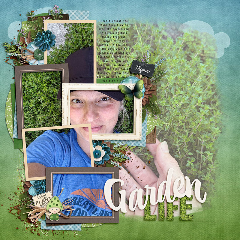
“I really love the giant background mask in these templates,” says Ally, “because I like how they look with a photo at reduced opacity. It adds so much texture. Of course, there is also the option to use a paper here too! This was such a fun stack of framed photos to play around with, and I love how it turned out with using one photo clipped multiple times!”

Karli demonstrates another method for showing off a large photograph by replacing the background layers with a 12″x12″ image.
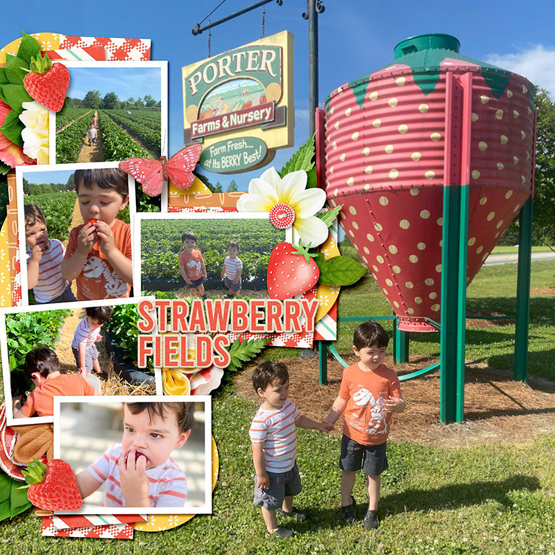
“When I scrap for the purposes of memory keeping I find it so hard to narrow down the photos that I want to use,” says Karli. “With Lori’s templates I don’t have to! When I saw this template I knew right away that I wanted to fill the background with a large photo and I knew just the picture to use. I love the way the photo cluster seems to fit so snugly into the page. This layout didn’t take me ages to put together but still came out so beautifully clustered – definitely a plus when you have a lot of pages to make and not a lot of time!”
Technique #3: Reorient it
Another approach you can take to stretch a template beyond its initial design is to change its orientation.

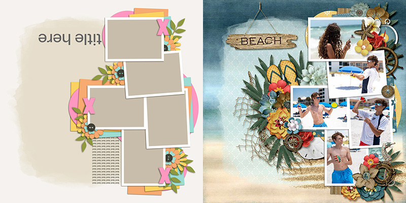
Evelyn rotated the template 180 degrees, placing the photo stack on the opposite side of the canvas.
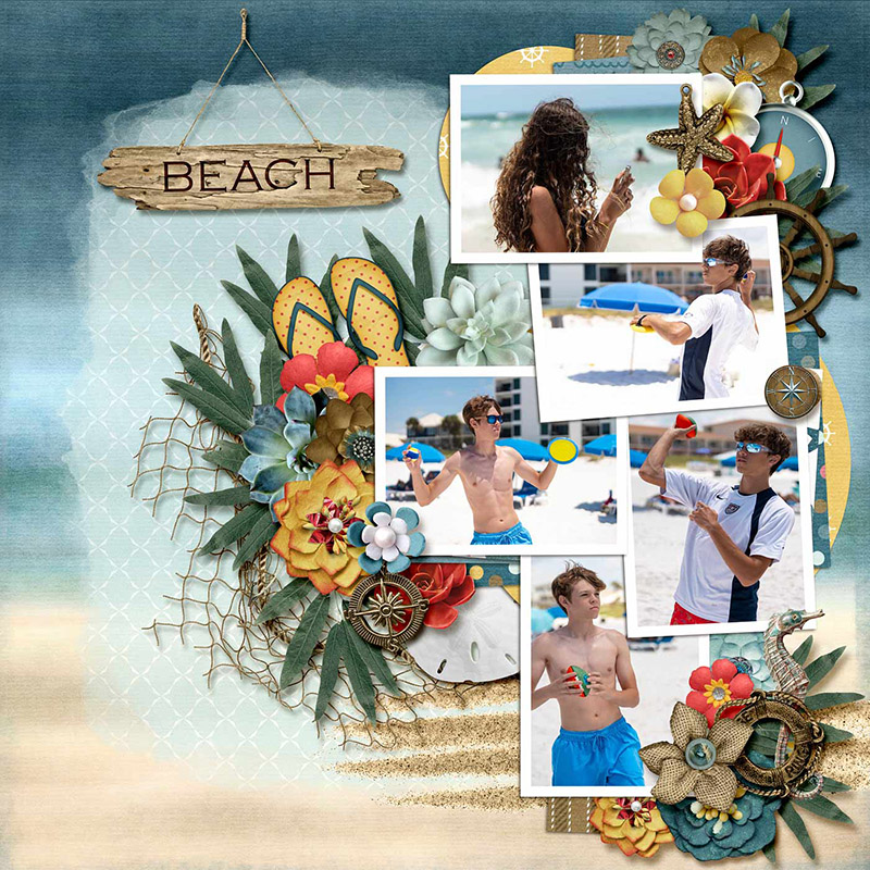
“You can rotate this template and use it so many different ways!” says Evelyn. “I love that there is ample space on either side of the photo boxes to add flower clusters and other elements. This template was so much fun to work with and made the process of creating a page easy and took the stress out of deciding where to place everything. Also, I really love the cascading vertical design of the layout!”

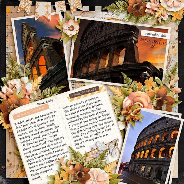
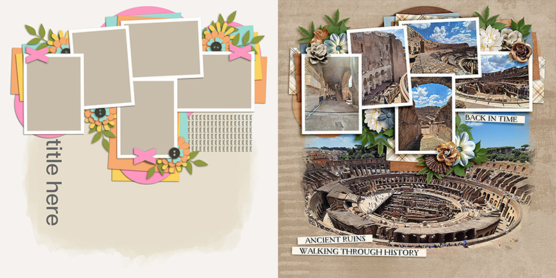
Jacinda rotated the template 90 degrees clockwise and created this stunning travel-themed layout.
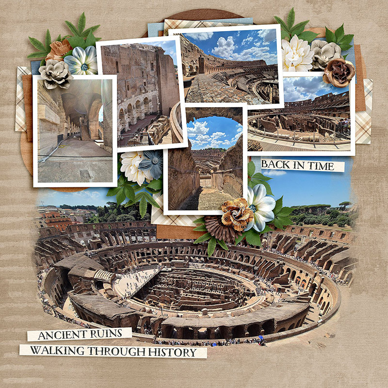
“I love that there’s a selection of both portrait and landscape photo spots,” says Jacinda. “Rotating the layout 90 degrees to the right enabled me to include the 3 portrait photos I wanted, and then place the large Colosseum pic centre stage.”

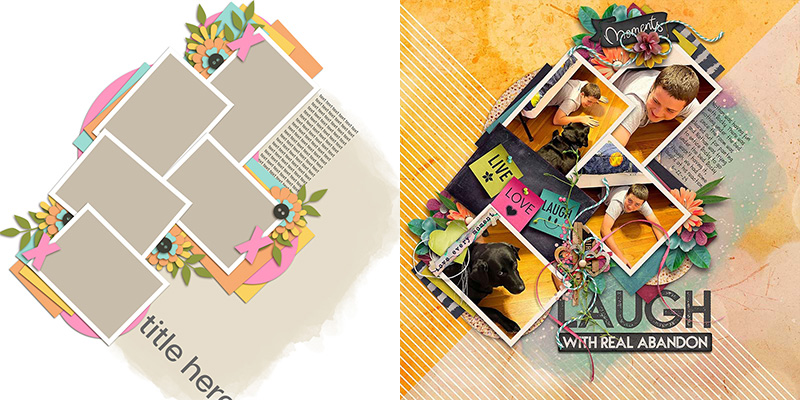
Charlene split the difference, so to speak, by giving her template a 45-degree turn. The result is a stunning diagonal layout with tons of energy!
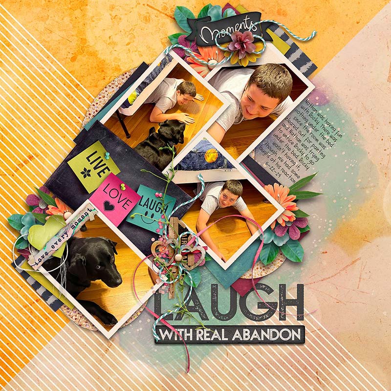
“This is such a versatile template,” says Charlene, “I’ve used it once already as it is and loved all the photo spots as well as the mask that could be for a paper or big photo. With these silly pictures of my son, I thought angling the template would compliment the quirkiness of the moment captured.”
Technique #4: Change its size
Another way to get even more use from a template is to start playing with its size in relation to your overall canvas.

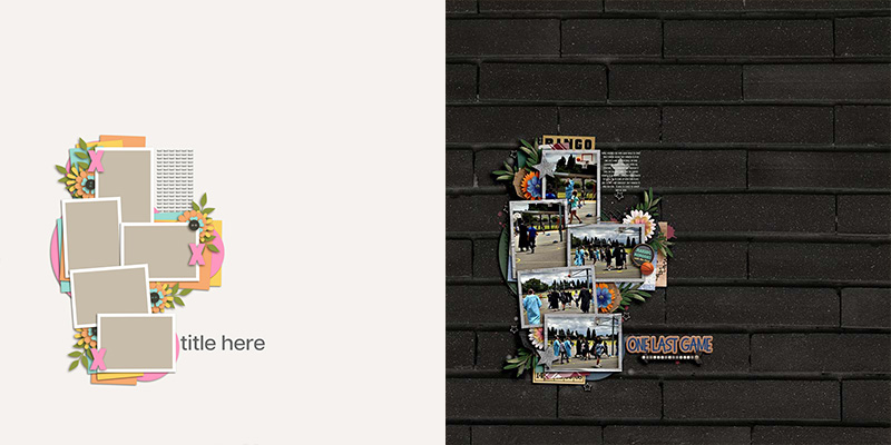
Carrie took the approach of shrinking down the template’s photo stack, creating a layout with ample whitespace.
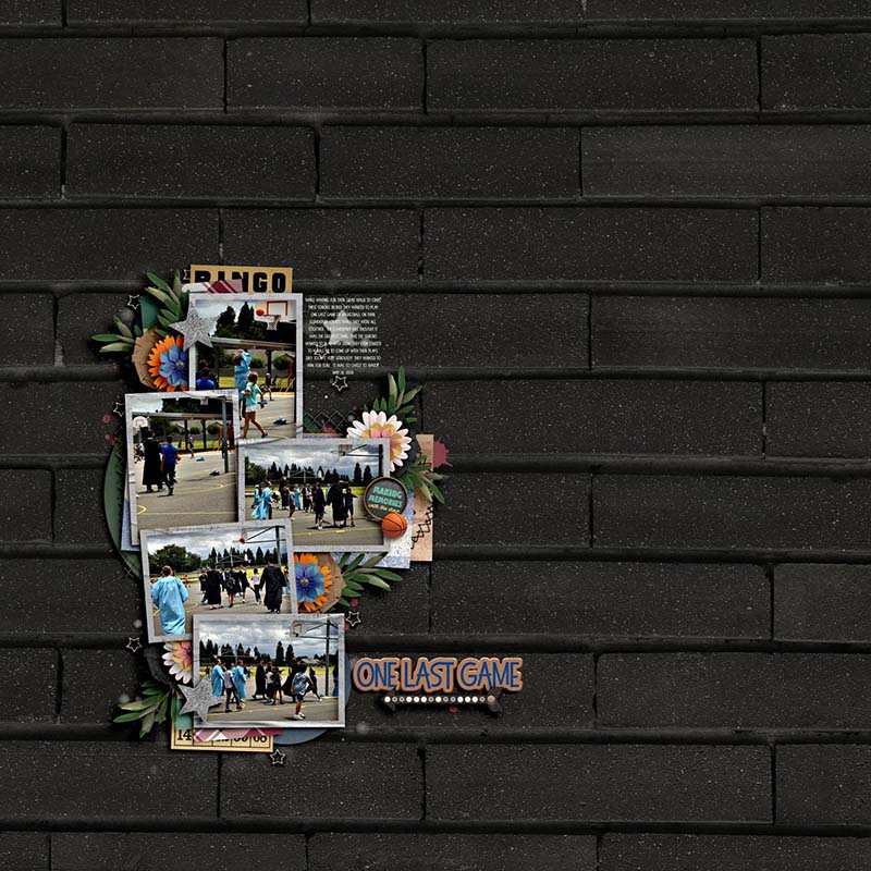
“I don’t typically scrap multiple photos so templates like this really help with my creativity when it comes to that,” says Carrie. “I happened to have some recent photos of my son’s grad walk and he and his buddies playing one last basketball game on their elementary school courts. This template provided the perfect placement for those photos and I scaled the template quite a bit to show off the amazing background paper.”

Eve took the opposite approach and went BIG by resizing all the template’s layers and dragging them around on her canvas until she had room for four larger photographs.
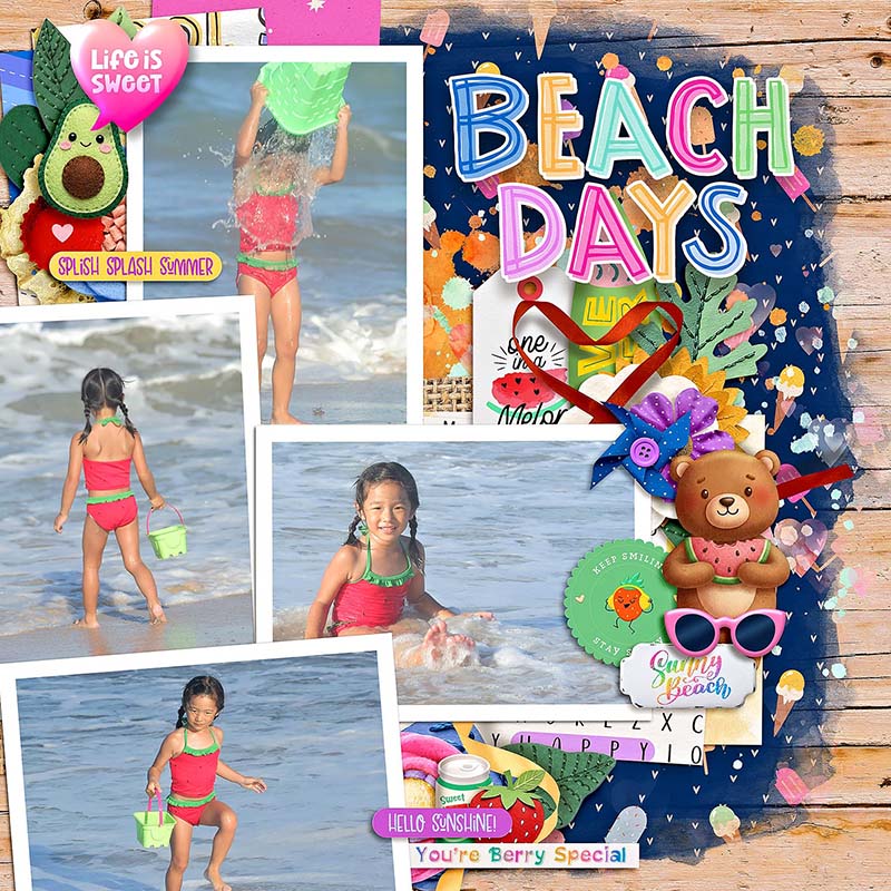
“I love how this template contains multiple mixed (landscape and portrait) photos,” says Eve. “After I made them bigger, I kept them on the left side mainly to match the flow of pictures that I plan to use for this template. I also kept the overlay on the background at original size and clipped another paper as background paper beside the wooden paper.”
Technique #5: Change its style
Every scrapbooker has a layout style they gravitate towards with their creations. Whether you embrace a clean and simple aesthetic, lots of clusters and elements, a more grungy and distressed style, or a mixed-media filled canvas, you can apply your preferred style to any template.

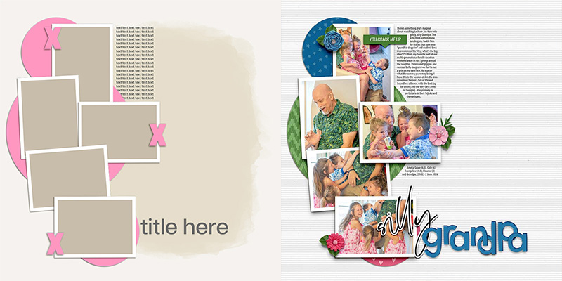
My scrapbooking style tends to extremes; either I fill my layouts with floral clusters or I go super minimalist … which is exactly what I did with Lorie’s template.
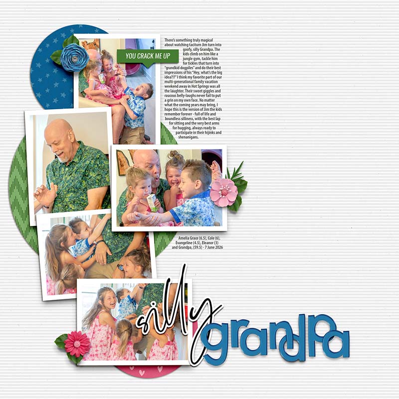
I started by hiding all the layers except for the photo masks. Then I turned on the paper layers one by one until I settled on including only the three circles. I knew I wanted to include small elements – a single blossom with leaves – so I turned on the top accent layer (with the three pink X’s) and used them for my placement. I’m super pleased with the end result! Sometimes I just need a reminder that you don’t have to use every single layer in a template.

Taking the opposite approach from my layout, Mary A opted for a cluster-filled embellishment-heavy style for her page, and it really is full of sweetness!
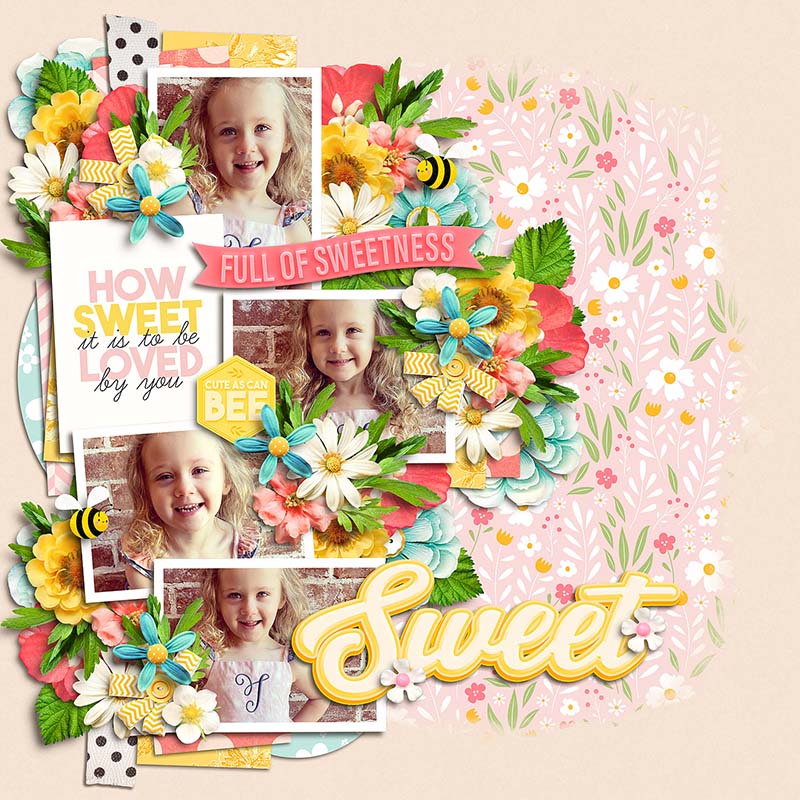
Mary says, “One thing I love about this template is how the color‑coding makes it so easy to add the same paper to different spots on the layout without second guessing yourself. It also gave me a great starting point for placing clusters, and then I was able to build onto it and make it fuller.”

Heather is one of our resident art journalists, so she used the template as the starting point for this mixed-media masterpiece.
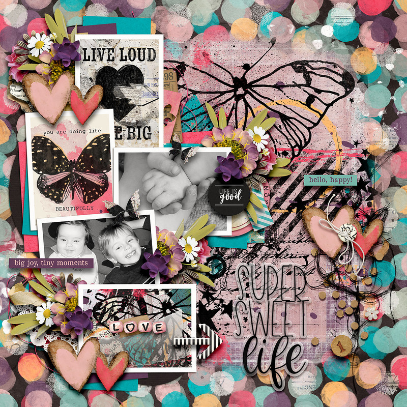
“I love how versatile this template is!” says Heather. “The mask layer gives you an option to either use a large photo in the background or blend in a paper which is what I chose to do. I had lots of fun adding in stamps and paint to give it more of an art journal-style feel.”
Technique #6: Mix it up
When you want to get a lot of mileage out of your template collection, you can start mixing them up to create something completely new.

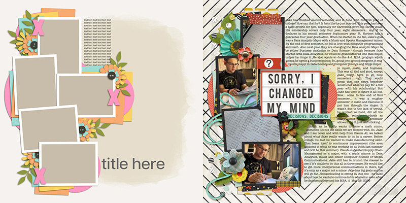
Rebecca wanted to use her page to tell a story with multiple paragraphs of journaling. Even though this template is designed with just a small journaling block, Rebecca mixed it up and made it work!
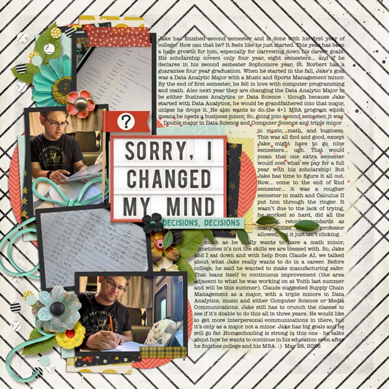
“Lorie’s blended templates are so versatile, as you can see… but they are perfect for those pages where you need to get out the full story. Having a blended masks allows for using a patterned background – and I love a good patterned paper! This page is about my son finishing his first full year and changing up his major again.”

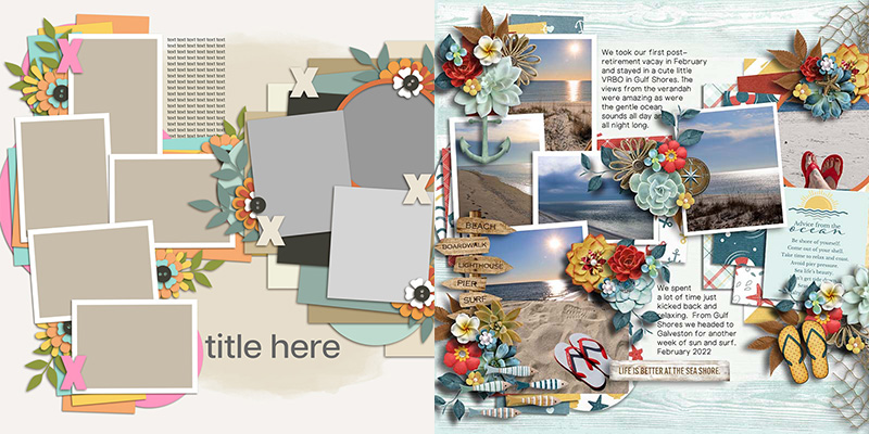
When you’re ready to think way “outside the template”, you can start mixing different templates together into a single layout. Jill does this to gorgeous effect by combining today’s template with one from Lorie’s 4 Story: Sand & Sea template pack.
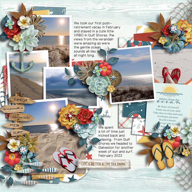
“My page was created by blending two different templates together,” explains Jill. “The first template had a strong visual weight on the left side, so I went searching through Lorrie’s goodies and found one that balanced the design with weight on the right.”
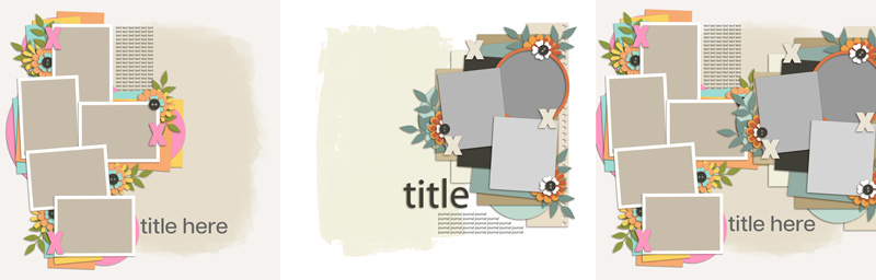
“The two templates worked together beautifully,” concludes Jill, “making the combination process almost effortless.”

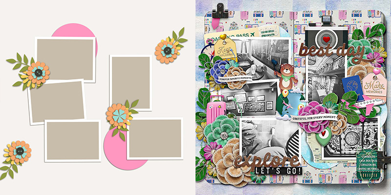
When you feel like doing your own thing but still want a starting point, you can use the template like Mary M. and really mix it up!
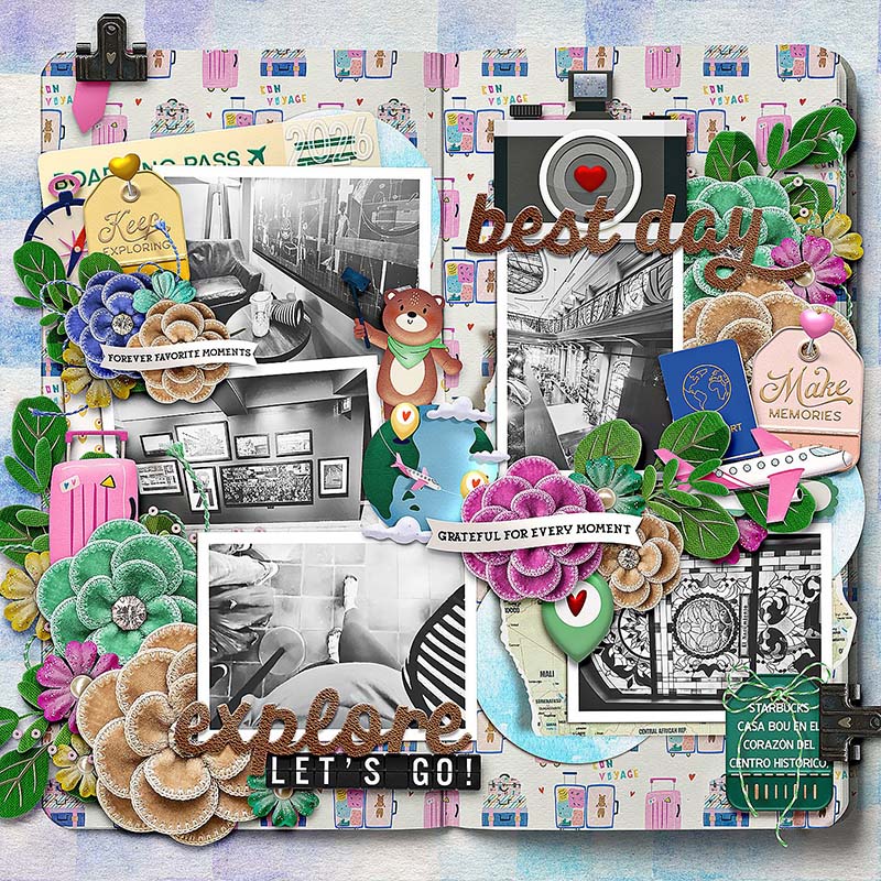
“I took out the background mask,” explains Mary, “and moved the photo frames around to fit on my open book. I also removed the paper strips behind the framed photo spaces and moved the circle shapes around to fit my mood of the layout. I love how this template had built-in spaces for multiple photos without feeling cluttered it gave me room to tell a story from my trip. Also the template’s cluster areas made it easy to build those embellishment groupings without overwhelming the photos.”
And there you have it: sixteen uniquely different layouts, all from one single layered template!
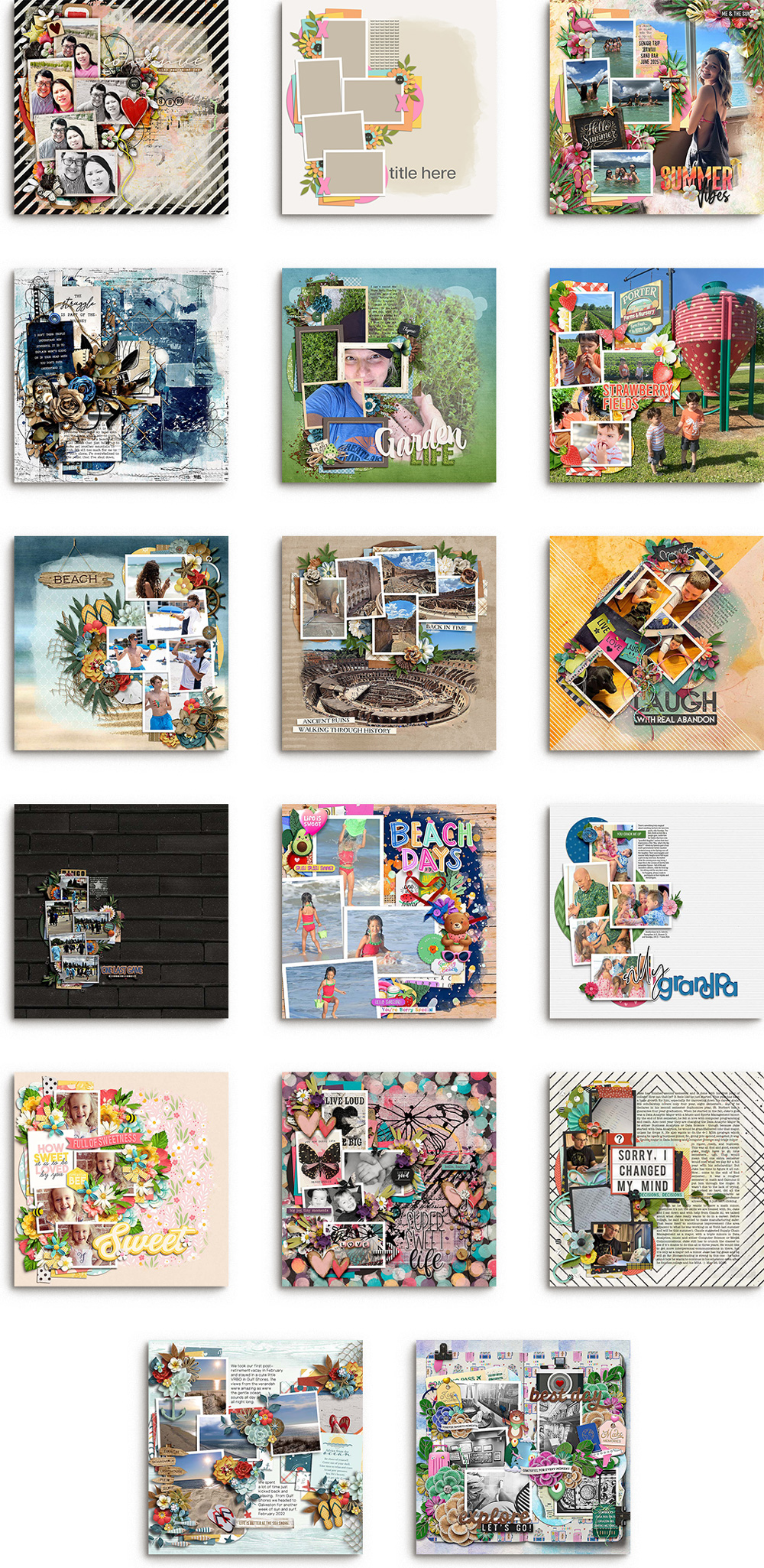
We hope that today’s post gives you fresh inspiration for how to get the most out of your layered scrapbook templates. Whether you use this gorgeous template from LJS Designs or another from your stash, keep these six techniques in mind: use it exactly as-is, change up the photos, reorient it, change its size, change its style, or mix it up. We can’t wait to see what you create next!