It’s All In The Title
Heather here, with some fun tips and a little tutorial on title work. This was requested a few weeks ago in the forum here and I’m excited to talk a little bit about how I do my title work and give you a few tips on making them stand out. Titles are really hard for me to come up with, so one of the things I like to do is look at the word bits and word art in the kit I’m using. That usually tends to help trigger something creative in me. This also helps because then I can use that word bit or word art in my layout for a title or part of a title. I also like to browse Cindy’s layered title templates, Penny’s Word Jumbles and Shawna’s Title Work series for ideas. So, we’re going to take a look at how I did my title on one of my layouts and then we’ll take a look at some amazing layouts from some of the SugarBabes and Designers… and I’ll talk about some tips I have for doing your title work.
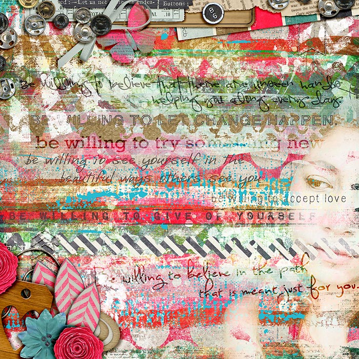
OK, let’s get started… here is my layout all ready for a title…

In the kit, there is a cute little bottle cap that says “refreshing” and I knew I wanted to use that. I also really like the chipboard title frames from Cindy and thought I’d use the one that says “Happiness Captured”. I decided that instead of the “captured” part of her frame I would use the alpha from the kit. This is the beauty of Cindy’s layered titles. Just like templates they are great jumping off points… so you can use what she’s given you, or you can make some alterations to it and make it your own. I also chose to leave my picture as is, instead of clipping it to the photo spot in the layered template. Here’s what it looks like with just adding the frame…

Now I’m going to add the bottle cap “refreshing” to the title and I’m going to add it on top… since it’s a 3D item I don’t want to have paper on top of it so I make sure I’ve added it on top of the cherry stamps but leave it below the leaves. I like it there so I’m going to leave it that way. I also moved my flower cluster over a bit and added some more greenery to help fill up some space a bit. Here’s what my layout looks like now…

Now I want to use the word “captured” but I wanted to use the alpha with the kit instead of the word art from Cindy’s template. I decided this needed to be on top but still below some of the more 3D items on my page. I then messed around with a few more elements to really finish off the page and make it look more complete and here is my completed layout…

OK, so I’ve showed you how you can use one of Cindy’s layered title templates, now let’s take a look at some other layouts with great title work and I’ll share some tips on things you can use, besides just the alpha that comes with the kit.
Let’s take a look at Darcy’s fonts. Darcy has some really great fonts for title work. You can do a few things with them… you can use them in conjunction with the alpha, usually fonts are good for “small” words, like Rebecca did here…

You can mix a couple different fonts to create your title, like Celeste did here…

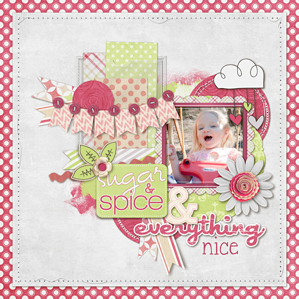
You can use a font to “cut out” a word from your paper, like Celeste did here…

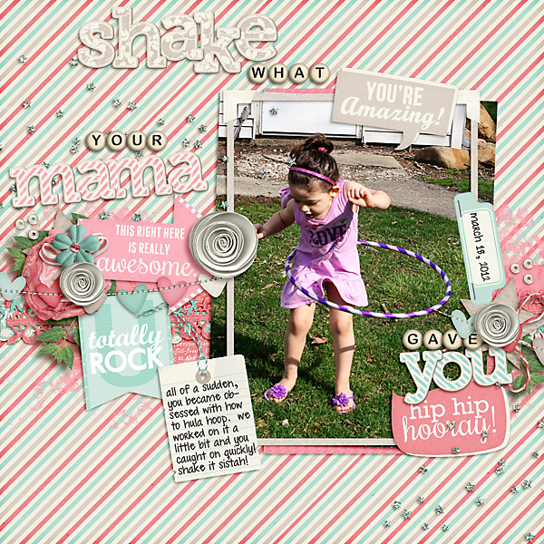
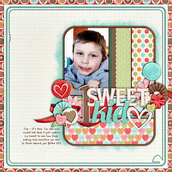
Now let’s take a look at some tips for using alphas for your title work. The biggest tip I can give you is to use big alphas for the words you want to stand out and smaller alphas for the smaller words like “the”, “and”, “of” or “in”… you get the idea. Here’s a couple layouts using small bead like alphas for the smaller words…
Here are a couple using smaller paper alphas for the smaller words…
Another fun thing to do is to replace some of the letters in the title with elements from the kit, like Darcy did in this layout…
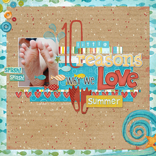
One of the things I like to do is actually use some of the word bits in the kit for some of the words, like in these layouts…
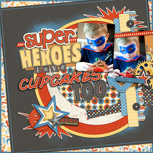
There are some other ways of being creative by using numbers as the main focus, like this layout by Keely…
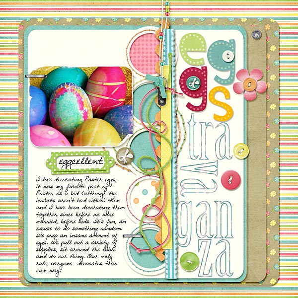
Keely’s always really creative in how she does her title, like this layout, she uses one alpha for “egg” and another alpha for “stravaganza” and she has them turned all sorts of different ways to fill up the side of the layout…
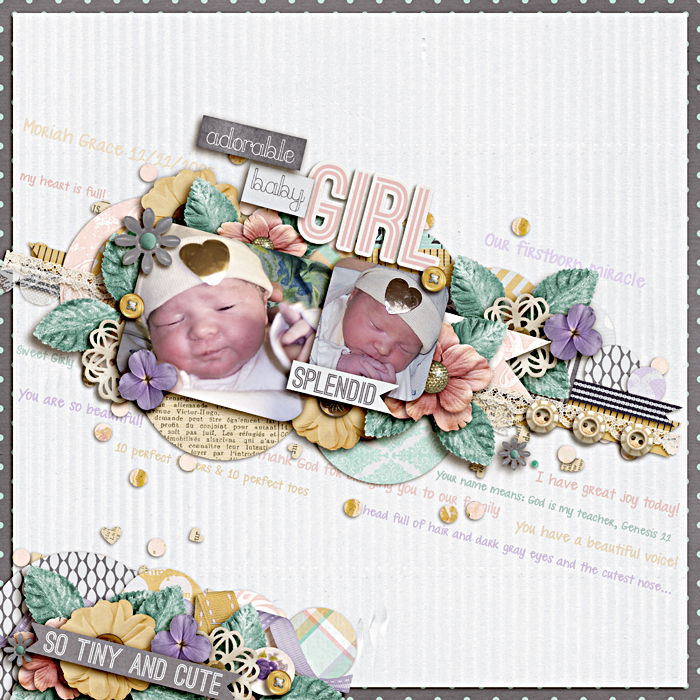
Sometimes there is a word art in the kit that is just perfect for a title, like in this layout…
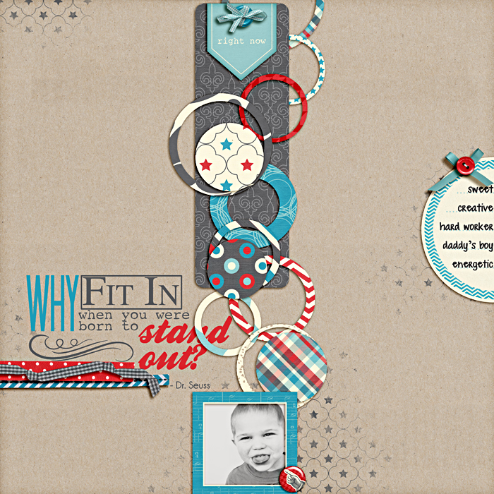
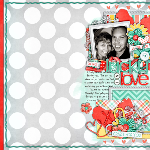
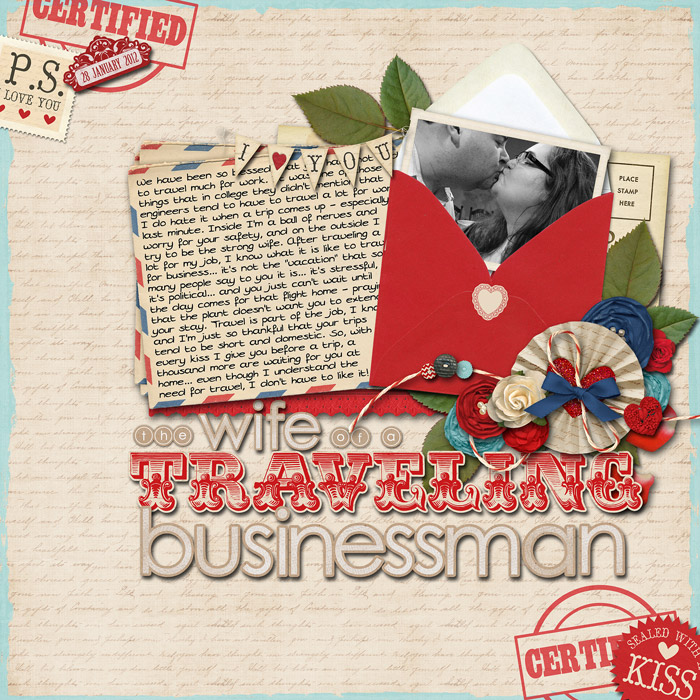
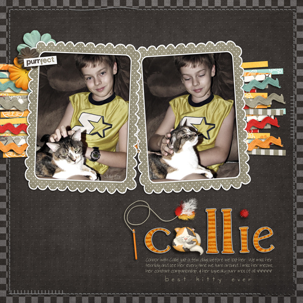
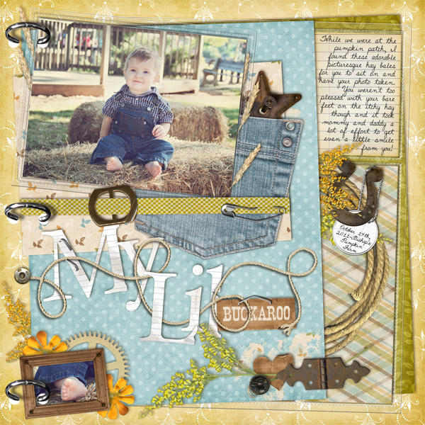
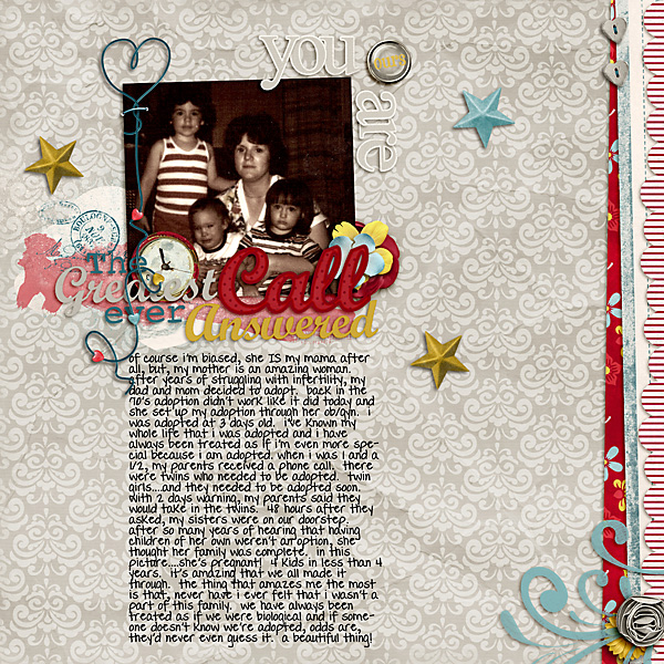
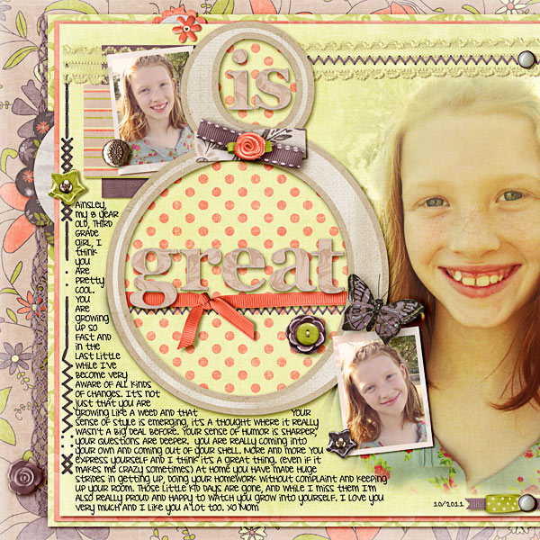
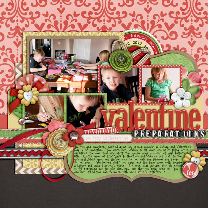
I’d say my biggest tip though, is to not be afraid to use a different alpha for each word of your title… it really does make the title stand out to see all the different alphas and fonts, like in these layouts…
I hope this gave you some ideas on how to create awesome titles for your layouts and feel free to browse the SugarBabe gallery and Designer gallery to see some other great examples of awesome title work that hopefully will inspire you to search outside of your kit and have some fun with using multiple alphas, fonts and elements in your title work.
Digital Art Journaling 101 Series | Traci Reed Designs said...
on November 26th, 2012 at 1:21 am
[…] awesome additions to your titles. I’ve also done a tutorial on title work, that you can find HERE. Psssst…I also hear there’s some awesome new alphas coming to SSD next weekend from […]