Thursday Treats – Color Therapy 3/17
“Mere color can speak to the soul in a thousand different ways.” – Oscar Wilde
Happy National Color Therapy Month! As scrapbookers, we are already aware – at least on some level – that color evokes mood, feelings, and sensibilities. But did you know it can be used for therapeutic purposes as well?
Color therapy is a powerful, complementary therapy that has been used since ancient times, whether it was for physical, emotional or mental healing purposes. It’s been said that Hippocrates understood the power of color … and used color ointments on his patients.
Today, color therapy may be as simple as wearing a particular color because you want to feel better about yourself, like wearing Red to have more energy or more courage or become more grounded.
Personally, I work with color in many different ways. I use colored lights, color sprays, color therapy glasses, drinking water that’s been solarized in colored glass bottles, colored gemstones, colored tuning forks—even writing with color.
But that’s not the only reason the month of March is one of the most colorful months of the year. This month marks the Ancient Indian religious festival of Holi, also known as the Festival of Love, the Festival of Spring, or the Festival of Colors. You may have seen gorgeous photographs of people in India or Nepal smearing one another with colors or throwing colored powder on each other. “Holi celebrates the arrival of spring, the end of winter, the blossoming of love and for many, it is a festive day to meet others, play and laugh, forget and forgive, and repair broken relationships.” source This year, Holi falls on March 17th.
You may wonder why those brightly colored pigments are used as part of the Holi celebration. According to the Times of India, “In ancient times, people used … plants’ colors … because the effect of colors on the human body was considered to be healing.” How apropos for National Color Therapy Month – it’s an ancient form of color therapy!
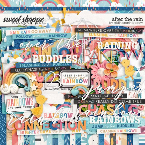
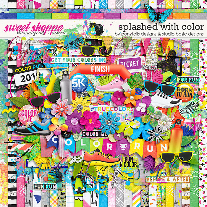
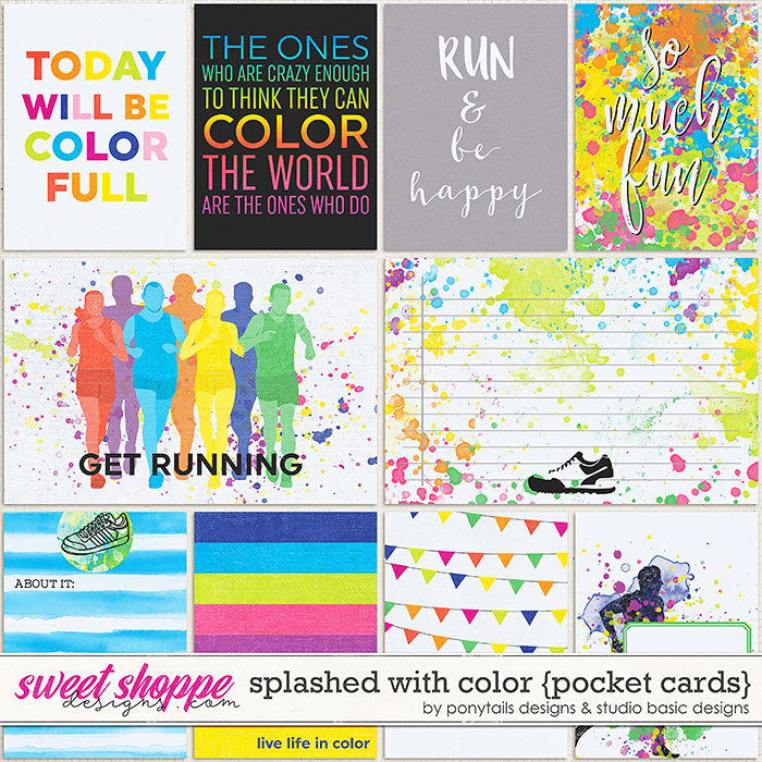
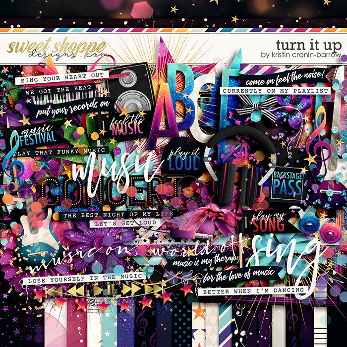
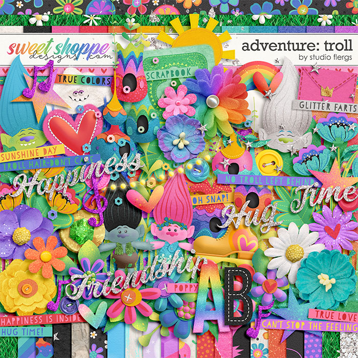
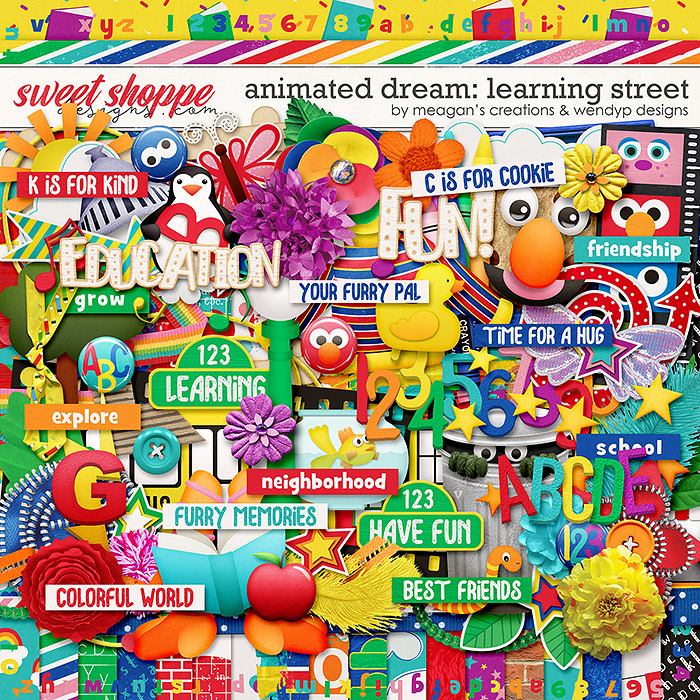
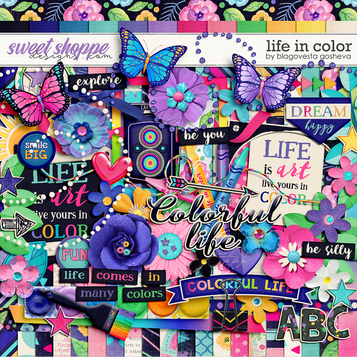
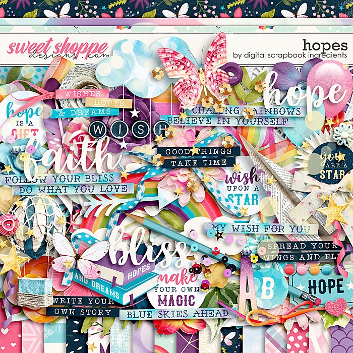
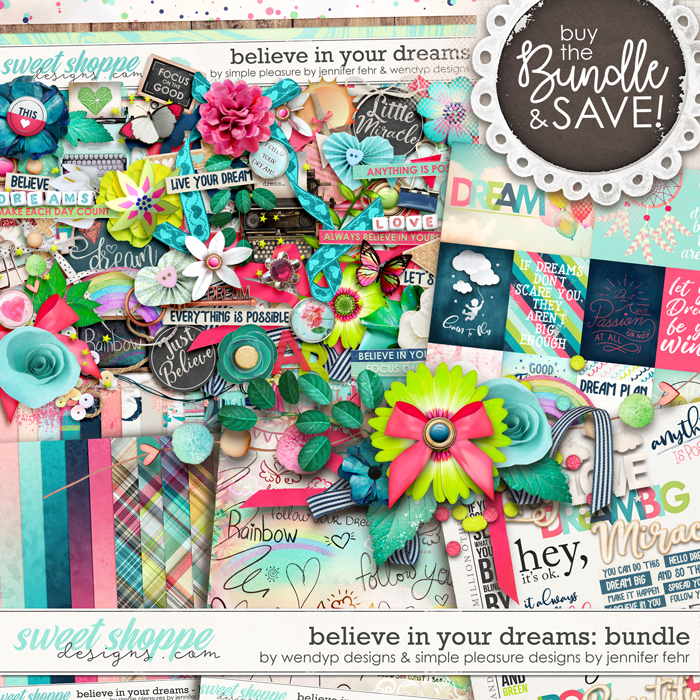
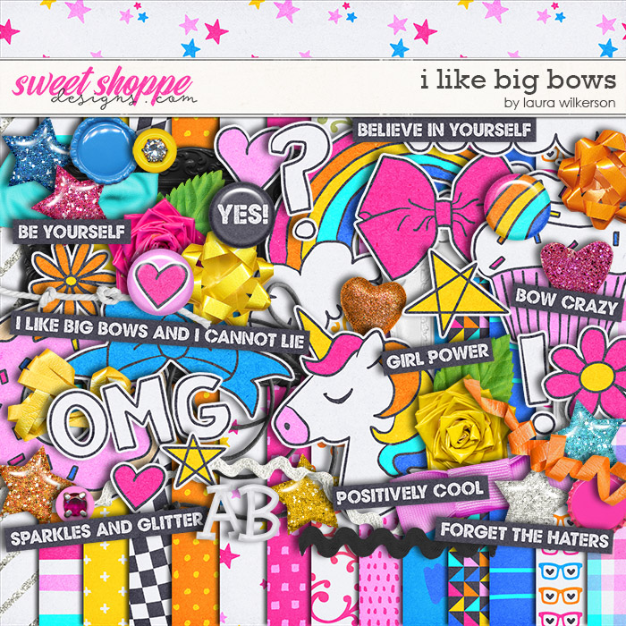
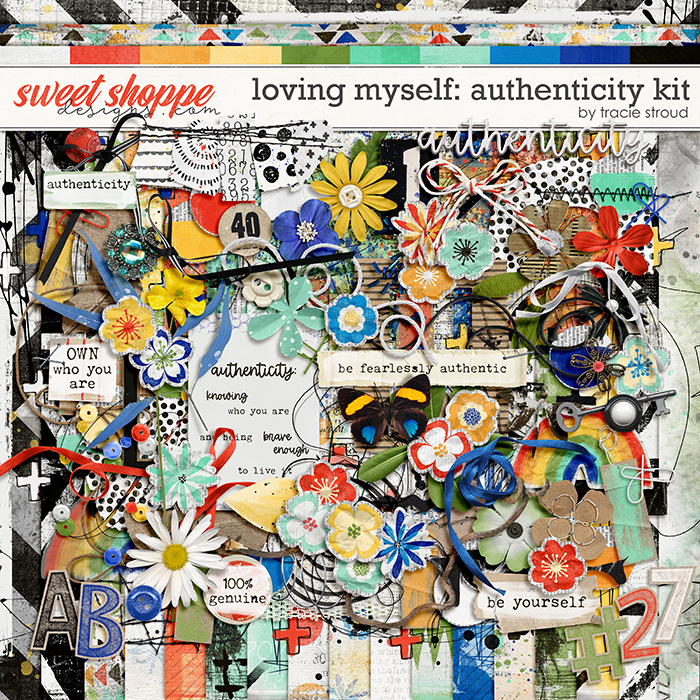
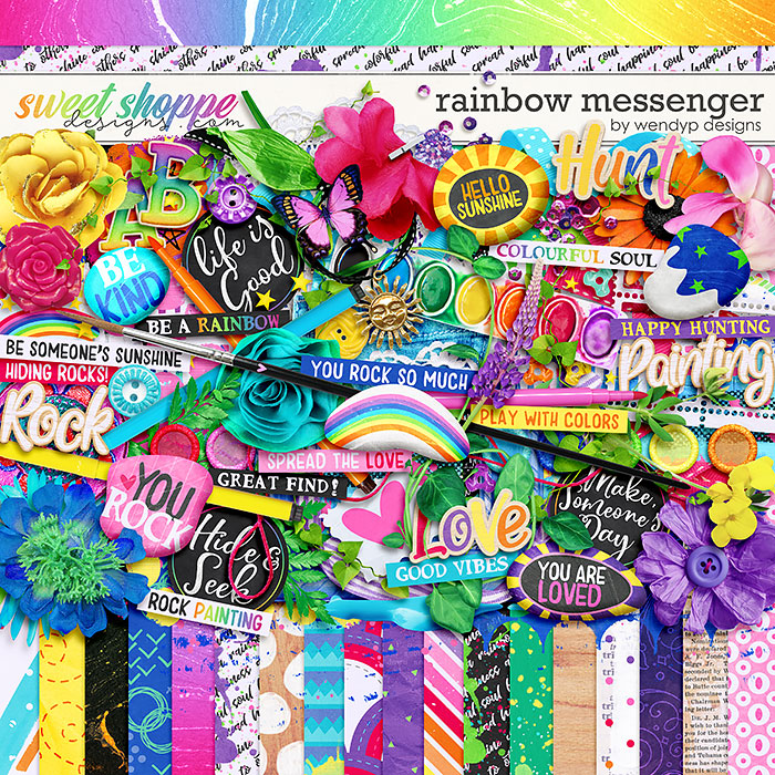
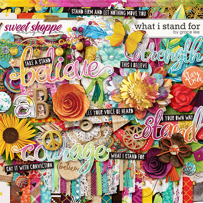
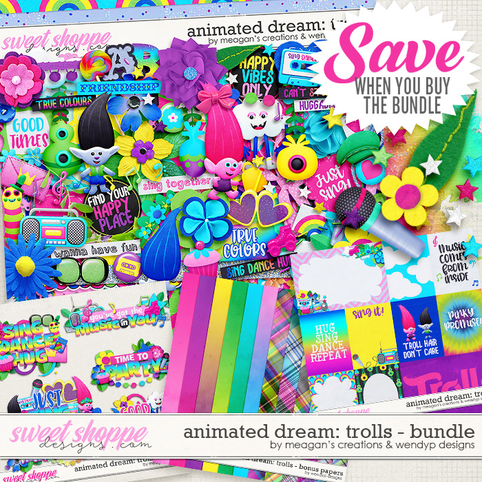
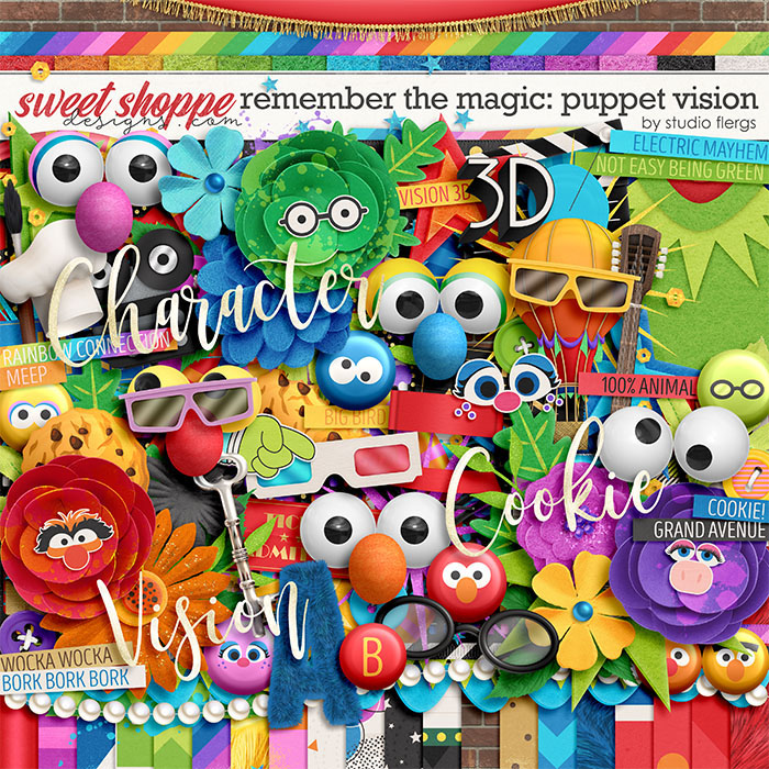
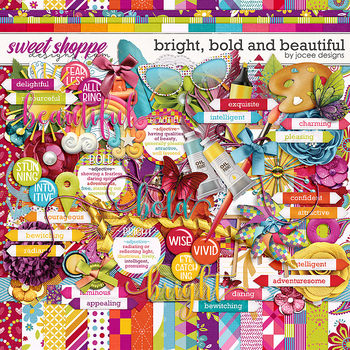
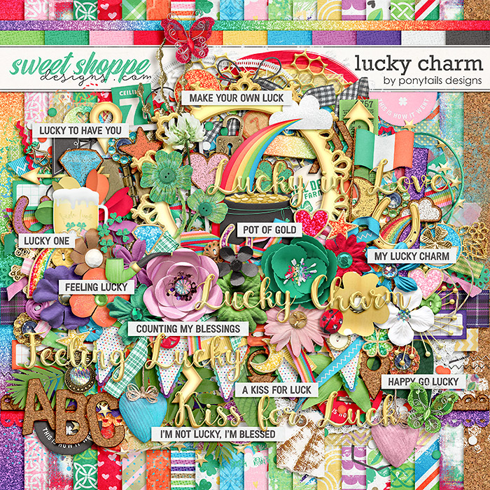
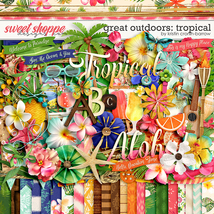
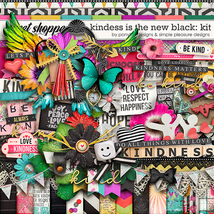
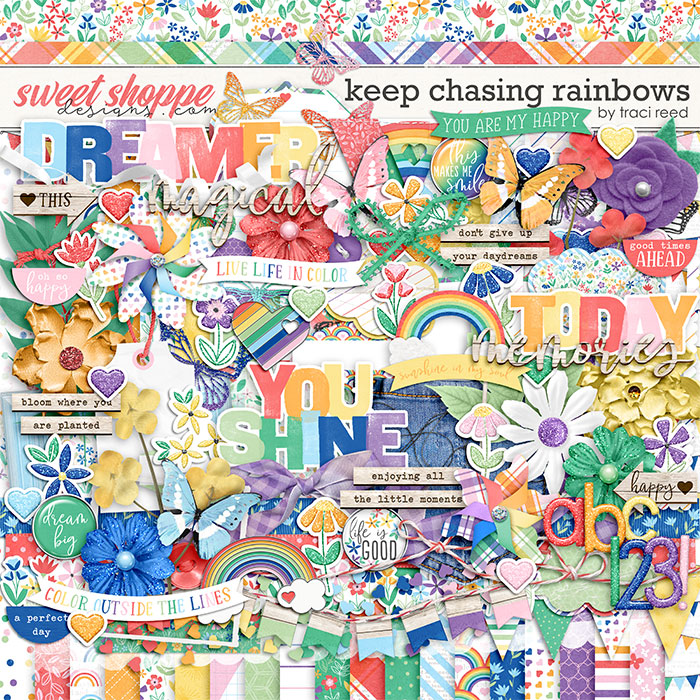
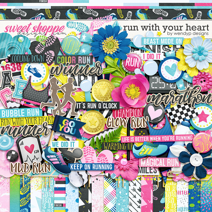
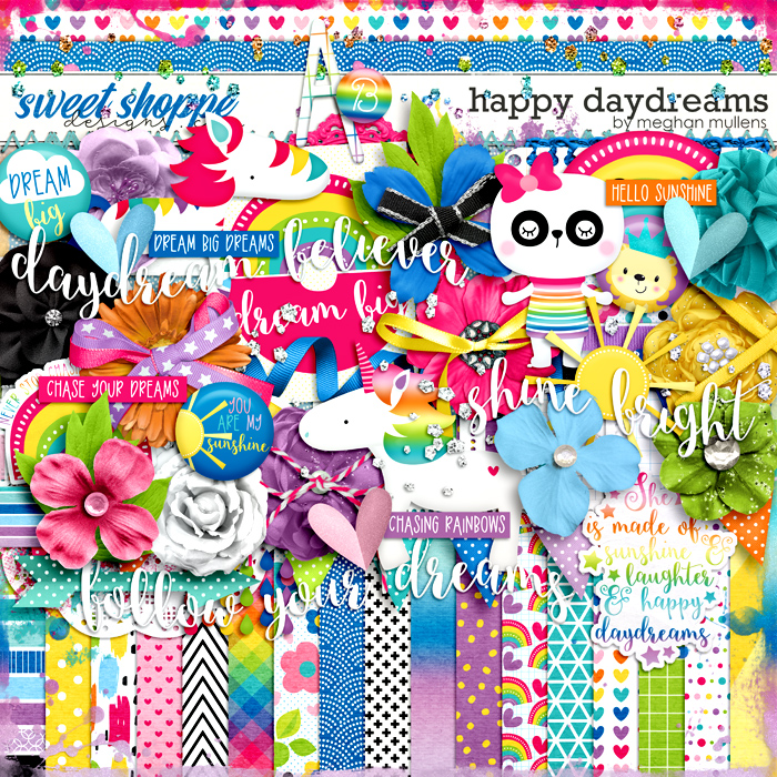
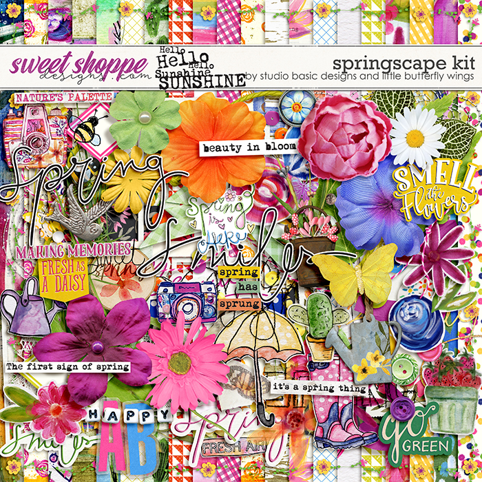
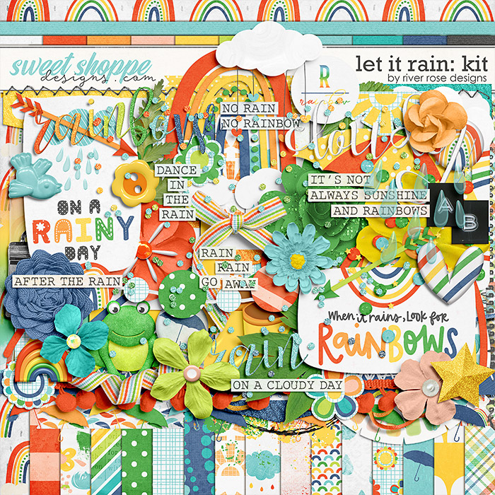
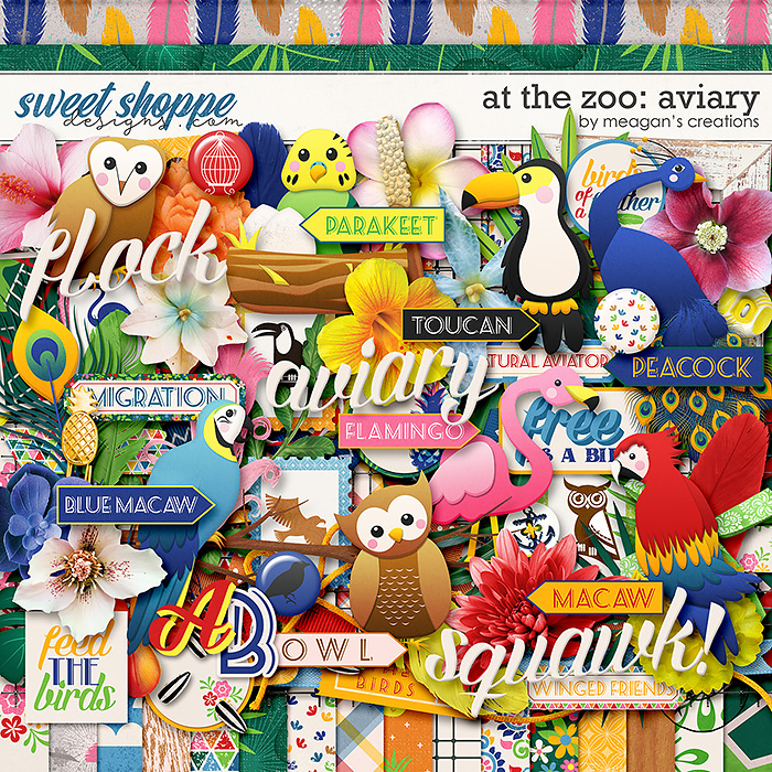
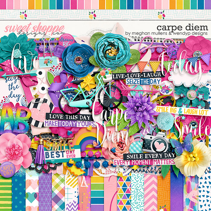
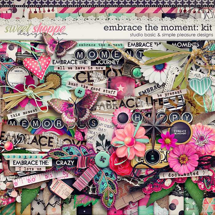
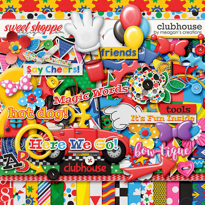
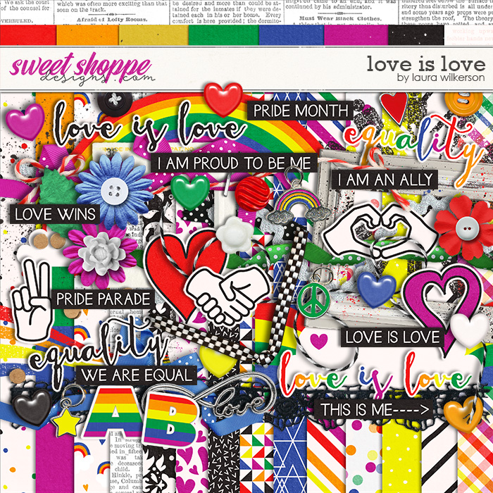
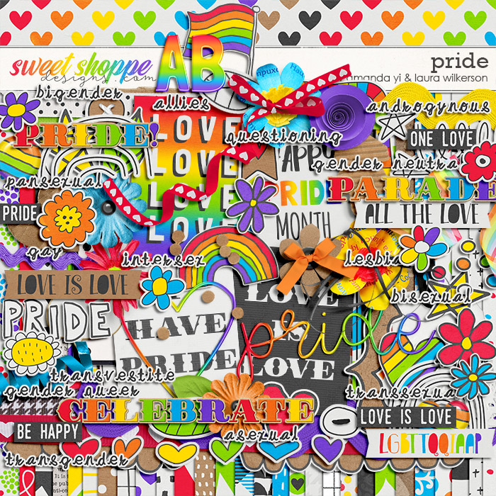
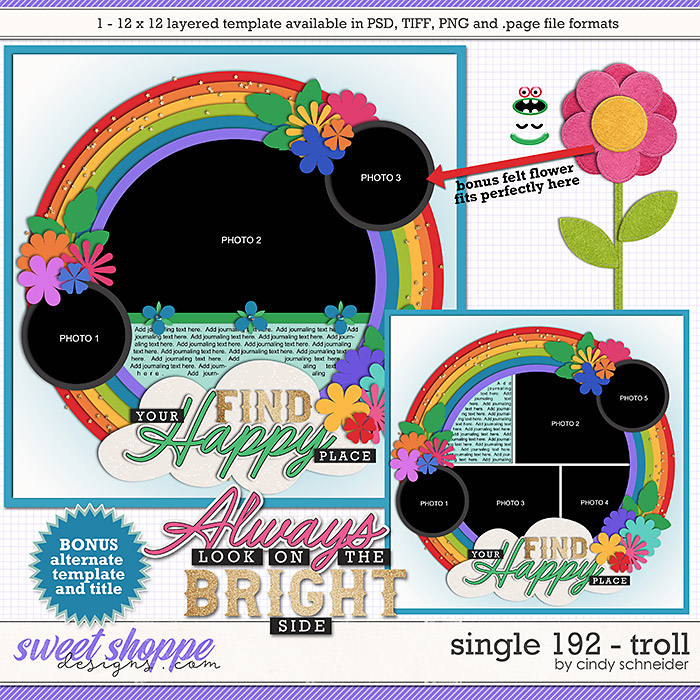
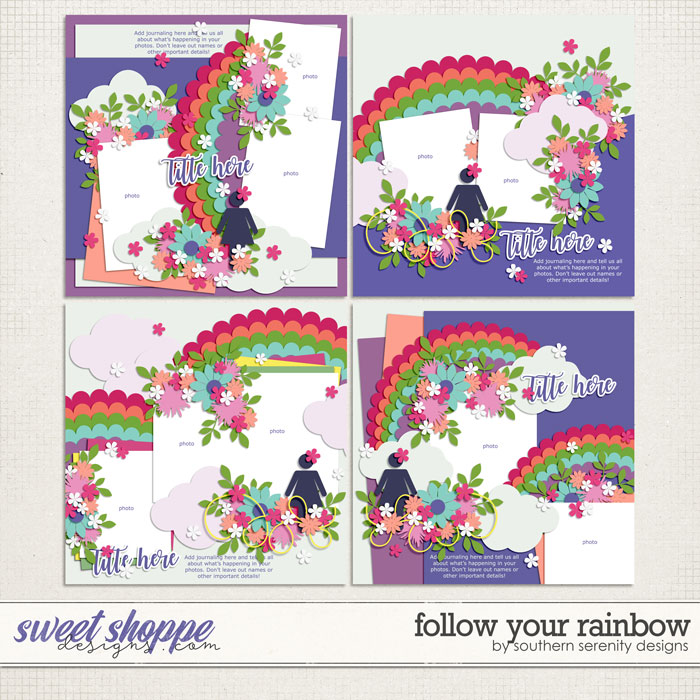
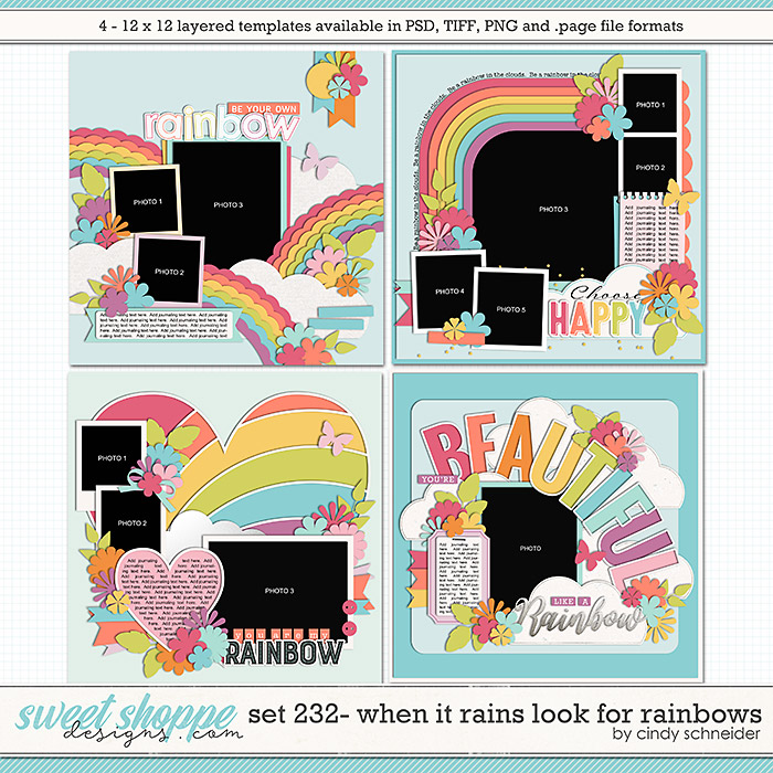
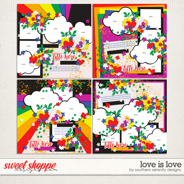
In honor of both this colorful festival and National Color Therapy Month, we’ve brought together a broad spectrum of kits and supplies from the Shoppe you can use to scrapbook your love of color. Be sure to scroll to the bottom of this post where you’ll find a brief guide on the psychology of color and which colors you can use to evoke specific feelings on your layouts.
A Brief Run-Down on Psychology of Color For Your Next Layout:
Warm colors (like red, yellow, orange, and variations like pink and coral) generally evoke warm feelings like optimism, enthusiasm, and passion.
Cool colors (like green, blue, purple, and variations like aqua and lavender) typically have a calming effect; they tend to be relaxing and subdued.
Red – Passionate, aggressive, important. “Red adds gravity and heightened awareness – quite literally, as the color increases blood circulation, breathing rates, and metabolism.” “The unifying factor in all meanings is a sense of importance.” Intense emotions ranging from anger, aggression, stress, wrath, sacrifice, danger, heat, passion, sexuality, desire, love, warmth, strength, courage, confidence, and power.
Pink – Feminine, young, innocent. Romance, youthfulness.
Orange – Playful, energetic, activity, energy, fresh, healthy. Peach is sweet and affable; vibrant orange is vitality, energy, and encouragement.
Yellow – Happy, friendly, cheerfulness, friendliness, joy, energy, mental clarity, intellect. “Lighter shades play on the happiness aspects … darker shades, including gold, add more weight and give a sense of antiquity.”
Green – Natural, stable, prosperous. Organic, natural, stability, envy. Brighter, lighter greens evoke growth, vitality, and renewal; darker, richer greens represent prestige, wealth, and abundance. Acts as a bridge between warm and cool colors.
Blue – Serene, trustworthy, inviting. Reliability, trustworthiness, communication, calming, tranquil, harmony, coldness, aloofness, indifference, sadness, depression. “Studies show that [blue] actually acts as an appetite suppressant.”
Purple – Luxurious, mysterious, romantic. Royalty, majesty, nobility, luxury, opulence, feminine, sentimental, nostalgic. “Lighter shades bring to mind spring and romance … darker shades add more mystery … symbolize creativity.”
Brown – Earthy, sturdy, rustic. Wholesome, orderly, grounded, simple, strong, durable, sturdy, natural.
White – Clean, virtuous, healthy. Simplicity, purity, innocence, perfection.
Black – Powerful, sophisticated, edgy. Formal, luxury, elegance, sophistication, exclusivity, death, evil, mystery.