One Sketch, 9 Layouts: Making a sketch your own – 4/18
There’s 12 days left in April – how are your This or That? Challenges coming along?
One of the things I enjoy about our monthly scrapbooking challenges is their variety. In our list of 15 challenges where you can choose “this” option or “that” option, you’ll find everything from topic ideas (#1a Sunshine & Rainbows or #1b Storm Clouds & Raindrops) and photography challenges (#4a Reflections or #4b Shadows) to products (#15a Polaroids or #15b Photo Props) and techniques (#10a Taped Down or #10b Cut Out). But my favorite has to be the sketch challenge.
I’ve always loved using sketches as a starter for my layout. If I don’t feel like beginning with a layered template, a sketch is the perfect way to give my page some initial structure that I can then embellish to my heart’s content.
This month, I was tickled to provide one of the sketches for Challenge #14. In today’s blog post, I’m going to share 9 layouts from our community of scrapbookers that all began with this sketch:
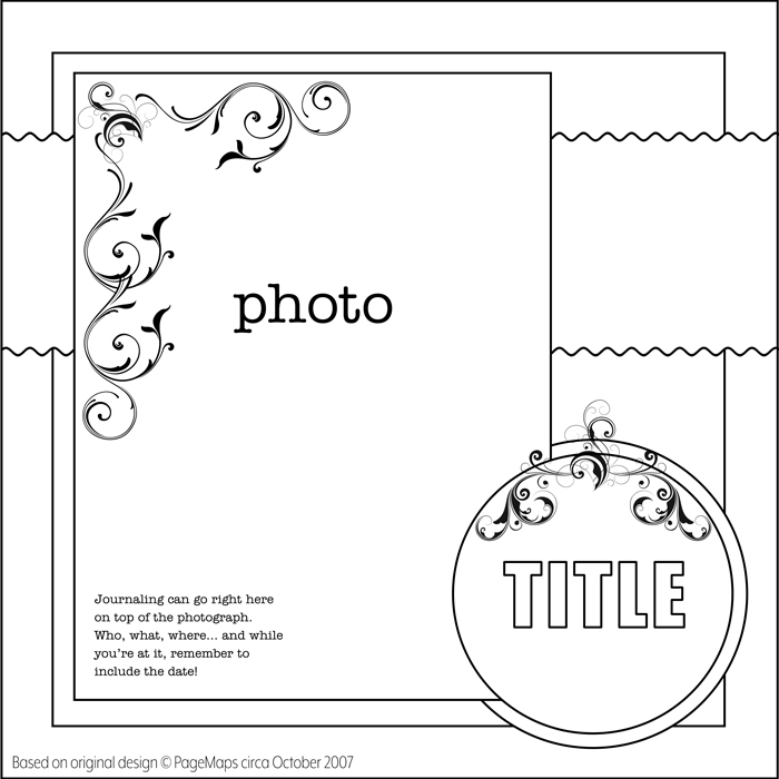
It’s a very “vintage” design circa 2007 (15+ years qualifies it as vintage in the scrapbooking world!) so I was excited to see how our layout artists would interpret and update it. And they did not disappoint!

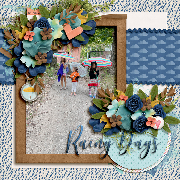
Rainy Days by Leablahblah
Lea’s layout is a straightforward layout based on the sketch. In place of the decorative scrolls directly on the photograph, she used floral clusters which are very current and on-trend. Lovely!

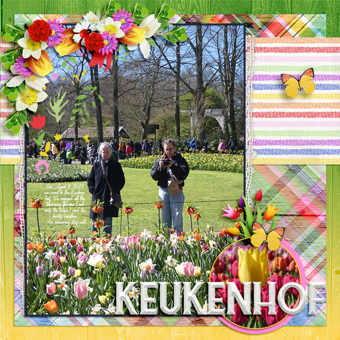
Keukenhof by Romajo
Romajo’s layout is another straightforward interpretation of the sketch, using floral clusters in place of the decorative scrolls. I especially like the way she had those tulip elements “break out” of the circular frame.

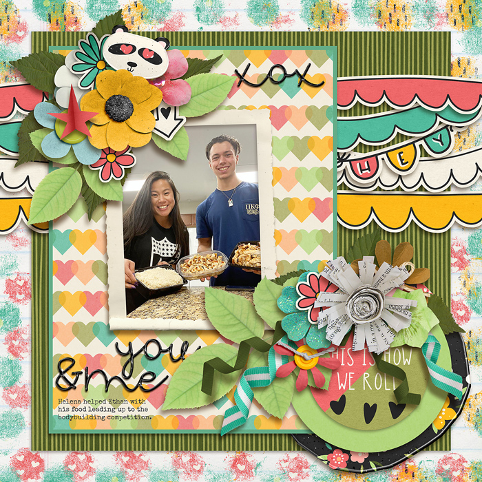
This is How We Roll by SweetChar
Charlene took a twist on the sketch, replacing the wide paper piece running behind the main photograph with a series of decorative borders and banners. Very fun!

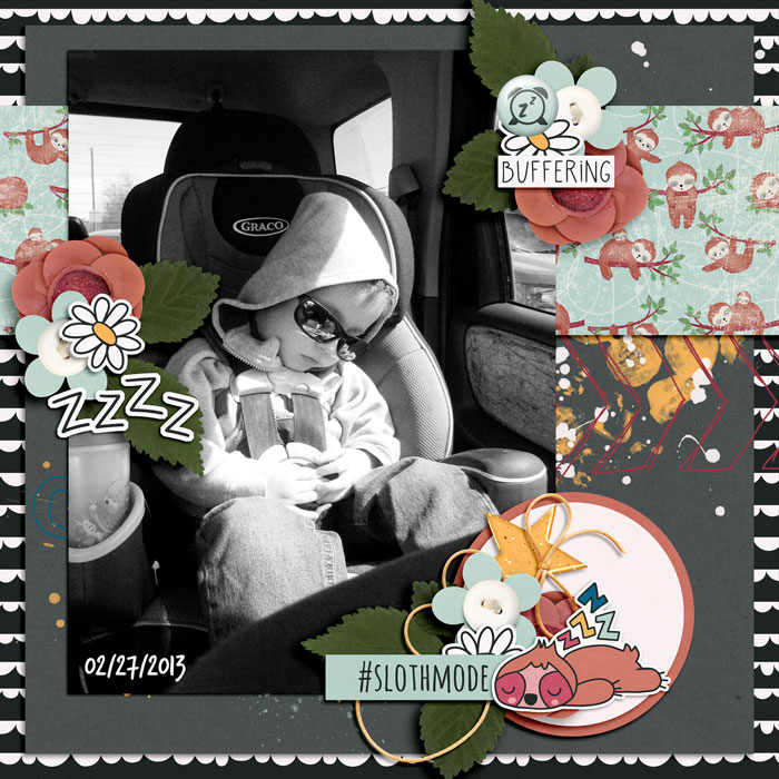
Sleeping C by Kimberly27
Kimberly opted to shift around her decorative elements from where they were on the sketch. Rather than two clusters – one in the corner of the photo and one above the circular title piece – she created a visual triangle with three smaller clusters that lead the eye around her layout. Simply lovely!

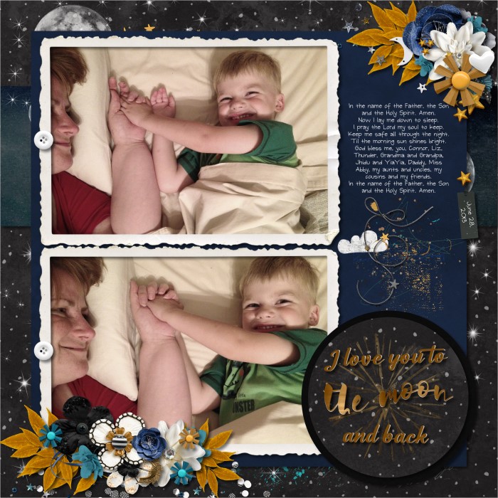
Prayers by bienejen
Jennifer also changed the location of her decorative clusters from the sketch, but her biggest change was to split the single portrait-oriented photo block into two smaller landscape-oriented photos. She’s placed their mats so close together that they visually “read” as a single block. This is a great way to alter a sketch when you need more photos than it’s originally designed for. Nicely done!

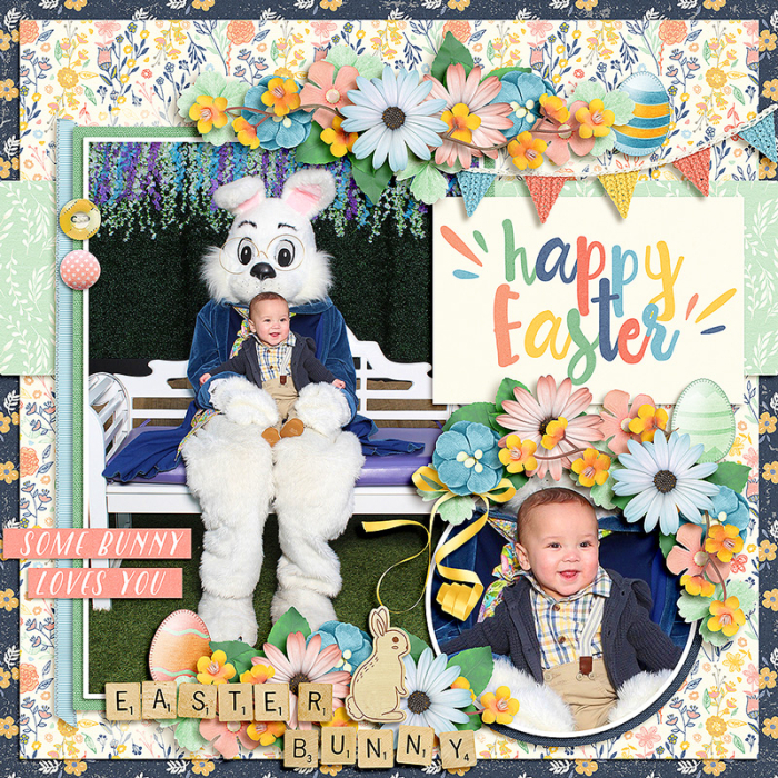
Benjamin Meets the Easter Bunny by crazycat1126
Catherine’s approach is another great way to incorporate additional photos into a sketch. Rather than using the circle as a title block, she replaced it with a close-up of baby Benjamin. It provides the perfect contrast to the full-length shot of him with the Easter bunny, and allows the viewer to appreciate his sweet grin. Just perfect!

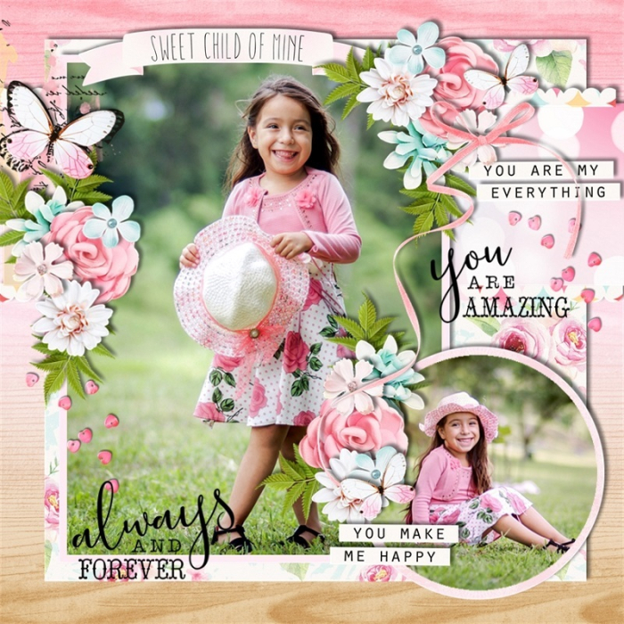
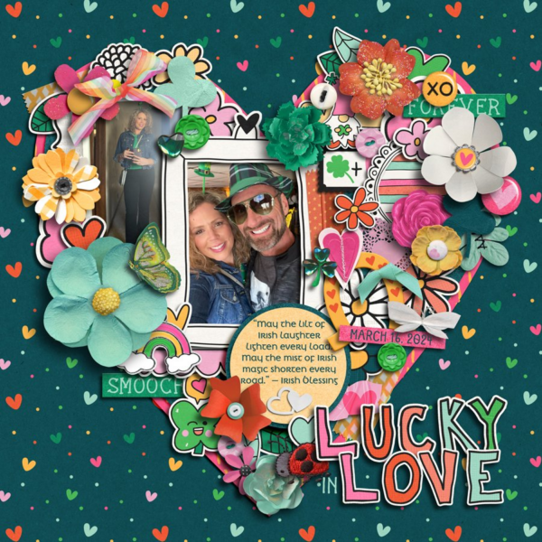
Always and Forever by scrappinnewbie
Melinda took a similar approach to Catherine – using the circle for a second photograph rather than the title block – and the results are gorgeous! I like the way she added a banner above the large photograph for her title and used three floral clusters to draw the eye around her page.

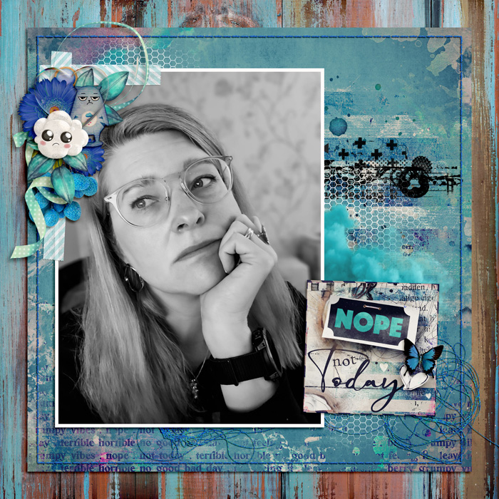
Nope by Cinna
Cinna’s moody layout illustrates how any sketch can be adapted to your personal scrapbooking style. She replaced the horizontal paper strip with a series of paint layers, stamps, and stitches, and she changed the smaller block from a circle to a square. I love all the texture in this layout and the way Cinna used a black-and-white treatment on her photograph to convey a bleak mood.

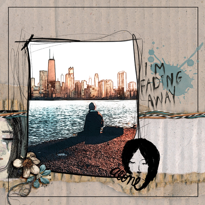
I’m Fading Away by Dady
Of these nine layouts, Dady’s is perhaps the furthest from the original sketch, but you can still see it in the bones of her page. She replaced the circular title block with the stamp of the woman’s face, and instead of paper mats, she used a doodle-style border (around the photo) and a simple lined border (on the page). She also shifted the horizontal paper mat toward the bottom of the layout and replaced it with both torn elements and layers of string. It’s the perfect example of how a sketch can be interpreted in a completely different visual style.
One sketch … nine very different layouts. The next time you start your layout with a sketch, remember these five ways you can make it your own:
- Swap out dated decorative elements for more modern ones
- Change the location of decorative clusters
- Break one photo block into two or more
- Swap a title block for a photo, or a photo block for a title, word art, or journaling card
- Replace basic structural elements with layers of multimedia
What other methods do you use to customize your layouts based on a sketch? Tell us in the comments below!

Charlene said...
on April 19th, 2023 at 5:34 am
It’s fun seeing various takes on the same sketch.
LidiaG said...
on April 19th, 2023 at 11:19 am
These are great examples! I sometimes like to flip or rotate a sketch to give it a completely different look. There are times I start with a sketch and by the time I’m done it doesn’t look anything like it but like you said, it’s a great starting point when you’re staring at a blank page and you don’t know where to begin.
leablahblah said...
on April 19th, 2023 at 1:52 pm
I love seeing all the differences in the layouts from one single sketch. So fun! Thanks for picking mine.
Bienejen said...
on April 21st, 2023 at 11:57 pm
This was so fun to see such a variety of interpretations! Thanks for including mine!!
Carina said...
on April 22nd, 2023 at 11:45 am
Loved seeing the variations of interpretations – and thank you so much for picking mine!!!
StephC777 said...
on April 25th, 2023 at 10:22 am
This post inspired me to scrap this sketch – love how it turned out =)