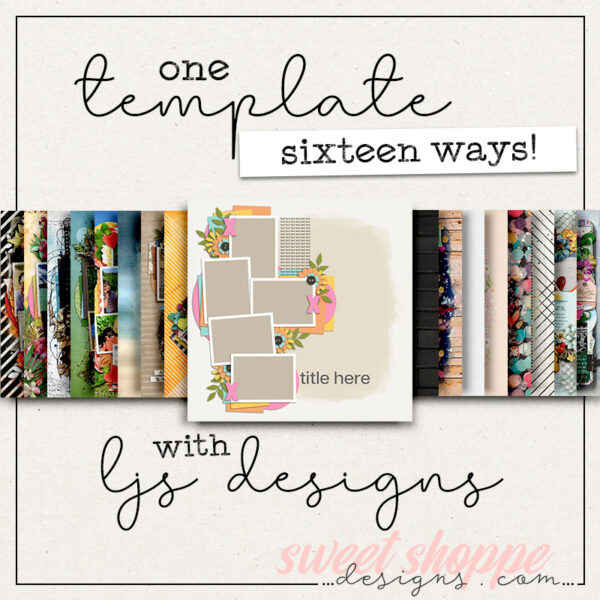
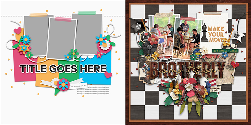
One Template, Seventeen Ways with Studio Liv
In the words of author Jonathan Swift, “Vision is the art of seeing what is invisible to others.” Here at the Sweet Shoppe, that’s what our “One Template, Many Ways” series is all about!
In this monthly feature, we challenge our creative team – known as the Sugar Babes – to work with one digital scrapbook template. The goal is to see how many different layout variations they can create in order to showcase the true versatility of layered scrapbook templates. Along the way, you’ll be inspired by lots of gorgeous layouts and pick up more than just a few ideas for your next scrapbook page.
This month, we’re featuring a set of templates from Olivia of Studio Liv. Liv’s kits are full of vibrant colors and lots of hand-drawn elements. Her templates are equally vibrant and graphic, filled with bold shapes, paper layers, prominent photo masks, and just the right amount of embellishment.
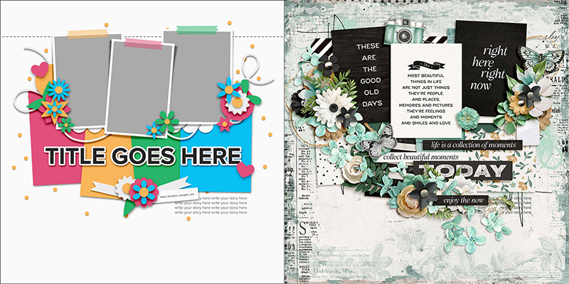
We’re working with a brand-new pack of templates that will hit the Shoppe this weekend (May 31st) so this is a fun sneak-peek of a new release! It includes four coordinated templates, each featuring lots of paper layers, sizeable masks set aside for your photographs, space for big, bold titles, and ample whitespace.
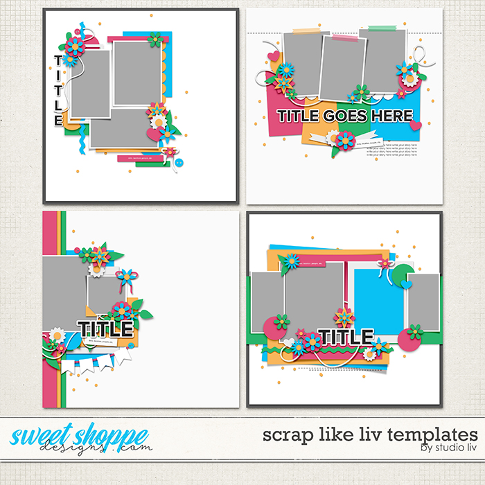
These templates are all sized for 12″ x 12″ @ 300dpi and are available in PSD, TIFF, and PNG formats for use with your favorite digital scrapbooking programs.
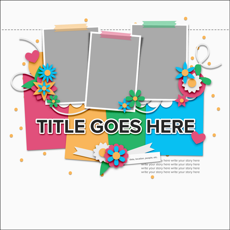
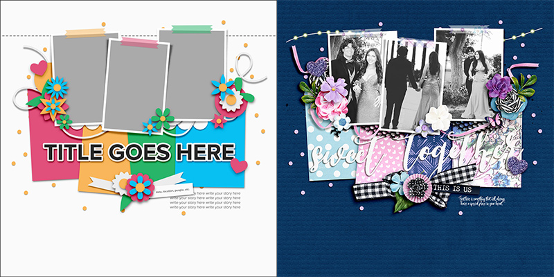
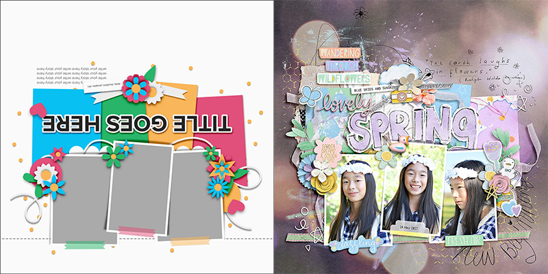
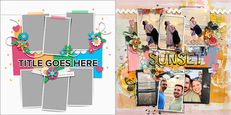
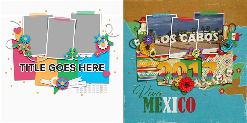
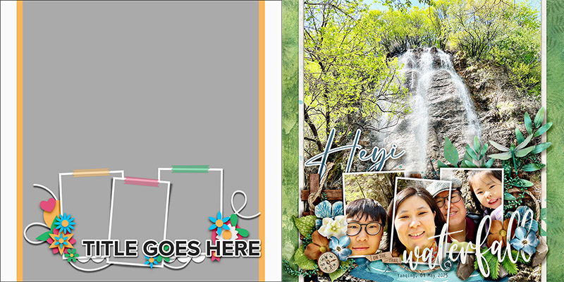
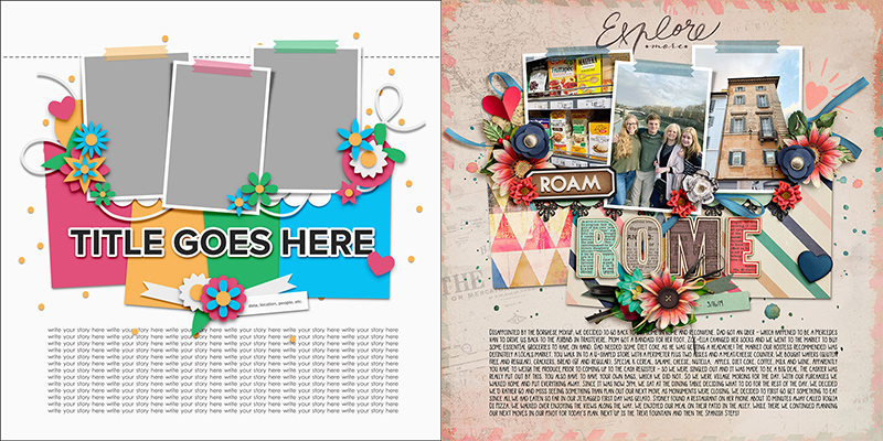
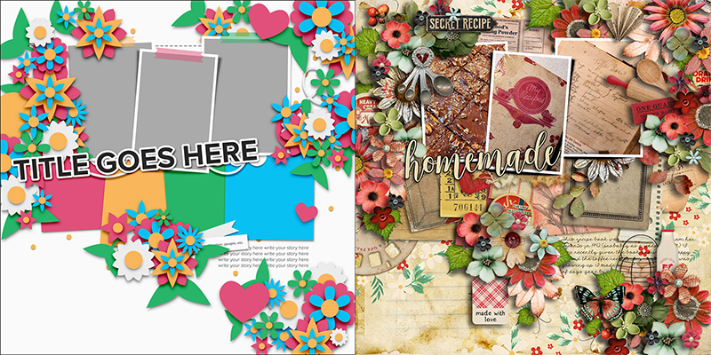
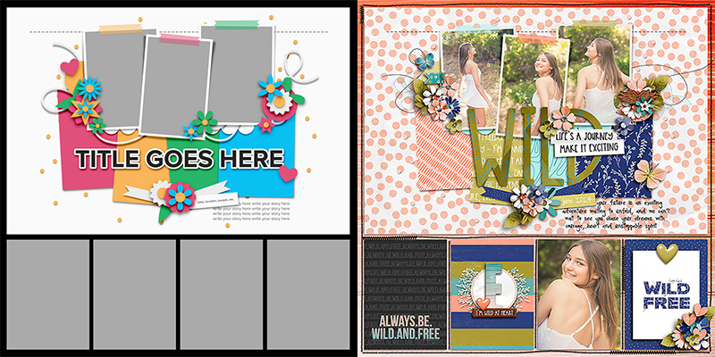
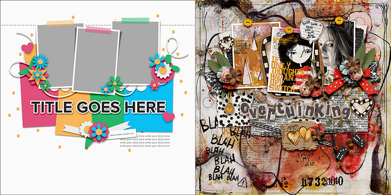
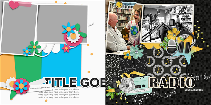
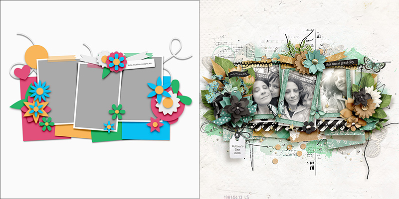
For this month’s challenge, we’re working with the template in the upper right-hand corner. It has three portrait-oriented photo blocks backed by four large paper pieces. There’s lots of room for an eye-catching title, space for journaling directly on the background paper, and three element clusters arranged in a visual triangle that draws the eye across and around the layout.
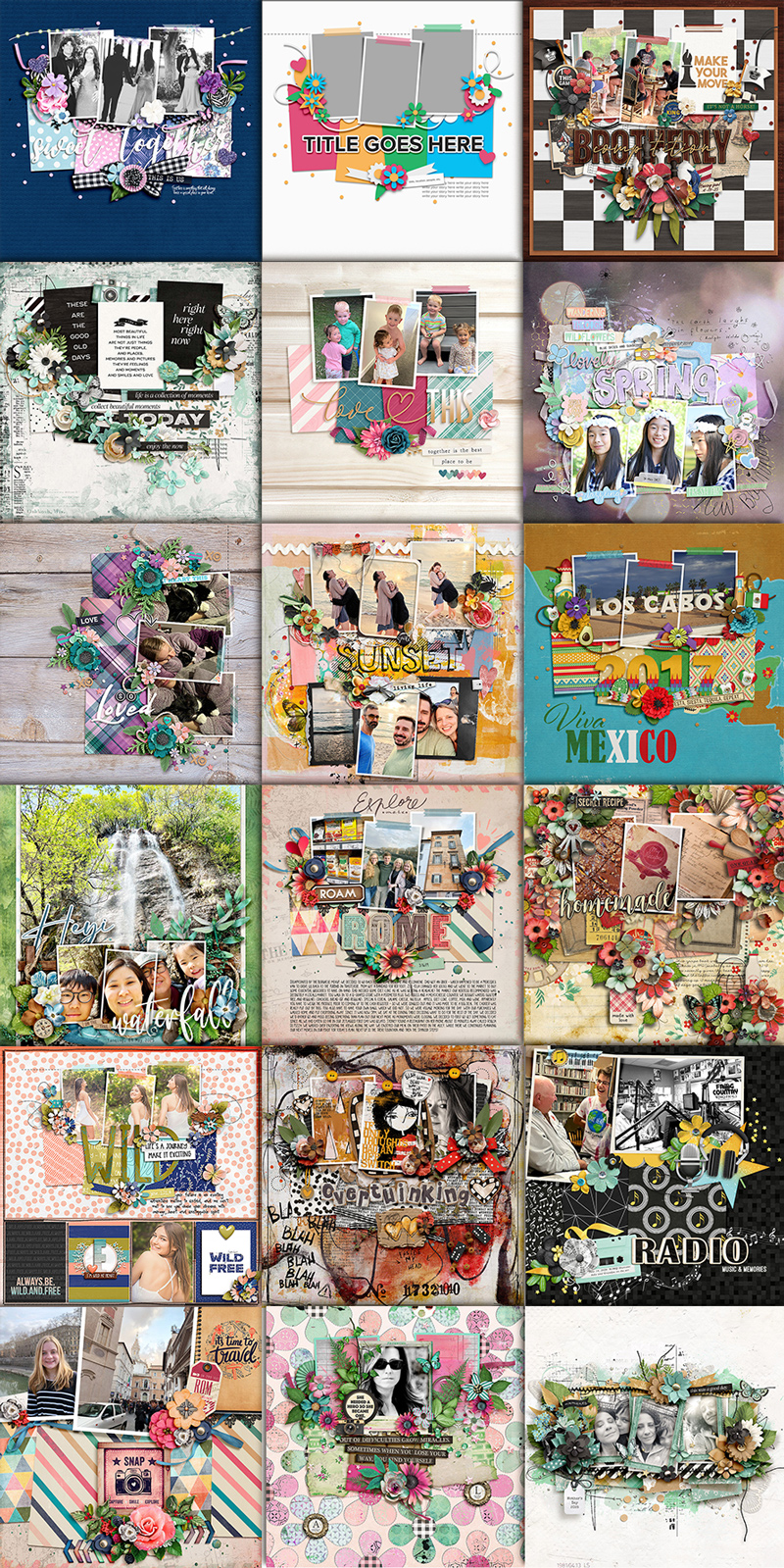
We gave this template to our creative team of Sugar Babes and challenged them to use it as the starting point to create as many unique layouts as possible. They came up with seventeen different layout variations based on this one template. Just wait until you see this gorgeous roundup of layouts!

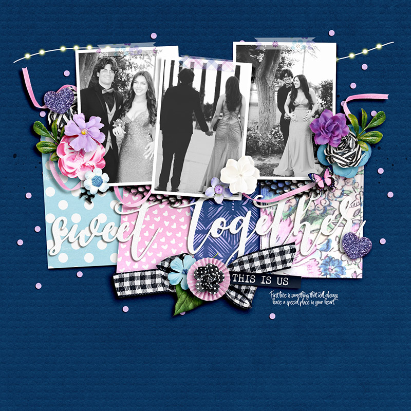
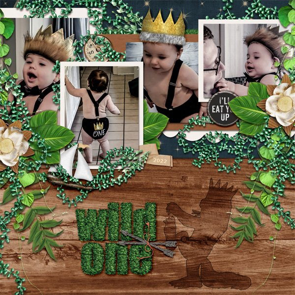
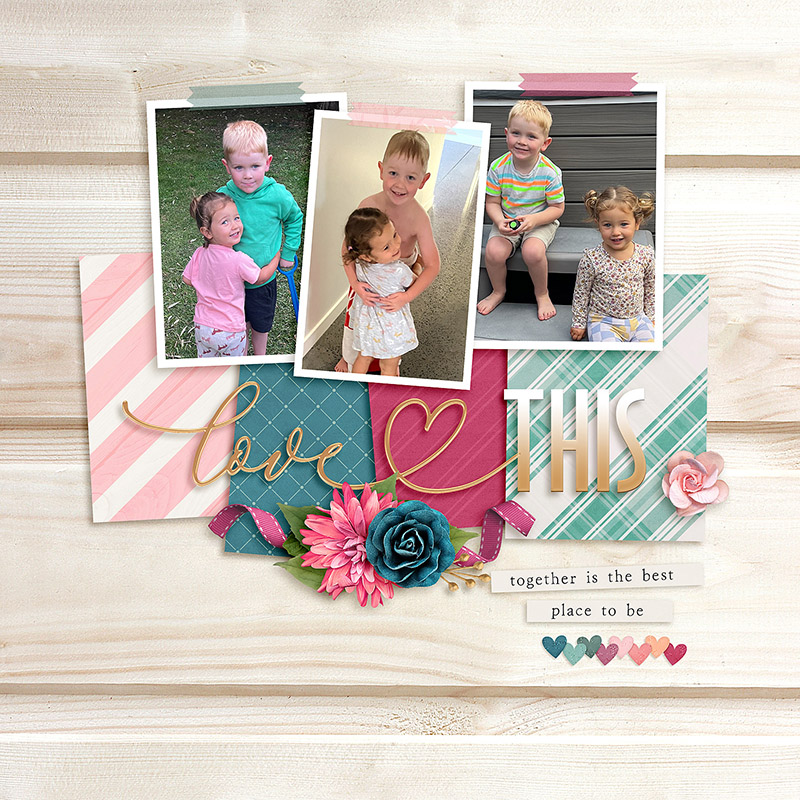
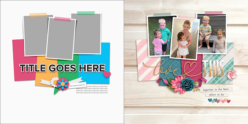
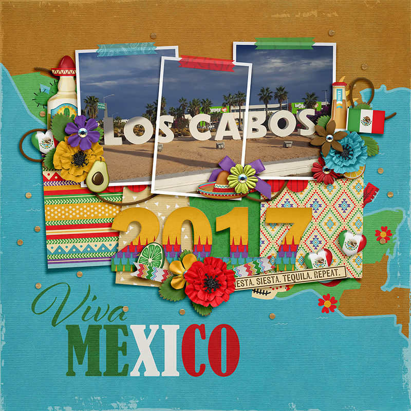
Carrie kicks off this month’s post with a layout that’s a straightforward interpretation of the template. She clipped three photographs to the provided masks and chose four beautiful patterned papers for the four paper shapes. Then she built her title from two pieces of word art, replaced each of the floral and foliage layers with elements from the kit she chose, and used ribbon in place of the string layer. Finally, she added a little bit of journaling with a handwriting-style font and voila! One beautiful layout of a special event!

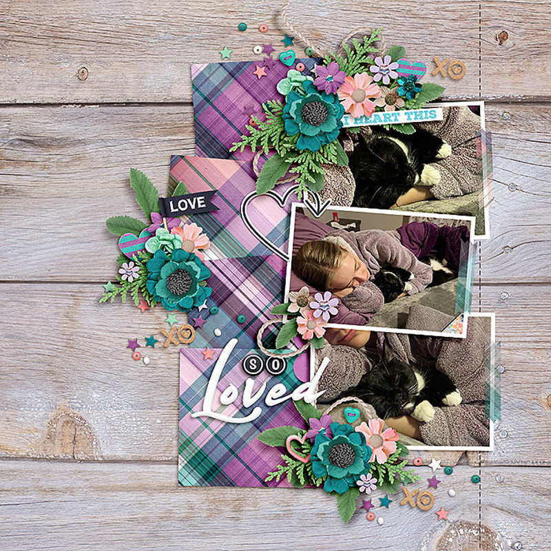
Charlene demonstrates how you can make use of this template even if you have fewer photographs than the template is designed for. After clipping her photos to the first two photo masks, she used a pre-designed pocket card for the third spot. Then she replaced the paper layers with similarly sized ephemera from the kit she was working with. She built an absolutely stunning title and embellished her clusters with themed elements from the kit. It’s absolutely gorgeous!

Trina shows us how easy it is to use this same template with zero photographs – instead, clipping pocket cards with word art to the three photo masks. It’s a great approach to use when there’s a story you wish to tell but don’t have any photos to support it. Simply find a kit with a theme that’s similar to your message, and make use of those gorgeous pocket cards!

If you’re more of a clean-and-simple scrapbooker, Jacinda’s layout is one you’ll definitely want to check out! She started with the same template but removed most of the layers of embellishments, leaving only the ribbon-and-floral cluster beneath the title. The result is a layout with fewer decorations that places more emphasis on the photographs and patterned papers. Simply beautiful!

Eve is the first Babe this month to take the layout for a literal spin. She rotated the template 180 degrees so that the photos sit at the bottom of the canvas rather than at the top. She clipped in four patterned papers but also added layers of paint and doodles to give her layout a more “artsy” look and feel. I love the quotation from Ralph Waldo Emerson hidden on the background – it’s the perfect complement to her happy photographs!

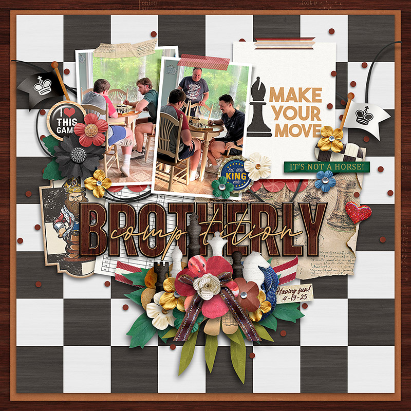
Cassie turned the template 90 degrees clockwise so that instead of three portrait-oriented photo masks, she now had three landscape-oriented spaces. Remember this trick the next time you want to scrapbook a set of photos with a different orientation than the template has space for! Also notice that by using the same plaid paper for all four paper blocks, she was able to incorporate lots of color and a bold, graphic design without it overwhelming the photographs. Nicely done!

Got lots of photographs? Be like SugarBabe Ally and duplicate the template’s photo masks! This allowed her to include a whopping six pics on one layout. I love the way she used a variety of frames from her chosen kit to provide some variation and additional visual interest to the page. And all that paint on the background? Just gorgeous!

Amie’s vacation layout demonstrates a fun technique: clipping one large photo across all three photo masks. It’s easier to do than it looks. Start by dragging your photo onto the layered template; resize it so it covers all the photo masks, and then duplicate it twice. Then clip the three copies of your photo to the three different masks. ¡Ahí está! One bonito result!

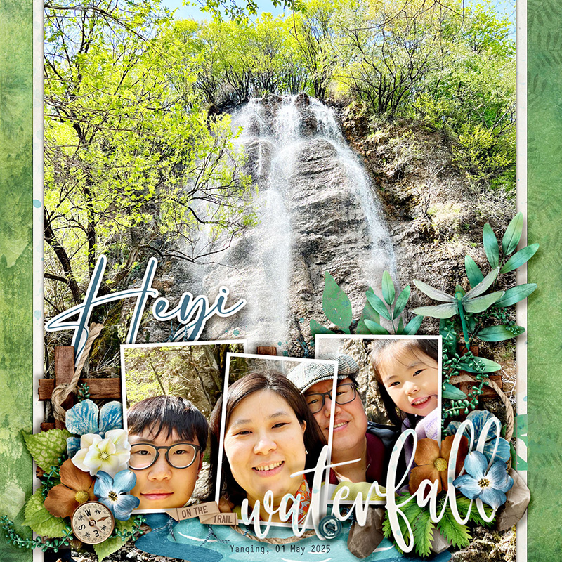
If you love photographs as much as I do, then you’re probably on the lookout for ways to include great big full-page shots in your albums. Sherly demonstrates one way to do this by using a big photo as her background. Here’s how she made it work: First, she removed the four paper blocks, leaving only the three photo squares. Then she slid them down on her canvas to the bottom of the page so they’d sit at the base of the waterfall. Next, she took a selfie of her family and clipped it across all three of the photo masks (using the same technique as Amie did above). Finally, she positioned the title in the lower right corner and replaced all the element layers with bits and bobs from her selected kit. I just love the end result!

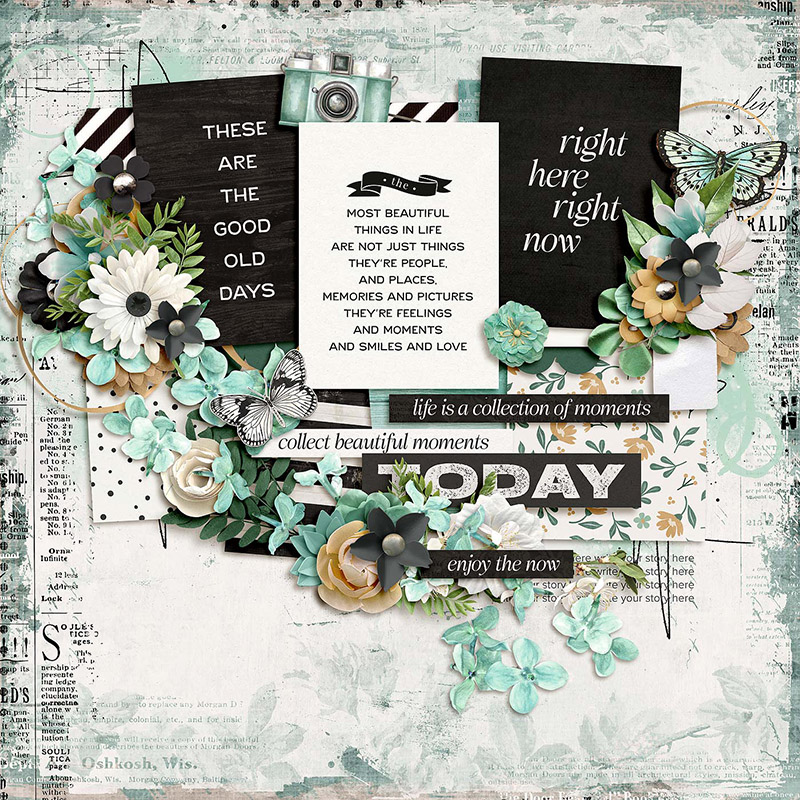
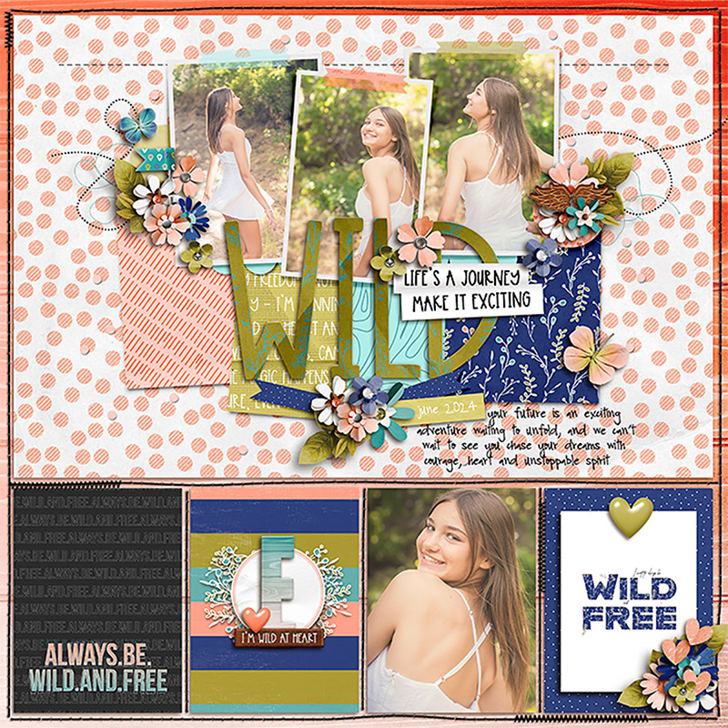
Got lots and lots to say? Krista shows us how to include a longer narrative on this template by repositioning and resizing the text block. Notice that when she dragged out her new journaling text area, she kept the same margins as the other elements on the page. This allowed her to maintain some of the whitespace and end up with a cohesive, well-designed scrapbook page.

If you love flowers and foliage and ALL THE ELEMENTS, you can take Jill’s approach and fill your layout with element clusters. Jill left the photos, paper blocks, and journaling area as-is, but added more flowers, foliage, and themed elements around the upper left and right corners of the canvas. Then she took the cluster below the title and built it up, and finally added another element cluster to the bottom right of the page. It’s a great way to make full use of a kit you love while still using the template as a starting point. Well done!

Do we have any pocket-style scrapbookers in the house? Krista Lund is our resident queen of pocket scrapbooking, and she demonstrates how this non-pocket-style template can be used on a pocket page. Krista started with a pocket template that’s designed to feature four 3″ x 4″ photos or cards along with one large 12″ x 8″ photograph. Then, she dragged the Studio Liv template’s layers onto the canvas and positioned them inside that large block at the top of the page. The end result is a gorgeous layout that marries together the pocket style of her album and the fun, graphic design of the template. How cool is that?!?

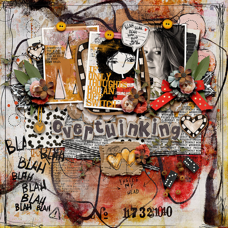
If you’re into art journaling, you’ll definitely want to check out what Heather did with this template. She clipped a combination of photos and pocket cards to the photo masks as well as two busy patterned papers to the paper layers. Then, she built up her background with layers of paint and digital stamps. Finally, she embellished the layout with dimensional, textured ephemera from her chosen kit in all the spots set aside for element clusters. I love the addition of that speech bubble and the use of the same “blah blah blah” stamp from the bottom left corner of her background, simply in a smaller size.

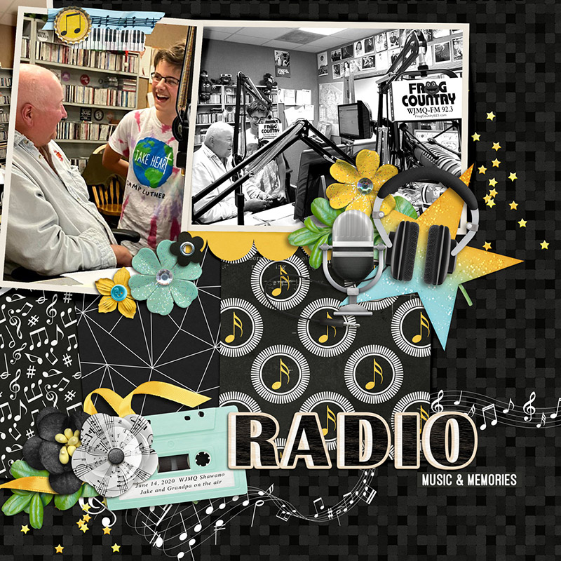
Rebecca is the first Babe this month to play with the size of the template. She resized the template layers to 150% of their original size and positioned them on her canvas to focus on the center and right photo masks. Then, she rotated the right mask 90 degrees to fit her landscape photograph, clipped patterned papers in all the appropriate places, added elements, and placed her title in the lower right quadrant of her page. I think my favorite part of her design is the white stamp of a music staff & notes that she placed just above her background paper. It draws the eye from left to right across her layout and its curvy, bouncy shape adds fun energy to her page.
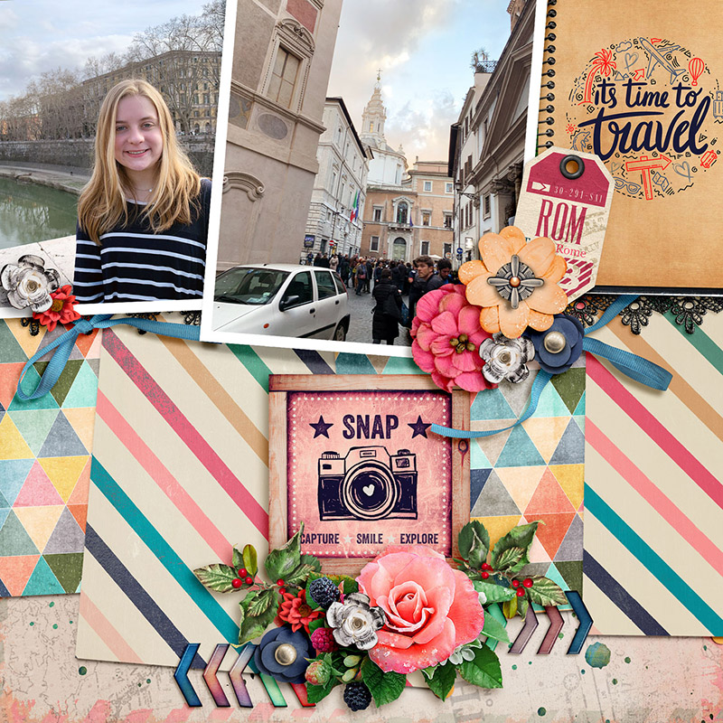
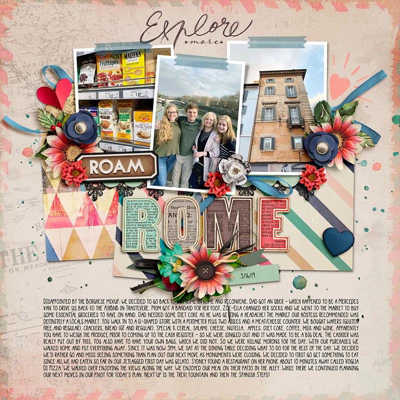
If you feel like you’ve seen something similar to this layout earlier in this post, that’s because you have! Krista P. was an absolute superstar this month, giving us not just one but two layouts based on this template. If you scroll back up a ways, you’ll remember Krista showed us how to include lots and lots of journaling with this template on her layout about Rome. She had more photos from this trip that she wanted to showcase in her album, so she re-used the same template to create a coordinating facing page.
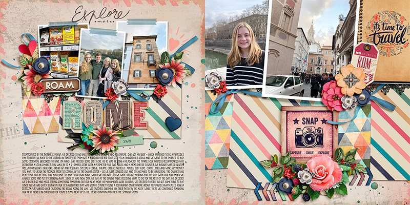
To create this second layout, Krista resized the template layers to about 200% their original size. By not only using the same kit as she did on the first page, but also using the same template with its stacked photos and paper layers, she maintained a consistent look-and-feel across the two-page spread while still incorporating variety and visual interest through the difference in size.

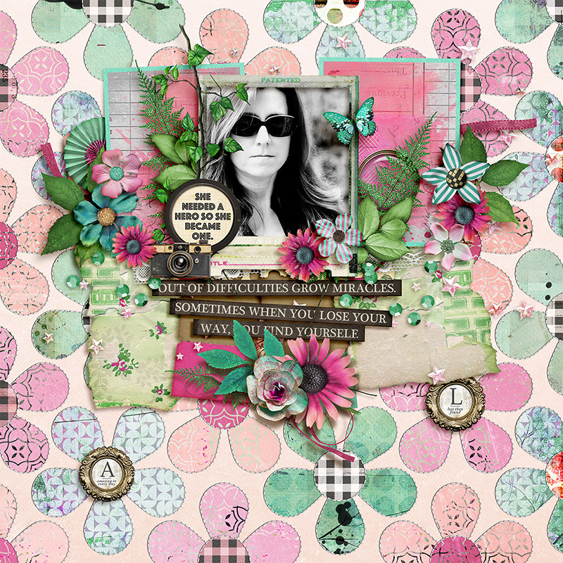
Why stick with just one template when you can mix two templates together? Sugar Babe Judie shows us how by incorporating a layered template from Bold Backgrounds 4 by Cindy Schneider. She chose the layered floral template and used it in place of her background layer. This allowed her to mix together several sheets of patterned paper from her selected kit and include texture with the Bold Background template’s stitching layers. And I love the way she included the two circular framed word art pieces from the kit by placing them as the centers of two of the Bold Background’s flowers. How fun is that?

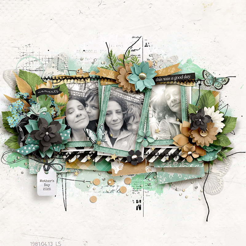
Our final layout this month comes from Sugar Babe Sheri, and she has once again “gone rogue” with the template (but we love it when she does that!). Sheri likes to move things around, repositioning and resizing as she goes. Here’s how she created this stunning work of art: first, she centered, resized, and framed the photographs using dimensional frames from her chosen kit; next, she resized the papers and shifted them around a bit; she removed the title and journaling block, and moved the bottom center cluster to the top of her page (using a word art strip in this cluster as her page title); finally, she enhanced the element clusters, building them out with additional layers, and added loads of brushes and paint to the background. What a gorgeous layout!
Ta daaa! One template, seventeen gorgeously unique creative creations!
Perhaps you’re looking for a way to streamline your scrapbooking design time, or want to include more photos on more pages in your albums, maybe you need to tell a long story or a story without photographs, or perhaps you’re creating a bound book and want it to have a cohesive look but variation from page to page. Hopefully today’s post has given you a bit of inspiration.
Remember, layered scrapbooking templates are a versatile tool for digital memory keepers. They aren’t “cheating” and using one doesn’t make you “lazy”. Instead, they’re a clever means to jump-start your creativity and give you a starting point for your next layout.
Whether you use the template precisely as designed or start moving things around, spinning it, flipping it, resizing it, doubling the photo blocks or taking elements away, mixing it with another template like a Bold Background, dress it up with lots of element clusters or make it totally artsy with layers and layers of paint and mixed media, the only limit is your own imagination.
So grab yourself a template – watch for this template pack to release in the Shoppe this weekend – and get started in creating your own layout magic today!