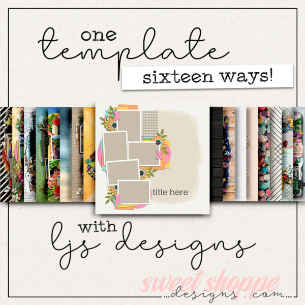
One Template, Thirteen Ways with Designed by Soco
In the words of Edward De Bono, “Creativity involves breaking out of expected patterns in order to look at things in a different way.” Today’s blog post is all about the creativity of looking at things in a different way – because it’s time for “One Template, Many Ways!”
In this monthly feature, we challenge our creative team – known as the Sugar Babes – to work with one digital scrapbook template. The goal is to see how many different layout variations they can create in order to showcase the true versatility of layered scrapbook templates.
This month, we’re featuring a set of templates from Designed by Soco. If I had to describe Soco’s templates in just a few words, I think I’d say they’re “clean and lovely”. She features lots of whitespace along with bold, graphic shapes and just a sprinkling of embellishments.
This month, we get the pleasure of working with a brand-new pack of templates that will hit the Shoppe this weekend (June 27th) so this post also doubles as a sneak-peek of a new release! “Over The Rainbow” from Designed by Soco includes four coordinated templates, each themed around the beauty of the rainbow.
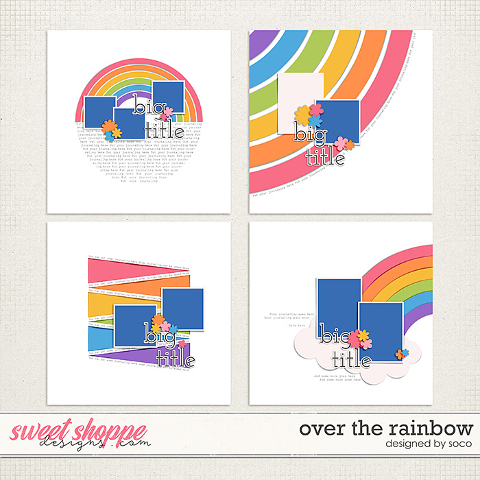
These templates are all sized for 12″ x 12″ @ 300dpi and are available in PSD, TIFF, and PNG formats for use with your favorite digital scrapbooking programs.
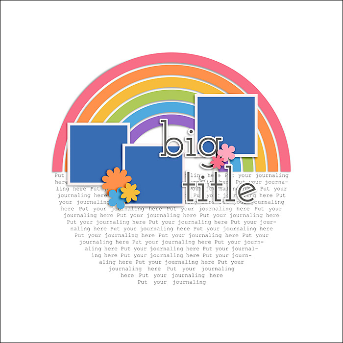
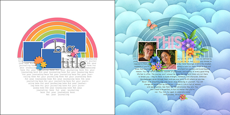
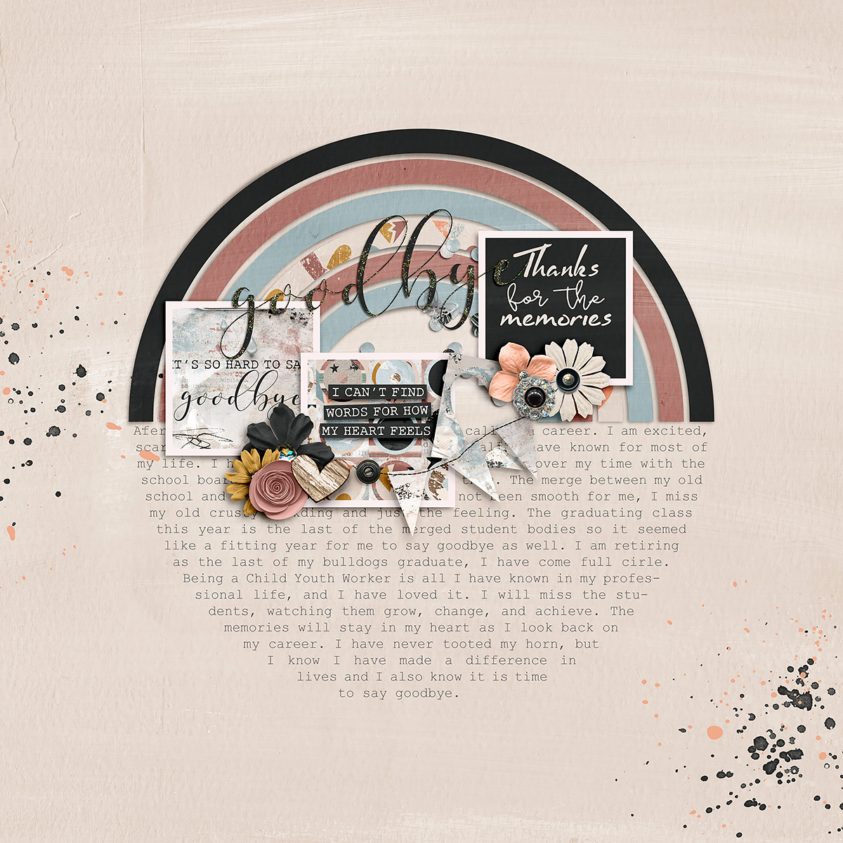
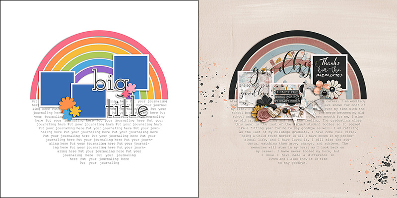
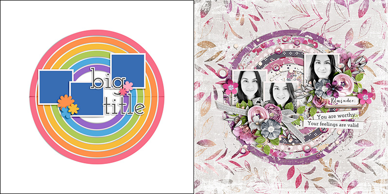
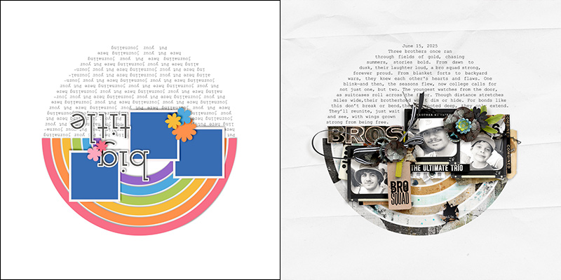
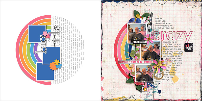
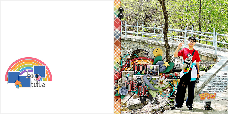
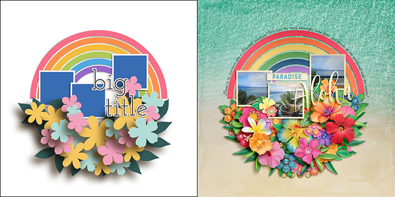
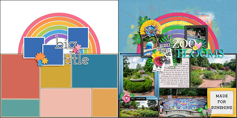
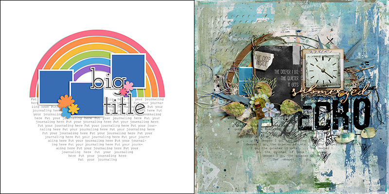
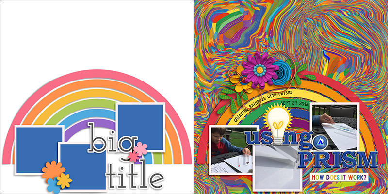
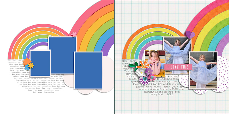
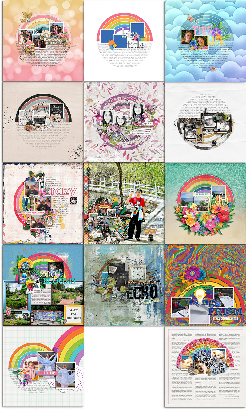
For this month’s challenge, we’re working with the template in the upper left-hand corner. It has three square photo blocks atop a really unique circular shape, the top half of which is a rainbow and the bottom half of which is a shaped journaling block. A large title floats over part of the photos and journaling, and it’s anchored by placeholders for a few small embellishments.
We gave this template to our creative team of Sugar Babes and challenged them to use it as the starting point for as many unique layouts as they could create. They came through with thirteen different layout variations based on this one template. Just wait until you see what they came up with!

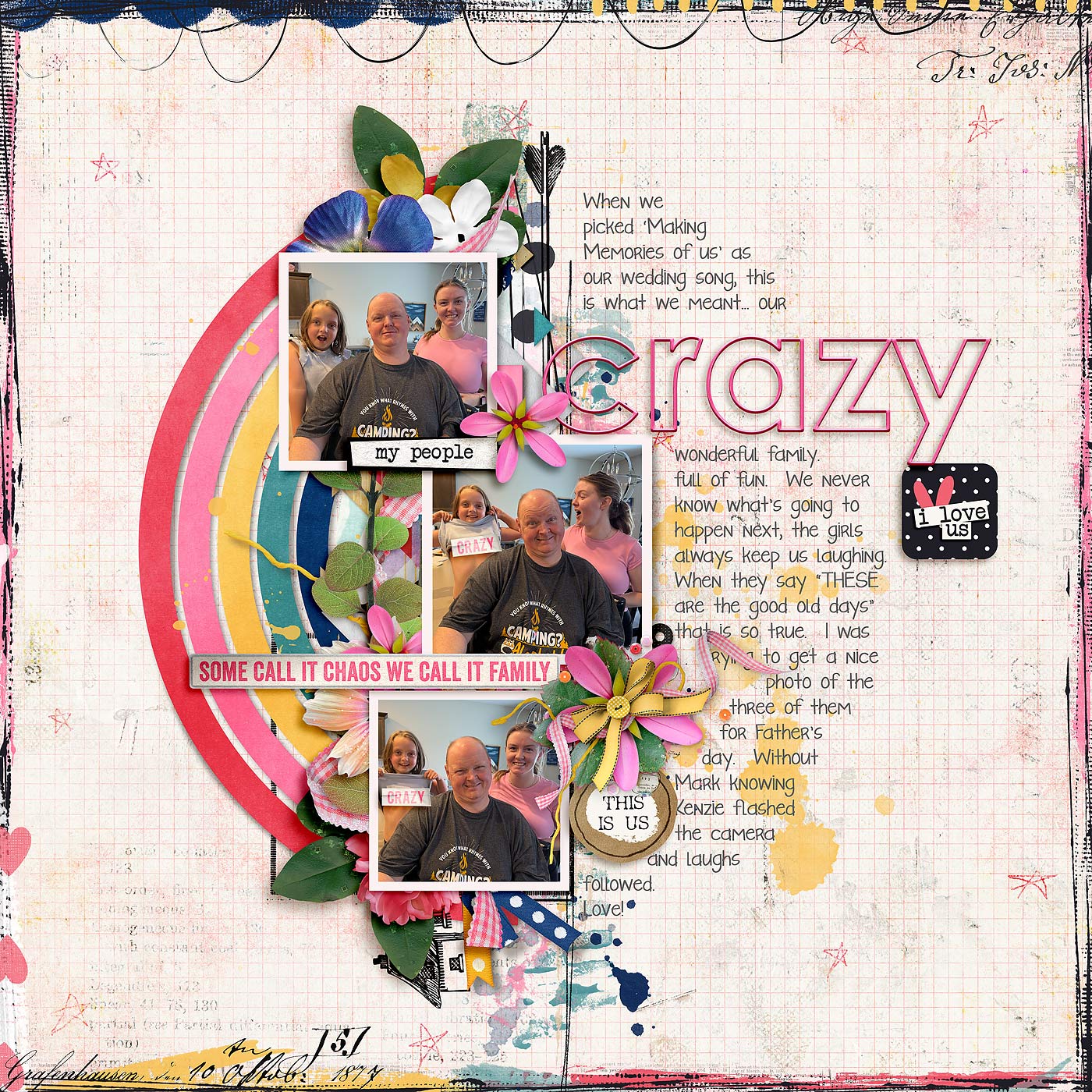
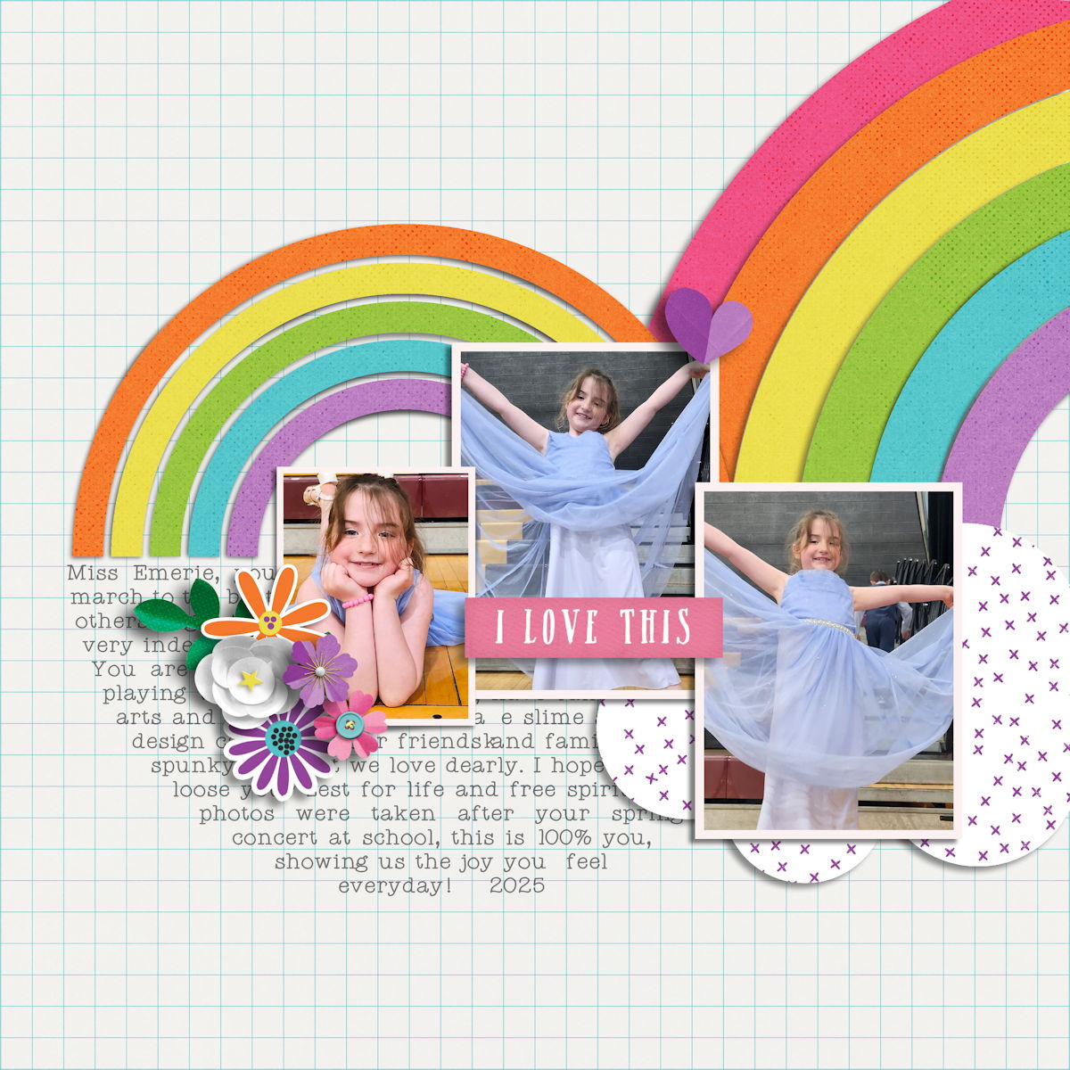
Krista starts us off by using the template exactly as-is. She clipped photographs to each of the three square photo masks and patterned papers to each of the rainbow arches. Then she added her journaling, created a title with a piece of word art and several paper strips, and finished off the layout with a few beautiful element clusters. It’s simply gorgeous!

Jacinda’s approach to the template involved swapping out one of the photo masks for an additional element cluster. She only wanted two photographs on her layout, so after she clipped them to the two left masks, she removed the third mask and built a bigger title with digital alphabet stickers, backing it with a larger floral cluster. I absolutely LOVE the way Jacinda used the template’s five rainbow arches: she gave them an engraved layer style that allowed her background paper to show through – it’s a beautiful, delicate effect and it really makes those photos the star of her layout.

Jaye’s approach to this template was a photoless one, as she used it to chronicle a story without the use of photographs. Jaye picked out three pocket cards that included word art that was meaningful to the story she wanted to tell, and clipped them to the three square masks. Then she added her journaling, clipped a mix of solid and patterned papers to the arched shapes, and added flowers and other elements from the kit. I really like the way she used the splattered paint in the lower right and left side of her layout – it’s a fun, finishing touch that incorporates several of the colors from her rainbow.

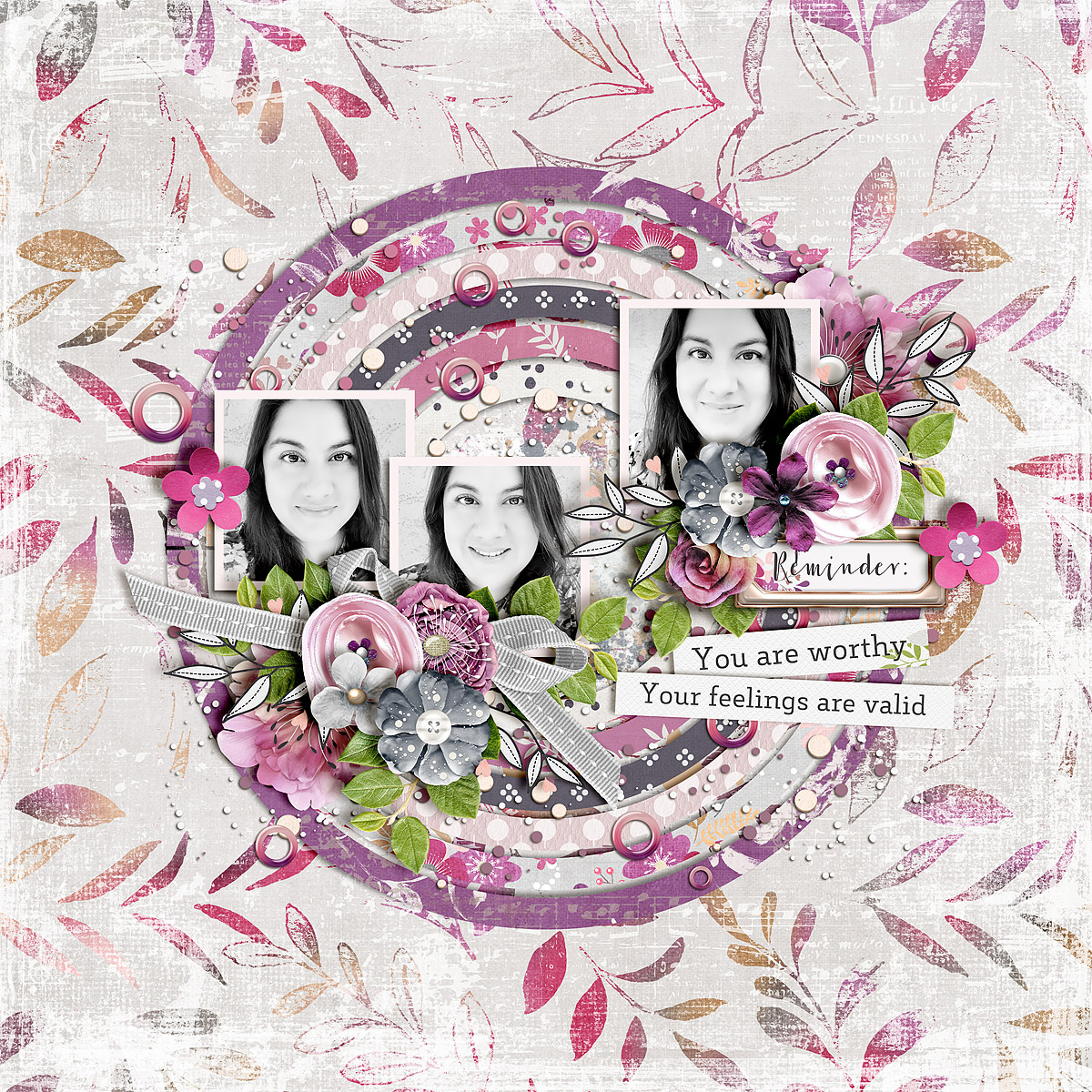
Mary demonstrates a really fun approach to this template as she removed the journaling block and, instead, duplicated the rainbow arcs to create a full circle. It maintains the circular design of the layout, but instead of a rainbow, she now has a series of rings made of patterned paper. I love the use of black-and-white for her photographs; they really stand out against the vivid colors of the kit she chose to work with. Also, note that Mary built bigger element clusters than the template called for, but placed them in the same areas as the smaller element placeholders. It is another way to maintain the balance of the original design even while working with Mary’s preferred style of embellishments. Nicely done!

Sheri is the first of our Babes to play with the orientation of the template. She rotated it 180 degrees to place the journaling at the top and the arcs at the bottom. Now, rather than a rainbow, she has a series of paper arcs supporting the trio of photographs. This is a gorgeous, textured, masculine layout and the metal-style word art she used for her title is sheer perfection! What a fun spin on the original template!

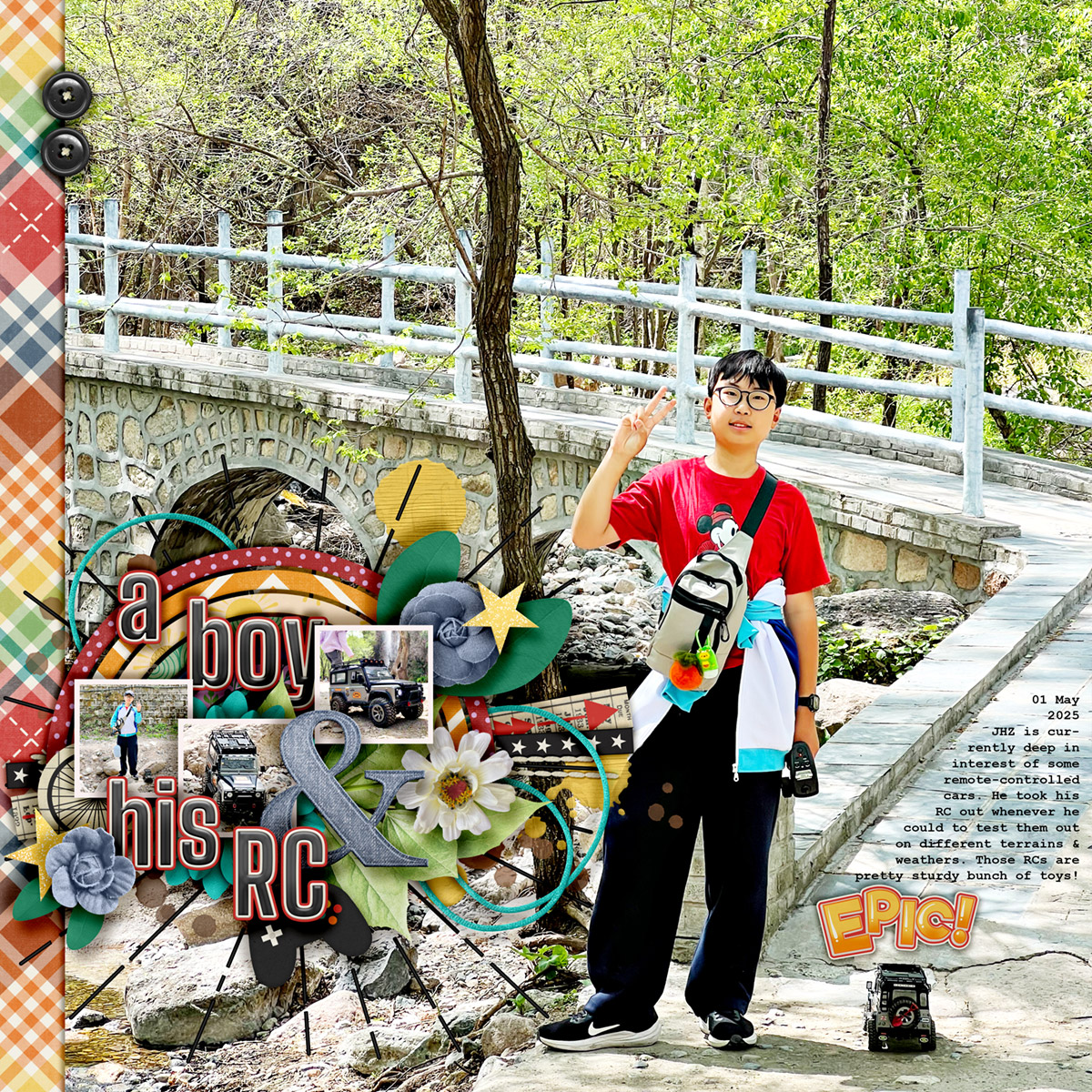
Trina also played with the template’s orientation, giving it a 90-degree spin in a counter-clockwise direction. Her layout is now split left-to-right rather than top-to-bottom. She opted for vibrant solid papers for her rainbow arcs, and built up additional floral and foliage elements behind the photographs. After adding her journaling, she finished everything off with a big wire-outline title and a few additional pieces of word art. Gorgeous!

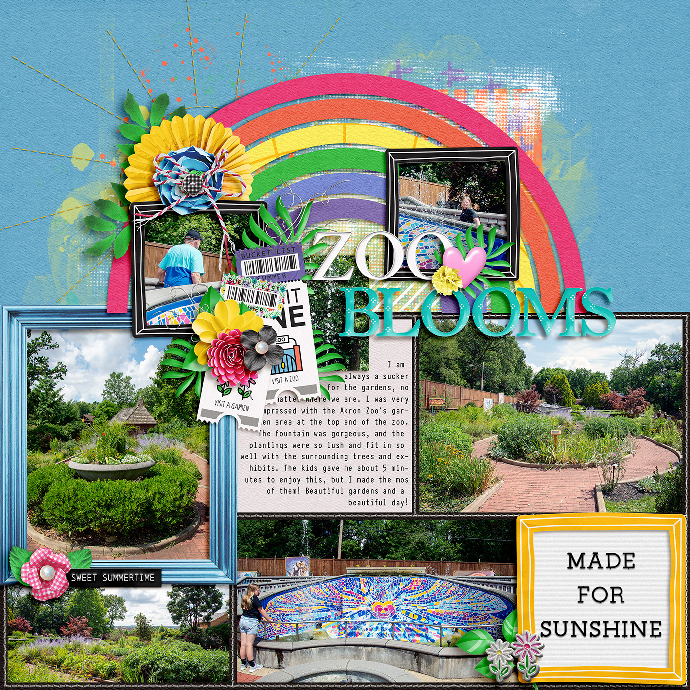
Sherly’s layout is a great example of how any template can be used to jazz up a full-page photograph. Sherly took the template’s layers and shrunk them to fit in the lower left quadrant of her page in an area of the photograph that could easily be covered. Then she removed the journaling layer, leaving her with a half-arc and the three photo spots. It allowed her to add a few more detail photos atop her big background photograph, and she used some additional paper strips and a layer of paint in a circular ray shape to back the template’s cluster. I love the explosive, energetic feel it gives to her layout!

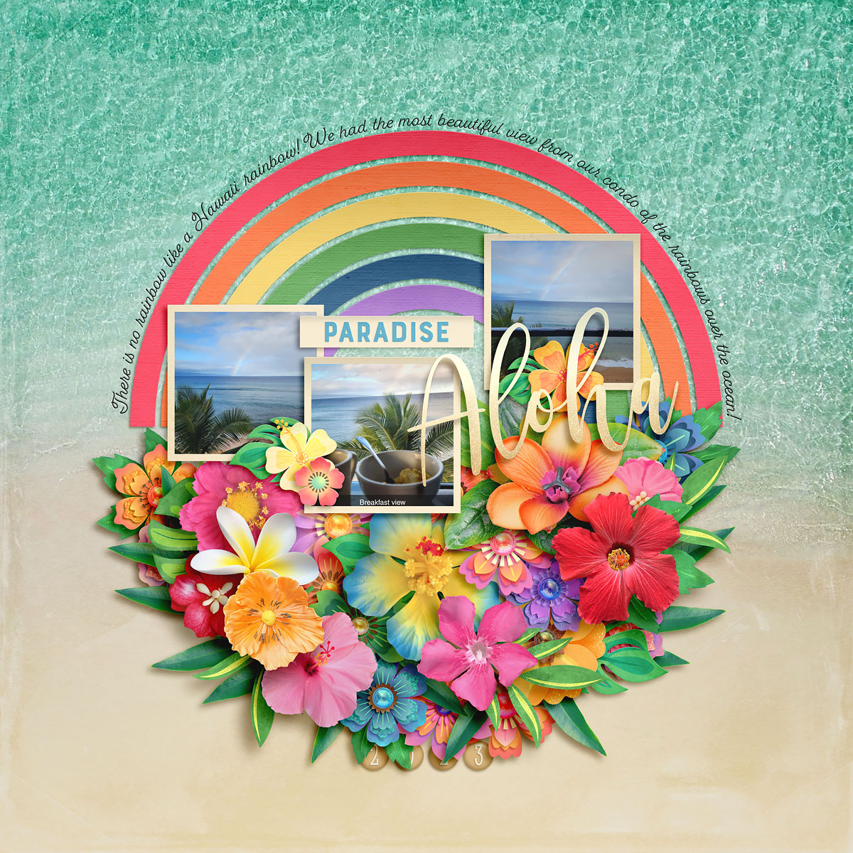
Amie’s beautiful tropical-themed layout shows another approach to using the template, as she replaced the journaling at the bottom of the circle with a lush floral cluster. If you have less to say on your layout than the template is designed for, this is a terrific approach! Amie added one shaped arc of text – just two sentences – that follows the outside arc of the rainbow paper strips. And the patterned paper Amie chose for her background is absolutely perfect – the way it is split halfway between sand and water is a perfect match to the way the template shapes are split between paper arcs at the top and flowers at the bottom. Masterfully done!

Ally demonstrates another way this template can be super versatile, combining it with a pocket-style scrapbooking page. She combined the template by Soco with a pocket-style template from Erica Zane. After removing the shaped journaling from the bottom half of the template, she repositioned it so the rainbow is sitting right atop the pocket squares, and it looks like it was always intended to go together! After adding her photographs and including journaling in the top center pocket square, Ally clipped solid papers to the rainbow arc in a traditional red-orange-yellow-green-blue-purple order and backed it with layers of textured paint. So pretty!

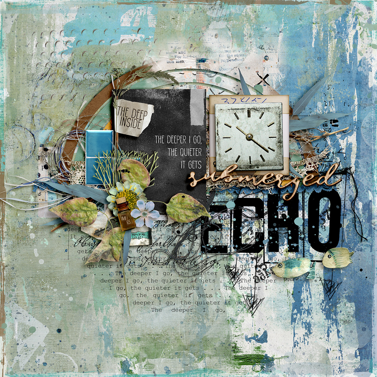
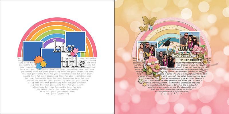
Judie gives us all the mixed media feels with her take on this template as she took it in an art journaling direction. In the side-by-side comparison below, you can see that the original shape of the template is there, but it’s enhanced by adding lots of layers of texture. Between the paint and doodled-style stamps in the background, the layers of coiled thread and string, and all those lovely foliage layers, the end result is an artsy layout that makes you want to reach through the screen and touch it.

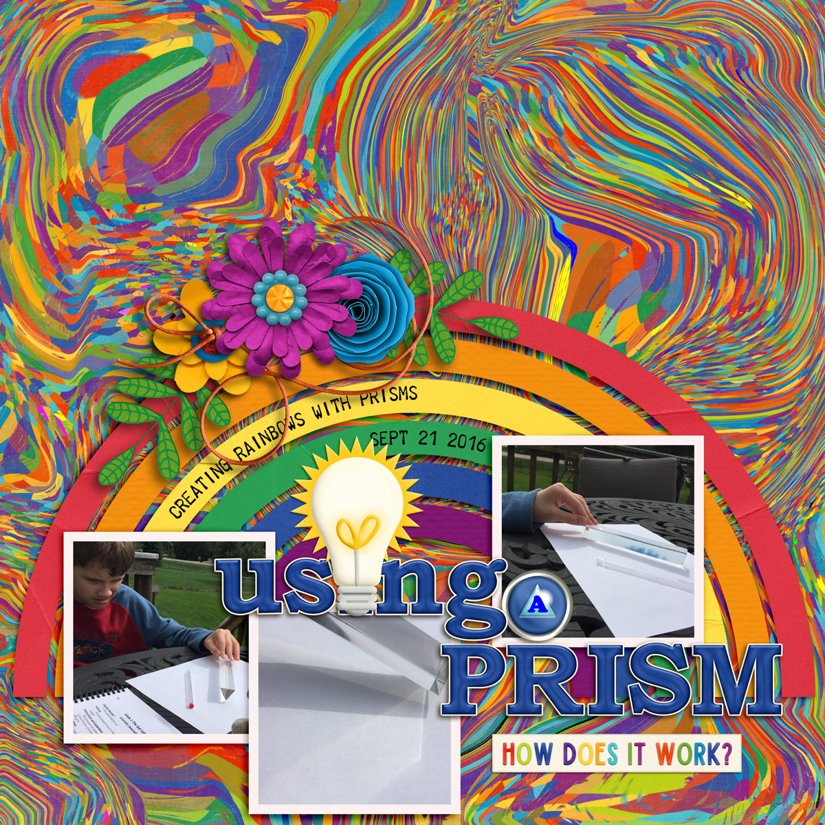
Rebecca went big with the template as she increased its size to about 140% and dragged it to the bottom of her page, only using the top half of the design. This allowed her to include larger photographs along with a really big, fun title. I love the way she replaced the “i” in “using” with that lightbulb! And notice that despite the fact she removed the shaped journaling area from the template, she was still able to include a few words of explanation by typing them directly atop the paper strips of her rainbow.

Jill doubled up on the rainbow goodness with her layout as she combined this template with another template from its 4-pack. As the templates are all designed to coordinate with one another, it can be a fun way to add more dimension – and additional photo blocks – to your layout. In this case, Jill added the rainbow and photo masks from the template in the lower right corner of the preview image to the circular template in the upper right. The end result is lots of colorful fun along with bigger photographs. Just beautiful, Jill!

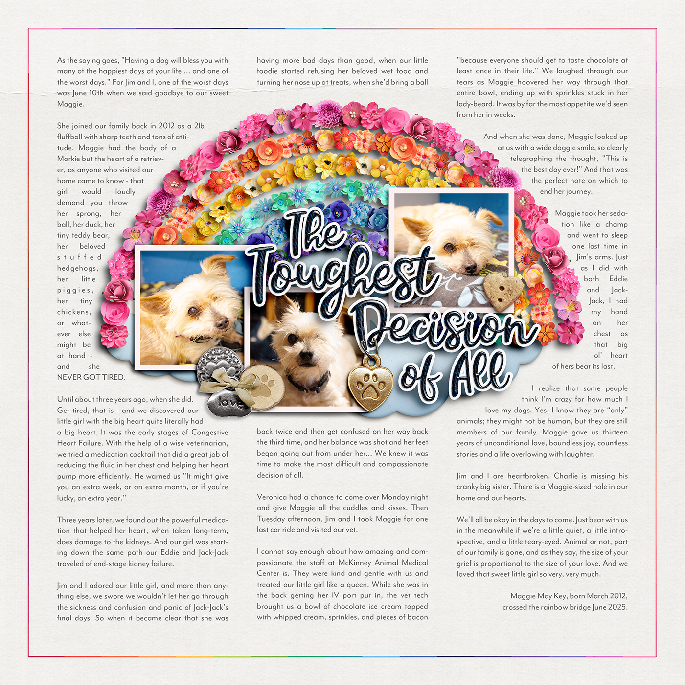
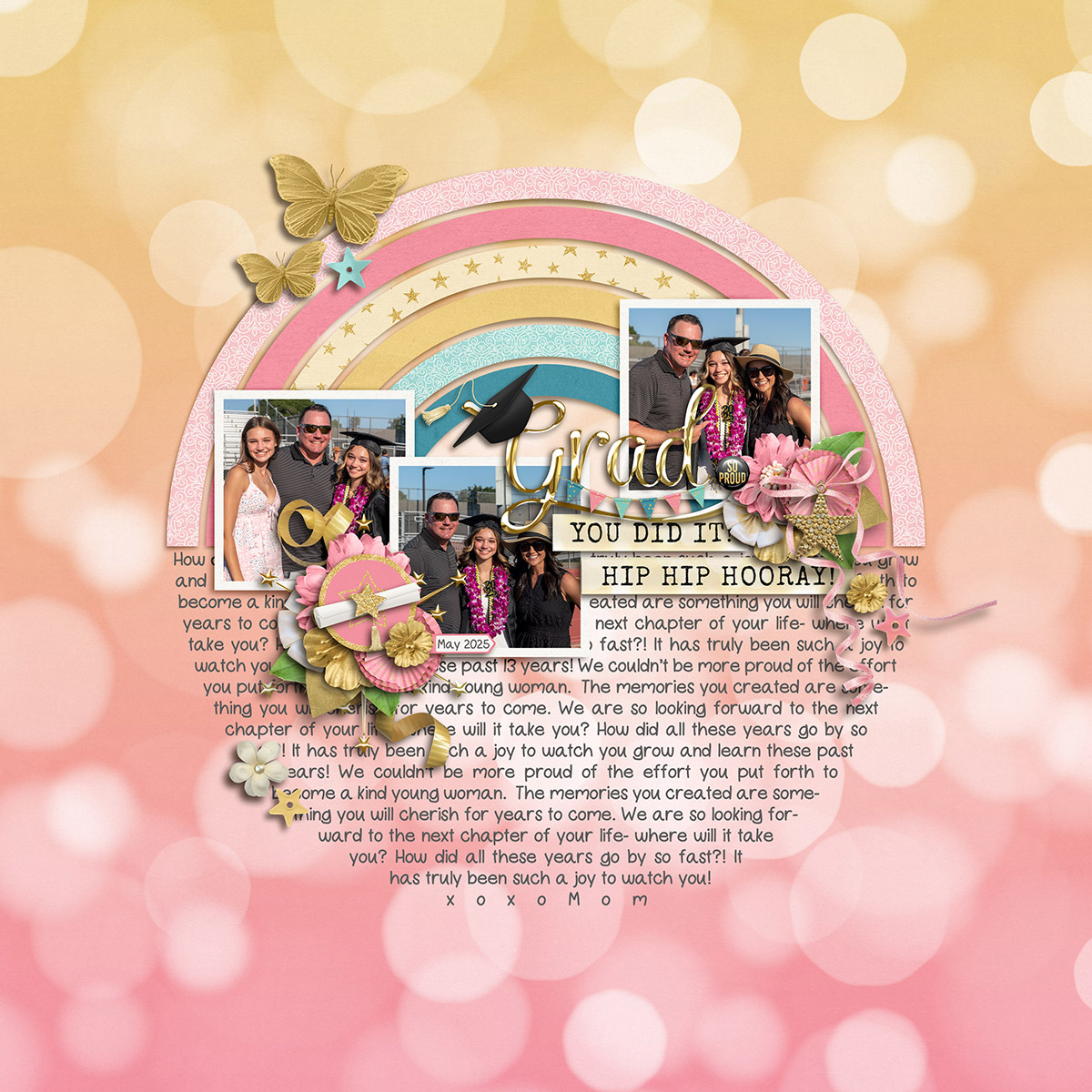
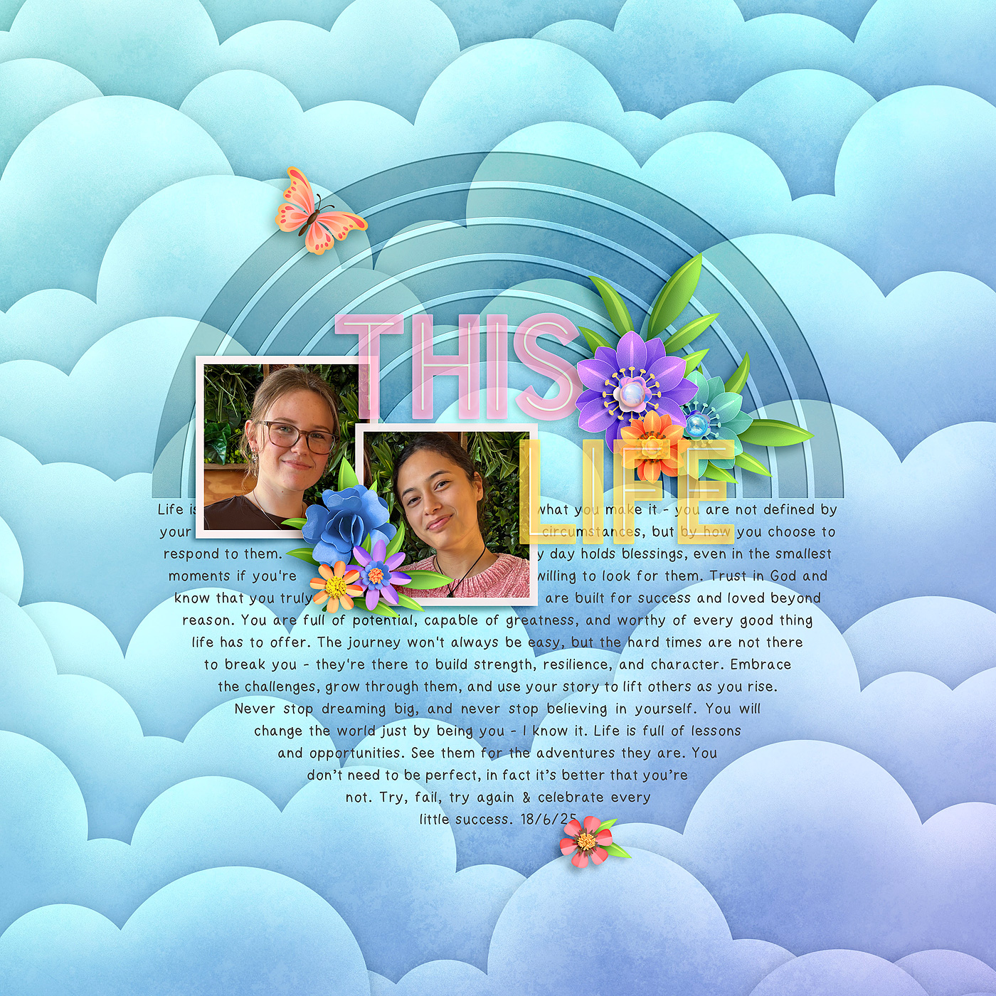
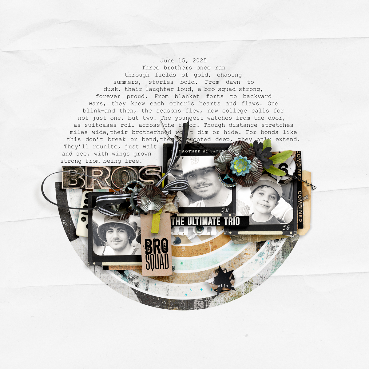
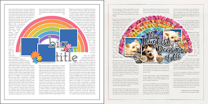
I ended up with an experience this month that cried out for this rainbow-shaped template but also lots and lots of journaling. I removed the shaped journaling area and instead filled the layout’s background with three columns of text. I gave the text wide margins along with ample space between the columns so it would be easy to read. Once I’d added my story, I clipped three photographs to the masks on the template and built a title using a font and layer styles. And finally, instead of clipping papers to the rainbow arcs, I used them as a guide to build up chains of flowers in the same shape and colors. The loss of a beloved pet is a hard story to tell, but in the end, I’m super pleased with the way this template helped guide me in creating this layout.
And there we have it: one template becomes thirteen lovely layouts in a mix of styles and approaches!
Remember, layered scrapbooking templates are a fun and versatile tool for digital memory keepers. They aren’t “cheating” and using one doesn’t make you “lazy”. Instead, they’re a clever means to jump-start your creativity and give you a starting point for your next layout.
Whether you use the template precisely as designed or get creative by flipping it, spinning it, shrinking or enlarging it, replacing text with decorative elements or filling the blank space with text instead, combine it with another template, keep it clean and simple or make it totally artsy with layers and layers of paint and mixed media, the only limit is your own creativity.
Remember, as De Bono said, “Creativity involves breaking out of expected patterns in order to look at things in a different way.” Hopefully today’s post has you looking at templates in a different way and has planted an idea or two for your next layout.
So grab yourself a template – and watch for this template pack to release in the Shoppe this weekend – and get started in creating your own layout magic today!
Jacinda said...
on June 27th, 2025 at 3:07 pm
Fantastic post Angie! Love your take with the column journalling.