One Template, Sixteen Ways with Cindy Schneider
In the words of American poet & writer Dorothy Parker, “Creativity is a wild mind and a disciplined eye.” Let’s get wild, my sweet, scrappy friends, because it’s time for “One Template, Many Ways!”
In this monthly feature, we challenge our creative team – known as the Sugar Babes – to all work with the same digital scrapbook template. The goal is to see how many different layout variations they can create in order to showcase the true versatility of layered scrapbook templates. Along the way, you’ll be inspired by lots of gorgeous scrapbook pages and pick up more than just a few ideas for your next layout.
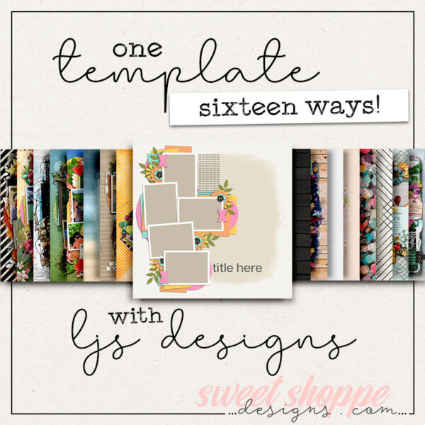
This month, we’re featuring a set of templates from the OG template designer, Cindy Schneider. Over the past fifteen years, she’s created thousands of layered templates for the Sweet Shoppe. To add a unique spin to this month’s feature, we decided to work with one of her journaling-focused template sets, Trio Pack 136: Half and Half.
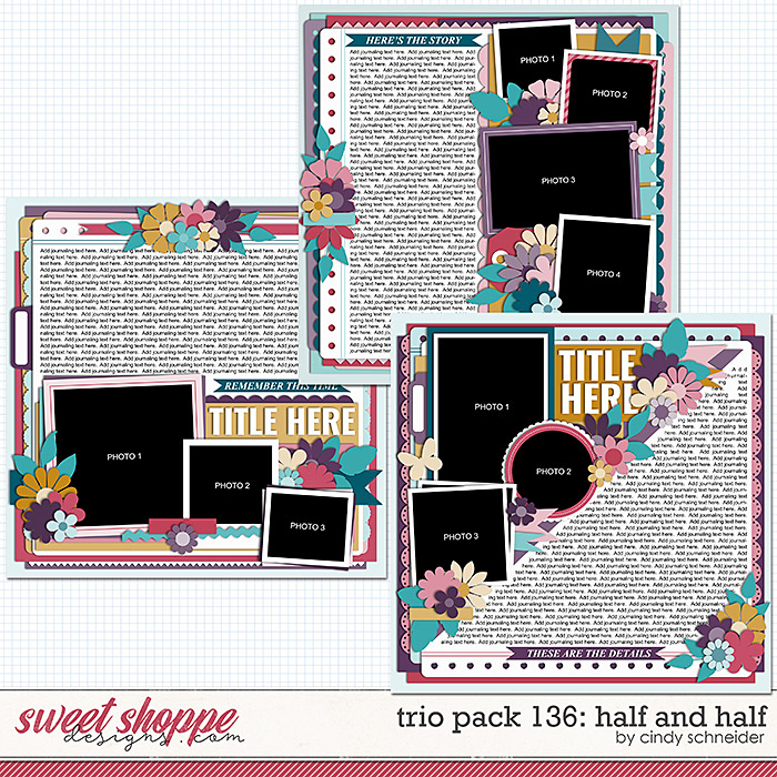
This set includes three 12″ x 12″ templates at 300dpi, and are available in PSD, TIFF, and PNG formats for use with your favorite digital scrapbooking programs. Each of the three designs has dedicated half of the page to a journaling block, making them the perfect choice for recording a longer story in your albums.
Not big on journaling? Don’t worry! Let us show you how to use this set even if you don’t want to tell a story using lots of words.
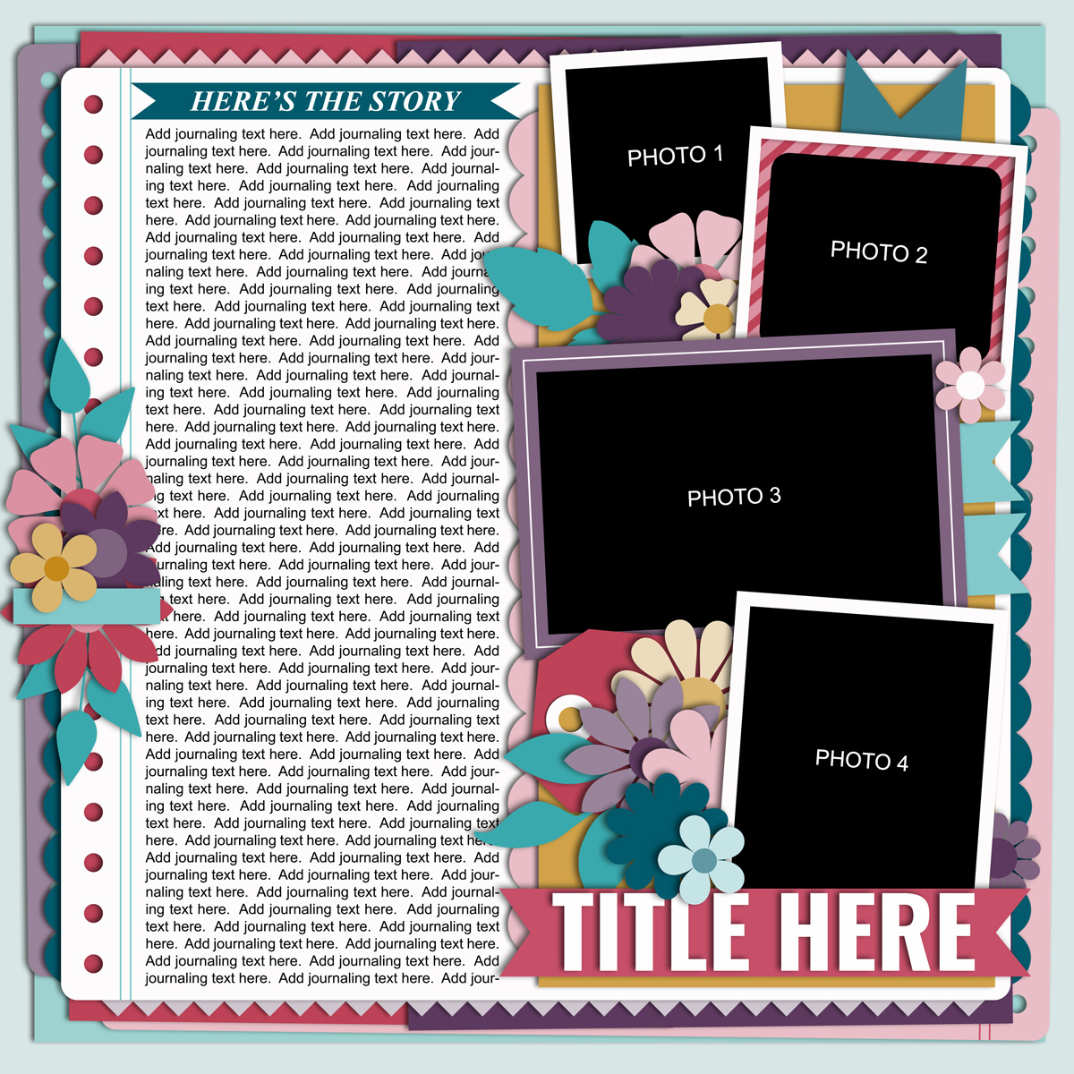
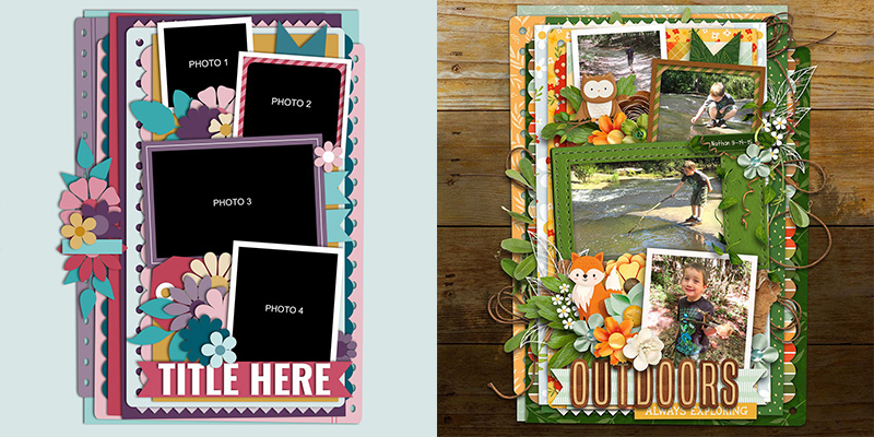
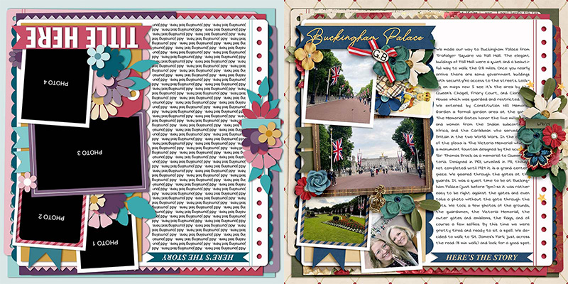
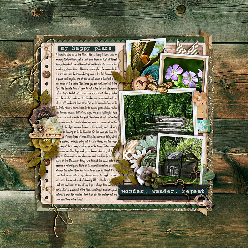
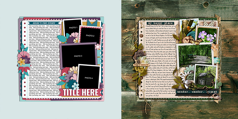
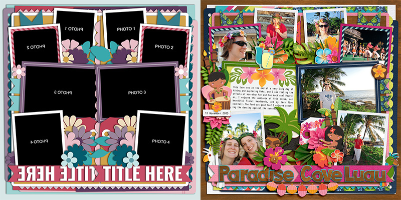
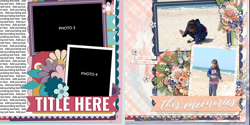
For this month’s challenge, we’re working with the template at the top of the preview. It boasts four photo masks on the right side of the page with the left-hand column dedicated to journaling. There’s a few clusters of flowers and foliage tucked between the various layers, as well as paper ribbons and shaped border pieces to add more visual interest.
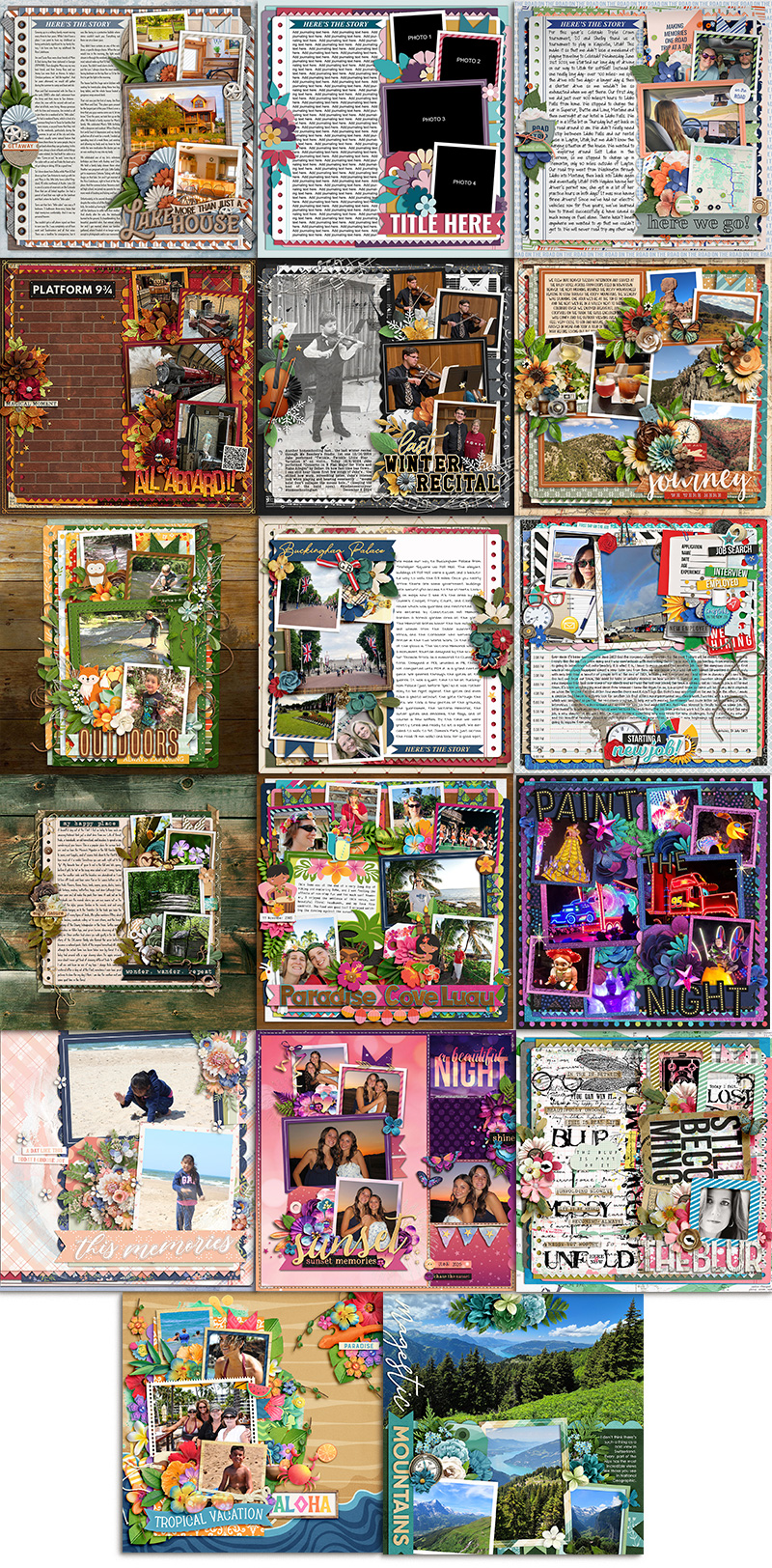
We gave this template to our creative team of Sugar Babes and challenged them to use it as the starting point for as many unique layouts as they could create. Of course, each page will look different when you use a different kit of papers and elements to embellish it, but their challenge was to go even further and take a unique approach to each layout. They came up with sixteen different variations on this one template, many of which don’t include more than a few sentences of journaling. Let’s take a closer look!

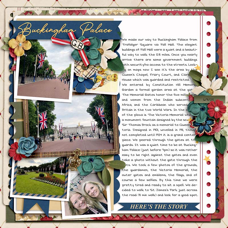
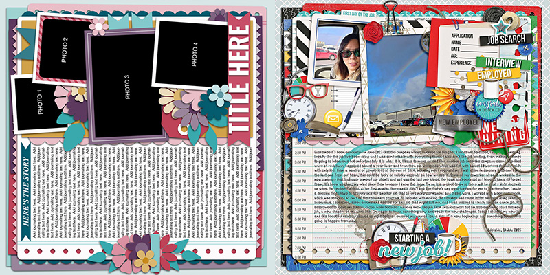
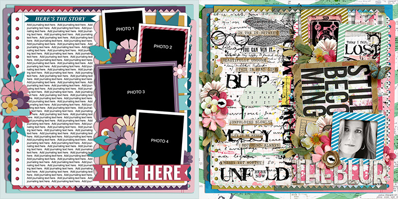
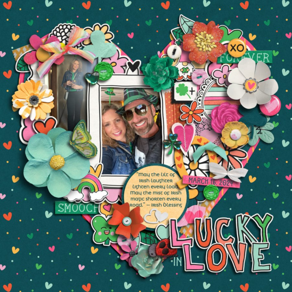
I got to start things off this month by using the template as-is. As a writer, I’ve always got more to say than I can fit on my scrapbook page, so templates like those in Cindy’s journaling series make my heart sing! The one change I made is to split the text field into two narrow columns – rather than one wide one – with a 1/4″ gap between them. In the publishing world, optimal line length is considered to be around 50-75 characters per line including spaces, or an average of 7-10 words per line. When a column of text is too wide, it’s difficult for the reader to skip from the end of one line to the correct start of the next. So I always try to err on the side of multiple narrow columns for my longer stories, especially when I get sneaky and use a condensed-style typeface to try and fit more words in!
Once my text was in place, I clipped four photographs to the designated spaces, and had lots of fun embellishing my layout with elements from Allison Pennington’s new kit, “Lake Mode”, which releases for sale in the Shoppe this Friday, July 25th.

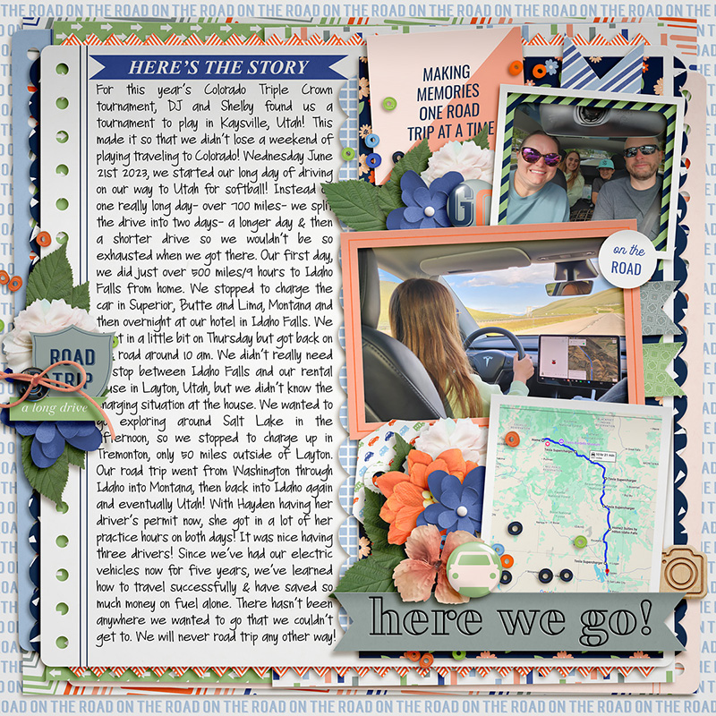
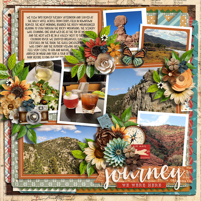
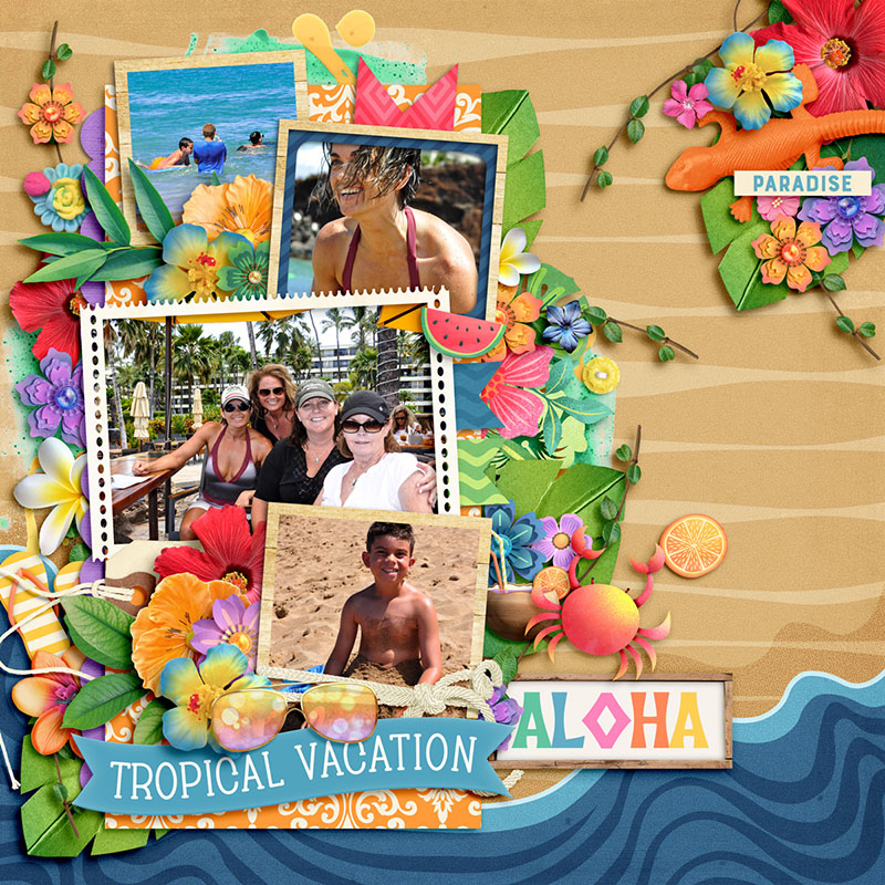
Amie also had a longer story to tell, but rather than sticking with just photographs, she used a mix of photos, screenshots, and journaling cards in the spaces designated by the template. I love the way Amie included a screenshot of the Google map for the route of their road trip! It’s details like these that make for some truly fun layouts, especially years down the road (no pun intended). You’ll also note that Amie used a fun, handwriting-style font for her journaling; because it’s much bigger than the typeface I chose, the single column of text turns out to be just the right width for 7-10 words per line and it’s beautifully readable.

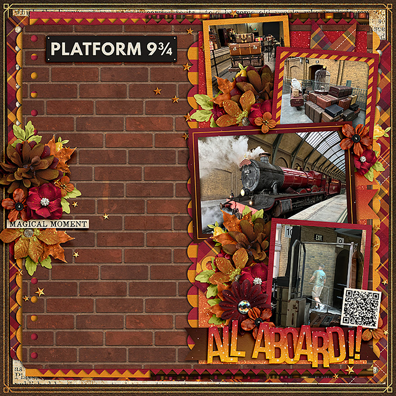
Cassie is the first of our Babes to demonstrate how to use a journaling-heavy template even when you don’t want to tell a story with words. She completely removed the journaling and, instead, clipped a patterned paper to the journaling block. The brick wall provides the perfect backdrop to her Hogwarts Express-themed photographs and her layout remains balanced. Nicely done!


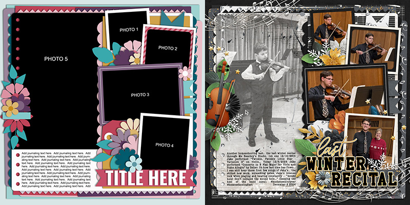
Rebecca demonstrates another approach to using a journaling-heavy template for a story with fewer words by clipping a big photograph to the journaling block. She shrunk the text field to the bottom quarter of the column and used it to fill in the whitespace left by her photograph. It’s a great way to add another photograph to your layout – and I personally adore the way she used it to contrast a “then vs now” story of her son playing the violin. So sweet!

Jill shows us yet another approach to using this template with fewer words; she replaced the left-hand column of journaling text with one small journaling card and three additional photographs. Notice that Jill duplicated the frame from the middle photo on the right and used it to outline both her journaling card and the bottom left photograph, and then applied the same wide stroke and shadow to her two left center photos as are found on the right top and bottom. Repetition is an important graphic design principle, and by doing this Jill gives her layout a beautifully cohesive look.

Charlene’s layout gives us yet another approach to using this template without all the journaling; she hid all the layers on the left and used only the right half of the template for her layout. By resizing the background paper layers and dragging everything to the center of her canvas, Charlene created a center-weighted piece built in a single column with lovely, wide margins on the left and right. And don’t you just love those sweet little animals she tucked into her floral clusters?!? What a gorgeous layout!

Krista gives us our first “spin” on this template with her travel-themed layout. She rotated the template 180 degrees so the title is now in the upper left corner and the journaling takes up the right-hand column. This is an absolutely fantastic way to get additional use out of a template, especially if you’re working on a themed album like a vacation. You could use this template multiple times throughout the book, each time giving it a spin, for any page where you’ve got a longer story to tell. It’s a great way to have consistency in a bound book while still including variety.

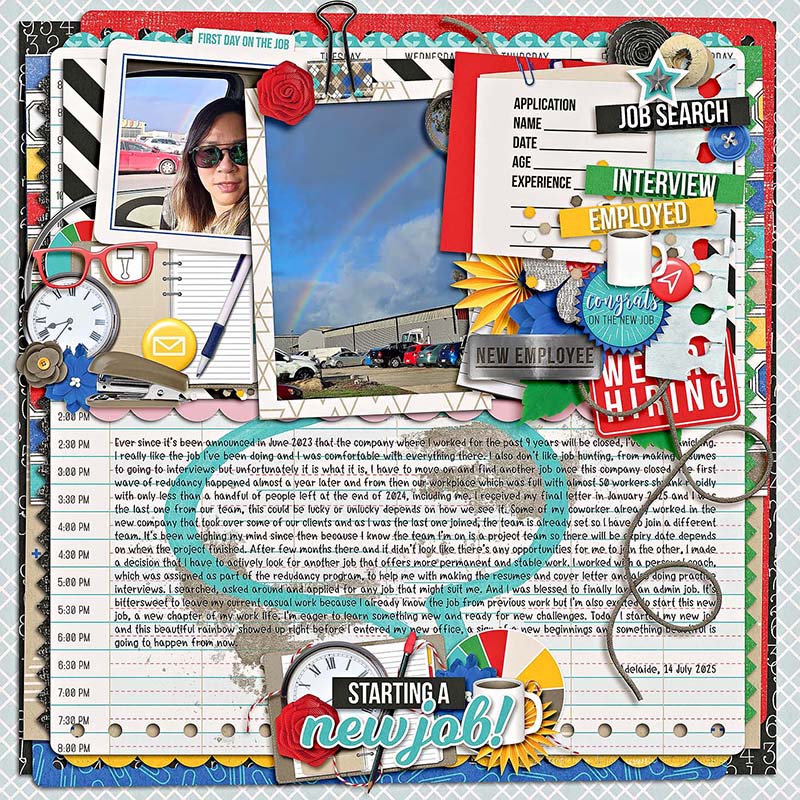
Eve demonstrates another way to “spin” the template by rotating it just 90-degrees. Now, rather than a long and narrow column of text, she wound up with a short and wide column instead, and her photographs are spread across the top of the canvas. I think it’s just perfect for the stacks of paper and binder- and paper-clips she added to accent her employment-themed layout!

Jaye is the first of our Babes to play with the size of the overall template. She shrunk it to 75% of its original size and centered it on her canvas. This gave her wide, even margins around all four edges of her layout, perfect for showing off a beautifully textured patterned paper. This change in size also means the journaling field holds fewer words at the same font size, so it’s a great approach when you have a medium-length story to tell rather than an extra-large one!

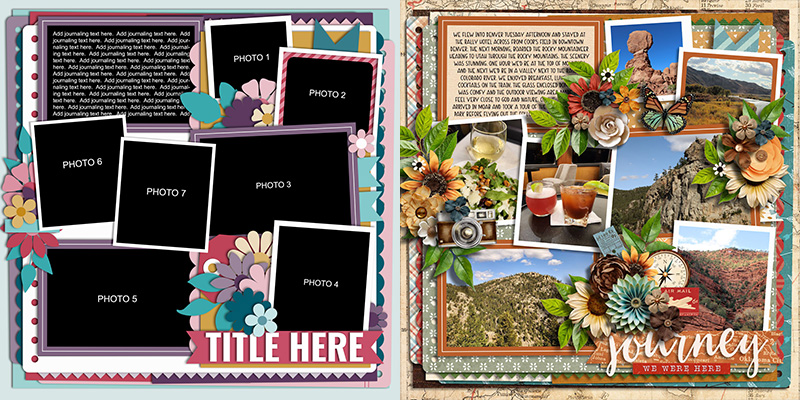
Got lots of photographs? Ally shows off one way to use this template for lots of pics by duplicating the right side of the layout and mirroring it on the left. Notice that she reserved one of the photo spots for a journaling card, which allowed her to include several sentences of description while still including a whopping seven photographs on this one 12×12 page layout.

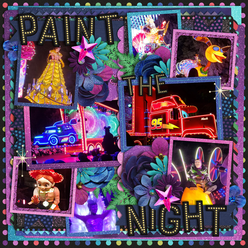
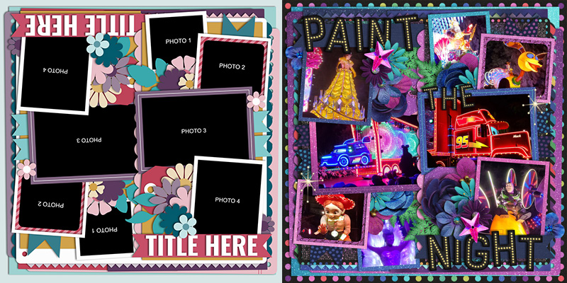
In the same vein, Mary’s approach to using this template for lots of pics was to duplicate the right side of the layout and rotate it 180-degrees before placing it on the left. She was able to include eight photographs on this page but also had lots of space to spread out her page title. What a fun page featuring lots of images of the parade!

Cherry went big with this template, transforming it to 150% its original size and placing the bottom right corner on her canvas. This gave her space for two photographs and a big title as well as some stunning floral clusters. I like how she removed the journaling on the left and, instead, layered paints and some word strips from her chosen kit to finish off her creation.

Krista is our queen of pocket-style scrapbooking, and shows off a beautiful approach to using this template on a pocket page. She started with a pocket-style template from Traci Reed’s 365Unscripted – Stitched Grids 7. Then Krista isolated (a) the vertical cluster and (b) the four-photo-and-title stack from Cindy’s template. She layered these on top of the pocket-style template, and the result is a gorgeous layout that will fit perfectly in her pocket-style album!

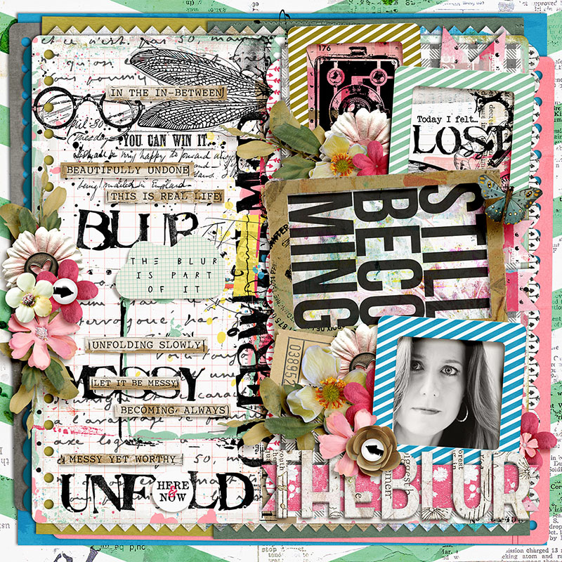
Judie shows us how even this template can be used for art journaling when you mix it with lots of paint and other textured elements. Notice how she replaced the long column of journaling text with a combination of stamps, word strips, and a paper shape with additional verbiage. If you’re looking for a large canvas to play with this style of art journaling, don’t overlook a template designed for lots and lots of journaling!

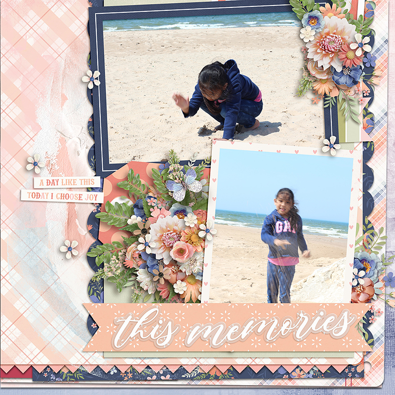
Carrie took on this month’s “mix-master” challenge and mixed this template with a second, completely different template. She chose to work with one of the “Life in Progress” templates by Fiddle-Dee-Dee Designs. After removing the title, paper strips, and four photo spots on the Fiddle-Dee-Dee template, Carrie then added in the four-photo-and-title stack from Cindy’s template. They layer together nicely, and the end result is a beautiful beach-and-vacation-themed layout with a fun and cohesive look.

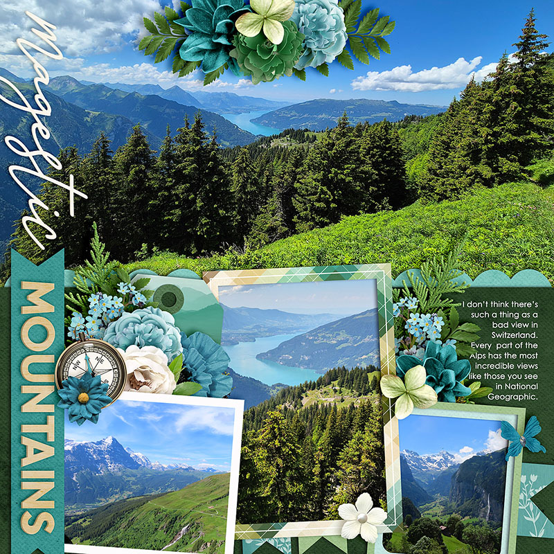
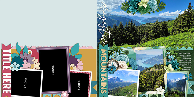
Jacinda wraps things up for us this month with this stunning layout that features some of her gorgeous photography from a trip to Switzerland. To create this page, Jacinda rotated the original template 90 degrees counter-clockwise. Then she removed the journaling and its associated paper layers, and clipped a big, beautiful photograph to the background of her canvas. I love big photos as much as I love telling long stories, and I adore how Jacinda shows us how this one template could be easily used for either style of layout!
There we go: one layered scrapbook template used sixteen different ways!
Remember, layered scrapbooking templates are a fun and versatile tool for digital memory keepers. They aren’t “cheating” and using one doesn’t make you “lazy”. Instead, they’re a clever means to jump-start your creativity and give you a starting point for your next layout.
Whether you use the template precisely as designed or get creative by swapping journaling for photos, flipping it, spinning it, shrinking or enlarging it, mixing it with another template, taking a “clean and simple” approach or going totally artsy with lots of mixed media, the only limit is your own creativity.
As Abraham Maslow once said, “Almost all creativity requires purposeful play.” So make some time to play this weekend! Grab yourself a template – like this featured set from Cindy – and get more stories and more photos in your family’s albums!
Jacinda said...
on July 24th, 2025 at 8:35 pm
Love your blog posts Angie!