Lighten up, baby!
Well hey there Sweet Shoppers! Jacinda here to share with you my secrets for shadowing lighter kits. Now I’m by no means a shadow guru, and I’m sure there are a hundred different ways to do it, but this is my way, and I thought I’d share.
I’ve lost count how many times I’ve seen a beautiful layout in the gallery that would look SO much better if only the shadows were lighter. Sometimes the shadows are so dark, they’re the only thing I can focus on, and the rest of the layout seems secondary. Today I’m going to share with you the shadow settings I use when working with lighter coloured papers/elements.
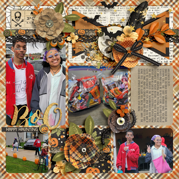
This is the layout I’ll use as an example. I’ve created the layout and applied my shadows as I do for every layout. As you’ll see, the shadows are quite dark. I’ve used my regular go-to shadow presets that normally look great on darker papers, but on the lighter colours, they are just too heavy.

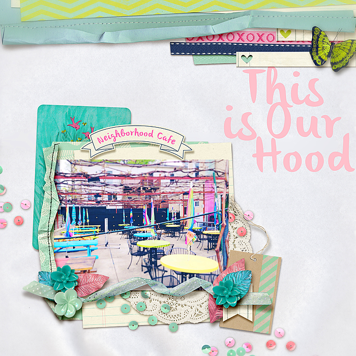
Here is the layout with lighter shadows that I will show you how to get. (It is linked to the gallery for credits):

First I’ll change the shadows on the flowers and leaves. I find that black is just too dark for good looking shadows. Normal shadows pick up the colour of the item below it, so for this layout, with a pink background, I’m going to give my elements a slightly pink toned shadow. Click on a flower or leaf layer, open the shadow dialogue box and click on the colour picker. Now click somewhere on the background of your actual layout. Drag the cursor down the colour palette to get a darker colour then click OK. There’s no hard and fast setting, just go about half way down the palette.I settled on 845c53 for mine.

Next, I played with the shadow settings until I was happy, adjusting opacity, distance and size. I find linear burn is a nice blending mode to use as it picks up colour better. I have to say it felt strange the first time to have a really light shadow. It’s often not until several elements are lightly shadowed that the look comes together. These are the settings I decided on:

Click OK when you’re happy, then copy this shadow setting on to all other leaves and flowers. (Right click in the layers palette, select ‘copy layer style’. Then right click on other elements and select ‘paste layer style’).
Next I lightened the shadows on my title. I forgot to change the colour on this one, so you can see how much I had to lower the opacity to compensate:

The background paper. I also added a very light outer glow to the opposite edges so they don’t look so flat.:

And lastly, the stitching. I kept this really light:

Here’s the end result. I think the layout as a whole looks so much better. The flowers look softer, and the shadows don’t overpower the feel of the layout.
Here’s a side by side comparison.


So what do you think? Ready to try lightening your shadows a little? Have a go and see what you come up with. The lovely Krystal Hartley also has a tutorial and some free shadow styles available on her blog for those of you who would like a starting point. Remember that all preset shadow styles can still be tweaked to suit your layout.
Link to Krystal’s tutorial and free shadow styles: Scrap Happiness Inside
Lenie said...
on July 14th, 2013 at 6:18 am
I love it….thank you