Scrap Like a Sugarbabe: Kim B
This week’s Scrap Like a Sugarbabe post is from one of our new Kims! (Yes, we got TWO new Kims with our last call!) Kim B, also known as jak in the forums, is here today to share her tips on shadowing on light backgrounds. If you have ever looked through her gallery it is full of pages with light backgrounds, so this lady obviously knows what she is talking about.
About Kim:
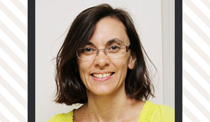
Hello, I’m Kim and I’m so excited to be a Sugarbabe here at Sweet Shoppe Designs! I live in Sydney, Australia with my husband and two boys and work part time in the environmental field. I’ve been scrapbooking since 2006 but switched to digital in 2009. I scrap to record memories for my family and as a creative outlet. And I scrap alot! When I’m not scrapping, I’m often out hiking, exploring, camping and taking even more photos to scrap!
Today I’m going to talk about how I shadow on light backgrounds. You don’t have to look far in my gallery to see that I usually use neutral, light coloured background papers on my pages. I like my photos and journalling, the most important parts of my layouts for me, to stand out on my page and not be lost in a busy background. I feel that a light background calls for light shadows, so that they look realistic.
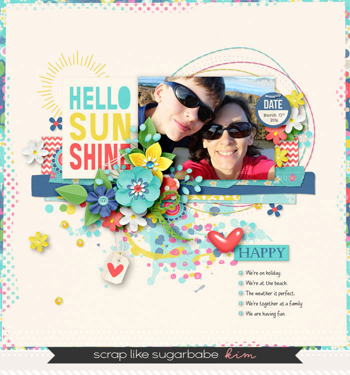
“Hello Sunshine” LO made with Pretty Little Spring Things by Blagovesta Gosheva.
First some general pointers. I use a set of shadow styles I picked up as a freebie years ago however, I often tweak the settings. I also shadow as I go. In choosing what shadow to apply to a paper or element I think about how it would look on a ‘real life’ paper layout. For example, the closer the paper or element is to the background, the smaller the shadow. As layers build up from the bottom, so does the shadow size. The thicker or deeper an element (e.g. a realistic looking flower), the larger the shadow.
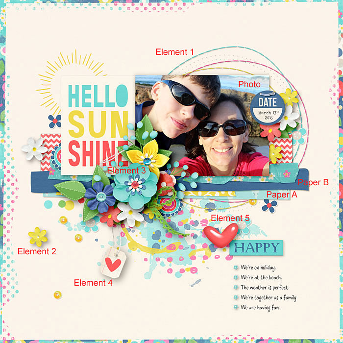
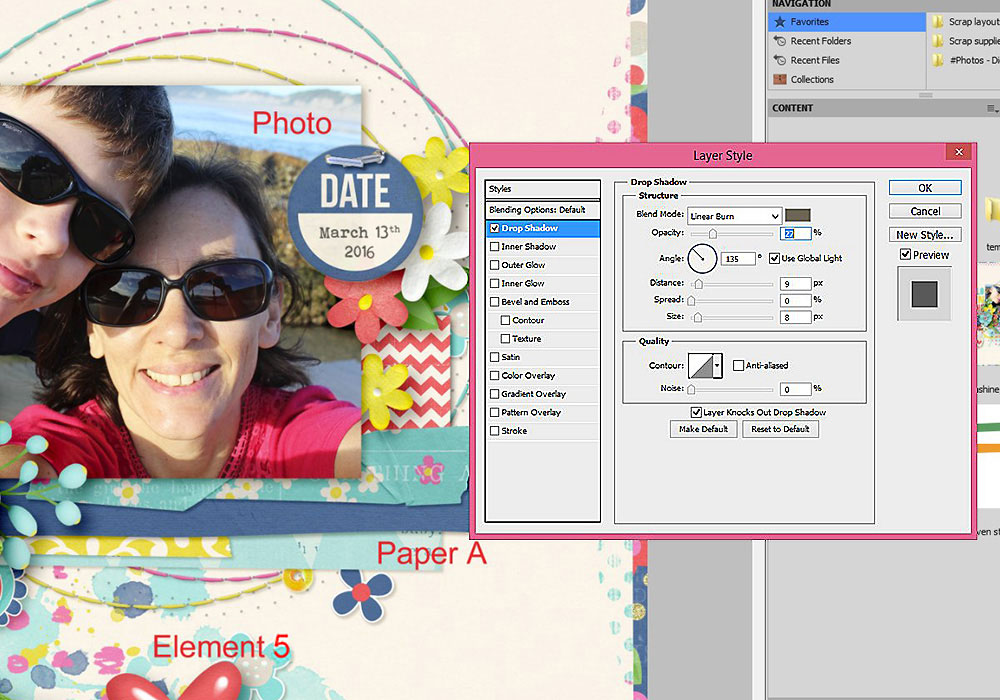
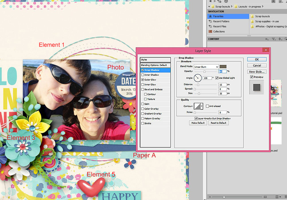
Now I’ll go through the shadow settings I used for some of the papers and elements in my “Hello Sunshine” layout. I work with Photoshop CS5.
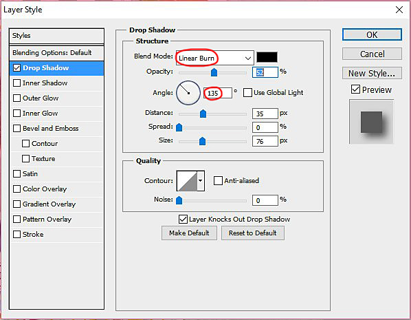
All my shadows are set at an angle of 135 degrees, as if the light source is coming from the top left of my page so the shadows fall to the bottom right. This is just a personal preference – you can set your shadows at any angle you like. An angle of -45 degrees for example, would see your light source coming from the bottom right and your shadows falling to the top left. I also use a ‘linear burn’ blend mode for my shadows.
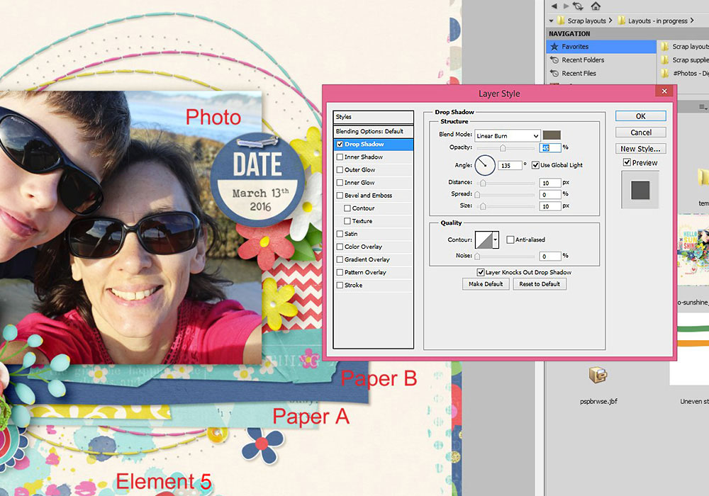
Paper A is the closest paper to my background so I’ve given it a fairly light (low opacity) and small (short distance and size) shadow.
Opacity: 27% | Distance: 9 | Spread: 0 | Size: 8
I usually add an outer glow to my papers, cards and photos to give them some definition on the opposite side to the shadow. This helps to separate them from the background .
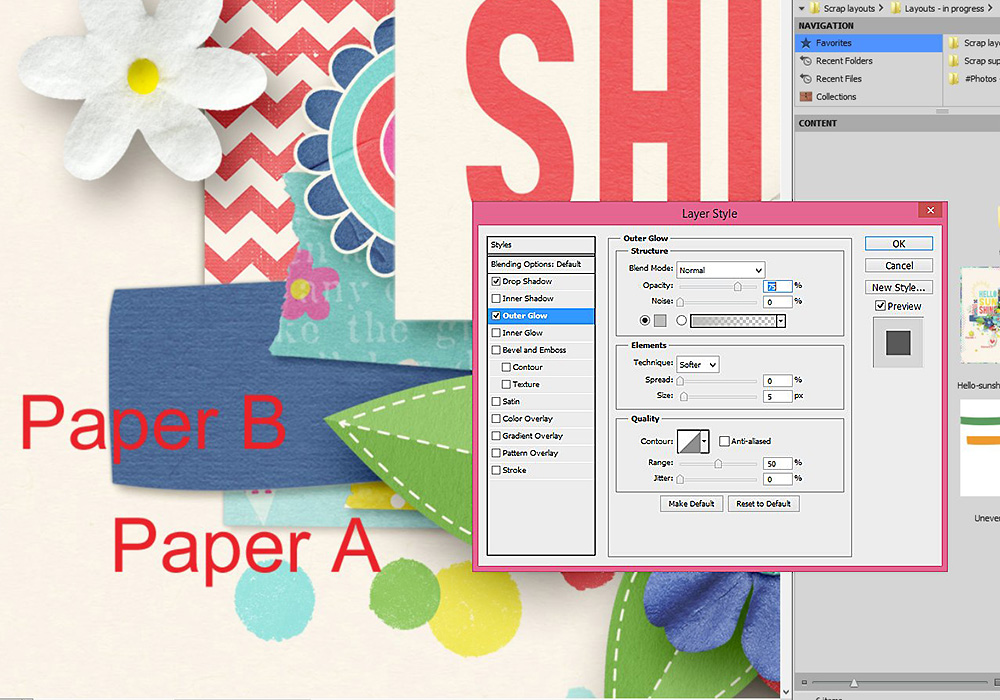
Paper B is the next layer up and has a slightly darker and bigger shadow.
Opacity: 45% | Distance: 10 | Spread: 0 | Size: 10
With photos and cards, I often tuck elements underneath them so I make their shadows even bigger than for a paper piece to give the effect that the photo or card is sitting higher off the page.
Opacity: 45% | Distance: 15 | Spread: 0 | Size: 35
Element 1 is some stitching. This sits close to the background , similar to my first paper layer, so has a low opacity and short distance and size.
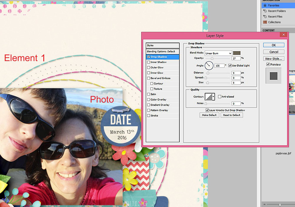
Opacity: 27% | Distance: 9 | Spread: 0 | Size: 8
Element 2 is a small flower. It is thicker than a paper piece so the distance and size of its shadow increase, to reflect the distance the flower is sitting above the background.
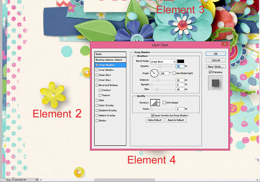
Opacity: 39% | Distance: 29 | Spread: 0 | Size: 49
Element 3 is a bigger flower sitting on top of a bunch of other elements. It has the heaviest shadow of anything on my page. These are the shadows I’m likely to tweak the most, including by increasing the opacity to make the shadow darker. I also use these settings for foilage.
A quick trick I sometimes use to make this shadow darker and heavier is to duplicate the shadowed element, and then adjust the opacity of the duplicated layer down to my liking (somewhere around 50%). This trick also works quite well to make string and ribbon shadows more prominent.
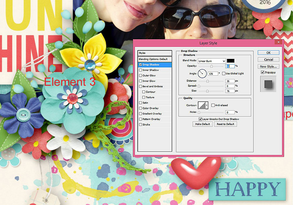
Opacity: 52% | Distance: 35 | Spread: 0 | Size: 76
Element 4 is a tag dangling off my page. I used a high but lighter shadow for this, by adjusting the size and reducing the opacity. I use a similar shadow for ribbons and butterflies where I want them to appear as though they are sitting ‘off the page’.
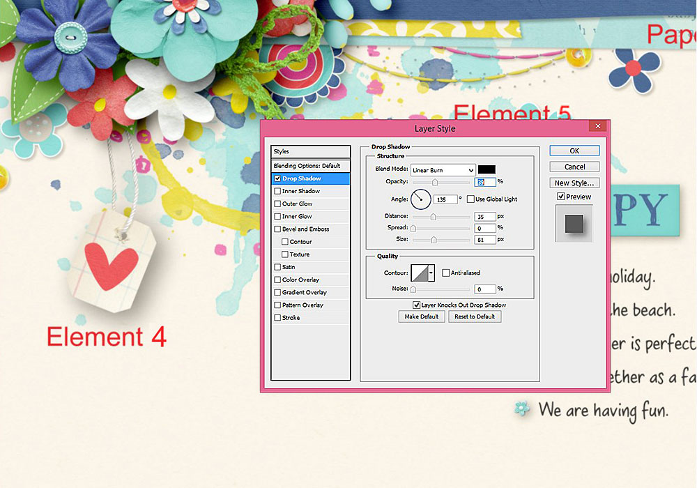
Opacity: 39% | Distance: 35 | Spread: 0 | Size: 81
Element 5 is an epoxy heart, similar to a flair or a button. I give these elements a shorter but darker or ‘denser’ shadow than a flower as they sit flat against the underlying layer(s).
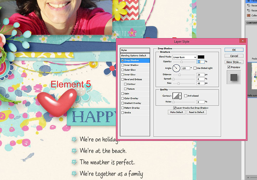
Opacity: 39% | Distance: 29 | Spread: 0 | Size: 49
So there you have a glimpse into how I scrap! As I said at the start, I often tweak my shadows so there is no hard and fast rule that I follow, and I may change the settings I use for the same element or paper from one page to the next. Its really just a case of playing around with shadows until they ‘look right’ to you.