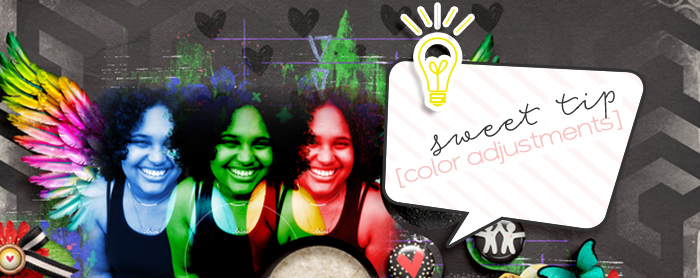
Color Adjustment Layers in Photoshop
 Every month in the forum we host a set of challenges called This or That. Each numbered challenge has 2 options for creating a page. For instance June has lots of summer-y related options like, Option #1a & #1b, giving a choice between vacations or staycations -or- Option #5a & #5b giving you a choice of bodies of water or fields of flowers. These themes are pretty easy to interpret but there’s always a few options each month that allow us to think outside of the box and bring the creative muse forth. Those are the options I love the most.
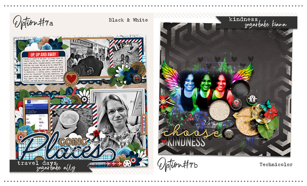
For June, Option #7a & #7b, gave us a choice between black & white or technicolor. Of course, the simplest form of interpretation I had when I saw these as a SugarBabe was using black & white photos (#7a) or using photos in color (#7b). I could have totally went that route….but the creative muse was pushing me to go a bit further. To dig deeper into that creative space and see what I could do if I thought a bit more literal on the definition of ‘technicolor’ itself.
To start my brainstorming of this challenge option I did a quick Google search and read about technicolor on the Wikipedia page. In essence, technicolor is a color process that was used for motion pictures dating back to 1916 that added color to b&w film. I kept reading because I wanted to know more about the actual process and what it actually entailed. The first process was the two-color technicolor and it used a red & green system along with a prism beam-splitter on the black & white films. It would simultaneously expose the frames behind filters of each color to ‘add’ in the color. Technicolor advanced pretty quickly from 1916 and by 1924 Process 4 was a full-color process that now was subtractive synthesis rather than additive like the predecessor of Process 1. This is where the 3 colors: red – green – blue were used in processing the negative film.
Once I kind of understood the actual process of technicolor a bit more I went inspiration searching online. I wanted to see, specifically, art based on and/or created using technicolor processes. My Google search returned numerous entries and it was actually the very first piece of “art” listed that inspired my page.
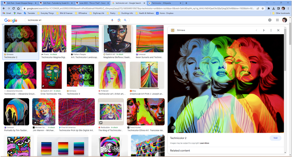
The classic beauty that is Marilyn Monroe is not only stunning but the colors were exactly what I envisioned in my mind when I think of technicolor. So I set out to create this on my page using my lovely daughter’s photo as my ‘Marilyn’.
The steps I used can be done in any software that allows blend modes and hue/saturation adjustments. But for the purpose of this tutorial I am using Photoshop CC 2023.
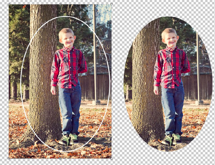
- Find a photo that is mostly of your subject. There can be minimal things in the background but you don’t want a photo of someone where there are a ton of people or objects behind them.
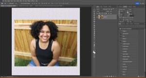
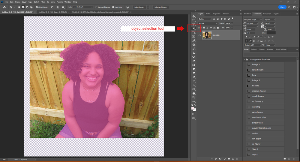
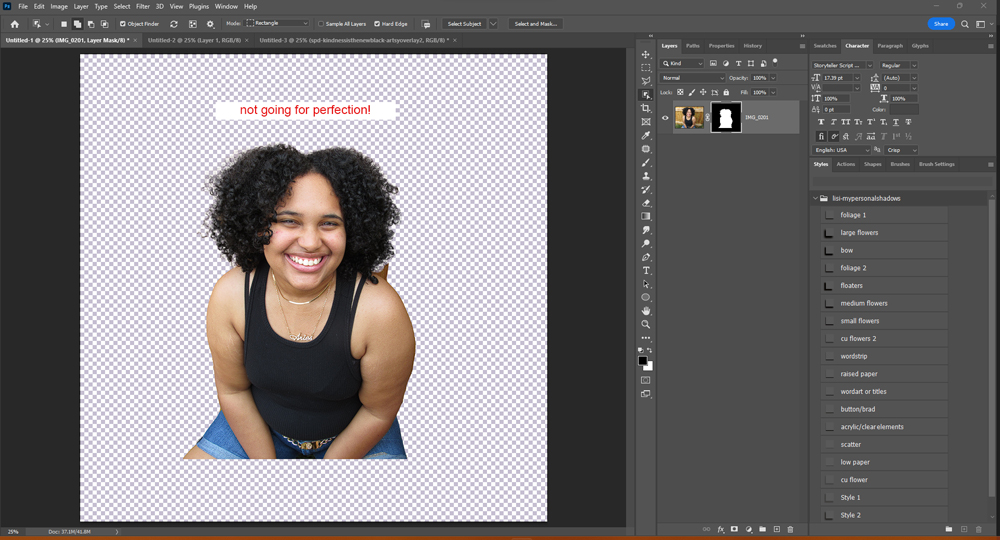
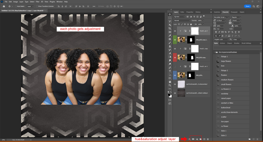
- I used the Object Selection Tool to extract out my daughter. Not worrying about any bits from the background that were left over. This doesn’t have to be pinpoint perfect since we’re using blend modes.
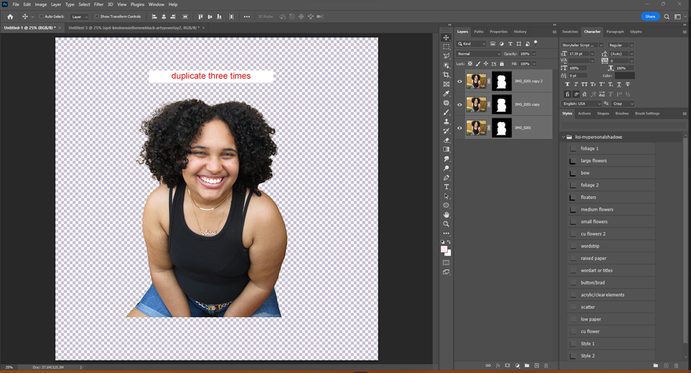
- Since I know there are 3-colors to the process I duplicated the extracted photo 2 more times.
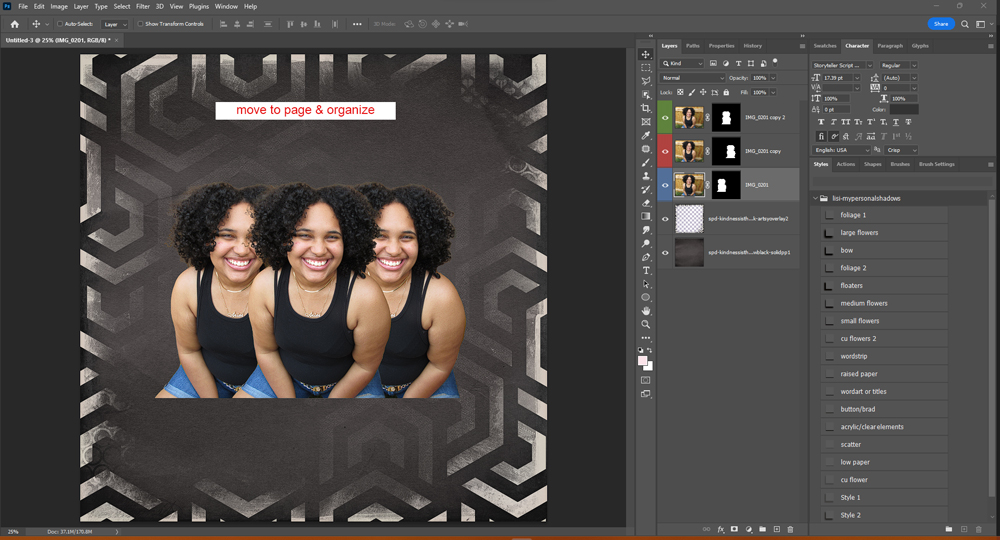
- Then you start your layout. I added in the background layer I wanted to use, this is easier for me to see how each photo will blend once I start adjusting the colors and blend modes. I also went ahead and organized the photos in the grouping of how I wanted them. **placing the photo in the center on top of the other two since that was to be the green layer and focal point.
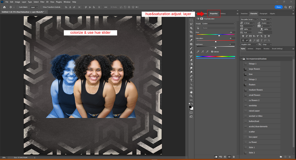
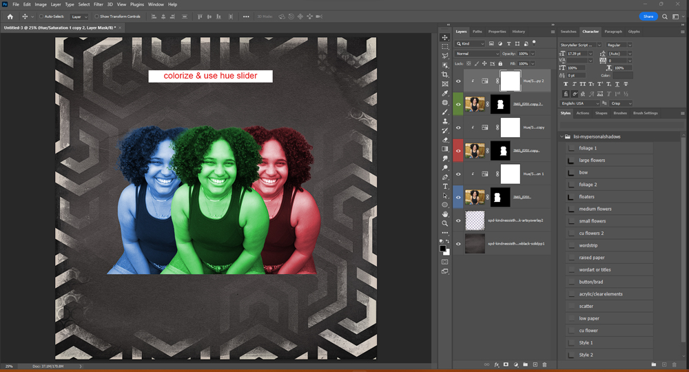
- Now that everything is lined up I started by adding the Hue/Saturation Adjustment layers to each photo by clipping them. Then going to my properties panel I went about adjusting them for the 3 colors I wanted them. Making sure I checked the ‘Colorize’ box and then using the ‘Hue’ slider to adjust the color to each of the 3. Blue, Green, and Red.
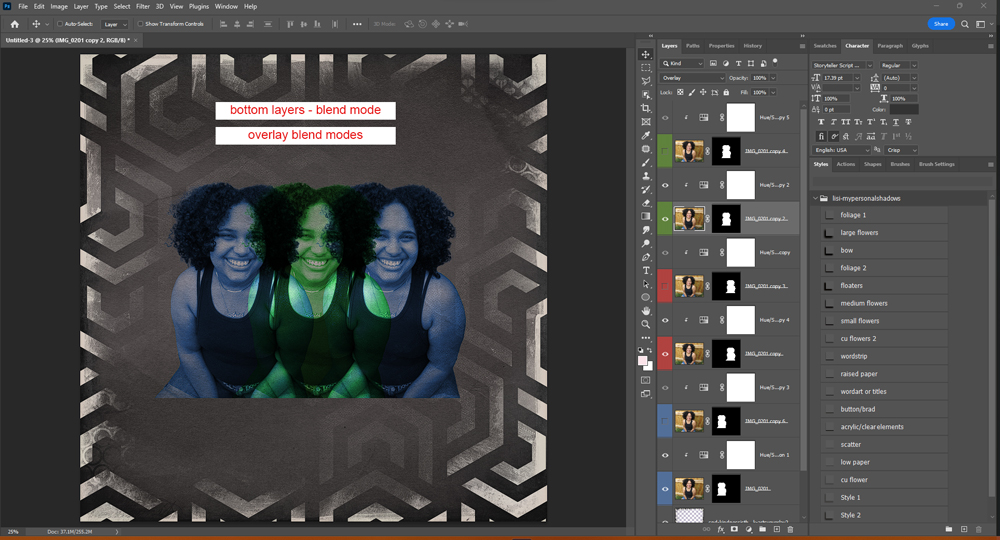
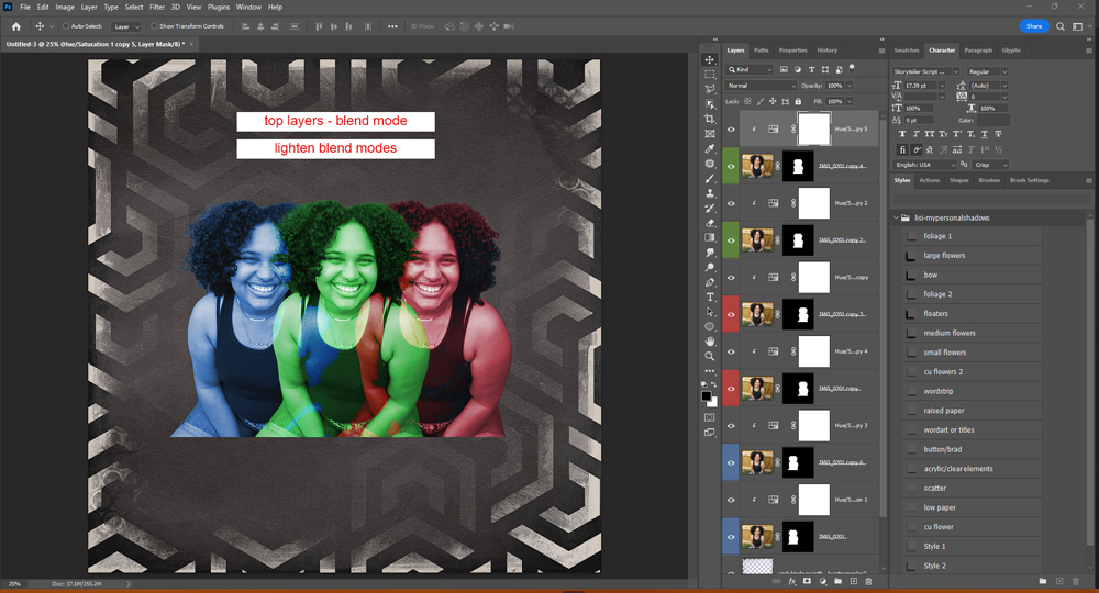
- Now that we’ve got our colors we get to play with the layer blend modes until we find something we like. I had to duplicate each photo & the respective hue/saturation layer so that I could work with more than one blend mode to get the effect that I wanted to see.
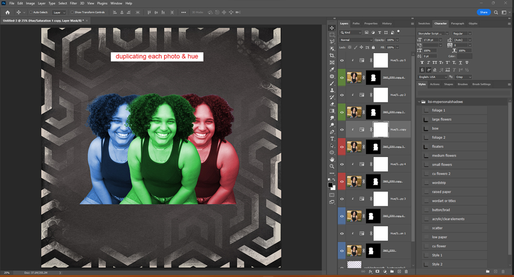
- Each of the colors now has 2 photos. I started with the bottom photo in each color group and changed those blend modes to ‘Overlay’. (I’m only changing the blend mode of the photo layers, not the actual hue/saturation adjustment layers). Overlay is where dark tones shift mid-tones to darken the color and light tones shift the mid-tones to brighten using calculations based on the brightness of the original base layer. This is why things become sort-of “see-thru” or blended into the backgrounds. *notice the red took on a dark tone and looks blue because of the dark black/grey paper underneath.
- Then each of the color groupings top photo layer I used the blend mode ‘Lighten’.
- From here I’ve got the look I want. I scaled my groupings down and placed them where I wanted them and started building my layout around them. You can play with all the different blend modes for all kinds of cool effects to create what you want your photos to look like. Or you can add more duplicates for the extra pop of color. *I love using blend modes for easy background blending without a lot of masking too.
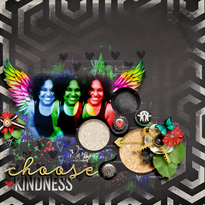
I had lots of fun creating this page and just playing with the hue/saturation and the blend modes seeing what I could do. I’d love to see you try out the technicolor method this month for option #7b. I really hope this gives you a little push and some tips to try it out yourself.