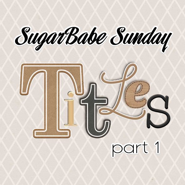
SugarBabe Sunday – Title Work II – 2/20
Welcome to the fourth post in a series of SugarBabe Sundays where we examine the digital scrapbooking elements that we struggle with and ask the Shoppe’s creative team for ideas. In October we looked at four ways feathers can be used on a layout. November saw us focusing on doodles and hand-drawn elements. And last month, we began our deep-dive into the different ways we can create titles on our scrapbook pages. That’s such a huge topic, we were only able to cover the first part of it in last month’s SugarBabe Sunday. So today, we’re going to pick it back up and finish our discussion of Title Work!
Our SugarBabes create their layout titles in six different ways. They:
- use the title from a template,
- use a pre-made journaling card as a title,
- use pre-made word art,
- use one or more pre-made alphabets,
- use a font,
- or mix, match, and combine word art, alphabets, fonts and/or elements.
Last month’s post, Title Work I, focused on the first four methods on that list. Let’s do a quick review…
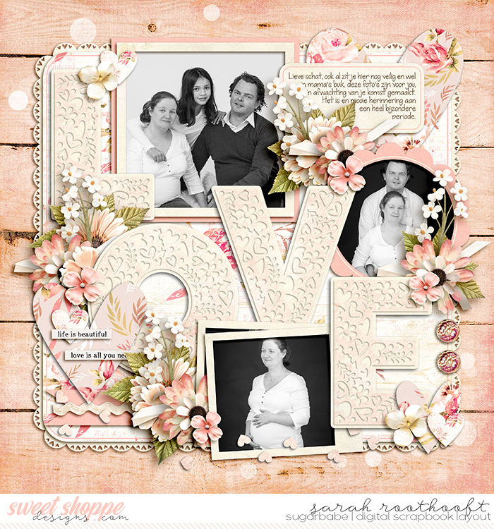
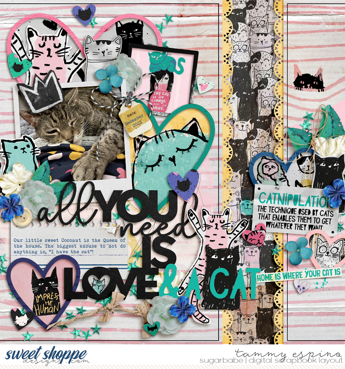
1. Use the title from a template.
Many templates in the Sweet Shoppe come with gorgeous, pre-designed titles that are ready for you to customize by clipping patterned papers or applying layer styles to the title layers. Here are some recent examples from SugarBabes Sarah and Tammy:


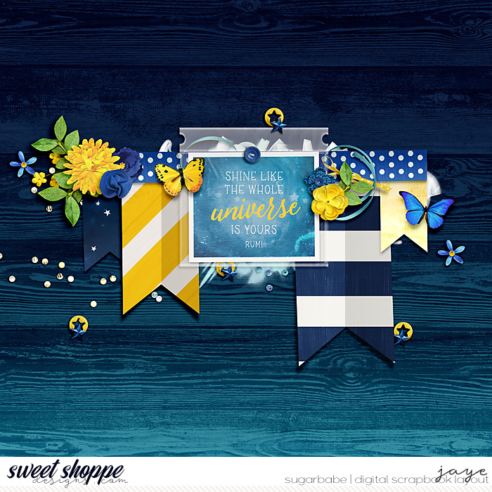
2. Use a pre-made journaling card as a title.
Journaling cards can make quick and easy titles for your scrapbook layout. Here are two recent examples from SugarBabes Jaye and Kjersti:


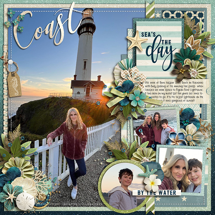
3. Use pre-made word art.
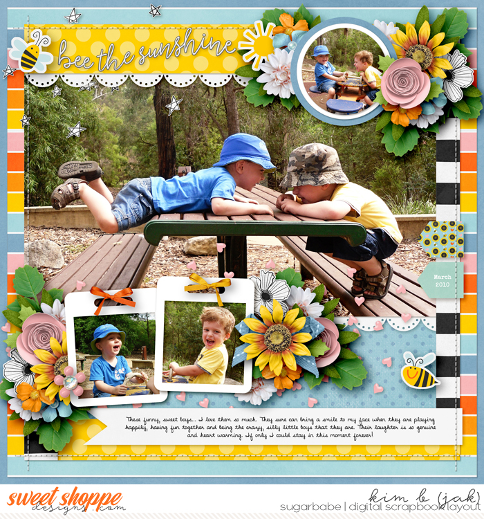
Why start from scratch every time when the kit you’re working with already comes with beautiful word art? If it’s a good fit for the title you want on your page, you can use pre-made word art just like SugarBabes Kim B. and Sheri did on these recent layouts:


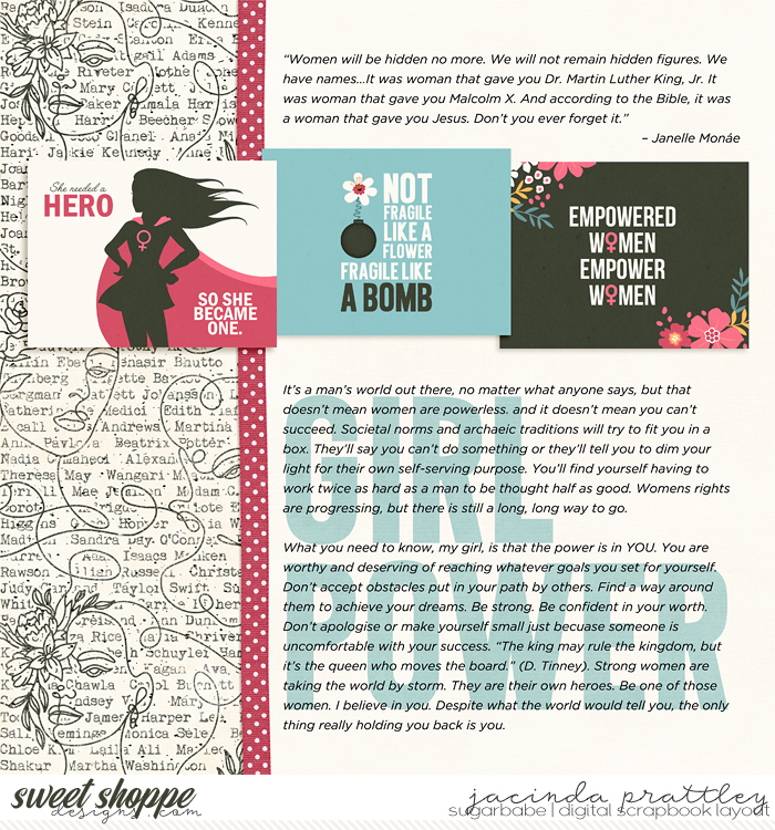
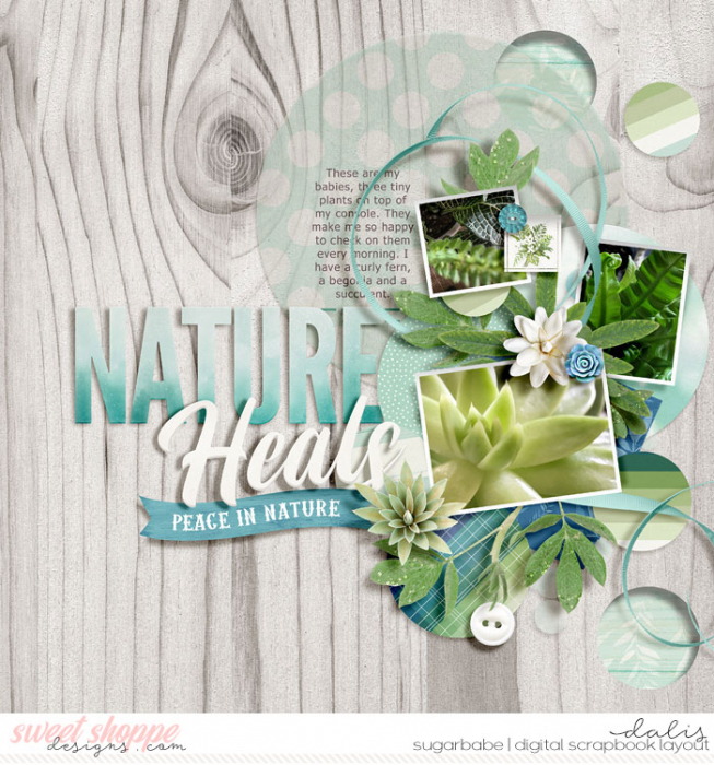
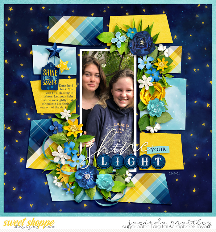
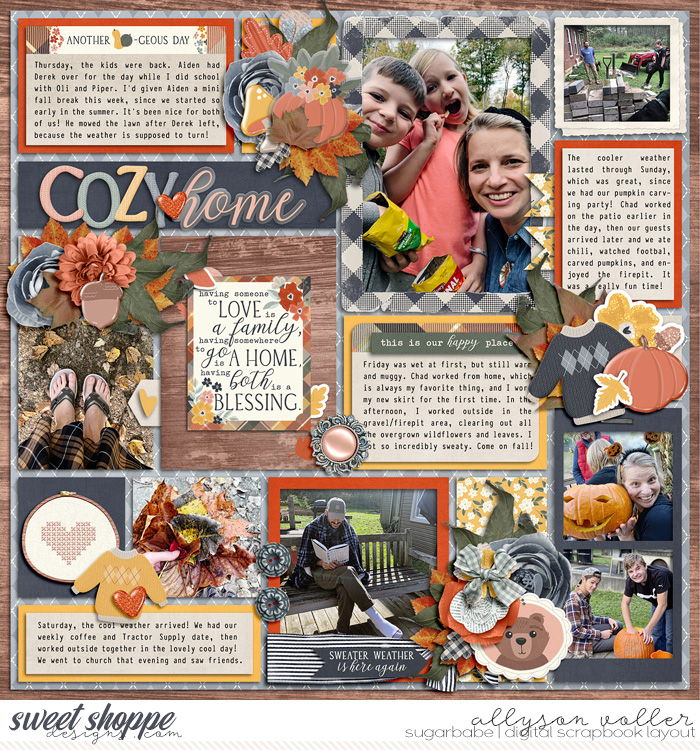
4. Use one or more pre-made alphabets.
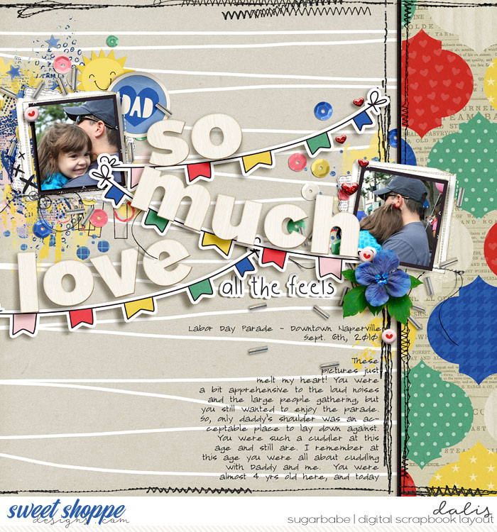
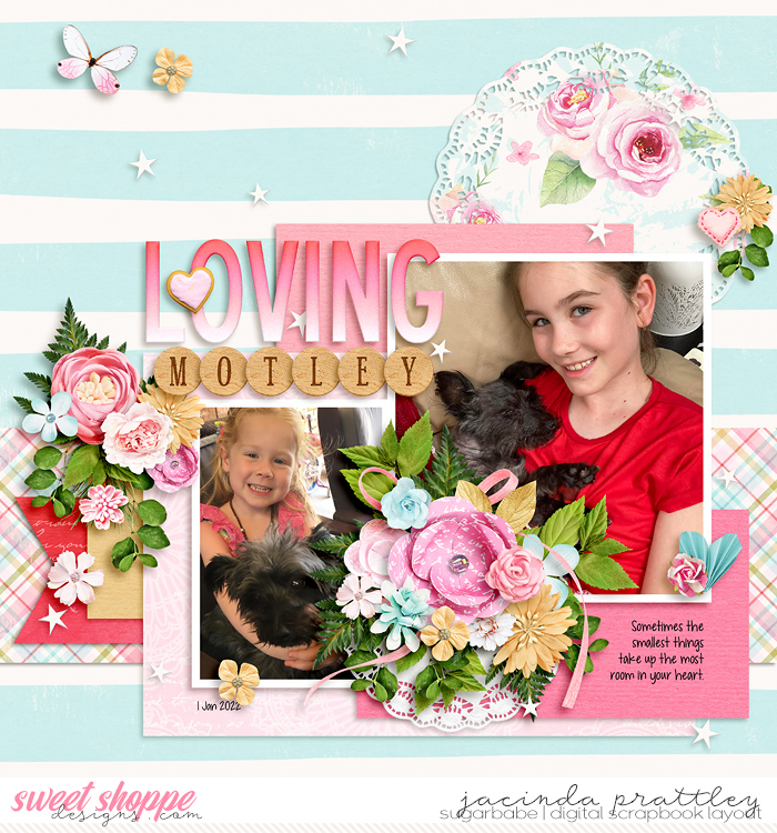
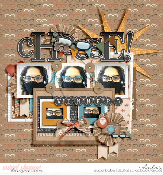
Pre-made alphabet elements harken back to the days of paper scrapbooking and sheets of alpha stickers. They are a classic way of creating a title on your layout, and the best part is, unlike those physical sticker sheets, with digital, you never run out of letters! Here are recent layouts from SugarBabes Dalis and Jacinda with titles they created using pre-made alphabets:


Remember, to go deep into these four methods of building titles – using the title from a template, using a pre-made journaling card, using pre-made word art, and using one or more pre-made alphabets – check out last month’s SugarBabe Sunday post, Title Work 1. Now, let’s pick up where we left off and talk about the next method our SugarBabes use when creating titles on their scrapbook pages…
5. Use a font.
When it comes to my own scrapbook layouts, fonts are – hands-down – my personal favorite method of creating titles. Perhaps it’s because I’m a self-professed font junkie with a bit of a “collecting problem” (*cough* over 13,000 *cough*) but I prefer to think it’s because when you combine a unique typeface with layer styles, the possibilities are endless!
Let’s look at five different ways of using a font to create a title:
- a. typography behind journaling,
- b. cut out from a photograph,
- c. beveled to create chipboard,
- d. stroked to create a sticker, and
- e. stroked to emulate a cut file.
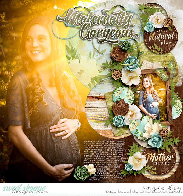
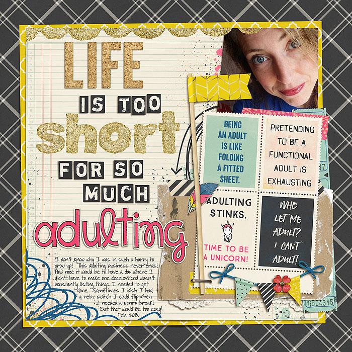
a. Typography behind journaling.
One of the ways SugarBabes Jacinda and Kiana create standout titles is by placing them behind their journaling text and lowering their opacity as in these examples:

This technique works best when your title is just a few words long and you use a chunky, heavy-weight sans-serif or slab-serif font for ease in reading. It’s a balancing act; be sure to lower your opacity enough that your journaling text is easily readable but not so much that your title is unreadable.
b. Cut out from a photograph.
As SugarBabe Dalis says, sometimes you just need to “Keep it big, simple, and cut it out!”
You can learn more about this technique in the Tutorials section of our site in the article Three Methods for Creating Cut Outs on your Layouts. Although it’s demonstrated in an older version of Photoshop, the process is still applicable.
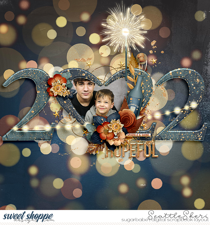
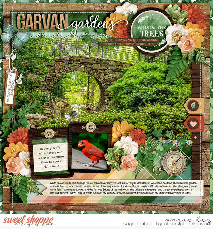
c. Beveled to create chipboard.
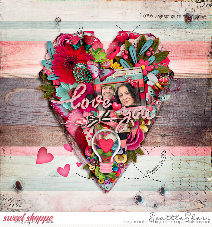
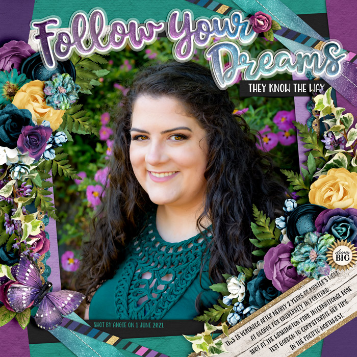
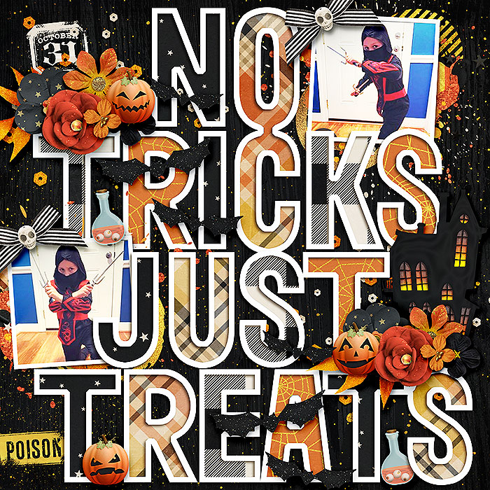
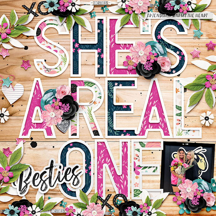
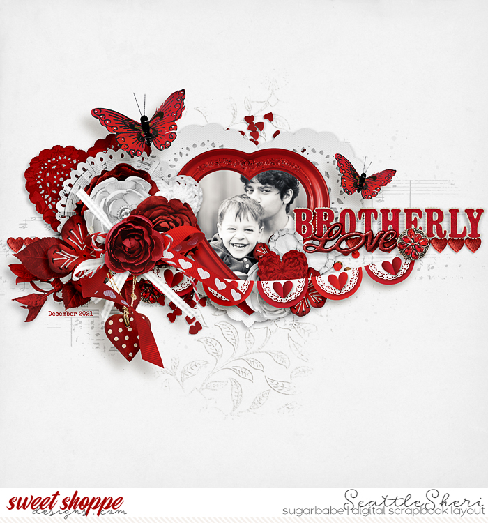
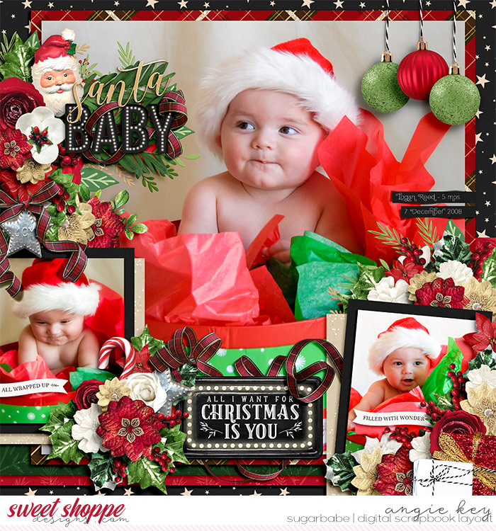
By applying an bevel layer style to a text layer, you can make it look like your title is made of a thick chipboard. To take it up a notch, clip patterned paper to the text layer before applying the layer style, as shown in these examples by SugarBabes Sheri and Angie:

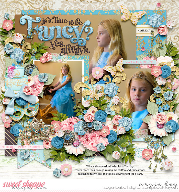
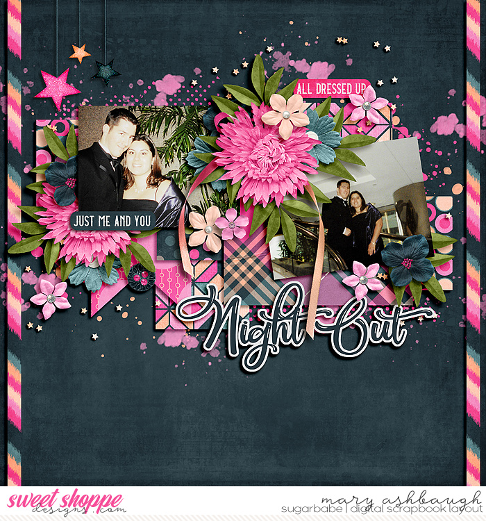
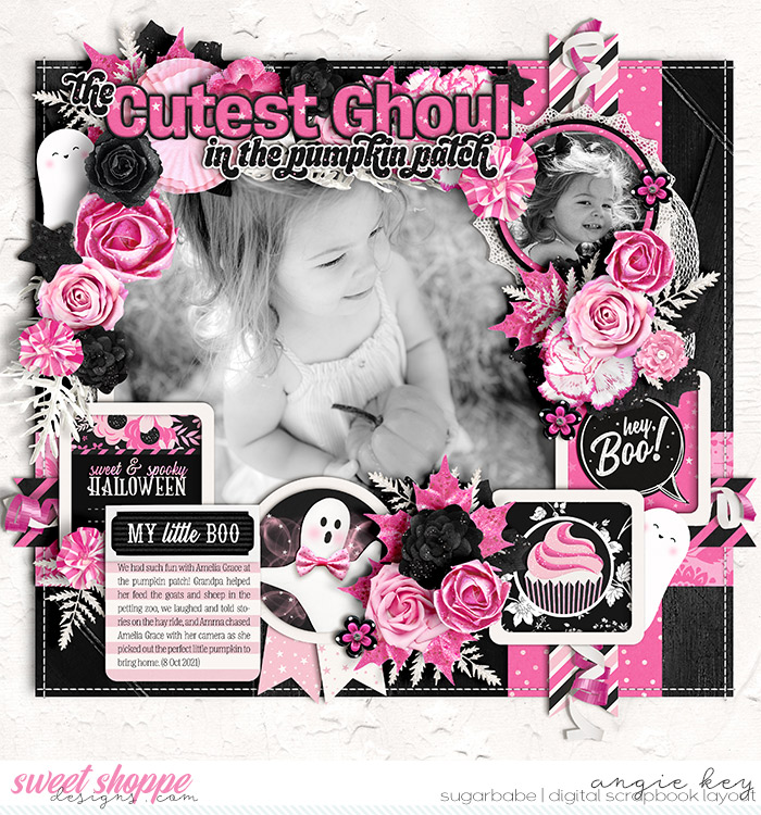
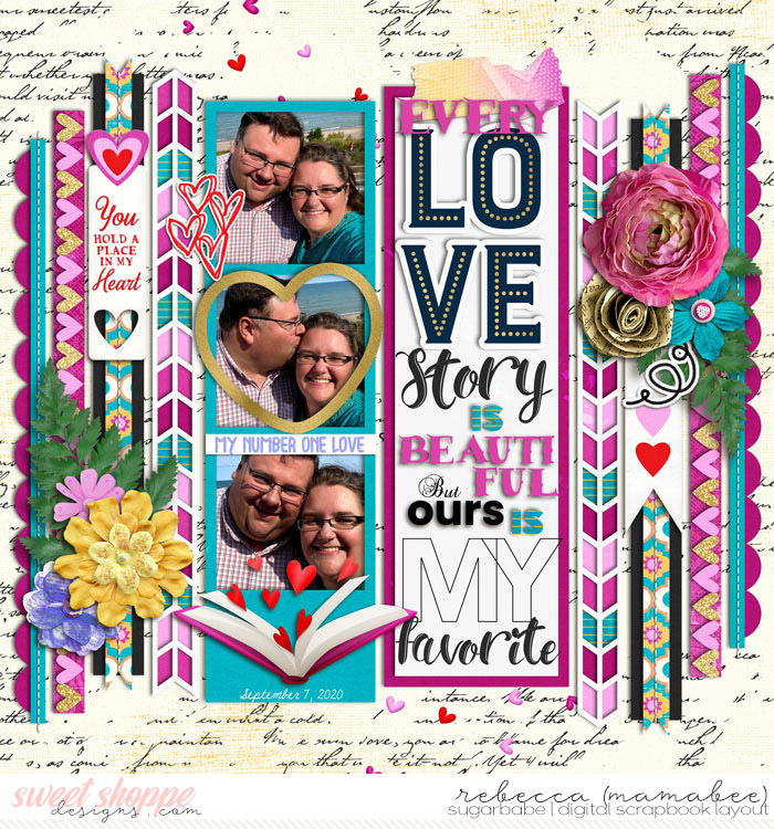
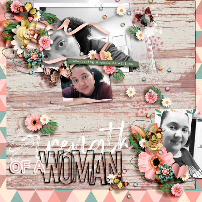
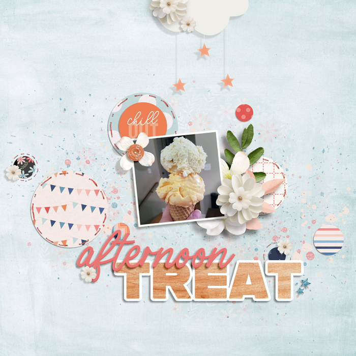
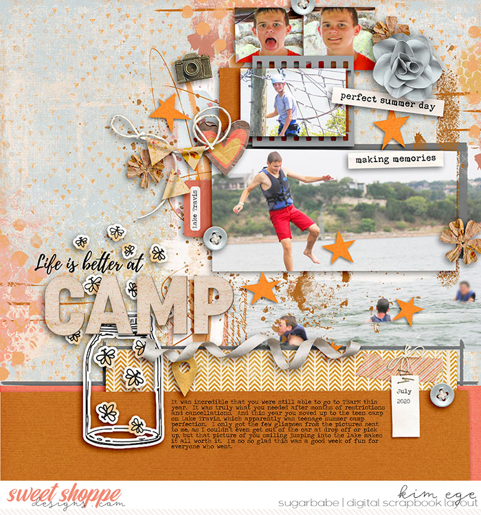
d. Stroked to create a sticker.
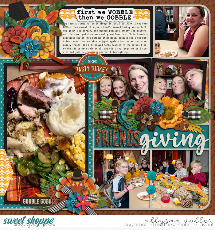
Adding a simple stroke to the outside of a font is a fast and easy way to create a title that stands out on your scrapbook page as shown in these examples from SugarBabes Mary, Angie, and Kim:


And remember, the stroke around a title doesn’t always have to be white:
Nor do you have to limit yourself to a single stroke. In the example below, after clipping a patterned paper to the text layer, I added a layer style to stroke it in white. Then, I duplicated that layer and rasterized its style, and added another stroke with a lowered opacity to emulate vellum:
The possibilities are endless!
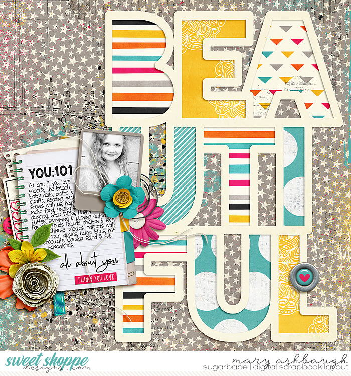
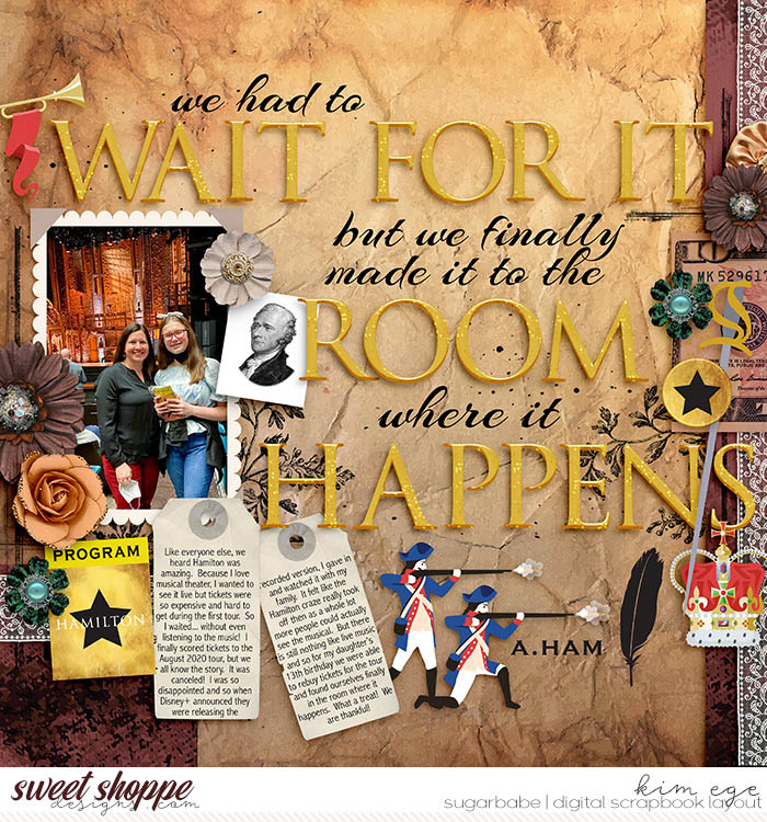
e. Stroked to emulate a cut file.
Jak says, “The queen of stand out titles would have to be Mary (marnel) – her gallery is full of them. I especially love her cut out ones and I would love to know how she does them!!”

This type of title is often created using a custom cut file but can also be created using a font and layer styles!
After typing out your title (a chunky, heavy-weight sans-serif font works well for this) apply a thick stroke to the text layer. Then change the layer fill to 0% (so the text disappears, but the outline remains).
As you can see, fonts give you so very many options when it comes to creating titles on your scrapbook pages! Our SugarBabes like to use fonts to create titles that are:
- a. typography behind journaling,
- b. cut out from a photograph,
- c. beveled to create chipboard,
- d. stroked to create a sticker, and
- e. stroked to emulate a cut file.
6. Mix, match, and combine word art, alphabets, fonts, and/or elements.
Now that we’ve looked at each of the individual methods that can be used to create a title, this is where your creativity gets set loose and you combine them any which way you please! I’ve got a slew of examples for you of how the SugarBabes create truly standout titles by mixing, matching, combining, and decorating their titles with word art, alphabets, fonts and/or elements. Let’s take a look:
Combining word art and alphabets
If a kit has a piece of word art that inspires you but doesn’t give you the precise title you want for your page, you can easily combine it with the kit’s alphabet to create exactly what you want.


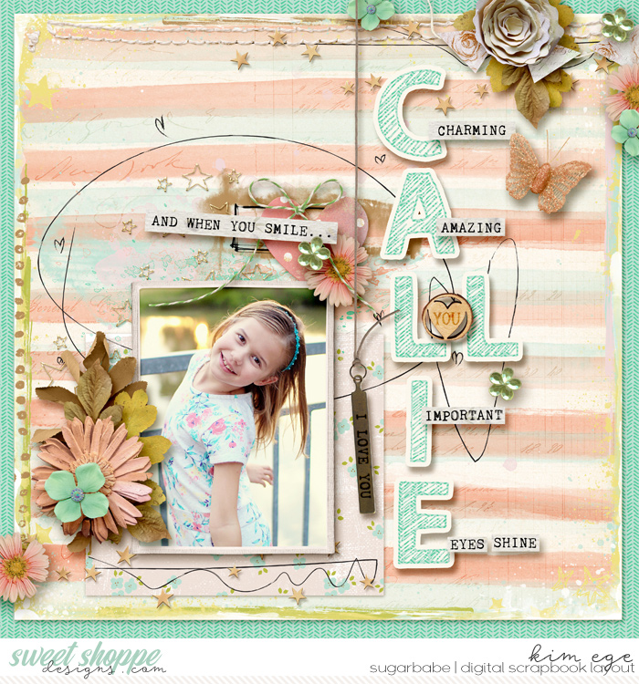
Combining alphabets and fonts
Another option for creating your title is to mix the alphabet from the kit and a font. Combining two different typefaces brings contrast into your title and can create fun visual interest, as shown in these examples from SugarBabes Kim and Angie:
Decorating them with elements
If you really want to take your titles to the next level, start looking for ways to decorate them! Dalis’s advice: “Use the holes of your letters to decorate the title.”
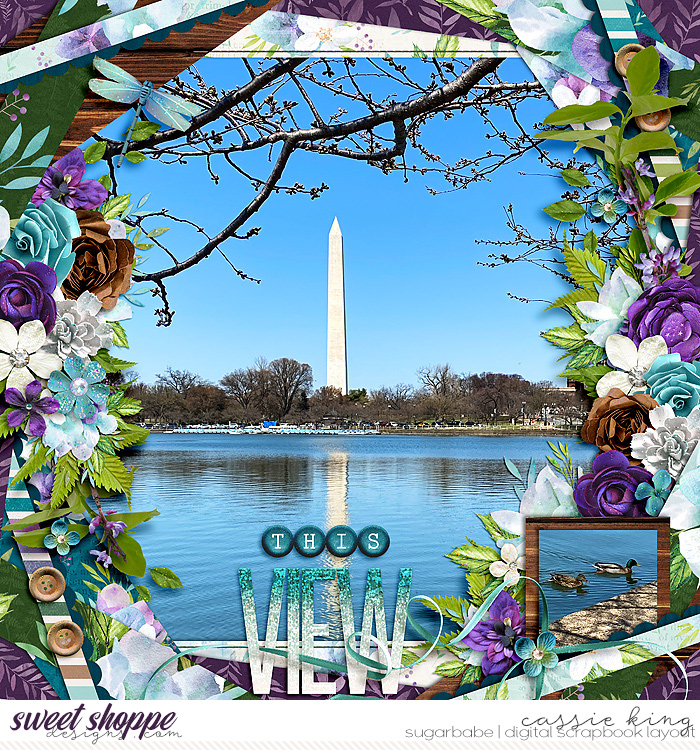
SugarBabe Cassie says, “I also really like to weave ribbons through my titles (like the one on my Washington monument page). It’s a fun little added detail I think!”
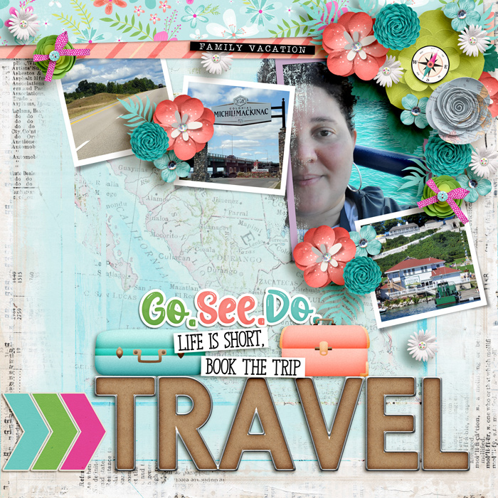
You can even just tuck the elements behind and around your title and treat it like an element cluster. SugarBabe Kiana said, “In this layout I used … the suitcase elements to create a standout title to convey how I was feeling about finally taking a family vacation that was long overdue.”
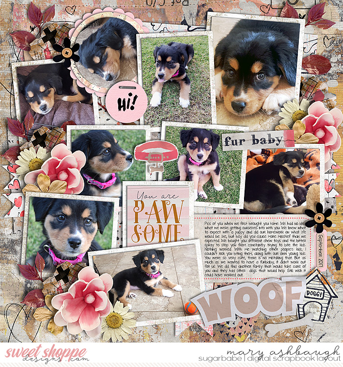
Isn’t that adorable? Here’s another example from SugarBabe Mary:

Aaaaaaaaaaand I’m spent! Whew! I can’t believe we made it through all that material… how about a quick review?
You asked us to focus on Title Work and look at different ways you can create titles for your scrapbook layouts. After talking with the SugarBabes and taking a deep dive into their Gallery, we learned they create their titles in six different ways. They:
- use the title from a template,
- use a pre-made journaling card as a title,
- use pre-made word art,
- use one or more pre-made alphabets,
- use a font,
- as typography behind journaling,
- cut out from a photograph,
- beveled to create chipboard,
- stroked to create a sticker, and
- stroked to emulate a cut file,
- or mix, match, and combine word art, alphabets, fonts, and/or elements, including
- combining word art and alphabets,
- combining alphabets and fonts,
- and decorating them with elements.
We covered #1-4 in Part 1 (which can be found here), and #5-6 in Part 2 (which is this post).
I hope you’ve come away with some new ideas and fresh inspiration for creating your next layout title. Be sure to post your finished layouts in the Gallery so we can be inspired by your title creations and leave you feedback and love.
Is there another type of digital scrapbooking supply you struggle to use or would like more ideas for? Let me know in the comments, and it could be the topic of a future SugarBabe Sunday!
Dalis said...
on February 22nd, 2022 at 8:28 am
Angie, wow! This is so comprehensive! Thanks for using some of my pages! It is always such an honor to see my page there. I still pinch myself.!
– Dalis
leablahblah said...
on February 22nd, 2022 at 2:16 pm
I love these types of blog posts! Thank you!
immaculeah said...
on February 22nd, 2022 at 5:24 pm
What an array of examples! Love all the inspiring pages and great ideas shared.
Jenna in Canada said...
on February 23rd, 2022 at 12:49 pm
Thank you so much for these awe-inspiring posts. I look forward to these every week. Please keep them coming Angie!
Claire Grantham said...
on February 25th, 2022 at 12:36 am
This is awesome so many great tips and tricks and inspiring ideas.
Lily said...
on March 5th, 2022 at 10:14 am
This is such a great resource. I hope there’s more of the same.
Scrap-therapy said...
on March 5th, 2022 at 11:01 am
Angie, sorry for the late comment but just to told you that I LOVE this second part! So much inspiring ideas and the great ideas you gave. Your article is so clear and so pleasant to read, I really enjoy it a lot! Thank you for doing this!:)