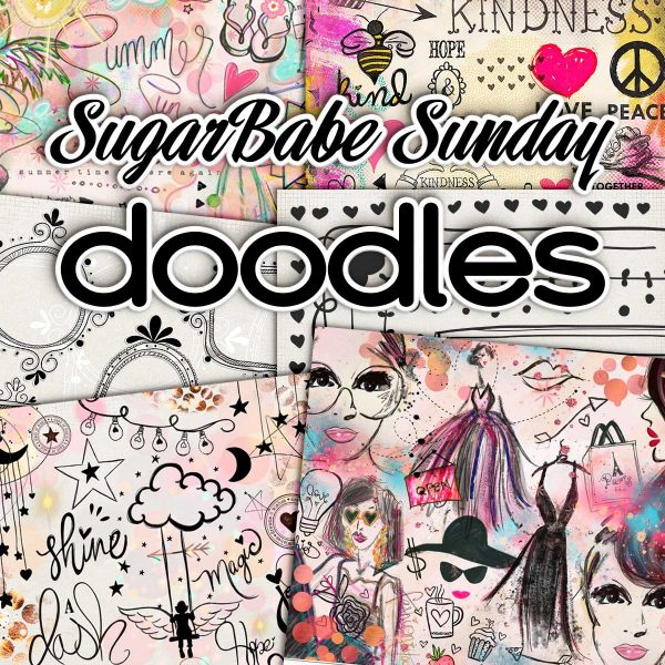
Sugar Babe Sunday – Monochromatic Layouts – 3/27
“Color is a power which directly influences the soul.” – Kandinsky
In honor of National Color Therapy Month and the ancient Indian Festival of Colors, Holi, we are continuing our celebration of color with this week’s SugarBabe Sunday as we examine monochromatic layouts.
A monochromatic color scheme is a color palette in which a single color tint is used as the basis for all shades and hues found within the image. The shade of color is varied by changes made to the saturation and/or brightness of the base color. White and black are always present as the two extremes on either end of the spectrum for whichever color is chosen for the monochromatic color scheme.
Monochromatic Scheme Characteristics:
- Based upon a single color
- Includes the various shades and hues of the base color
- Black and white can be present
What is a Monochromatic Color Scheme – Definition, Examples by Sam Kench at StudioBinder
Monochromatic color palettes are used by artists, interior designers, and filmmakers alike because they help to create a mood. Warm colors, like red, yellow, and orange, evoke warm or excited feelings like optimism, enthusiasm, and passion. Cool colors, on the other hand, such as green, blue, and purple, typically have a calming effect and tend to be relaxed and subdued. In our 3/17 Thursday Treats post on Color Therapy, we ended the blog post with a brief run-down on the psychology of color you can reference for your next layout.
“Whether you realize it or not,” writes Sam Kench, “certain colors evoke certain psychological responses in the human brain at a subconscious level. These pre-determined associations have been reinforced throughout generations of storytelling for both the subconscious associations and for the thematic relevance. Refer to the helpful chart below for some of the most common responses associated with particular colors.”
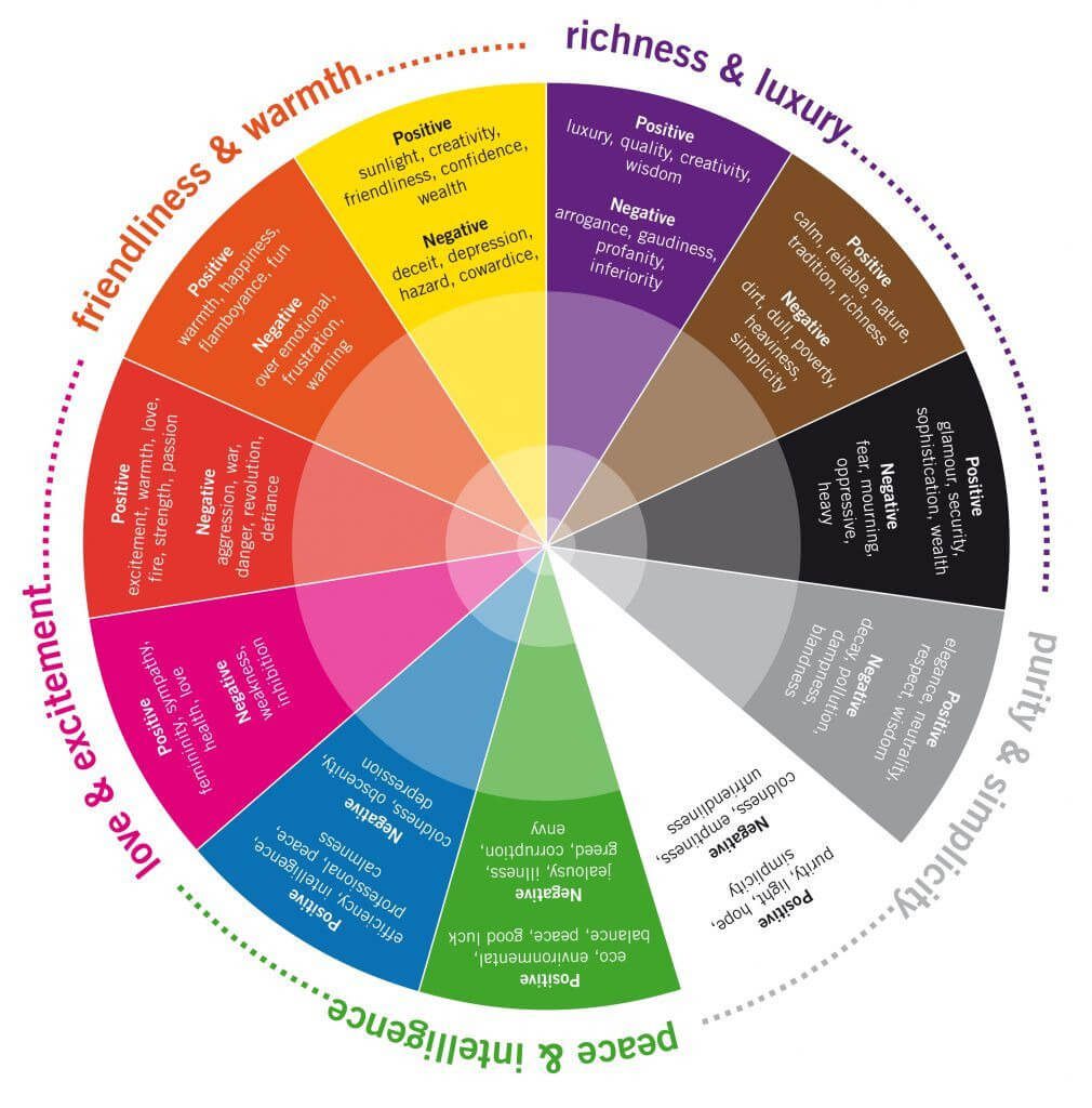
What are monochromatic colors? • The psychology of color visualized
Artist Georgia O’Keeffe once said, “I found I could say things with colors that I couldn’t say in any other way – things that I had no words for.” Color and the psychology of color are tools you can use as a scrapbook artist to convey meaning and add depth to your layouts. With this in mind, I asked the SugarBabes to show us some of their monochromatic layouts and talk to us a bit about their creation process. To be technical, what we’re really looking at are monochromatic(ish) layouts, where everything is based on a single color plus what we consider neutrals in scrapbooking: black, white, grey, kraft, or cream. So let’s take a closer look!
Pink
femininity, youth, innocence, sympathy, health, romance and love

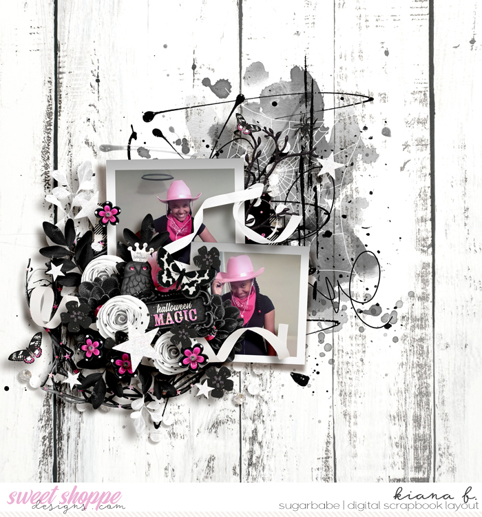
Halloween Magic by Kiana

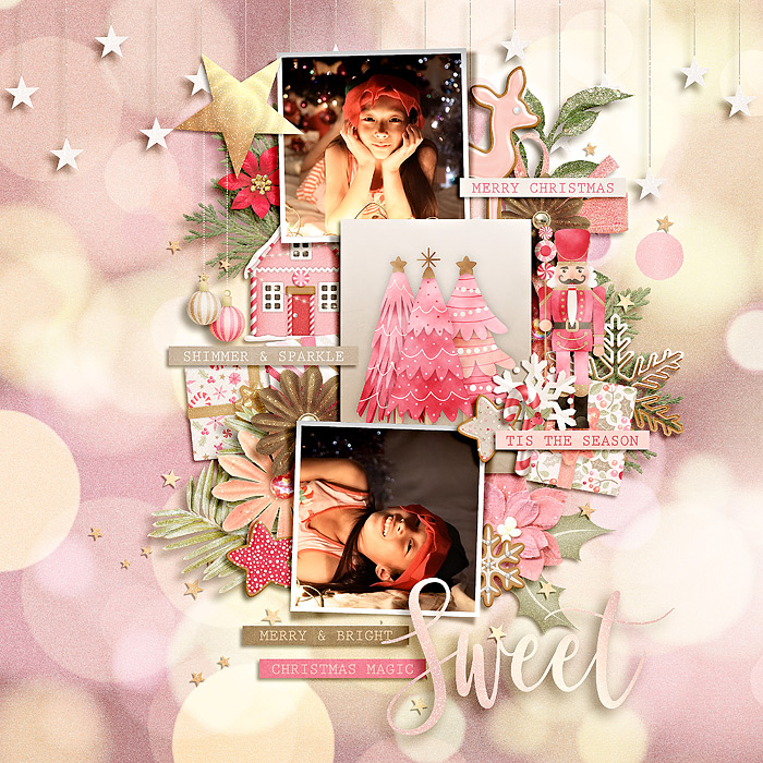
Sweet by Eve Chowindra

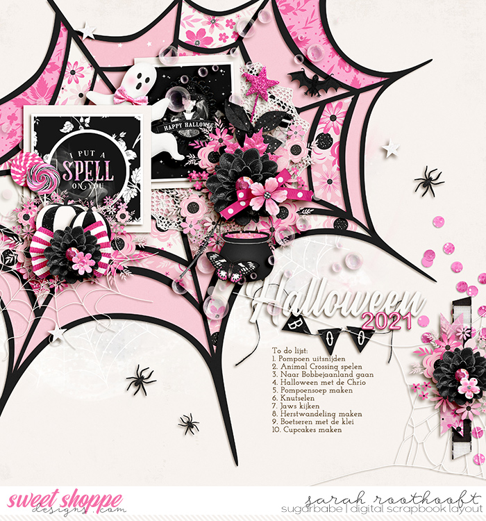
Halloween 2021 by Sarah

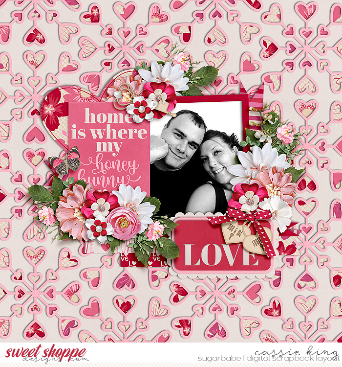
Love by Cassie
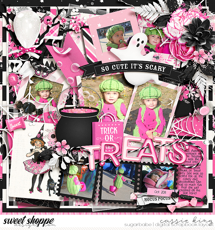
Trick or Treats by Cassie

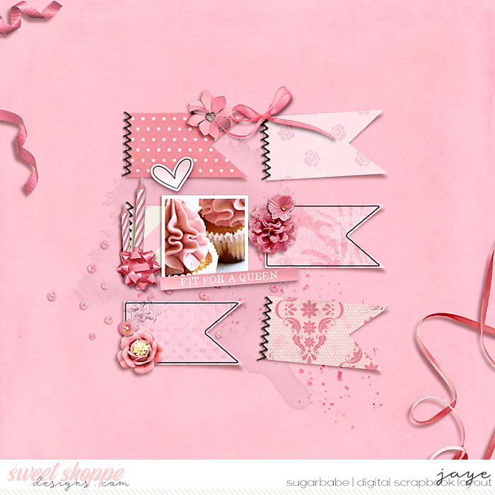
Fit for a Queen by Jaye

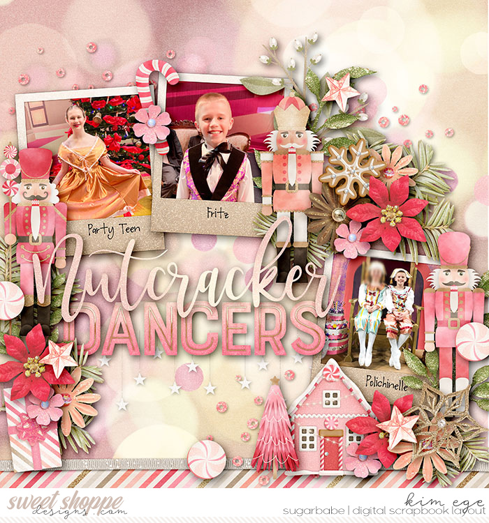
Nutcracker Dancers by Kim

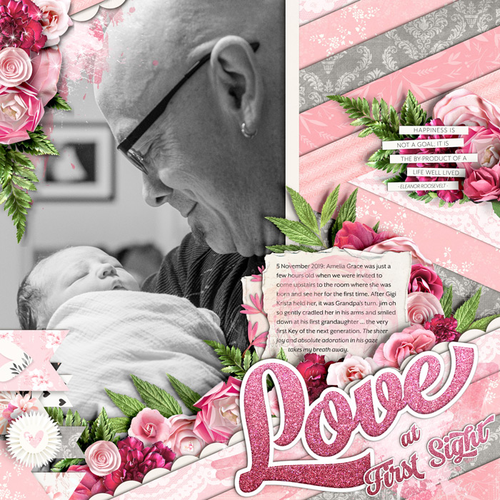
Love at First Sight by Angie
Angie said: “Newborn skin is nearly always blotchy and red, so the easiest solution for a pic of an hours-old infant is to convert it to black-and-white. That gave me complete freedom to work with any color. I chose light pink to represent youth and femininity – she is our first granddaughter – and the deeper shades of pink to represent the deep and instantaneous love I could see in my husband’s eyes.”
Red
excitement, warmth, love, fire, strength, passion, heat, desire, courage, confidence, power. anger, aggression, war, danger, stress, wrath, revolution, defiance, sacrifice.

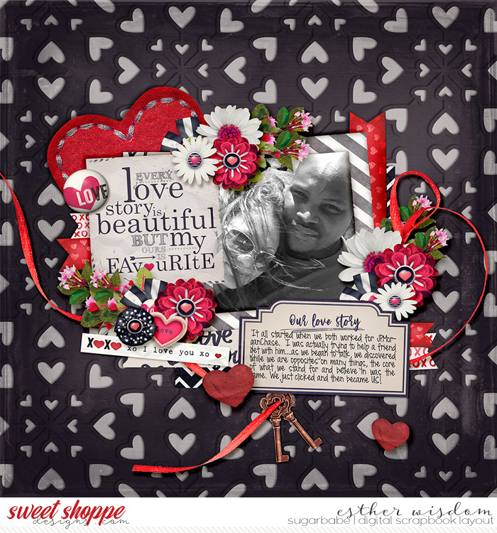
Love Our Story by Esther

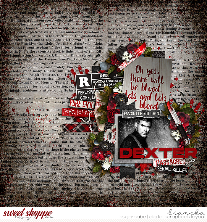
Dexter by Biancka
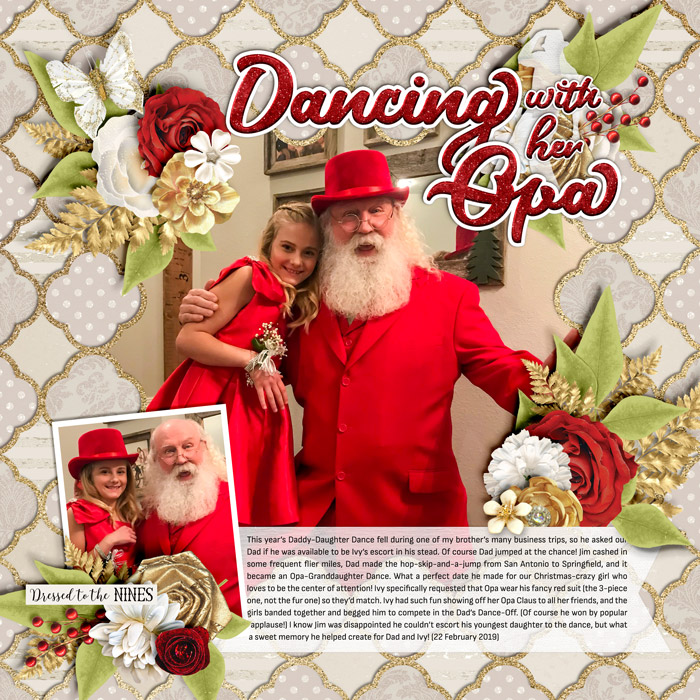
Dancing with her Opa by Angie
Angie said: “The subject of these photos really drove the design of this layout and my color selection. My Christmas-loving niece, Ivy, asked her Opa (a professional real bearded Santa) to take her to the annual Daddy-Daughter dance and specifically required that he wear his red three-piece suit and top hat. Since that was a key element of the story, I chose to use elegant creams, golds, and white as my neutrals and accent with strong pops of red. I love the way the design subtly introduces the story before you ever get to the journaling: her excitement to show off her Santa Opa at the dance and his sacrificial love for his granddaughter.”
Orange
playful, energetic, fresh, healthy, warmth, happiness, flamboyance, fun. over-emotional, frustration, warning. Peach is sweet and affable; vibrant orange is vitality, energy, and encouragement.
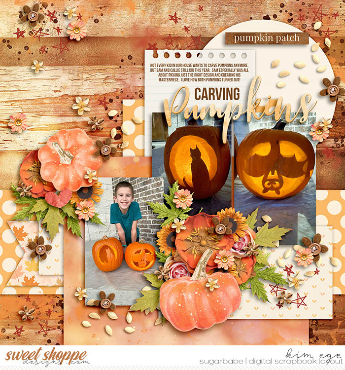
Carving Pumpkins by Kim
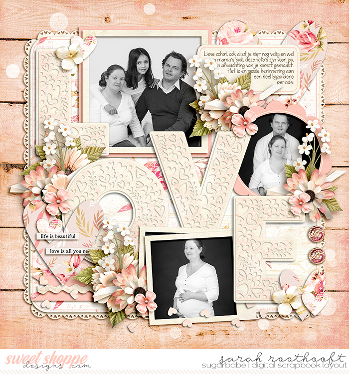
Love by Sarah
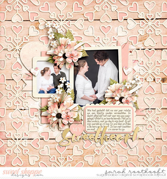
My Sweetheart by Sarah
Sarah said: “I wanted to use a soft color for these photos that are very dear to me. I was going through my stash and found this kit. The soft [peach] spoke to me.”
Yellow
sunlight, creativity, friendliness, confidence, happiness, cheerfulness, joy, energy, mental clarity, intellect, wealth. deceit, depression, hazard, cowardice. “Lighter shades play on the happiness aspects … darker shades, including gold, add more weight and give a sense of antiquity.”
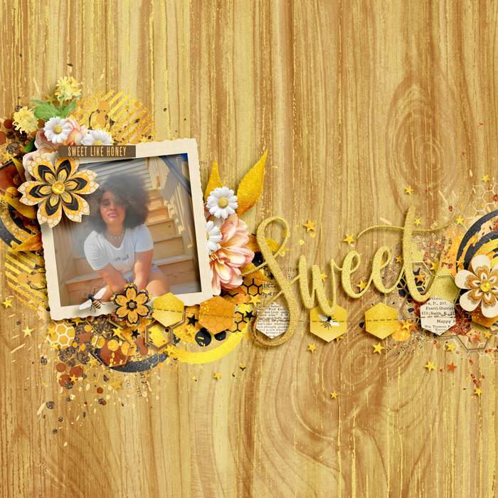
Sweet Like Honey by Kiana

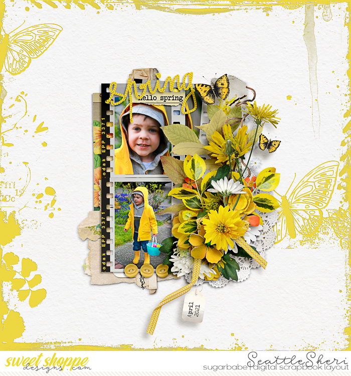
Spring by SeattleSheri

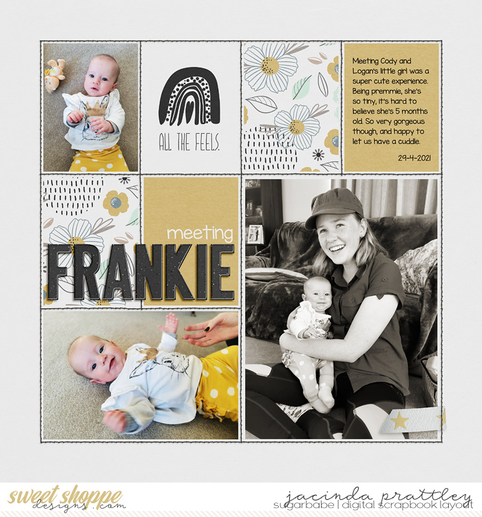
Meeting Frankie by Jacinda
Jacinda said: “The mustard and neutral colour scheme was taken from the baby’s clothing. Since my daughter had a bright blue shirt on, I used a black & white then sepia filter on that photo so the focus stayed on the baby.”
Green
natural, eco, environmental, stable, balance, peace, good luck, prosperous. jealousy, illness, greed, corruption, envy. Brighter, lighter greens evoke growth, vitality, and renewal; darker, richer greens represent prestige, wealth, and abundance.
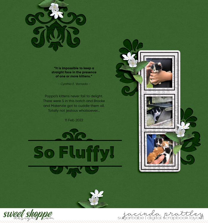
So Fluffy! by Jacinda

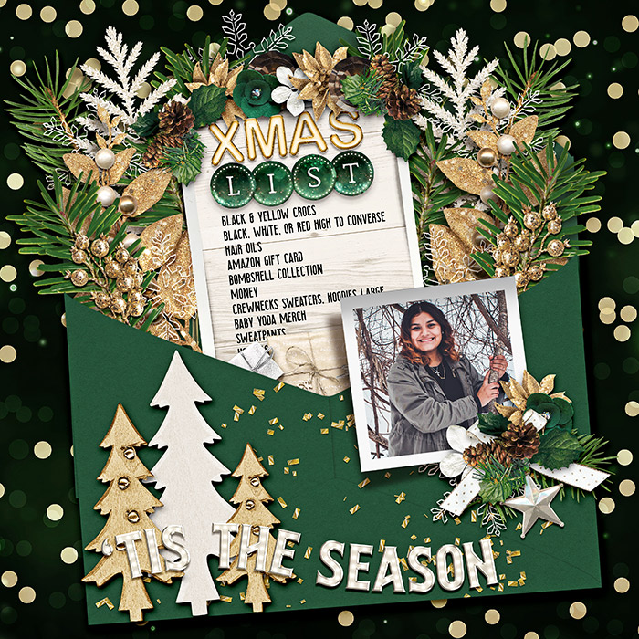
Xmas List by Marnel

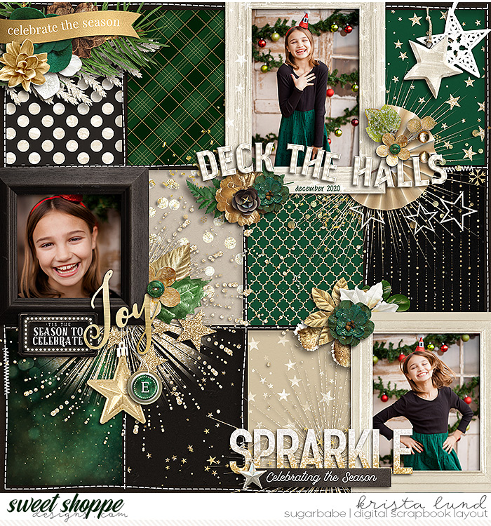
2020 Sparkly Season by Krista Lund

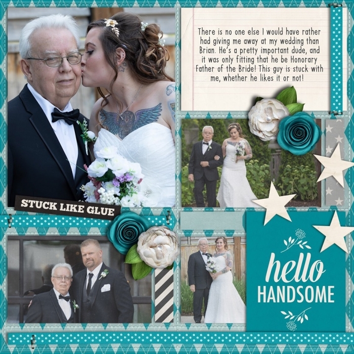
Hello Handsome by Laura Wilkerson

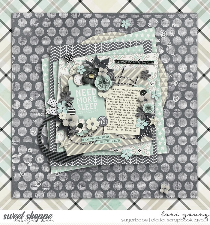
Need More Sleep by Loni
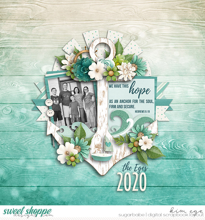
2020 by Kim
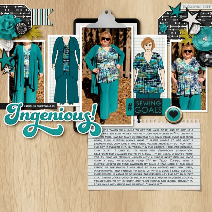
Ingenious! by Angie
Angie said: “In this case, it was less about the emotion evoked by the color and more that I wanted the focus to stay on the side-by-side comparison of the croquis sketches and the finished garments, so setting the page on a neutral foundation of light wood with black and white elements allowed the teal green to take center stage. Adding a title, word art, flowers, stars, and additional deco elements in that same shade of teal green jazzed it up, but still kept the eye focused within that horizontal photo band.”
Blue
serene, trustworthy, inviting, efficiency, intelligence, professional, peace, calmness, reliable, tranquil, harmony. coldness, aloofness, indifference, sadness, depression.
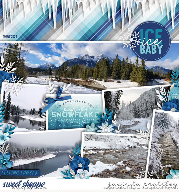
Ice Ice Baby by Jacinda
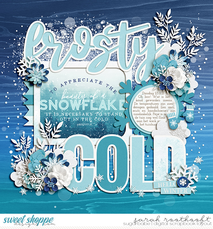
Frosty by Sarah
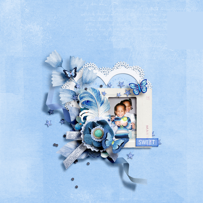
Sweet by Kiana


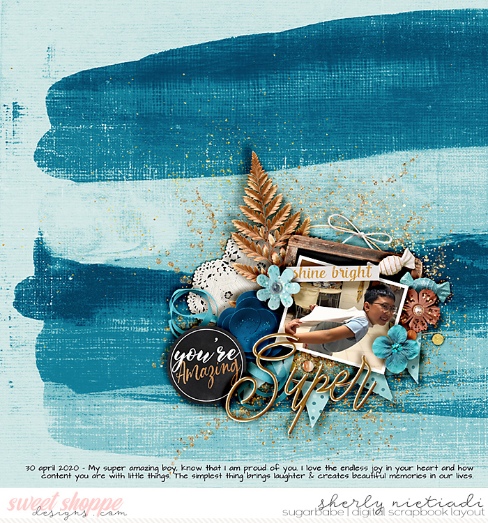
Super by Sherly
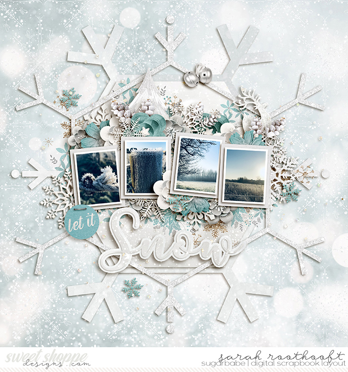
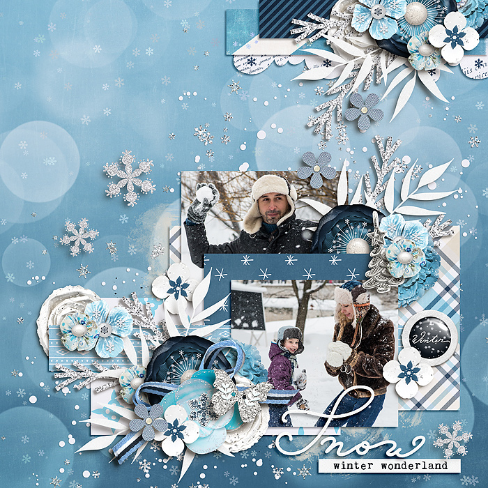
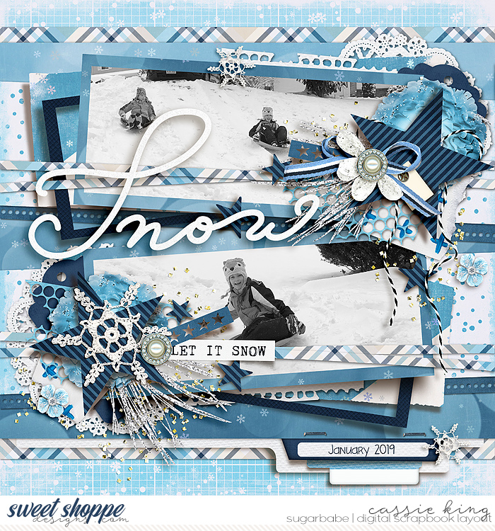
Let It Snow by Sarah
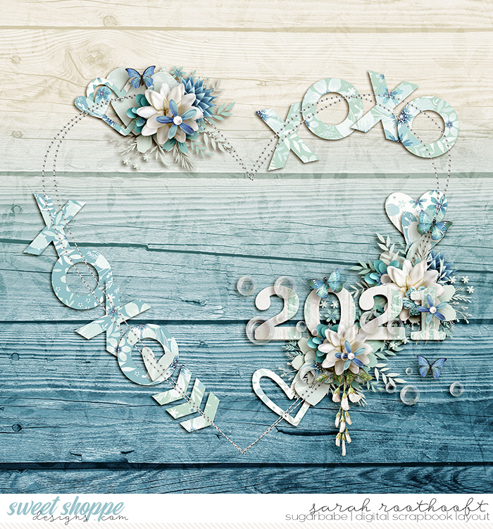
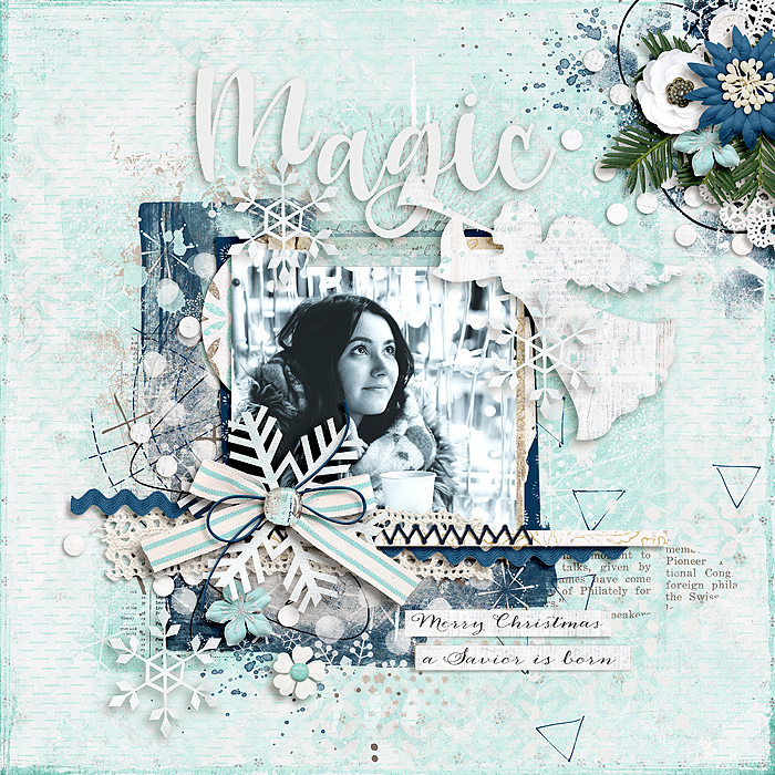
2021 by Sarah
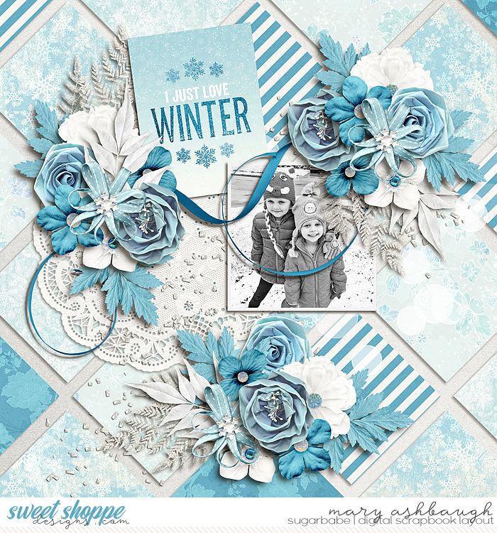
I Just Love Winter by Mary Ashbaugh
Mary said: “When looking back through my gallery, I see that I don’t really scrap monochromatic a whole lot. These layouts came from kits that were already in a way monochromatic and I just scrapped with the kit.”
Purple
luxury, quality, creativity, wisdom, mystery, romance, royalty, majesty, nobility, opulence, sentimental. arrogance, gaudiness, profanity, inferiority. Lighter shades bring to mind spring and romance … darker shades add more mystery and symbolize creativity.
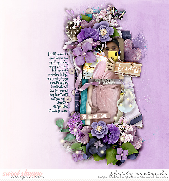
So Much Love by Sherly

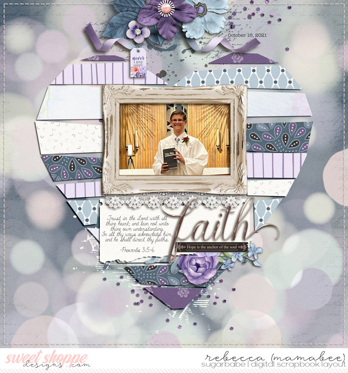
Faith by Rebecca (mamabee)
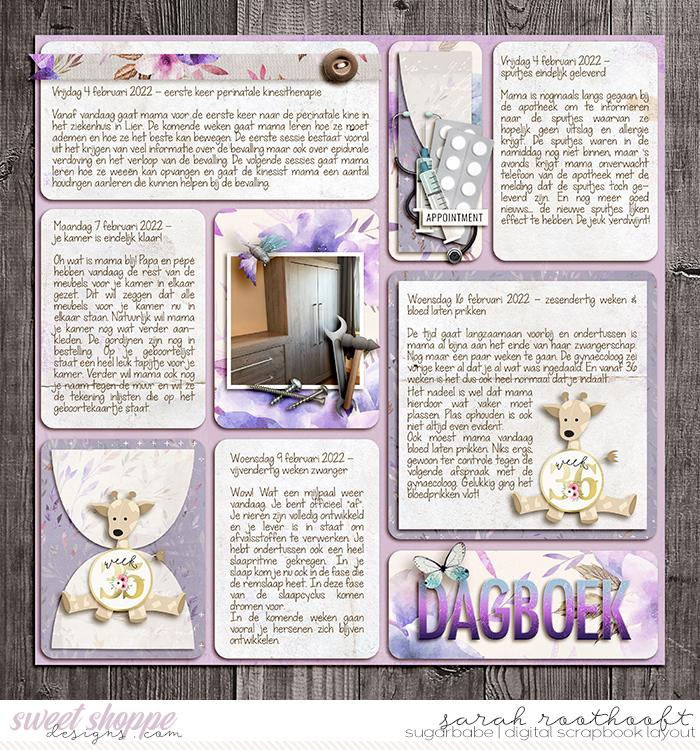
Dagboek Page 46 by Sarah
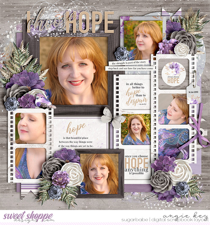
Choose Hope by Angie
Angie said: “These photos were shot the day after my 33rd birthday just after I’d clawed my way out of a months-long battle with clinical depression. The purple symbolizes the creativity and springtime and growth that had finally returned to my life after such a long period of darkness. It also doesn’t hurt that it matches the butterfly-painted top I wore in the photos!”
White
purity, light, hope, simplicity, virtuous, healthy, innocence, perfection. coldness, emptiness, unfriendliness.
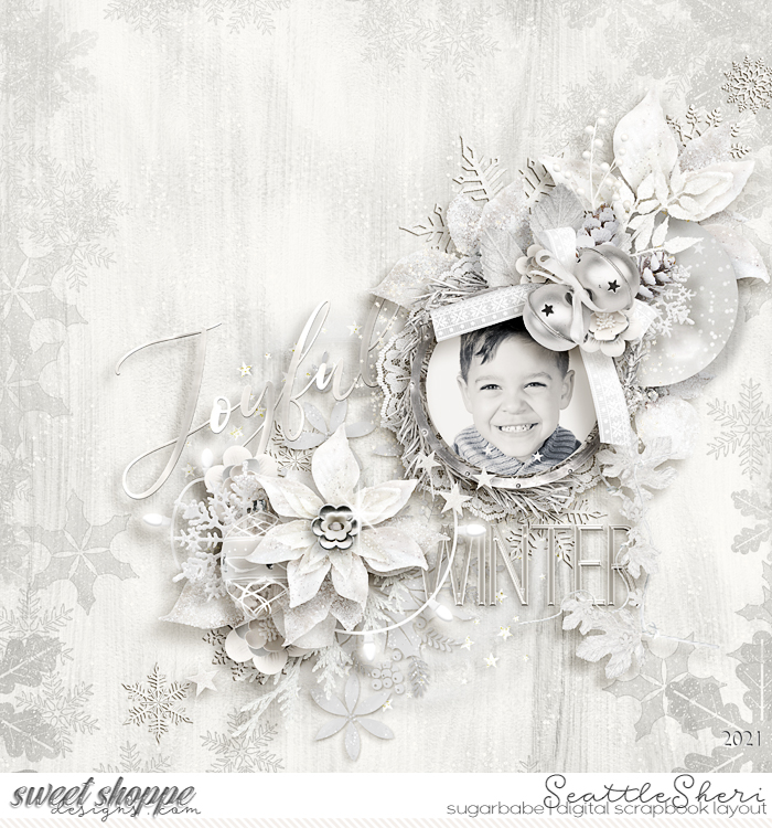
Joyful by SeattleSheri
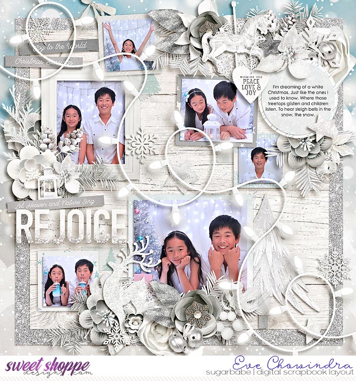
Rejoice by Eve Chowindra
Eve said: “I have Christmas photos of the kids wearing white clothes and when I saw this collection, I know that I want to use all the whites, silvers to emphasis the photos.”
Black & Grey
black: glamour, security, sophistication, wealth, power, formal, luxury, elegant. fear, mourning, oppressive, heavy, death, evil, mystery.
grey: elegance, neutrality, respect, wisdom. decay, pollution, dampness, blandness.
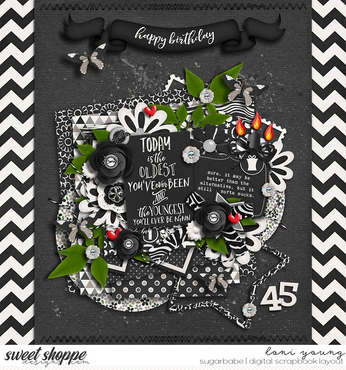
Happy Birthday/45 by Loni
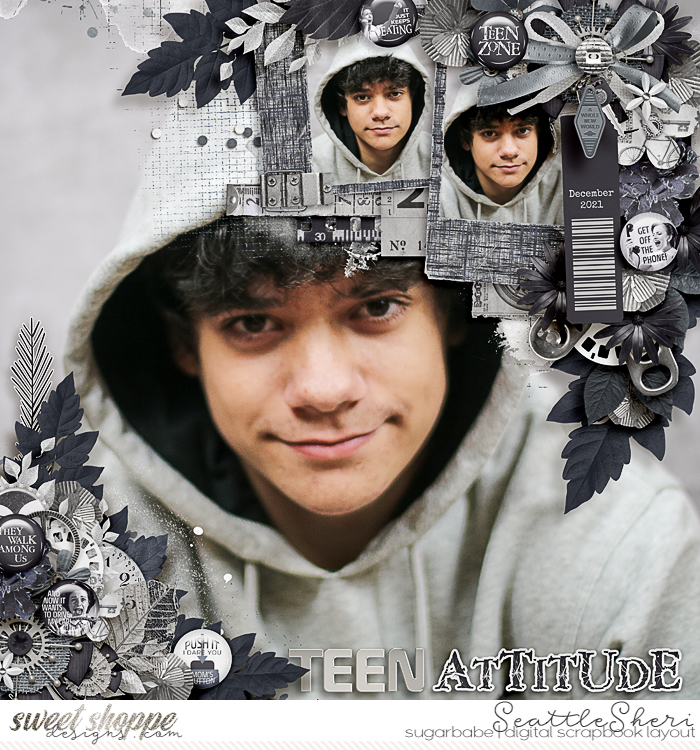
Teen Attitude by SeattleSheri
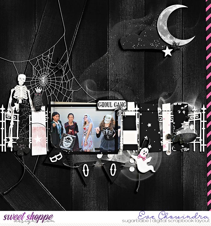
Ghoul Gang by Eve Chowindra
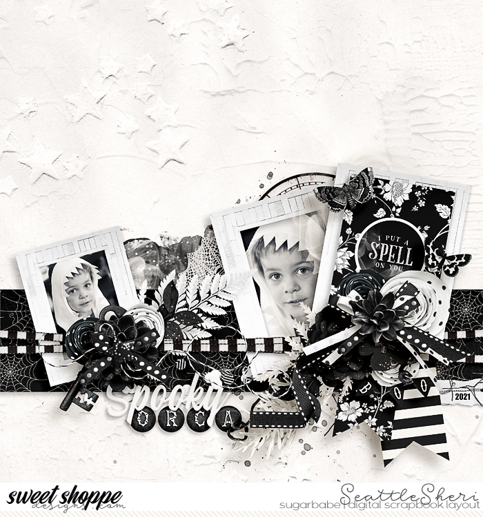
Spooky Orca by SeattleSheri
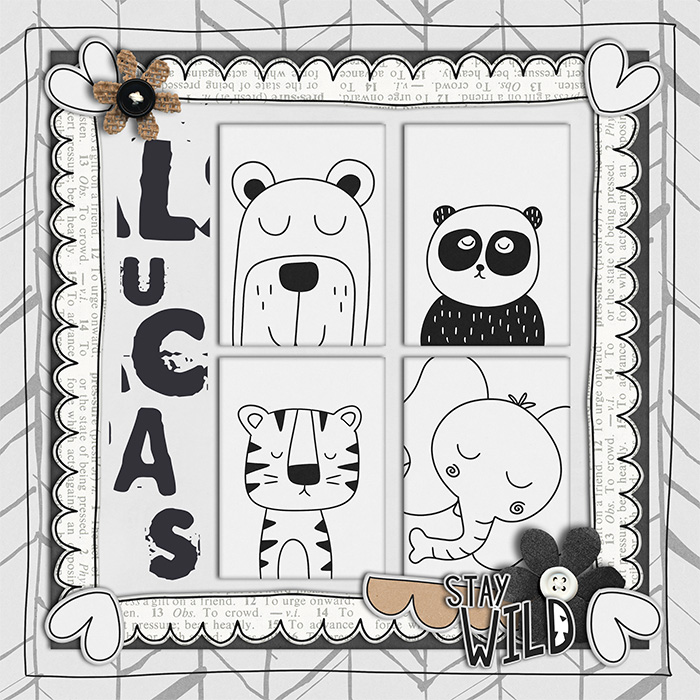
Lucas by Laura Wilkerson
Laura said: “I decided to go neutral with this layout because i had it printed on canvas for my nephew’s nursery.”
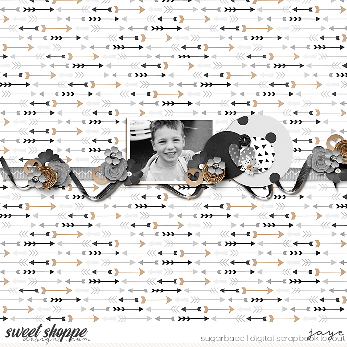
Brown
calm, reliable, nature, tradition, richness, sturdy, rustic, wholesome, grounded, simple, strong, durable, natural. dirt, dull, poverty, heaviness, simplicity.

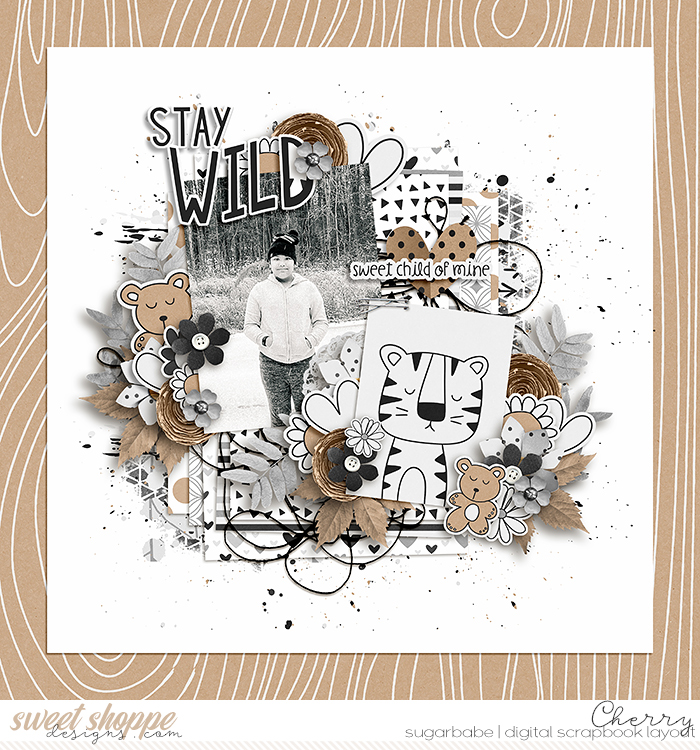
Stay Wild by Cherry
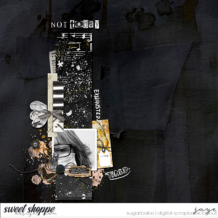
Not Today by Jaye
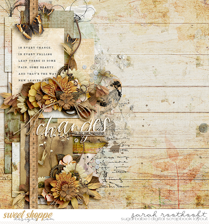
Changes by Sarah
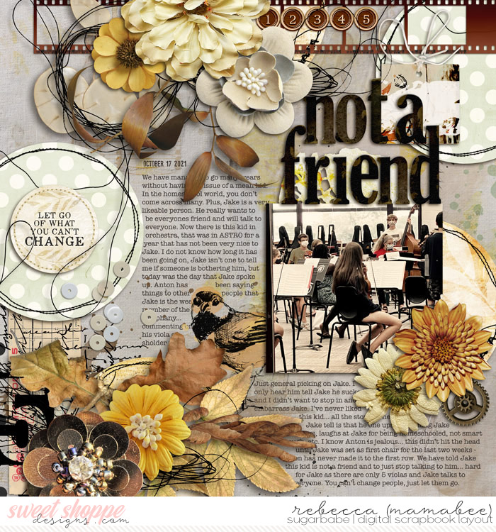
Not a Friend by Rebecca (mamabee)
Remember When? by Jaye
Jaye said: “I picked the neutral because I felt it just fit the photo. He had broken his wrist and was missing hockey, a trip to McDonald’s put a smile on that little face after sitting in the stands watching his friends on the ice.”
“There are truly no limits when it comes to using color in bold and creative ways,” writes Sam Kench. “Explore the thematic and psychological effects of color in your own … projects,” including your next scrapbook layout.
I can’t wait to see what you create! Be sure to post it in the Sweet Shoppe Gallery so we can admire your work and leave you some positive feedback. Tell me in the comments – what’s your favorite color to use in a monochromatic layout, and why?


LidiaG said...
on March 28th, 2022 at 9:49 am
I really enjoyed reading your blog and looking at all the wonderful monochromatic layouts created by the super talented Sugarbabes. My favourite colour scheme would have to be browns, beige and cream. To me, they are soothing, rich, natural colours. My favourite season is autumn, so no surprise that I gravitate toward the colours of the changing seasons.
Angie Key said...
on March 28th, 2022 at 8:17 pm
Lidia, those earth tones are just lovely. Nothing makes me happier than a gorgeous kraft textured paper or rich brown wood paper to use as my background on a layout!
Scrap-therapy said...
on April 1st, 2022 at 8:32 am
I just answer your poll in the forum and realize that I red and loved this post but not take time to leave you a feedback.
I love this subject and the explanation about the colors meaning. All the layouts are just stunning and I honestly barely scrap monochromatic but your post gives me the need to do more!:) Very interesting and full of inspiration in all the colors, just perfect!:)