Sweet Tips: Easy Cutouts plus a freebie!
Happy mid-October everyone I’m back on the blog with a sweet tip all about cutouts. Or rather creating text, shapes and more to look like those paper cut files that everyone loves so much. Our amazing Sugarbabe Mary creates stunning layouts, there’s no doubt about that, but lately people have been wondering about her awesome cutouts on her pages. If you’re unfamiliar with what I’m talking about then just browse her gallery for a bit of inspiration before I get into my spiel. lol
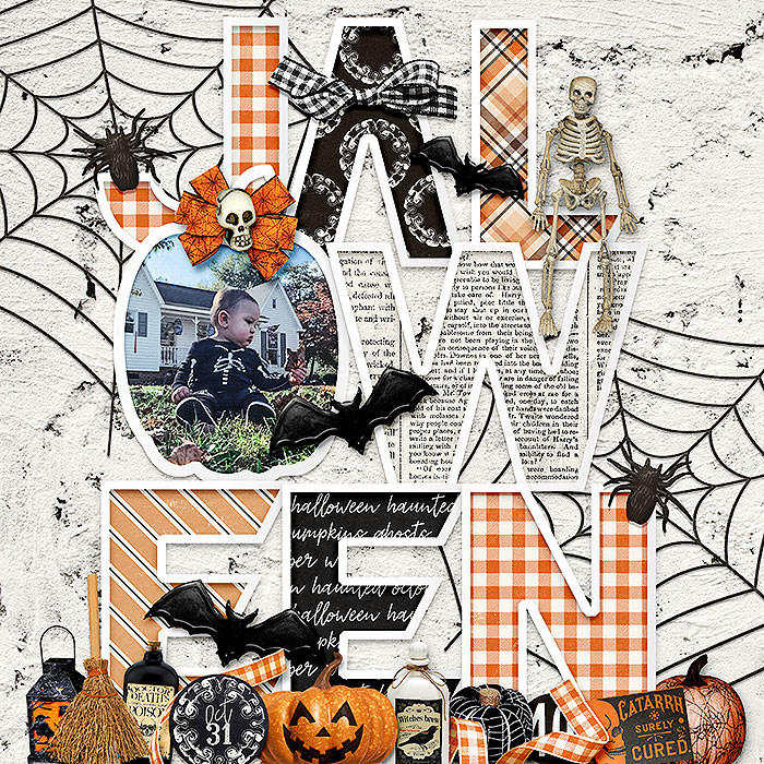
Whether she’s creating a spooky and fun title like this page:
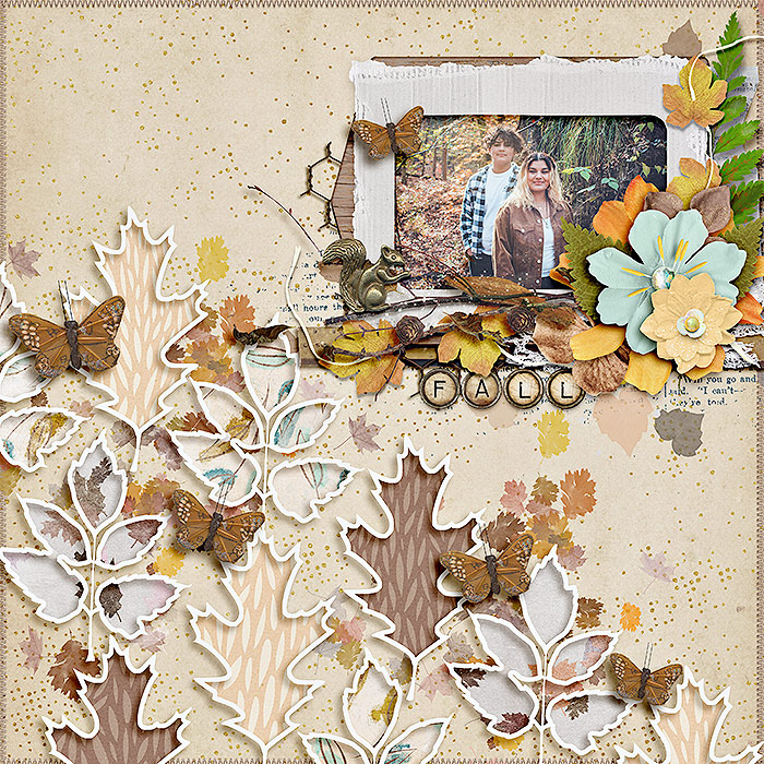
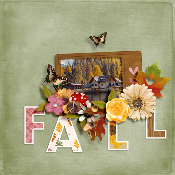
or if she’s using autumn leaves as her cutout inspiration like this page:
everyone wants to know how she does it! Would you like to know an easy way to do it?! Instead of going to the source, I wanted to attempt to find a way to recreate the look that would be both easy and time-saving for myself. You know I love time-saving when I’m scrapbooking, in fact, I wrote a blog post about that HERE too. I opened Photoshop and surprisingly it was super easy for me to recreate so I wanted to share my method with you all. Before I share I searched the tutorials and did find a post about cutouts that wasn’t quite what I wanted, but it may help someone else, so HERE is that article.
Now let’s jump in:
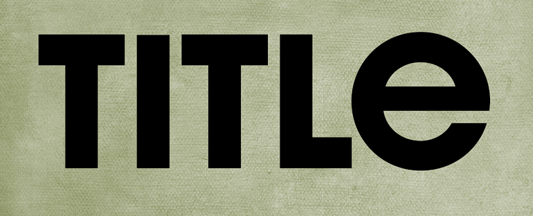
- First I started by typing out my title. I made it super big to fill up the page. Bigger space is going to give you lots of room “inside” the cutout for clipping patterns or photos.
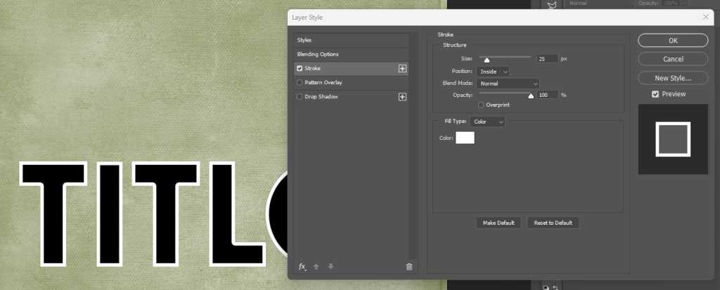
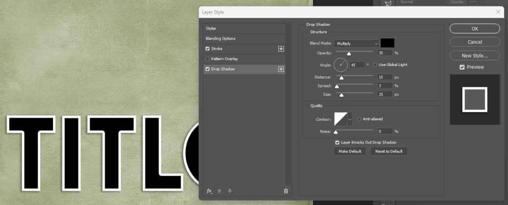
- Then I used the effects to add a stroke. The stroke was set to “inside” position and at a size of 25px in white.
- From here you can go ahead and add your drop shadow to your liking. Mary uses inside shadows I saw, but for mine I went with drop shadows at 45 degree angle with 15px distance, 3px spread & 25px size.
- That’s your basic cutout. You can clip a paper to your text like this:
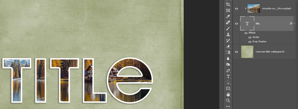
- Or clip one big photo to your text.
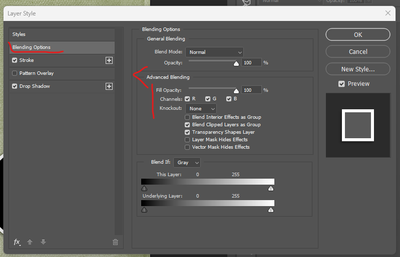
- If you want to get fancy, you’d type each letter on it’s own layer so that you can mix & match patterns and photos. Arranging your letters how you see fit. OR if you want the true cutfile look where it’s just a white stroke, then you could use the Blending Options and drop your fill opacity to 0%.
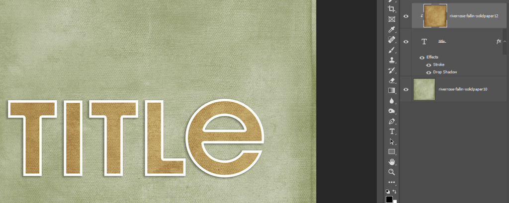
It’s really just that easy in Photoshop, or a program capable of the basics I listed with stroke, drop shadows and clipping masks. I created a cute little autumn inspired page using these tips and placed my title letters on separate layers. I added the stroke&drop shadow then clipped different pattern papers to each letter.
You can apply these effects to shapes, elements that are already in the kit, text, papers and more to create a ton of different looks for your pages. Since I made my own .asl style to use for future pages I create. I wanted to share it with you all here too. Just click to DOWNLOAD and you’ll get a .asl file for Photoshop & Photoshop Elements with 2 styles for you. One with the cutout style to clip photos and papers to and one with the “knockout” look like a traditional cutfile. Enjoy. Hopefully this tip helped you. Let me know what else you want to see me cover!
leablahblah said...
on October 13th, 2022 at 9:16 am
thank you Kiana!
LidiaG said...
on October 13th, 2022 at 10:57 am
Great tips and thank you so much for the freebie!
StephC said...
on October 13th, 2022 at 12:41 pm
Thank you so much – can’t wait to try this out =)
Kiana Fitzpatrick said...
on October 14th, 2022 at 8:17 am
you’re welcome!!!!
Kiana Fitzpatrick said...
on October 14th, 2022 at 8:17 am
my pleasure!!!
Kiana Fitzpatrick said...
on October 14th, 2022 at 8:17 am
can’t wait for you to try it too!!!
Bienejen said...
on October 17th, 2022 at 4:19 pm
This is great!!! I can’t wait to try this in my program. What font did you use for your ‘title’?
Kiana Fitzpatrick said...
on November 2nd, 2022 at 8:54 am
Hi thanks so much for reading. I hope the tips can help you out. I’ll have to check when I’m at home. I believe it was just a standard san serif font for the word “fall”