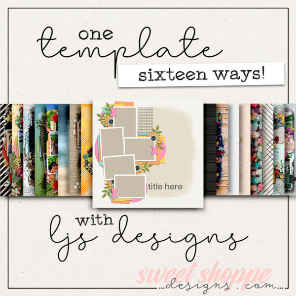
One Template, Fourteen Ways with LJS Designs – February 27
We’re back with another round of “One Template, Many Ways” – where we highlight the work of one of our talented designers while challenging the Sugar Babes to make the most of a single layered scrapbooking template.
This month, we’re featuring the paint-and-layer-filled work of Lorie of LJS Designs.
Lorie is well-known for her brightly-colored, illustration-filled kits that feature adorable pocket cards and gorgeous word art. But when it comes to her templates, Lorie is all about layers of paint and clusters of photos with decorative elements tucked between the layers of paper.
We reached back into Lorie’s shoppe and pulled from her 4 Story series of templates, each of which include four coordinated templates with a similar look and feel. For example, each template in 4 Story: Just Peachy includes a painterly mask for the background, five spots for photos or cards, layers of paper blocks and strips, ample room for journaling, and a prominent space for a title.
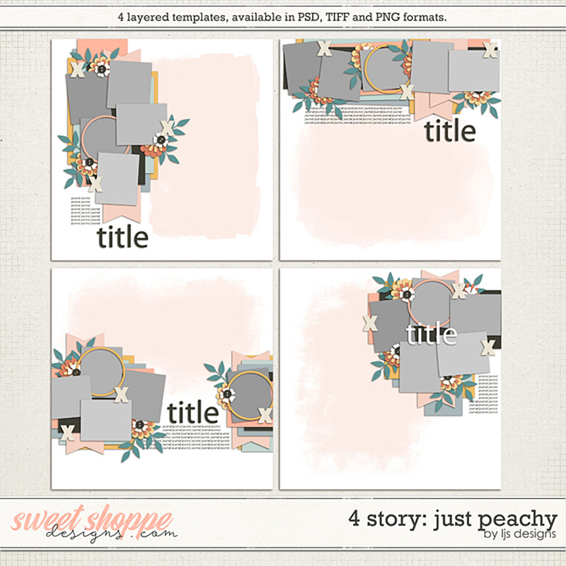
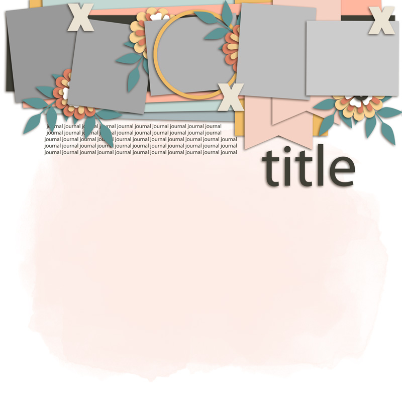
For today’s challenge, we worked with the template in the upper right corner. Its five photo blocks are arranged in a horizontal configuration anchored at the top of the page.
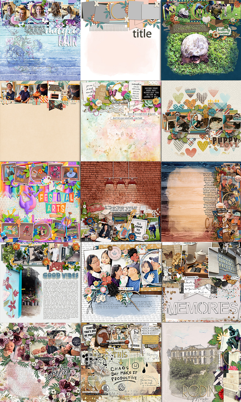
We gave this template to our creative team of Sugar Babes and challenged them to use it as the starting point to create as many unique layouts as they could come up with. Of course, every layout created with a template will look different when used with different digital scrapbooking kits and supplies, but there are additional techniques you can use to produce even more striking & stunning layouts. The Babes worked their magic and came up with fourteen different variations on this one template. Keep reading to learn how you can use these same techniques on your next template-based layout!

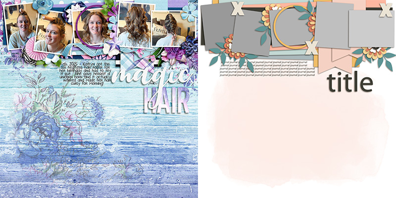
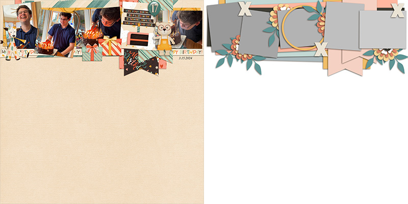
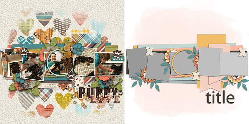
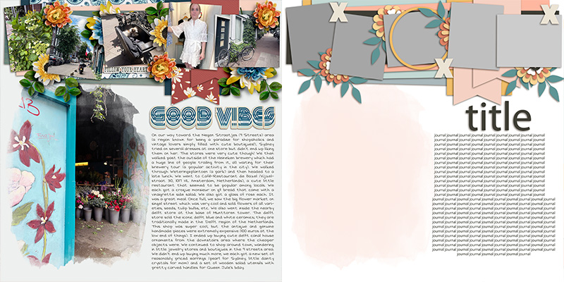
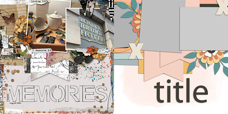
Trina starts us off with a layout that uses the template exactly as-is. She used the paint layer to blend a second patterned paper into the one she chose for her background. She clipped photos to each of the five primary blocks, and clipped patterned papers to the others. Then she replaced the floral and foliage layers with elements from the kit and gave everything beautiful drop-shadows. Finally, Trina replaced the title placeholder with a piece of word art paired with the alphabet from the kit, and added her journaling in the space designated on the template. The result is a sweet layout that will look lovely in her album!

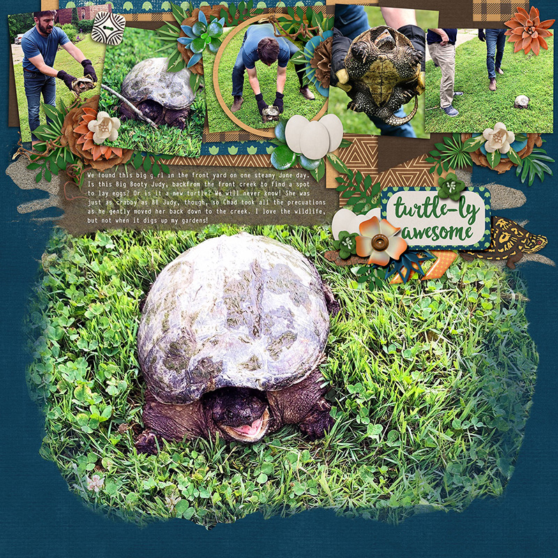
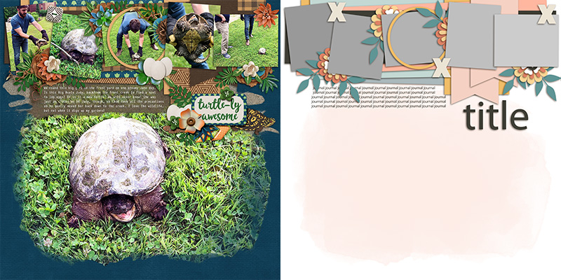
Ally give us our first variation on the template with her layout. Instead of using a sheet of patterned paper to blend with the background, she clipped a big, beautiful photograph to the paint mask layer. (I love layouts that feature big photos!) Notice what she did with her journaling block? To improve readability of her text and to keep it from blending in with the busy photo background, she added another layer of paint from her chosen kit. The block of brown is just enough contrast that her white text is easily read, and it shares a look-and-feel with the painted photo mask that gives her layout a cohesive feeling. Nicely done – or, should I say, “turtle-ly awesome”!

Rebecca’s layout demonstrates how a clean-and-simple scrapbooker can use this same template by removing layers. She started by deleting the big paint mask and using a solid sheet of digital cardstock as her page foundation. She uses no flowers and foliage; she replaced some of them with illustrated elements from the kit and completely removed others. And whereas the template includes space for five photographs, she only used four; instead, she clipped a pre-made pocket card to the remaining photo mask. It’s a sweetly clean-and-simple interpretation of this same template.

Mary decided to use the template to create a completely photoless layout. Sometimes you have a story to tell but no photographs to accompany it. Instead, you can do what Mary did – find a digital scrapbooking kit in the Shoppe that shares a theme with your story, and use its cards and word art to fill in the blanks! She clipped pocket cards to three of the photo masks, patterned paper to another, and replaced the fifth with a framed piece of word art. Then she built out the rest of her layout with elements from the kit and used word strips and a scripty piece of word art to complete the title.

Charlene is the first of our Babes to start moving things around on the template. She took the horizontal cluster of photos, elements, and paper pieces and pulled the whole thing down to the middle of her canvas. Now instead of a top-anchored layout, we have a center-anchored design that gives it a slightly different feel. Beautifully done!

Cassie decided to double up on the template and get a whopping ten photos on her layout rather than the original five. She duplicated the horizontal photo cluster and after rotating it 180-degrees, placed it at the bottom of the page. Now her canvas is anchored top and bottom, and she has space for twice as many photographs. I just love the results!

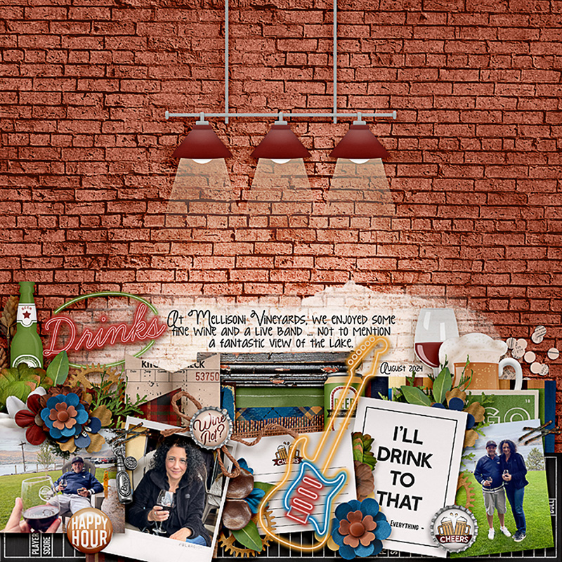
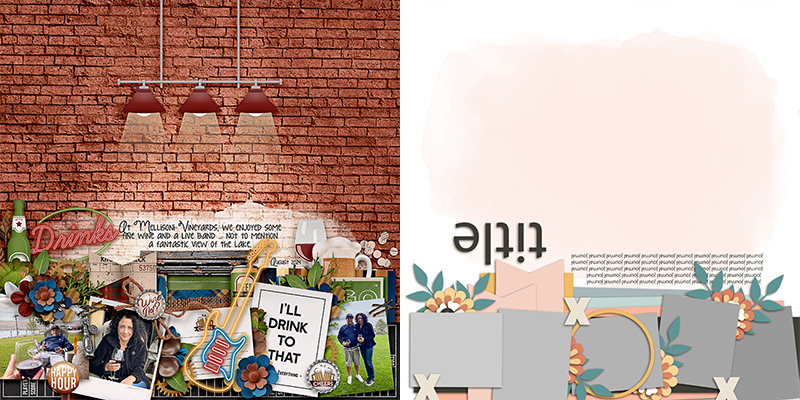
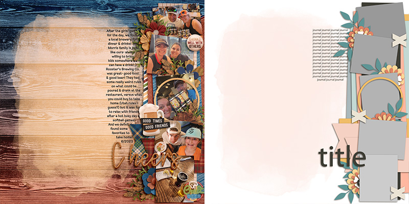
Sheri gives us our first “spin” on the template as she quite literally spun or rotated it 180-degrees. It maintains its original look-and-feel, but is now a bottom-anchored layout rather than the original top-anchored one. Sheri clipped a combination of photos and journal cards to the masks and really built out the element clusters using fun digital pieces from the kit. One final thing to notice here is her background – she went with a sheet of patterned paper and added the hanging light fixture to really reinforce the feeling of being in a pub or bar. By pulling the painted mask down on the page and only including enough to back her journaling, she allowed the “wall” to stand out as a fantastic foundation for her layout.

Amie gives us another “spin” on this template as she rotated it 90-degrees to create a right-side-anchored design. Notice that even though she rotated everything on the canvas, she rotated the journaling block back so the text still runs left-to-right rather than up-and-down. Then she used her Text tool and changed the shape of the journaling block so it’s skinny but tall, taking up the same real-estate as in the original template design: the few inches just below (or now, to the left) of the photo cluster. Great job!

Speaking of journaling, Krista shows us how this template can be used to tell a big story – or, at least, a story with lots of words. She moved the journaling block and resized it to take up the right half of the page in the empty space below the title. Then, knowing she wanted to use the painted mask to showcase a photograph, she resized it to fill the left half of the canvas below the horizontal photo cluster. It’s a perfect example of how you can use the same template to tell any length of story you want!

When you really want to stretch your use of a template, why not start stretching its size? Sherly shows us how with her 3-photo layout, and we promise, it started as the exact same template! She selected all the layers and increased their size to 200% of the original. Then, she dragged them around on her 12×12 canvas until the upper left corner of the template elements was anchored on her page. This is a great way to use a template – or, in this case, part of a template – when you want your photographs to appear larger than the template’s original design. So fun!

Jaye gives us a second variation on the template by stretching its size just like Sherly – except instead of anchoring the upper left corner on her canvas, she anchored the upper right. She used two of the blocks for large photographs and used the third for patterned papers and clustered elements. I love her addition of a torn word strip to the left photograph as a caption for the photo, and her use of painted elements on the background to create a frame for her page.

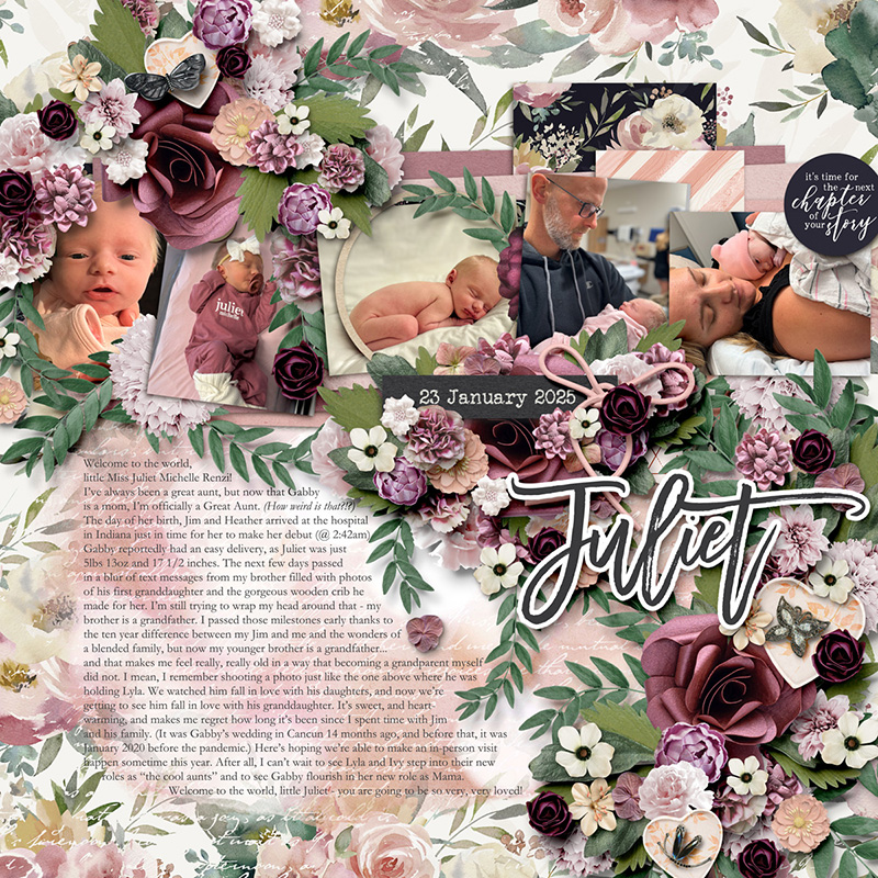
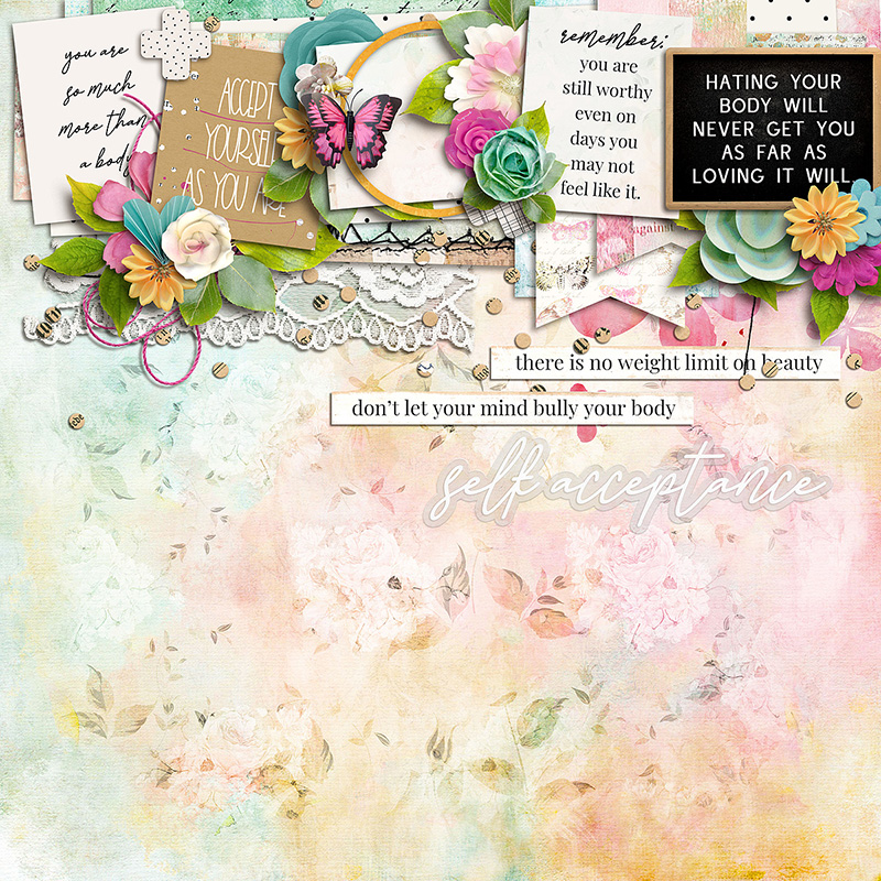
Sometimes, a layout just needs a little extra … or in this case, a LOT of extra. I wanted this layout featuring my new great-niece to have lots and lots of floral clusters, so here’s what I did: I moved the horizontal photo strip down a few inches to create some additional room. Next, I resized the text block so I’d have enough space for my journaling. Then, I went into my library of element clusters (learn all about how I extract clusters from templates for use on other pages in Fake It ‘Till You Make It: Element Clusters) and grabbed three clusters I’d extracted from the templates in Two Sides: of Life by Alchemy Wild Studio. I shifted them around on the page and resized them until I had created a left-to-right diagonal cascade of flowers that made me happy. And then I replaced each layer with a flower, leaf, or piece of foliage from my chosen kits. So if you like your layouts to have a little bit “extra”, try combining a layered template with clusters from other templates for results like these!

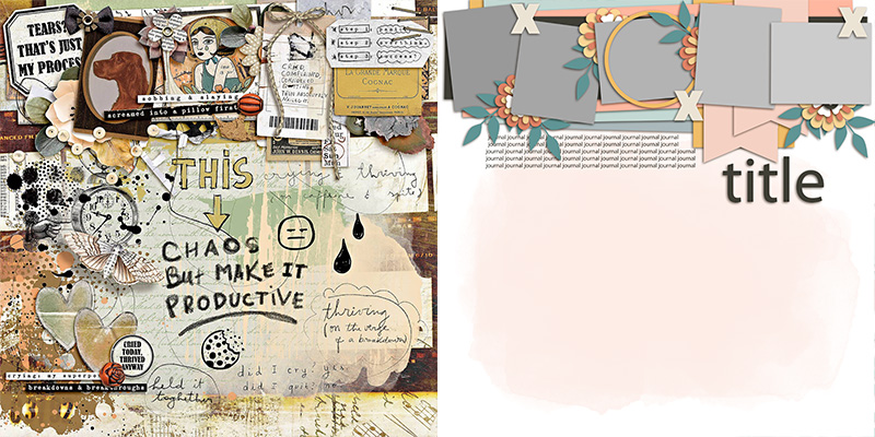
Eve takes this template in a different direction with this art journaling-style layout. Just because the original template doesn’t scream “art journaling” doesn’t mean you can’t use it as a starting point! Eve added lots of layers of paint and replaced some of the paper layers with ephemera instead. (Notice the two paper ribbons on the template behind photos 4 & 5? Eve replaced them with a stack of tags instead and it’s simply perfect!) So the next time you feel like expressing your emotions with an artsy-style layout but feel stuck on where to begin, grab a layered template and start interpreting each layer with a creative spin. It’s a great place to start!

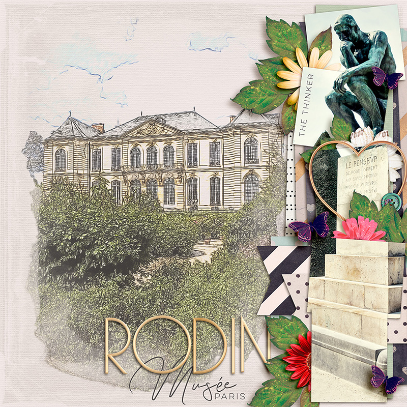
Judie brings us our final variation on this template, and it’s a stunning piece dedicated to the Rodin Museum in Paris. Judie did several different things to the template on the way to creating her layout. First, she rotated it 90-degrees clockwise so the photo cluster strip is now anchored on the right. Next, she expanded the size of the paint mask so it would hold her photograph of the museum exterior, to which she’d applied a photo filter to make it look like a pencil sketch. I love the way the photo “sketch” blends in with the textured cardstock of her background! And finally, Judie used the five photo masks on the right to house one long photo of The Thinker sculpture atop its raised plinth. Look closely, and you’ll see that it’s all one, continuous photograph. She did this by first sizing the photo to the full page height, and then duplicating it and clipping it to each of the five photo blocks. It creates such a cool effect with the little elements that peek out between the masks! Simply gorgeous!
There we have it: one template … fourteen uniquely gorgeous digital scrapbook layouts!
It’s our hope that our monthly “One Template, Many Ways” series will get you thinking about all the different ways you can use a layered scrapbooking template. Perhaps you start with a straight-forward interpretation, clipping photos, journaling cards, and word art to the photo masks. Maybe then you start moving things around on the template, spinning it, flipping it, doubling the number of photos or removing some instead. Perhaps you really stretch your templates by increasing the size of the layers and dragging them around so only part of the template remains on your canvas. Or maybe you add lots of clusters, remove them entirely for a clean-and-simple look, or go all out with an art journaling style. There are so many different ways you can use a layered scrapbooking template, and we’re here for all of them!
So grab yourself a template – we wholeheartedly recommend this set by LJS Designs – and create some layout magic today!