White Space
Hello everyone! It’s Kresta here with you today to discuss a design principle of digital scrapbooking: White Space.
Now, with so many beautiful papers in the kits in the Sweet Shoppe, you may be thinking “I don’t want to just have a white page!” Hopefully by the end of this tutorial, you will have a better understanding of what white space is and what it is not, and it’s importance in design.
So what is White Space?
Also called Negative Space, it is the absence of content. This is a design principle that goes far beyond the world of digital scrapbooking and into graphic design for media, print, web design, etc. In fact, it would be helpful for you to flip through a magazine you have and notice all of the pages that utilize white space (absence of content).
The point of White Space is to create gutters on the page, which lead the eye to the focal content. Without so many other distractions on the page, the eye naturally knows where to go and what to look at.
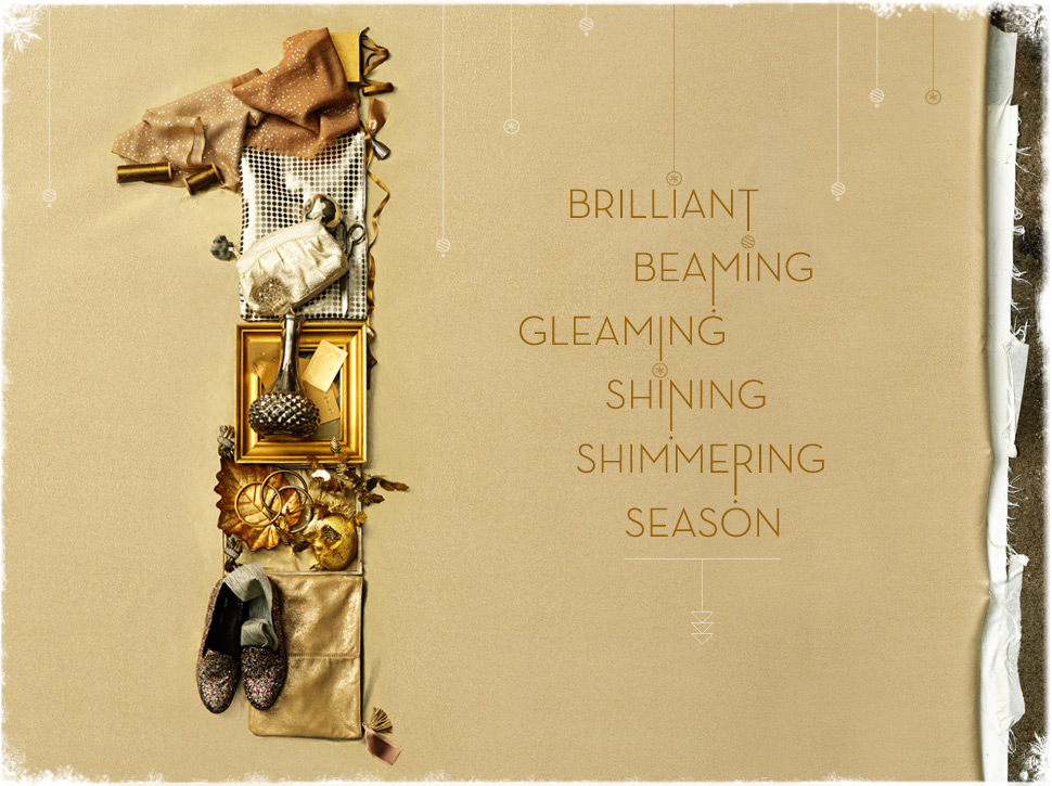
Here is an example of White Space in advertising:
Notice that the lack of content around the page helps your eyes to first land on the picture on the left and then to the text on the right.
So how do we use this design concept in digital scrapbooking?
Again, the Shoppe has so many beautiful elements and embellishments to use, that it is hard to think of scaling back too much. No worries – you don’t need to be super minimal in your design. The key is to create those gutters, areas where there is no content so that the eye lands where the content is.
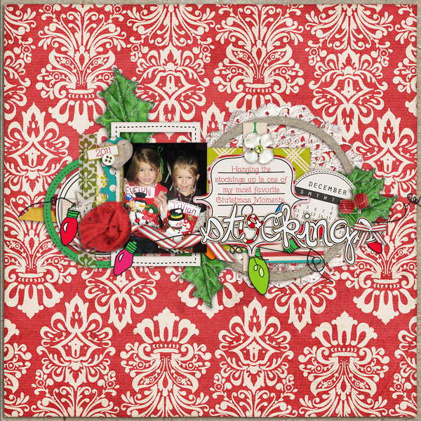
To utilize White Space, the “gutters” do not need to be white. You can use any background paper, even patterned ones, in your negative space. Here is an example (by Stephanie) of a strongly pattterned background paper that still utilizes the White Space concept:
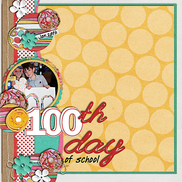
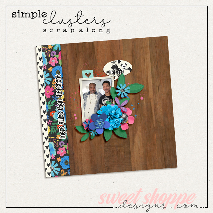
Also, White Space pages do not have to have a centered design. Here is a page that I created (with a template by Darcy) that has the content on the left edge of the page:
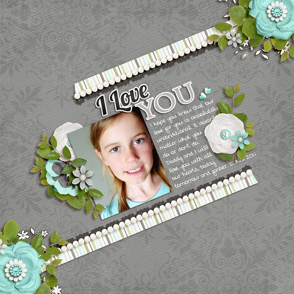
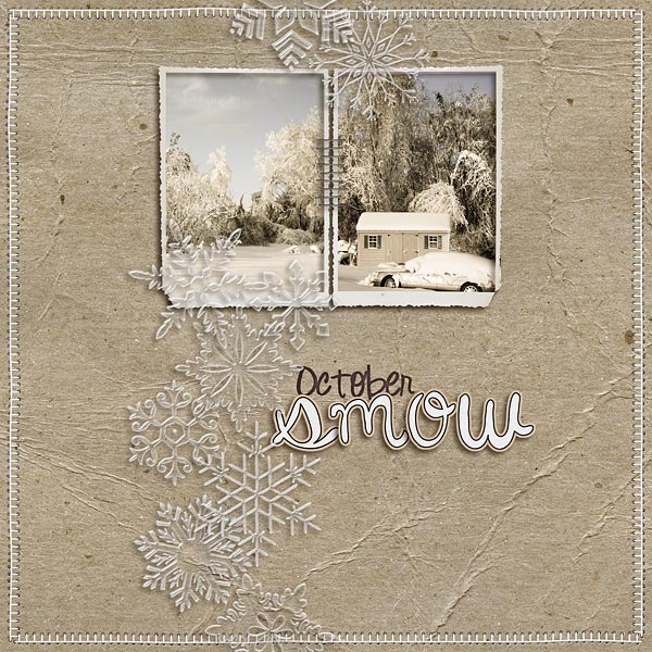
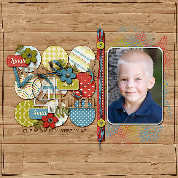
Here are a few more pages from the Sugarbabes that show off the White Space design principle:
(by Jacinda)
(by Aly)
(by Mary)
(by Lydia)
I hope that you now have a better understanding of White Space. If you’re having a hard time doing it yourself on your pages, here are a few suggestions:
- Look for more inspiration, both in the gallery and in advertising and media.
- Decide what you want to be the focus of your page and then try to create “gutters” around that.
- Try either centering your design or putting it on an edge, creating white space over the rest of the page.
Have fun with your White Space layouts! I can’t wait to see them in the gallery!
