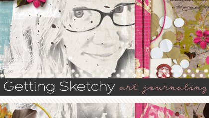
Playing with Text in an Art Journal Layout
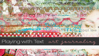
Hi Sweet Shoppers! Lex here to talk a little bit about how I play with fonts in my art journaling layouts. Sometimes my layouts can have just a solid block of journaling, especially if it is one of those OMGRAWRHULKSMASH kind of layouts, you know? Sometimes, I like to play around with type, especially if my journaling is borrowed text or quotes, etc.
HOW I PLAY WITH FONTS:
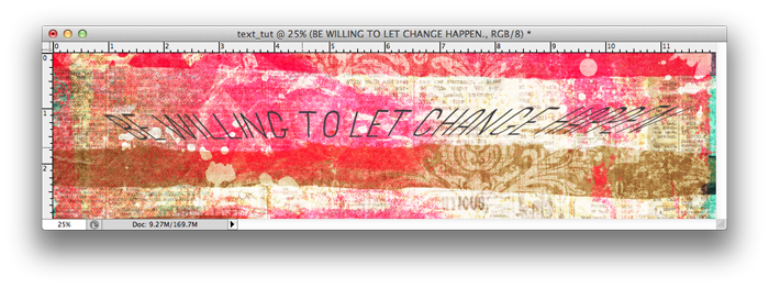
Here’s a recent layout I did:
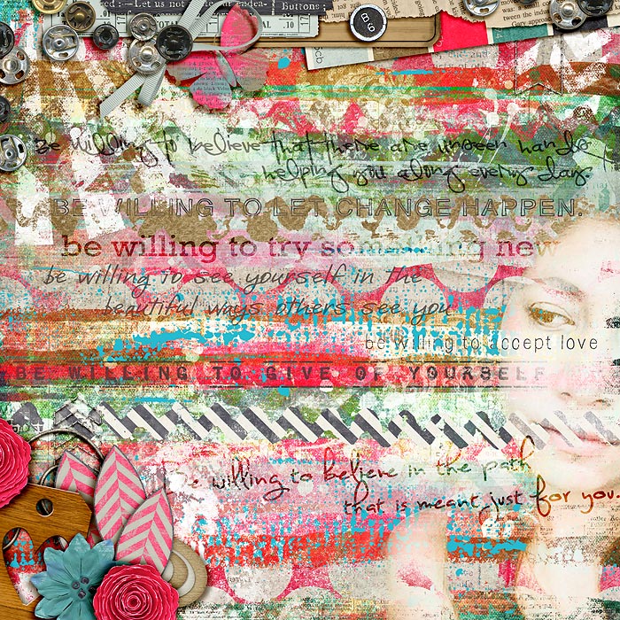
Normally, I try not to go over two-three fonts in a layout because I don’t want it too cluttered, especially if I get a little too layer-heavy. In this case, I wanted a different font per statement, which I felt contributed to the confusion of the layout’s composition *insert more complicated blathering*. So in this layout, I tried the following:
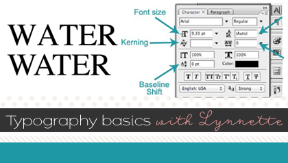
1. Adjusting the size, scale, or tracking of the fonts. Lynnette has a way better explanation of the technicalities of the Character Palette in Photoshop. I personally just like fiddling with the size and tracking mostly. Some script fonts actually look pretty cool with widely-spaced out characters.
2. Playing with different fonts for emphasis. In this case I used a different font per statement. But you can just use two fonts–one for main body text and another to emphasize a particular word or phrase.
Here are some other ways to experiment with your journaling:
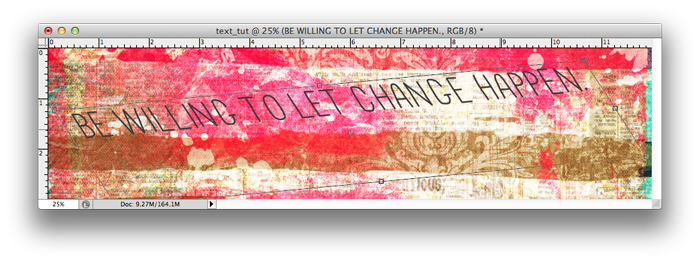
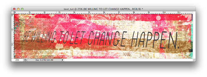
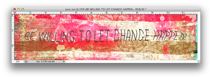
3. Playing with the Skew, Warp, Perspective, Distort tools. With the exception of the Skew tool, you’ll have to rasterize your text layer to make it editable (Go to Layer/Rasterize/Type). Then go to any of these tools (Edit/Transform) and experiment.
Using the Skew tool
Using the Distort tool
Using the Perspective tool
Using the Warp tool
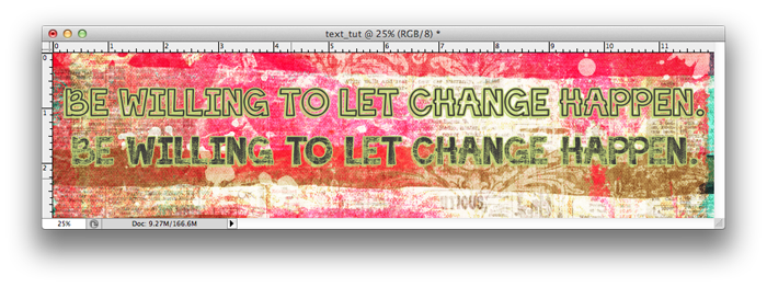
4. Playing with Styles. If you have an outline font, you can play around with fun styles like Misty’s Color Lift Photoshop Styles. (using Color Lift Lime 45) Just type out your word or phrase and apply the style. It works well with “solid” fonts, too. In both these examples, I used the Color Lift Lime 45 style from Misty’s set 
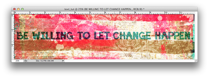
5. Recolor thicker fonts or use them as clipping masks and play with blending modes. I love blend modes! Depending on which one you use, they can let your journaling seamlessly blend right into your layout’s background paper, instead of simply sitting on top of it. You can even fiddle with opacity of your text for added blendyness (yes, that’s a word, lol). Perfect for a paint-heavy layout. In this example, I had recolored the font to a dark pink and applied the Difference blending mode.
FAVORITE FONTS TO USE:
Here are some fonts I like–I love these because they look like they are inked or painted unto a page. And hello, you can never go wrong with typewriter fonts!
These are the main things I play with when I do my art journaling pages, I hope they help! If you have your own techniques and tips, please let me know! I’m always on the lookout for new ways to play with my journaling
Christine Newman said...
on March 28th, 2013 at 3:30 pm
Awesome tutorial, Lex! I’m so excited to see one of my outline fonts on here! ♥
Christine
Sandy/tx-nana-scraps said...
on March 28th, 2013 at 4:48 pm
Great tut, thanks. Love learning new things to do to fonts.
Lorri said...
on April 6th, 2013 at 5:14 pm
I’ve started Art Journaling this year and am really enjoying it. I mainly use PaintShop Pro as this is what I’ve learned and used for over 15 years…. but I do have Adope Photoshop Elements 7. And I do like doing the text in it better than PSP. The latest versions of PSP have screwed up how the text can be used. grrrr!!! Anyway though, on a couple of occasions I’ve wanted my text box to be a certain shape to fit into my art journal layout…. like say… a circle shape. I cannot figure out how to get my journaling text to be in a certain shape. Can you help me? or point me to a tut that will help me?
Thanks so much!
Lorri
Traci Reed said...
on April 6th, 2013 at 6:05 pm
This should help Lorri! https://www.sweetshoppedesigns.com/tutorials/index.php/2011/12/text-on-a-path/
eve said...
on March 4th, 2014 at 8:16 pm
Thanks for the tut!