Blending Woodgrain (or Highly Textured) Backgrounds
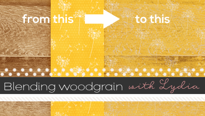
I love using woodgrain papers for backgrounds on my layouts. But, what I love even more is adding stamps and other overlays on top of those woodgrain backgrounds. One of my favorite tricks is using the “Blend If” options to make the texture from the woodgrain show through whatever layers I have placed on top of the background. Let me show you what I mean.
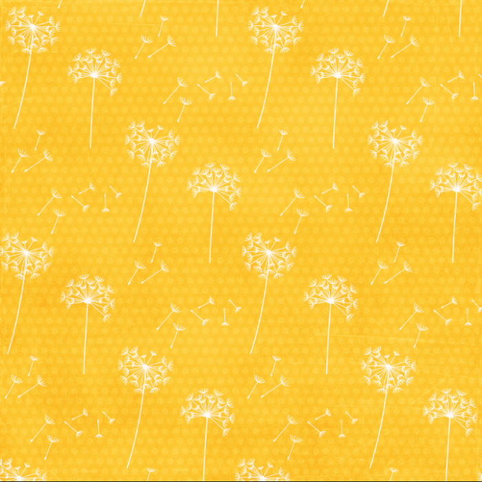
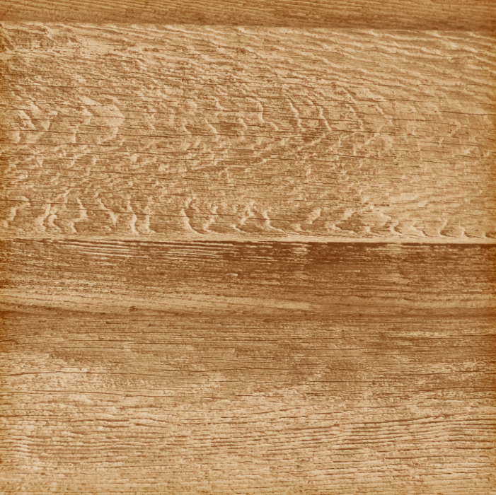
To create a background for my layout, I combined this paper:
with this paper:
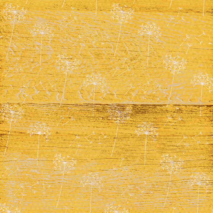
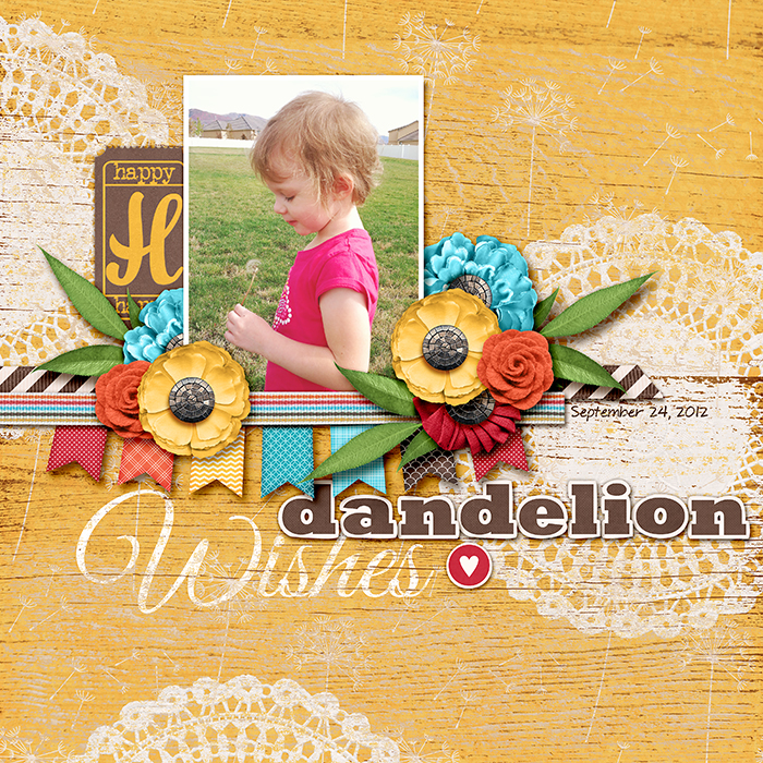
To come up with this:
And, here’s how you can do it!
1. Start with a background paper and add another paper on the layer above it.
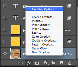
2. In the Layers panel, click on the Add a Layer Style icon and choose Blending Options.
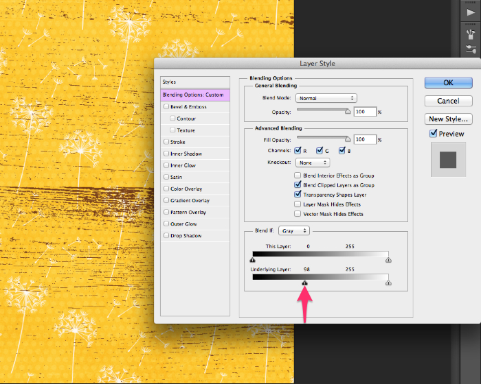
3. In the Layer Style dialog box, click on the left-hand arrow on the Underlying Layer slider and drag it to the right. This will make the darker portions of the background layer show through. Keep dragging to the right until you like what you see.
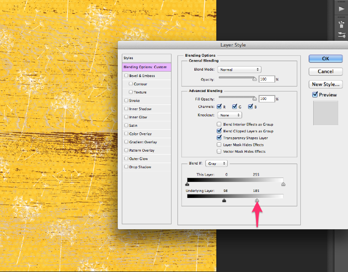
4. Click on the right-hand arrow on the Underlying Layer slider and drag it to the left. This will make the lighter portions of the background layer show through. Keep dragging to the left until you like what you see.
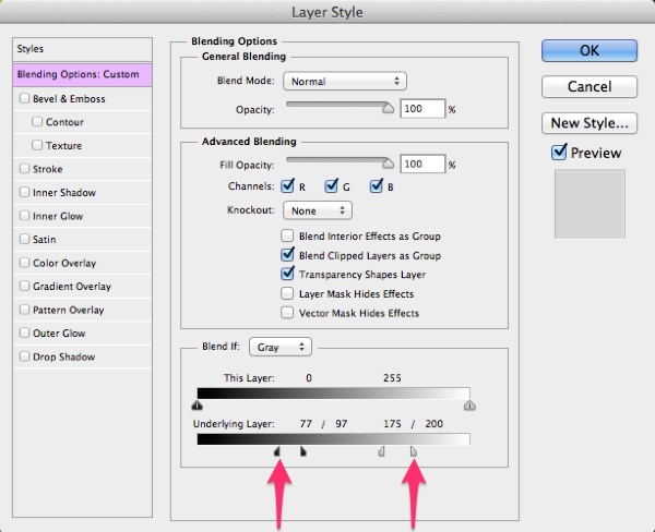
5. To soften the effect, hold down the Alt key (Mac: Opt key), click on the left-hand arrow, and drag back to the left. This will split the slider and make the effect a little more subtle. Keep dragging until you like what you see, and repeat this action with the right-hand arrow.
6. Click OK to close the Layer Style dialog box.
7. If you want to soften the effect even more, lower the Opacity of the top paper layer.
As you can see, I used this same effect on the script text and the doilies on this layout. You can also use it with brushes, alphas, and any other flat elements. I just love the effect of the texture from the wood coming through, making it look like the dandelion pattern was painted onto the wood. You could use other highly textured papers as well . . . it doesn’t have to be a woodgrain paper.
I hope you’ll give this tutorial a try and share your layouts with us in our gallery!
Lori Reed said...
on March 16th, 2014 at 4:27 am
What type of font is the yellow H in the above tutorial? Thanks!
Lydia said...
on April 13th, 2014 at 3:59 am
Lori – I’m not sure what font was used for the “H” on the ticket. The ticket was an element in the kit and already had the “H” on it. This layout was made using a collab kit by Jady Day Studio and Meghan Mullens. If you wanted to contact one of them via PM in the Sweet Shoppe forums, they might be able to tell you which font was used.